Spotify has been switching things up this year, especially lately. And now, they are rolling out their own font, Spotify Mix, to create a unique kind of appeal to their users across their UI.

𝙿𝚑𝚘𝚝𝚘 𝚋𝚢 𝙰𝚕𝚎𝚡𝚊𝚗𝚍𝚎𝚛 𝚂𝚑𝚊𝚝𝚘𝚟 / 𝚄𝚗𝚜𝚙𝚕𝚊𝚜𝚑
Sounds may seem like all that matters with audio streaming services, yet visuals contribute to how users feel using them and how likely they are to enjoy their experience. So it makes sense for them to make a few changes every now and then and improve UI appearances.
Spotify Mix, the company’s new font, starts rolling out today to replace the Circular font that Spotify uses for their UI across devices. A fresh new look that may seem minor but will make the audio streaming platform stand out with its unique visual identity.
Spotify Mix is a sans-serif typeface designed in partnership with Dinamo Typefaces, a Berlin-based type design studio that has worked with major companies, including Burberry, Discord, Nike, Patreon, and Tumblr, among others. Sans-serif fonts are simpler-looking than serif fonts and are popular among many brands, including tech giants Google and Microsoft. The font type is also known to be more accessible because it’s easier to read on smaller devices. TechCrunch
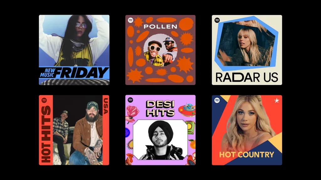
𝙸𝚖𝚊𝚐𝚎 𝚋𝚢 𝚂𝚙𝚘𝚝𝚒𝚏𝚢 𝚜𝚑𝚘𝚠𝚒𝚗𝚐 𝚑𝚘𝚠 𝚂𝚙𝚘𝚝𝚒𝚏𝚢 𝙼𝚒𝚡 𝚌𝚊𝚗 𝚋𝚎 𝚌𝚞𝚜𝚝𝚘𝚖𝚒𝚜𝚎𝚍 𝚝𝚘 𝚜𝚞𝚒𝚝 𝚍𝚒𝚏𝚏𝚎𝚛𝚎𝚗𝚝 𝚙𝚕𝚊𝚢𝚕𝚒𝚜𝚝 𝚌𝚘𝚟𝚎𝚛𝚜
"A combination of sharp angles and smooth curves" - Global Head of Brand Design at Spotify Rasmus Wängelin describes the font - "gives the typeface a distinctive character that feels quintessentially Spotify."
“To design this typeface, we broke free from traditional typographic constraints and merger elements from a variety of font styles. This approach mirrors the dynamic and evolving nature of audio culture over the years,” Rasmus continued in Spotify's blog post.
Spotify plans to use Spotify Mix on everything, and that includes playlist covers and marketing posters and campaigns. This is to further promote their brand and cement their unique appeal. It is a variable font that would allow Spotify to change its weight, slant, width, and the like, meaning it would be easy for them to customise and implement where necessary.

This serves as an example for brands and startups, showing the relevance and effect of even subtle yet effective changes such as this visual brand identity update, which can provide a sense of uniqueness. Using generic fonts, or even worse, disliked fonts like Comic Sans, may not send the proper impression to users.
Spotify Mix is rolling out today and will begin with "content written in all languages with Latin-based scripts, as well as Vietnamese." The new font can now be seen across the company's portal, For The Record.

By the way, make earnings with your content on Hive via InLeo while you truly own your account. If you're new, sign up in a few minutes by clicking here! And here's a guide on navigating.
Read More Tech News Below: