Good day Hiveians!
Join me in analyzing the crypto markets!
This TA post is a bit different
I don't want to focus on price charts, but rather on the order book as well as the depth chart.
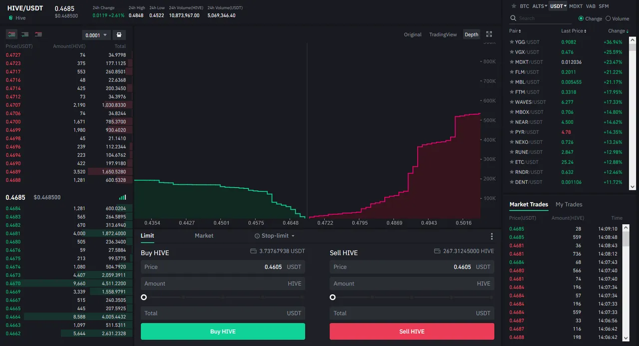
I think we can gather a lot of interesting insights by looking at how a coin gets traded. And today was/is interesting for Hive once again as we had a $235k sell wall in the order books which I have never seen (but that doesn't necessarily says a lot ;). While it is common for many other coins with higher market caps to have these kinds of orders, for Hive it's kinda big.
So let's have a look:
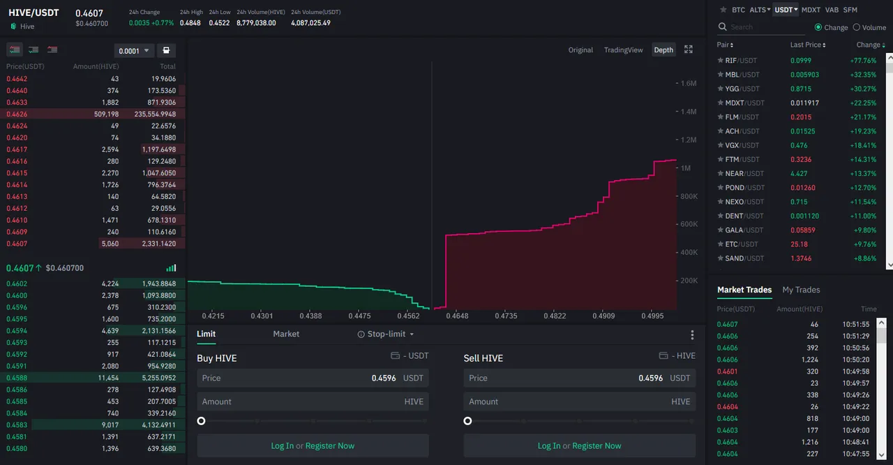
The depth chart shows us the state of the order book. How many people are willing to buy or sell? But be careful that this doesn't give us the complete picture as this is a very dynamic space. People/Bots can at any second change their orders or introduce new ones as well as cancel current ones. But the bottom line is that we can still get a "rough picture" of what is happening in the market which we don't get if we only look at price charts.
Price slowly crawled up to this sell wall. And in my experience, wehn there are large sell walls, they tend to get "broken" (bought up) or even more likely, cancelled which makes price move in that direction. In other words I was expecting price to head higher.
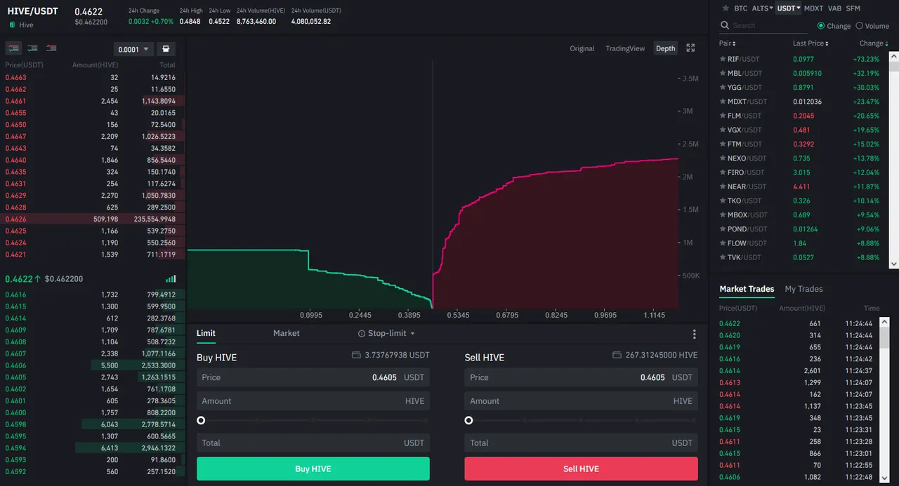
Bigger buy orders at around 10k now.
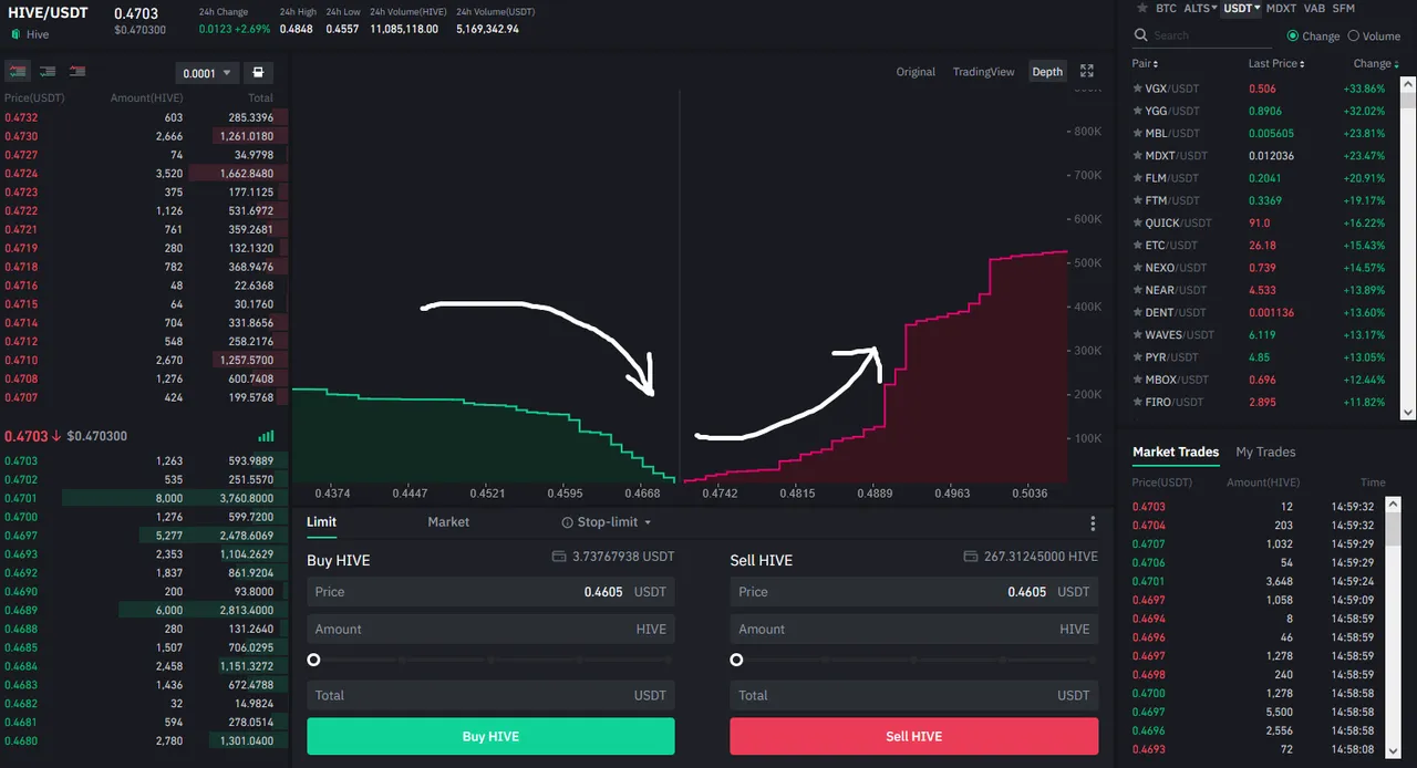
I took a small break and came back to this: Hive at over 47 cents and the sell wall disappeared. No big surprise! But look at the buying side: we now have a $57k buying wall. Again, things quickly change here.
Notice how the selling orders "head back" and the buying orders "creep forward". This always means that there is more bzying than selling pressure.
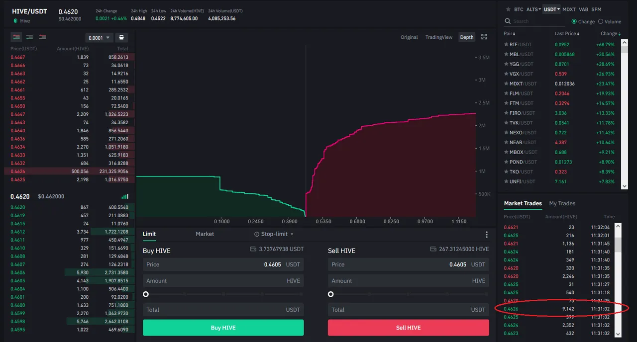
You can see the basic shape also in these arrows. On the buying side buying pressure is marked with an arrow pointing downwards - on the selling side the arrow is pointing upwards.
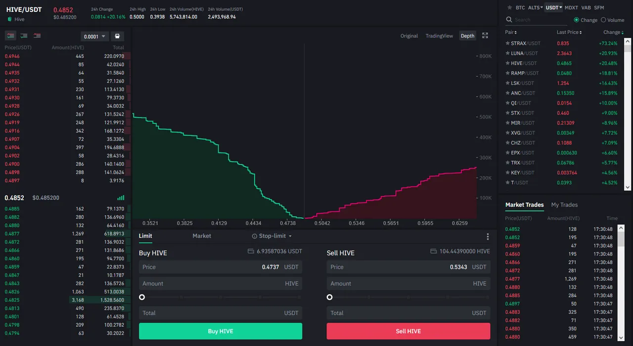
But notice that at the time of writing that the depth of the buying orders is quite low, while it is much more increased for the selling side. In fact, for this scale we have only about 400k buying orders and 1.4M selling orders! Many people apparently want to sell. This will make it difficult for price to move higher in a quick fashion. In fact, if the depth does not change, price will probably swing back down.

If you check the depth chart for other coins they pretty much all look much more even. In the last pump things looked quite a bit different. For the same scale we had 500k buying and 250k selling depth. Although this was right in the middle of the pump.
Conclusion
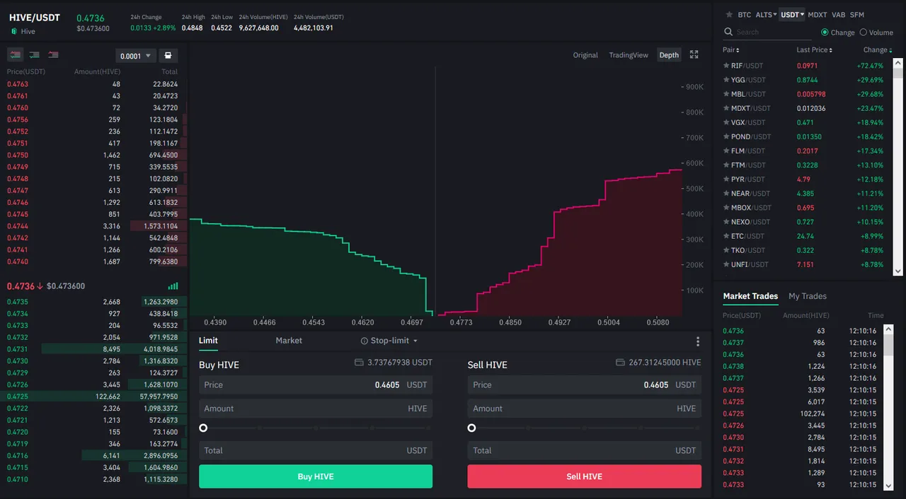
We can learn a lot from these charts. While the obvious caveat is that these charts are in a constant flux (i.e., one cannot assume that a buying/selling wall will remain and use it to "predict" price movement), we can still get " a feel" for the market environment. Selling pressure has to come down or more buyers have to come in for Hive to move up significantly in the short term since 1M Hive is listed for sale "only" to about 54 cents. Will someone buy all of that? Or will people/bots move the orders higher up? Or will price reverse again?
As a general reminder: Please keep in mind that none of this is official investment advice! Crypto trading entails a great deal of risk; never spend money that you can't afford to lose!


Check out the Love The Clouds Community if you share the love for clouds!