I already have my website up but there's nothing there yet, I will be using Github to host the code so anyone who wants to read it can do so, sort of like with any open source project. Hopefully this opens up my chances of getting a job sooner rather than later, although I am not actively searching at the moment.
Right now I am just grinding, grinding, grinding. When we are talking code, it all comes down to grinding. The more you grind, practice your skills, find out about new tweaks, practice what you should already know by heart, and just putting your code to work... the more you will learn.
I am already pretty efficient with my HTML and CSS code, I still need a lot of practice and a hell lot to learn regarding JavaScript - and don't worry, I've been taking my lessons religiously even though I haven't posted about JavaScript for something like two weeks; but the point is, these little projects are mainly about HTML and CSS and grinding my skills.
Hover lighting effect
I will have a matrix of boxes set on screen, then I will create a hover effect that will color some of those boxes in a specific way whenever I hover over them with my cursor. Pretty simple project but it provides some tricks to my sleeve that will be useful later on.
HTML Code
  <body>
    <div class="container" id="container"></div>
    <script src="script.js"></script>
  </body>
</html>
For editing purposes I am including the square class divs, but in reality these will be inserted via the JS code. I am including thse divs for CSS purposes only.
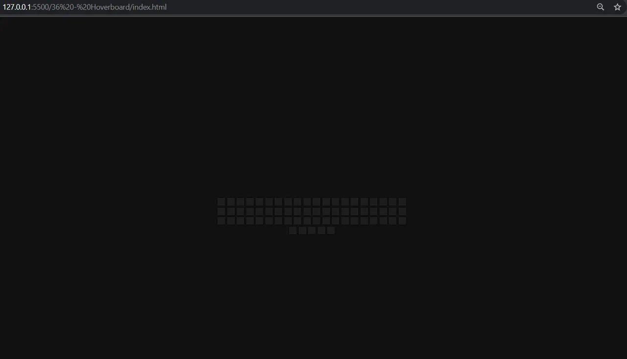
So far, this is what the HTML code shows:
That was some trolling, in fact there's nothing to be shown yet because the container box and the square div classes are empty.
CSS Code
@import url("https://fonts.googleapis.com/css2?family=Roboto");
* {
box-sizing: border-box;
}
body {
background: #111;
display: flex;
align-items: center;
justify-content: center;
height: 100vh;
overflow: hidden;
margin: 0;
}
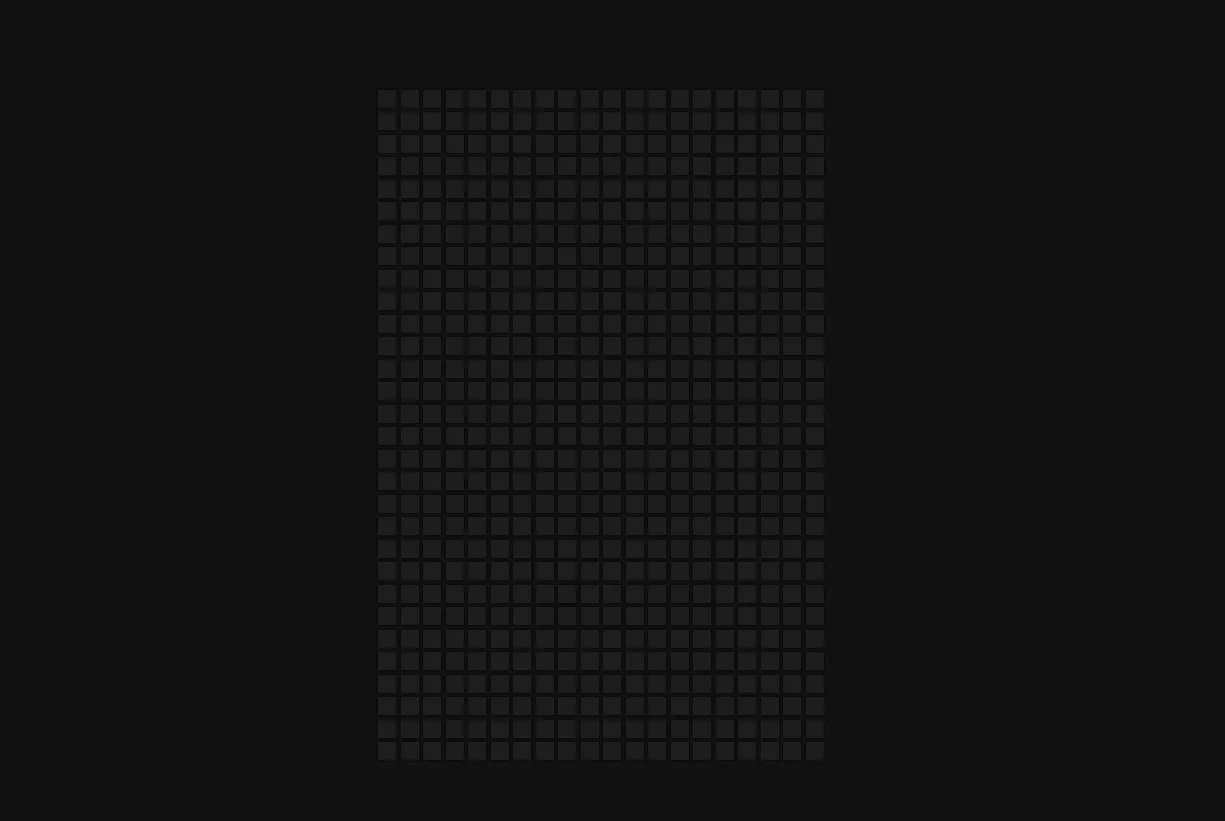
.square {
background-color: #1d1d1d;
box-shadow: 0 0 2px #000;
height: 16px;
width: 16px;
margin: 2px;
transition: 2s ease;
}
.square:hover {
transition-duration: 0s;
}
.container {
display: flex;
align-items: center;
justify-content: center;
flex-wrap: wrap;
max-width: 400px;
/* This means that if the width goes over 400px, it will continue on the next file. */
}
JavaScript Code
const container = document.getElementById("container");
Whenever the user hovers over one of the squares, I want said sqaure to light up in a random color, so I need to create an array of colors.
const colors = [
  "#0002ce",
  "#00d406",
  "#ca0205",
  "#fdca08",
  "#e280d5",
  "#ff8c1a",
];
Then I define a variable that will determine how many sqaures I want to insert via the JavaScript code (this one right here in case you haven't noticed)
const SQUARES = 600;

for (let i = 0; i < SQUARES; i++) {
  const square = document.createElement("div");
  square.classList.add("square");

  container.appendChild(square);
}
I created the class of square that I already styled in the CSS doc. Then I inserted that class of square into the container class as a child.
The grid is ready, but now I want to create the effect that will light any square that I hover over, and I want to do it with a random color.
const SQUARES = 600;

for (let i = 0; i < SQUARES; i++) {
  const square = document.createElement("div");
  square.classList.add("square");

  square.addEventListener("mouseover", () => setColor(square));

  square.addEventListener("mouseout", () => removeColor(square));

  container.appendChild(square);
}

function setColor(element) {
  const color = getRandomColor();
  element.style.background = color;
  element.style.boxShadow = `0 0 2px ${color}, 0 0 10px ${color}`;
}

function getRandomColor() {
  return colors[Math.floor(Math.random() * colors.length)];
}
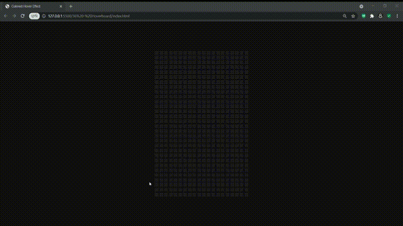
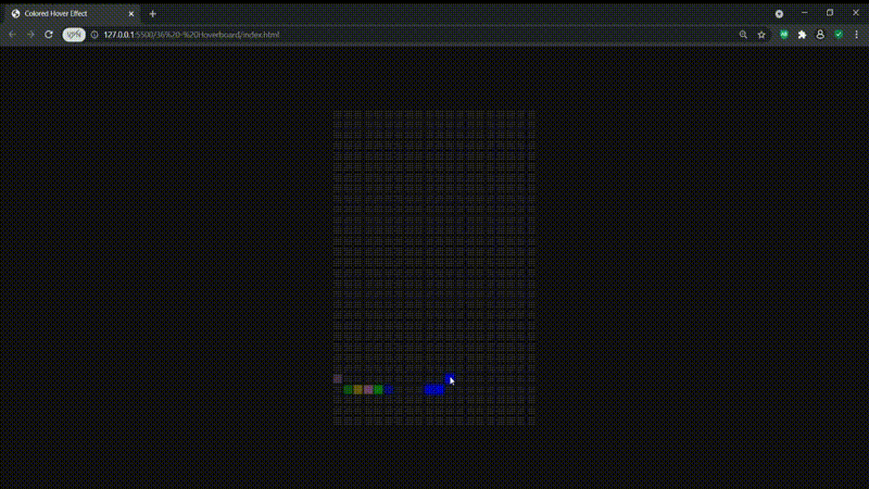
As you can see, the grid now lights up in random colors and this is actually useful to do simple apps to draw something or things like that, but I actually want the colored boxes to return to their black background state a couple of second after the cursor moves out of the box, so:
function removeColor(element) {
  element.style.background = "#1d1d1d";
  element.style.boxShadow = "0 0 2px #000";
}
And there it is, I actually like this mini project despite it being so simple, so far it's been my favorite because of the potential it has to expand the use-cases for this code.
These projects are based on a CSS, HTML and JS paid course I got on Udemy by Brad Traversy. I made my own changes and tweaks but the template so to speak, is his idea and I do not claim them to be my own. If you are looking to practice CSS and JavaScript, his courses are the way to go, check them out on Udemy.