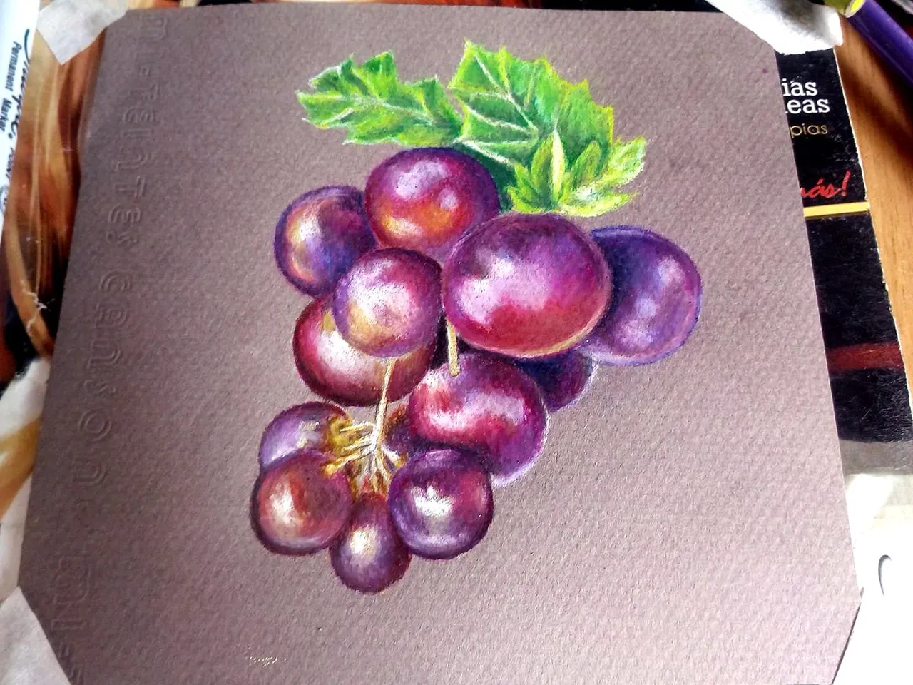
Hello friends, I hope you are very well wherever you are, today I want to share my last drawing: I have made some grapes drawn with prismacolor premier pencils and prismacolor school pencils. I liked the mixture of both types of colors, because the school colors have the hardest tip and serve to fill in the spaces where the premier ones cannot reach, and when blending they reach incredible tones, I hope you like it.
Hola amigos, espero que se encuentren muy bien donde quiera que esten, hoy quiero compartir mmi último dibujo: he realizado unas uvas dibujadas con lápices prismacolor premier y prismacolor escolares. Me ha gustado la mezcla de ambos tipos de colores, porque los colores escolares tienen la punta más dura y sirven para completar los espacios donde los premier no logran alcanzar, y al difuminar alcanzan tonos increíbles, espero que les guste.

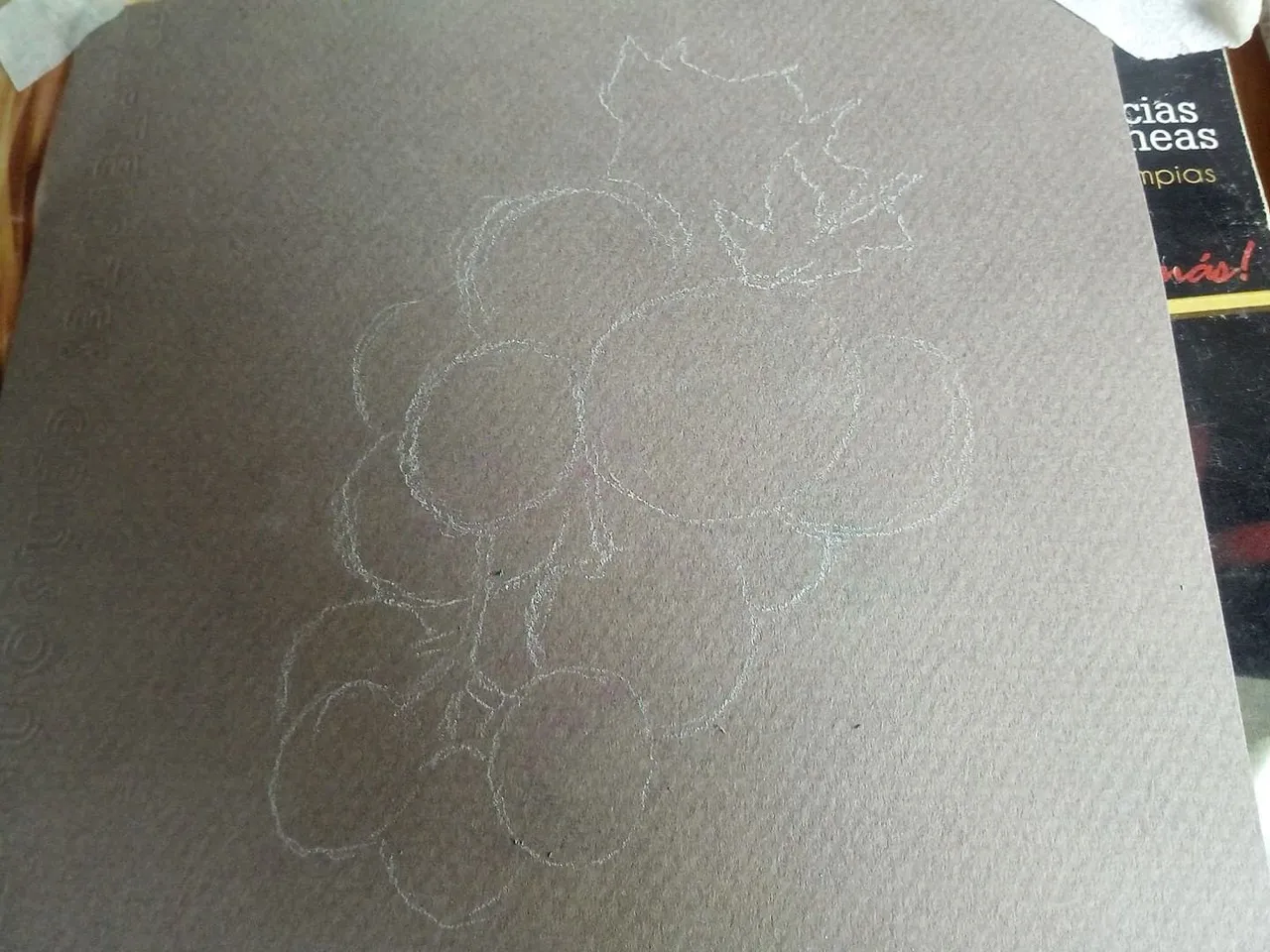
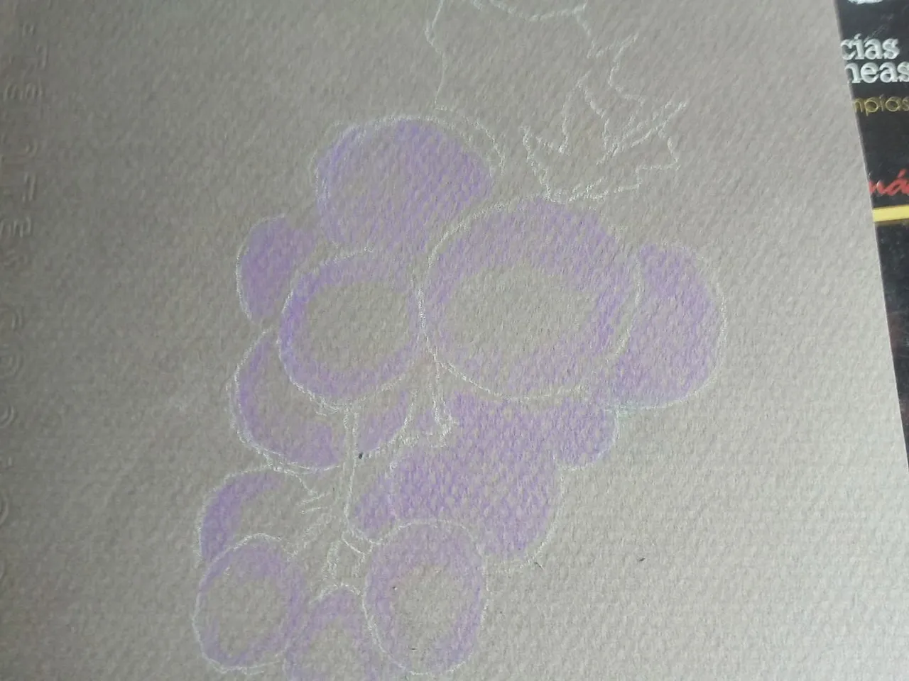
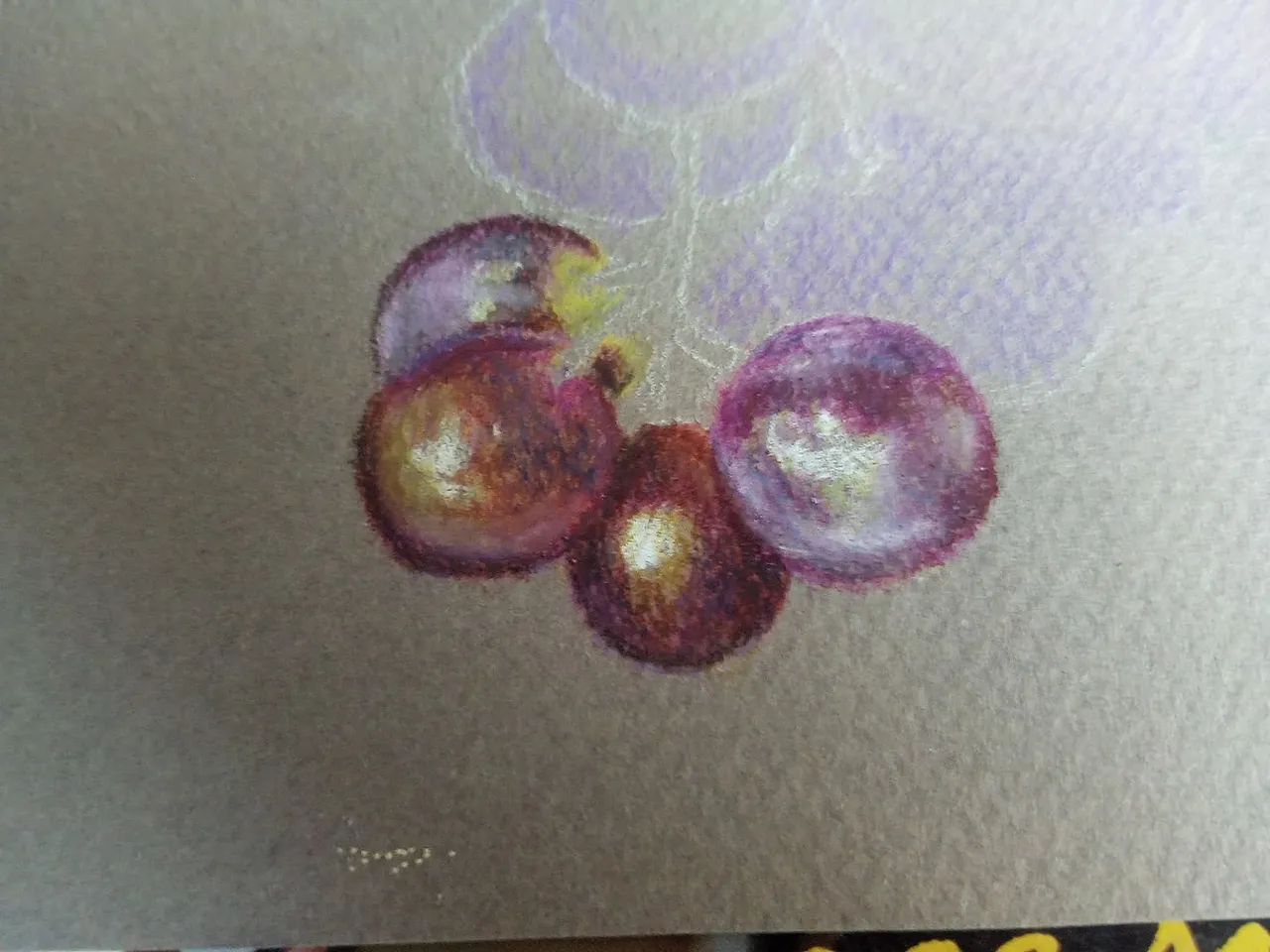
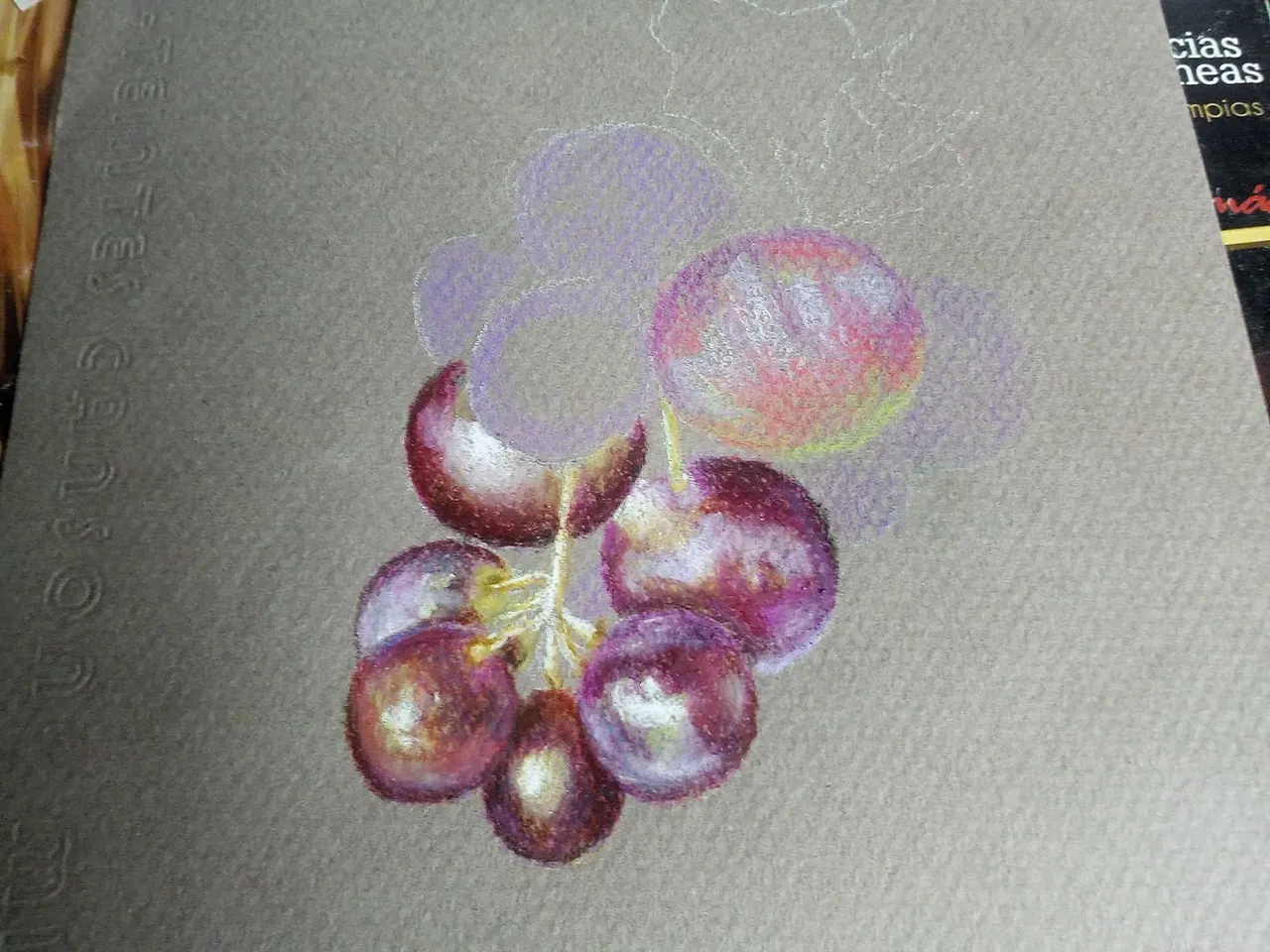
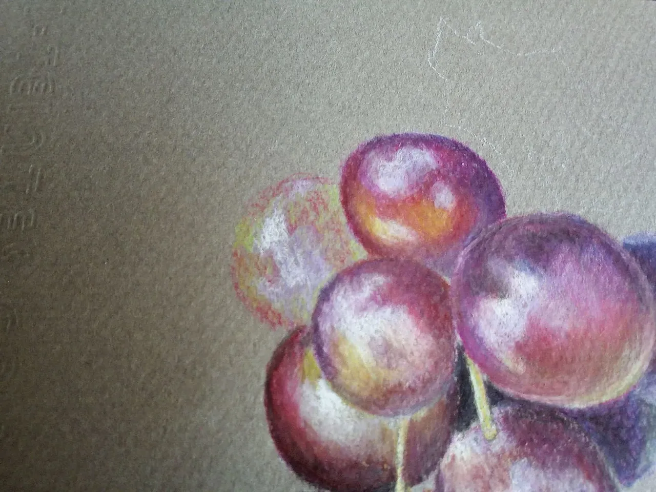
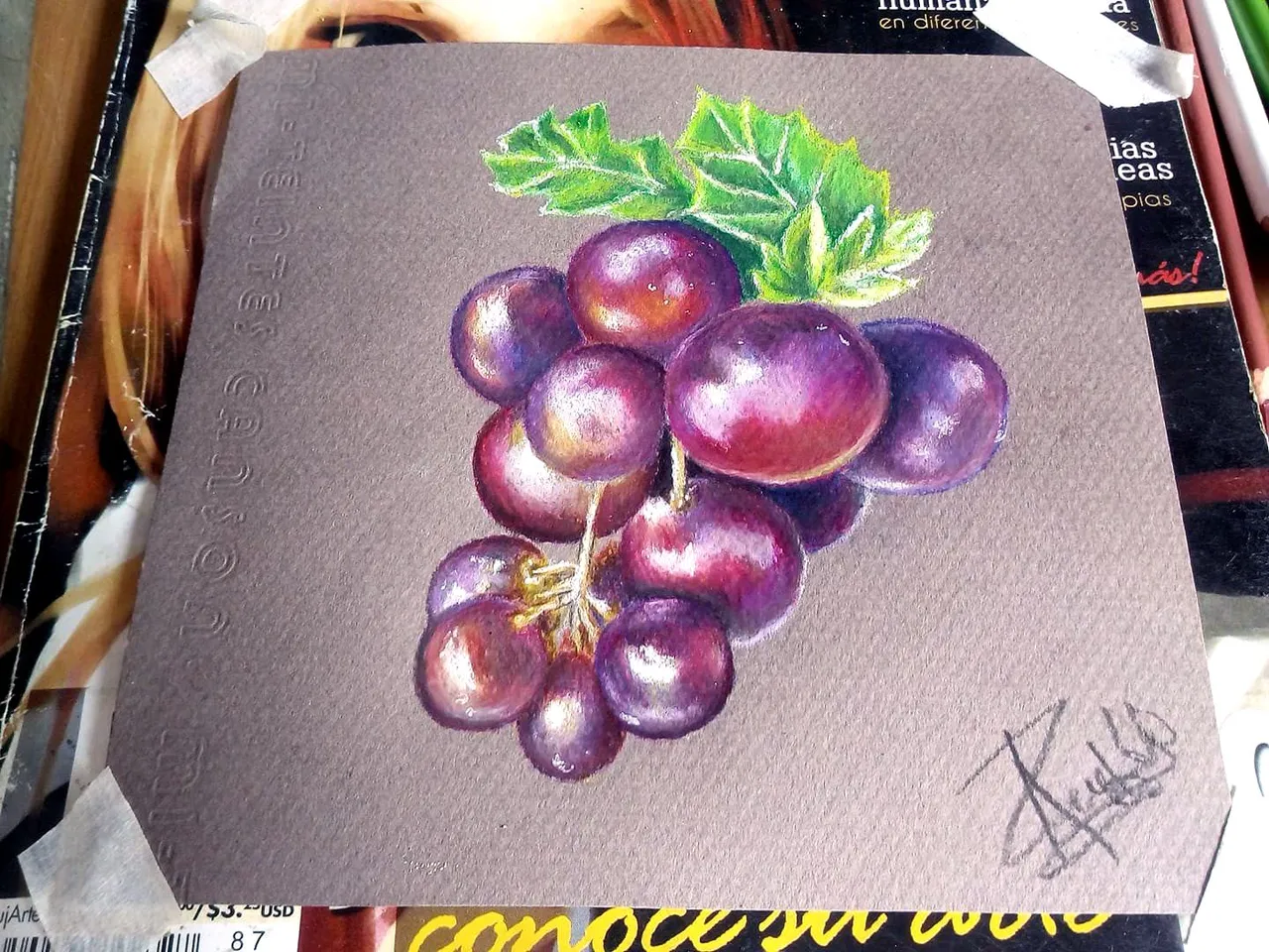
To draw these grapes we choose a coarse-grained Canson cardboard used for watercolors, we draw a sketch with white pencil and put a purple base, then we start from the grapes that are at the bottom mixing purple, lilac colors , light green, red and violet. We can play with these colors using the resource of lighting so we can give different tones to each grape.
Para dibujar estas uvas escogemos una cartulina Canson de grano grueso de las que se usa para acuarela, dibujamos un boceto con lápiz blanco y ponemos una base de color morado, luego comenzamos desde las uvas que estan en la parte de abajo mezclando colores morado, lila, verde claro, rojo y violeta. Podemos jugar con estos colores utilizando el recurso de la iluminación así podremos darle tonos diferente a cada uva.
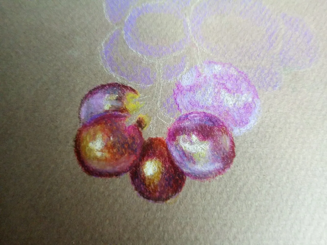
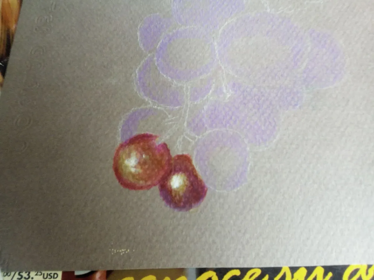
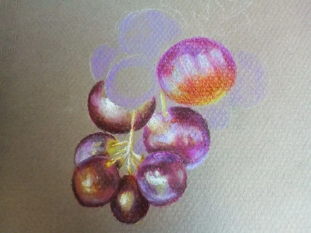
We repeat the same technique with the following grapes, then in the parts where the reflection of the light can be seen, we put a white pencil and begin to degrade the reflection of the light on the skin of the grapes. For the tones to look good we have to apply the process 3 times.
Repetimos la misma técnica con las siguientes uvas, luego en las partes donde se ve el reflejo de la luz ponemos lápiz de color blanco y comenzamos a degradar el reflejo de la luz en la piel de las uvas. Para que los tonos queden bien tenemos que aplicar el proceso 3 veces.
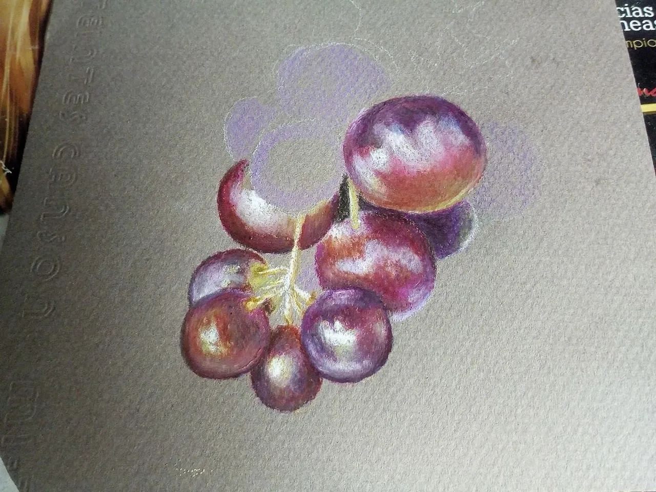
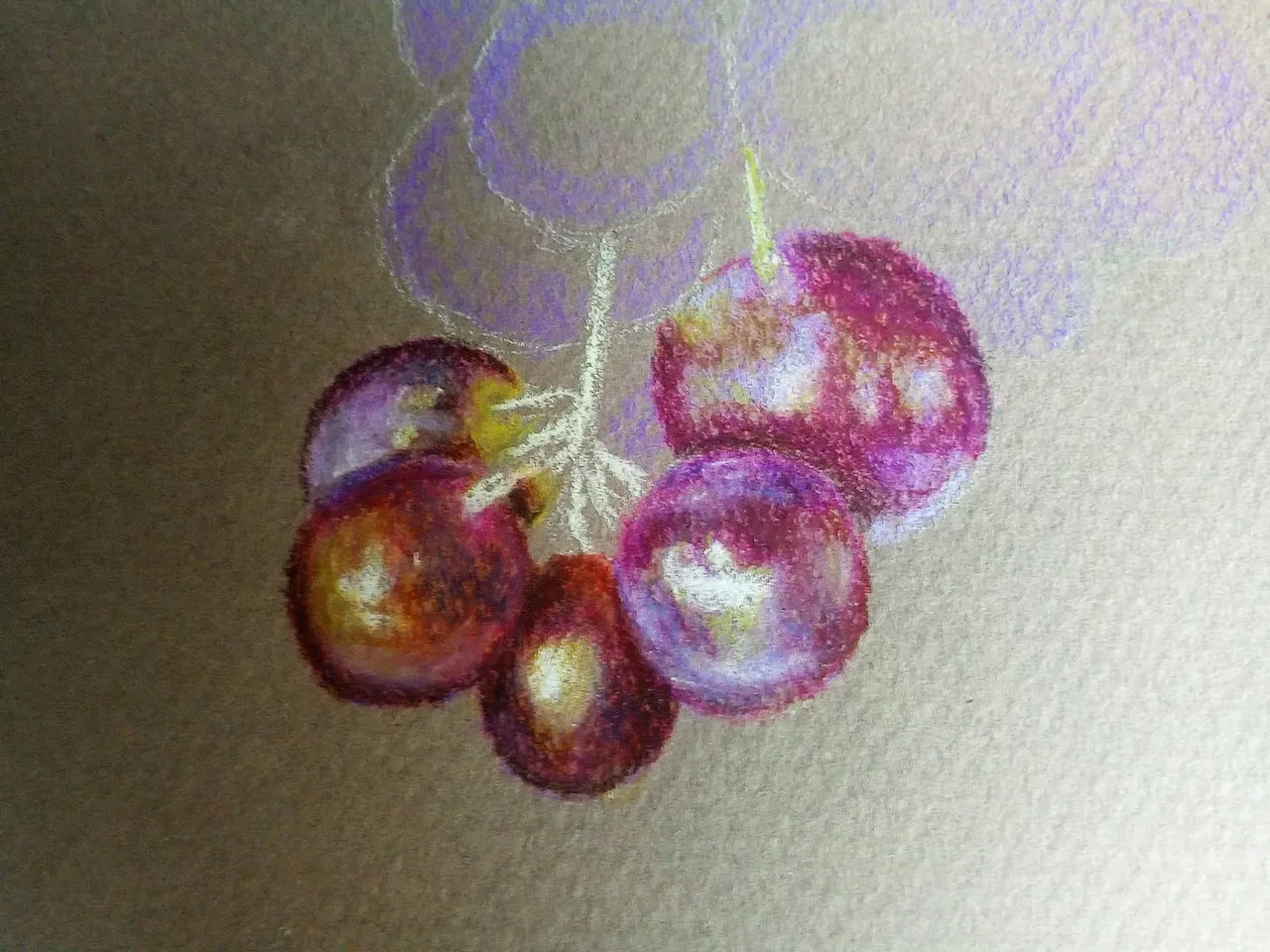
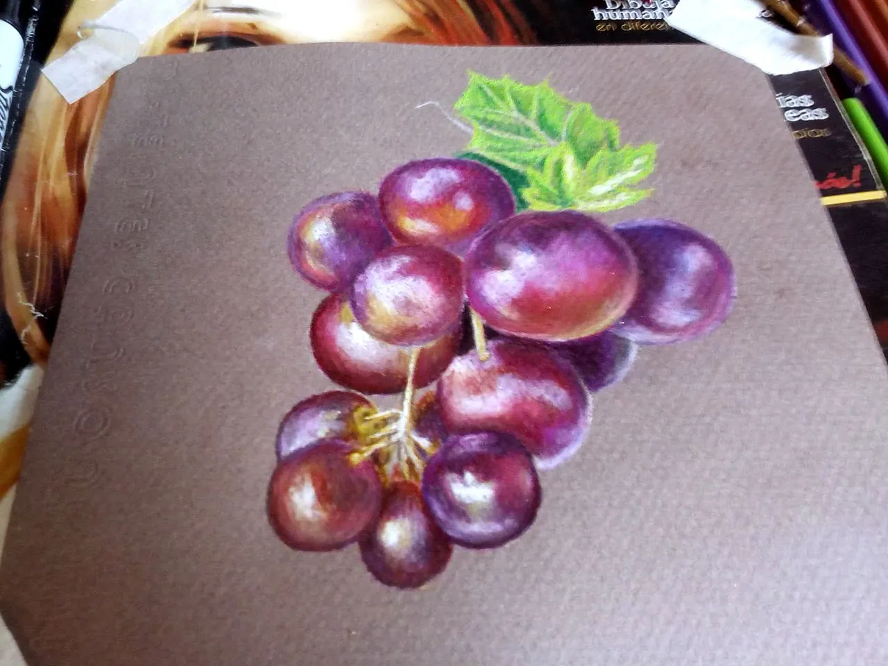
By taking half of the drawing made we can blur and mix the colors using a soft brush soaked in mineral oil, the oil dilutes the color ink and the mixing process is better. This helps us to layer colors again and give the lighting effect a better touch up.
Al llevar la mitad del dibujo realizado podemos difuminar y mezclar los colores utilizando un pincel suave empapado en aceite mineral, el aceire diluye la tinta del color y el proceso de mezclado queda mejor. Esto nos ayuda a volver a poner una capa de colores y dar un mejor retoque al efecto de iluminación.
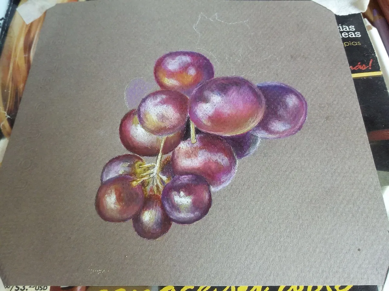
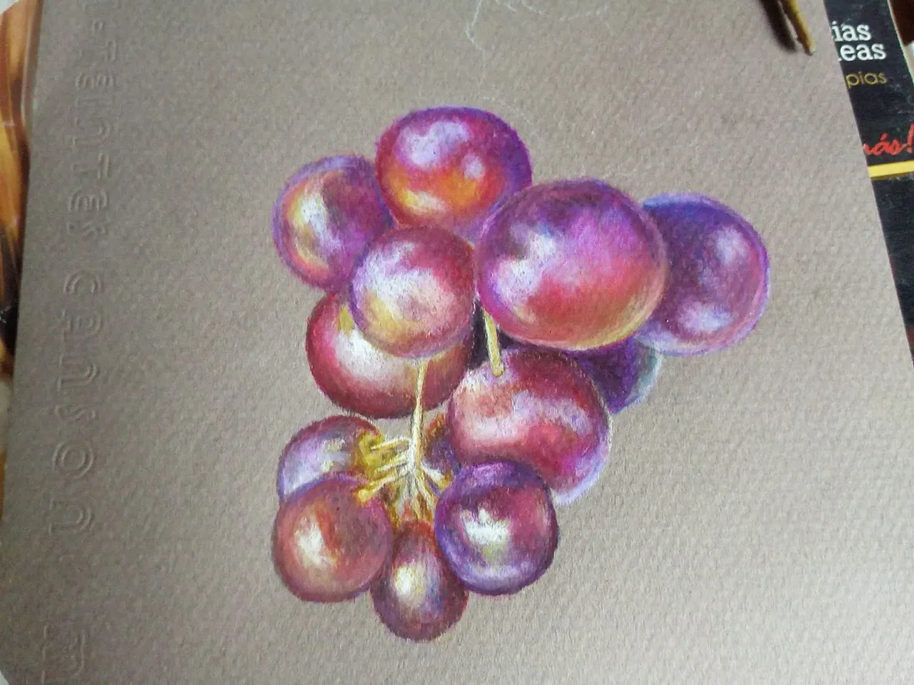
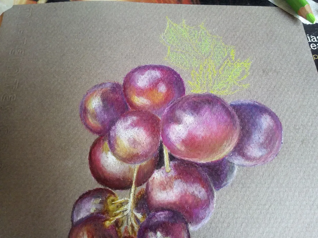
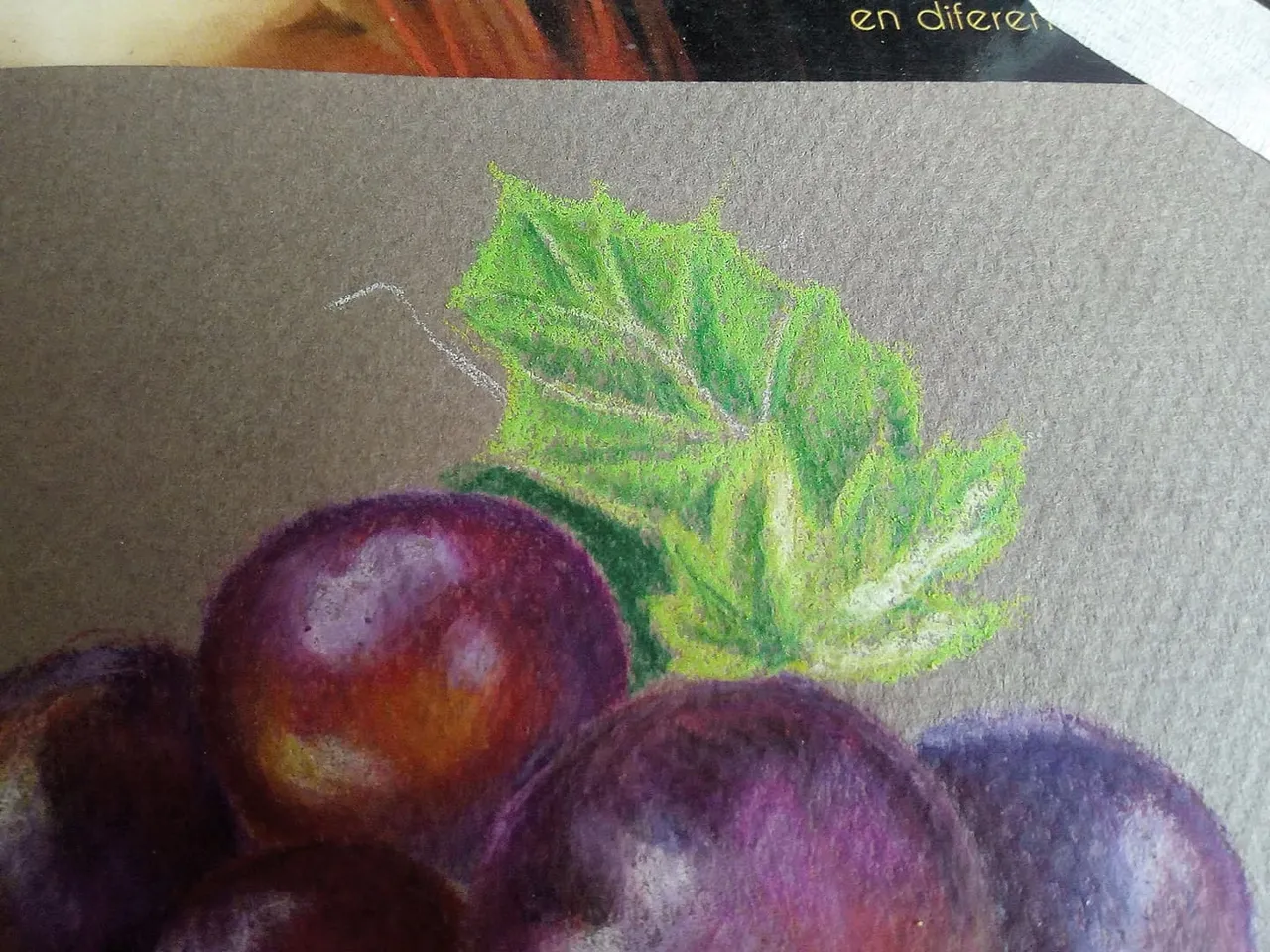
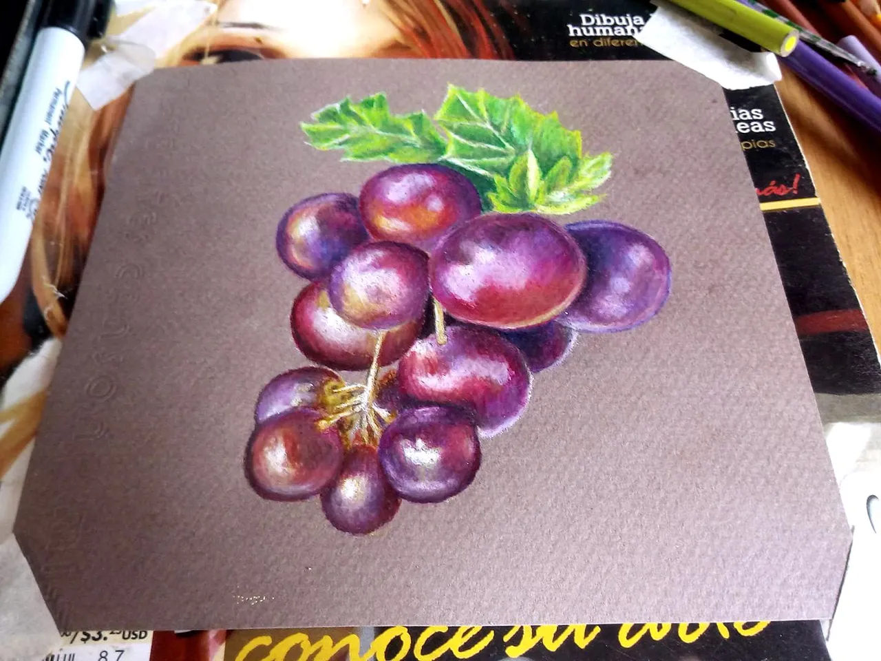
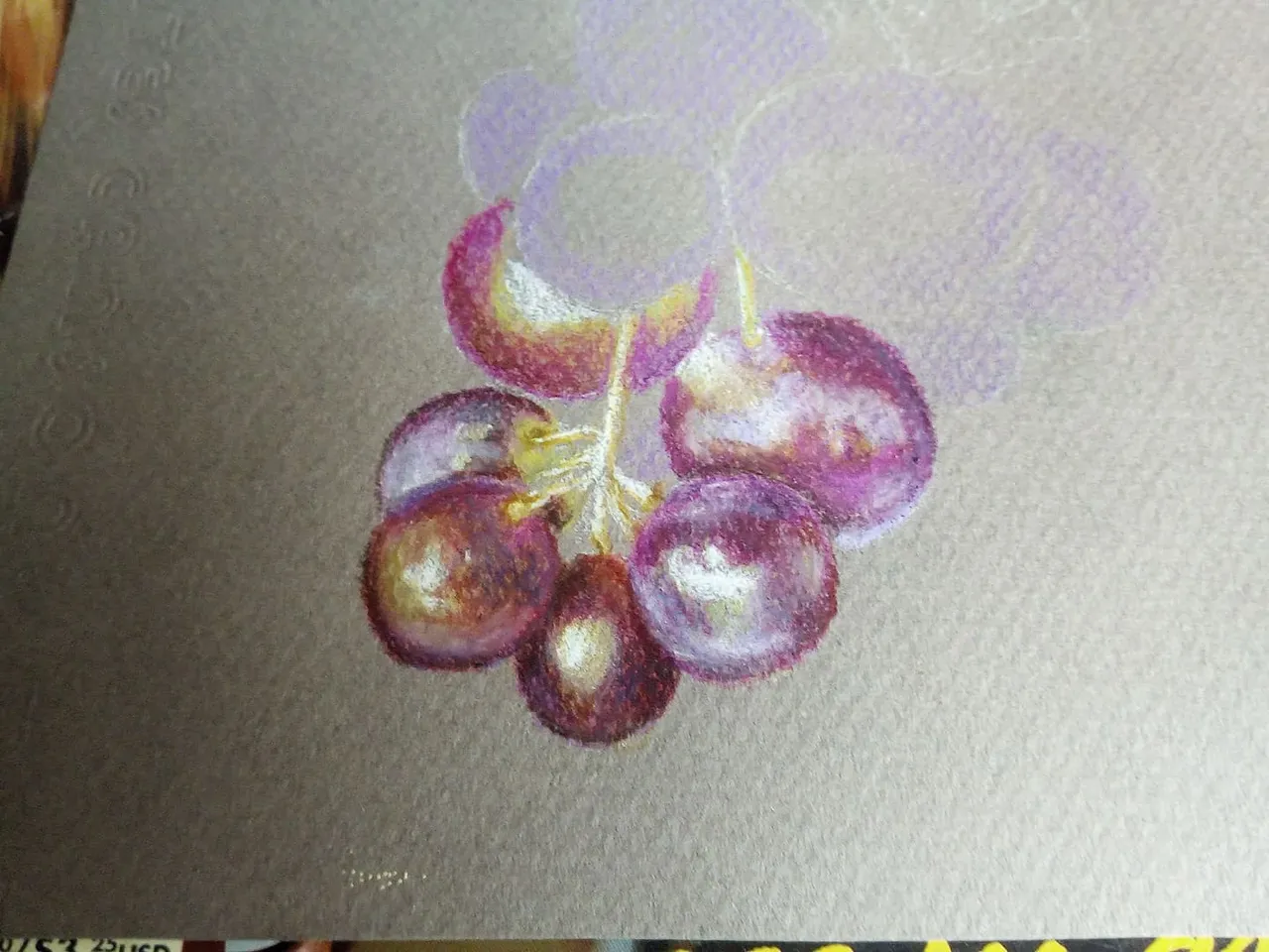
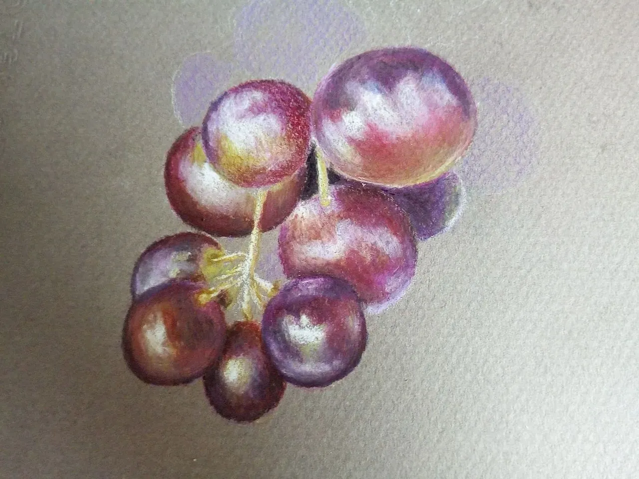
Finally we paint the grapes from the top and add some leaves to have a better finish. To paint the leaves we use light green and combine with dark shades of green and also light brown, without forgetting the illuminated parts using white. In this way we will have finished the drawing.
Por último pintamos las uvas de la parte superior y agregamos unas hojas para tener un mejor acabado. Para pintar las hojas utilizamos verde claro y combinamos con tonos oscuros de verde y tambien marrón claro, sin olvidar las partes iluminadas utilizando el color blanco. De esta manera habremos terminado el dibujo.
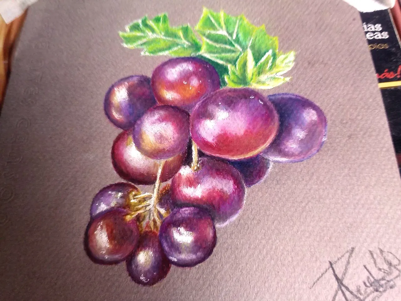
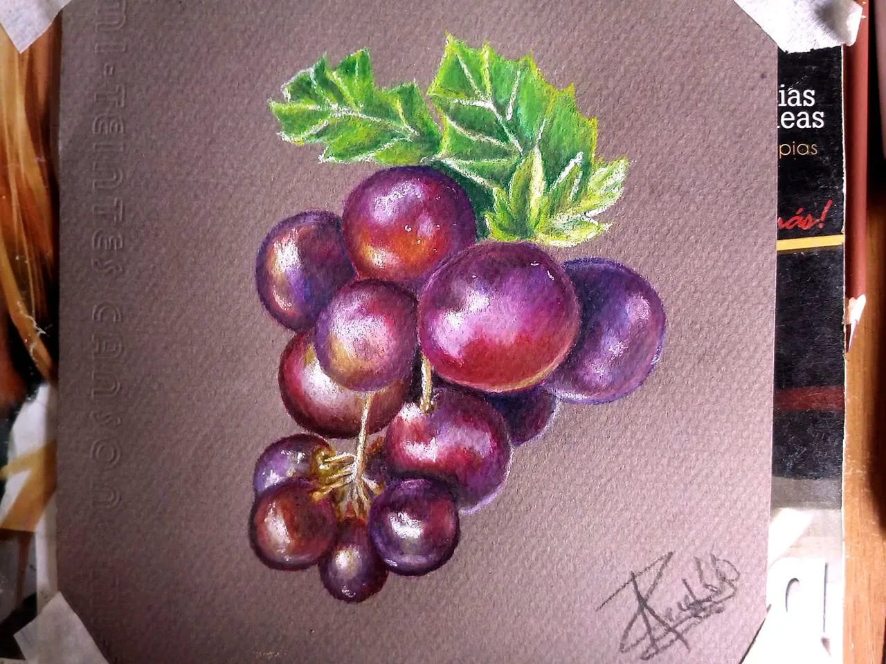
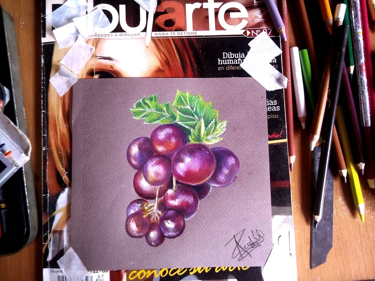
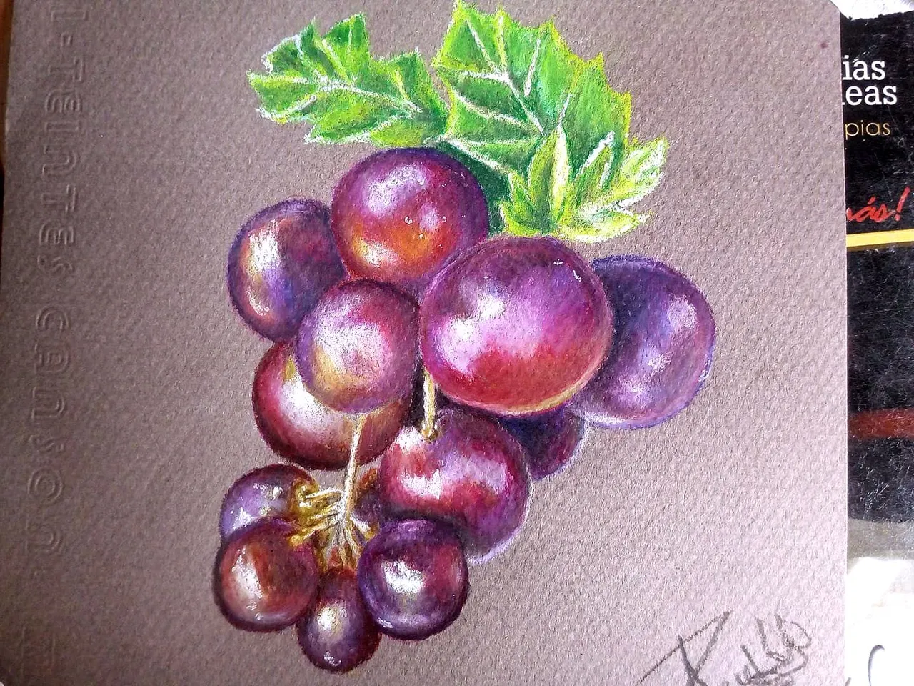
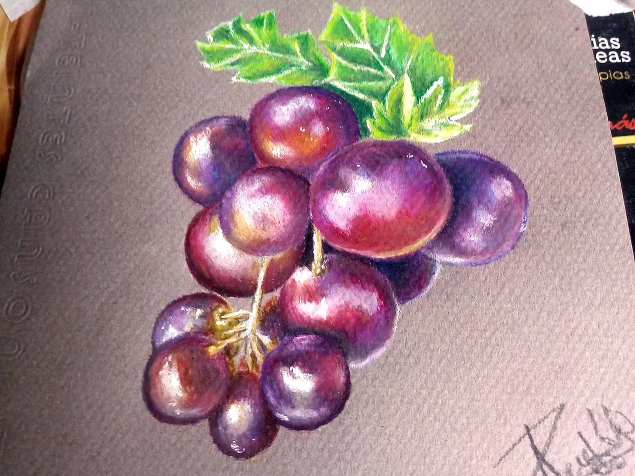
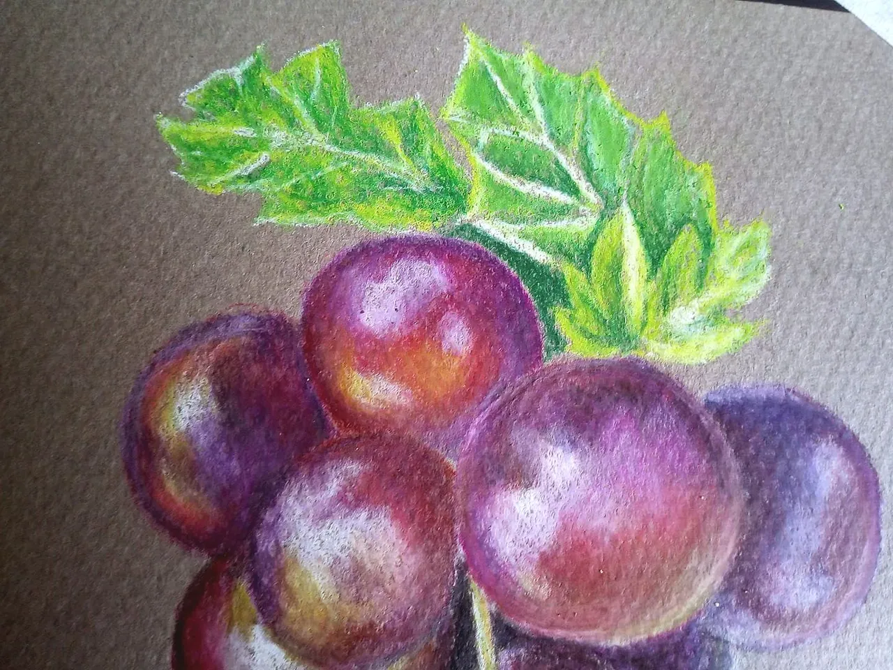
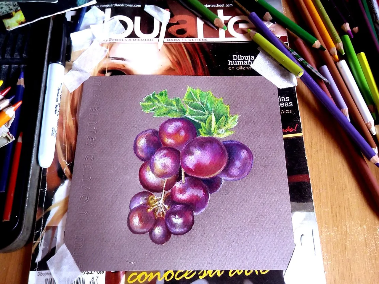
After finishing painting we make some last touches, in the dark parts and in the light parts, we can also reinforce the colors by blurring with the brush and applying another layer of colors, in this way we can achieve that transparency effect that grapes have. This is one of my favorite fruits, and whenever I have the opportunity I buy them, although they are a bit expensive hehe. I hope you liked my contribution, this is a way to mix school colors with professional colors, if we persist in the layout we will achieve the best results. It is not necessary to have the best colors to paint or the most recognized brand, the most important thing is to always practice. Do not forget to comment what you think, and if you have a favorite fruit that you would like me to draw. I say goodbye until soon wishing you good health and peace. See you soon.
Luego de terminar de pintar hacemos unos últimos retoques, en las partes oscuras y en las partes iluminadas, tambien podemos reforzar los colores difuminando con el pincel y aplicando otra capa de colores, de esta manera podremos lograr ese efecto de transparencia que tienen las uvas. Esta es una de mis frutas preferidas, y siempre que tengo la oportunidad las compro, aunque son algo costosas jeje. Espero que les haya gustado mi aporte, esta es una manera de mezclar colores escolares con colores profesionales, sin persistimos en el trazado lograremos los mejores resultados. No es necesario tener los mejores colores para pintar o la marca más reconocida, lo más importante es siempre practicar. No olviden comentar que les ha parecido, y si tienen una fruta preferida que les gustaría que yo dibujara. Me despido hasta pronto deseándoles mucha salud y paz. Hasta pronto.