I have not really been drawing for a few days. Traditional drawing actually so I decided I'd be making sketches daily or every chance I get to hone and tone my skills as each day passes before I'll have time to work on another major project.
So, today was about me trying my hands on some monochrome drawing of a zebra.. Well.... Zebras have always been monochrome though.
Tools :
Glossy cardboard paper
0.4mm mechanical pencil
GPC charcoal pencil, Soft medium
GPC graphite pencil 9B
Blending stomp and tortillions
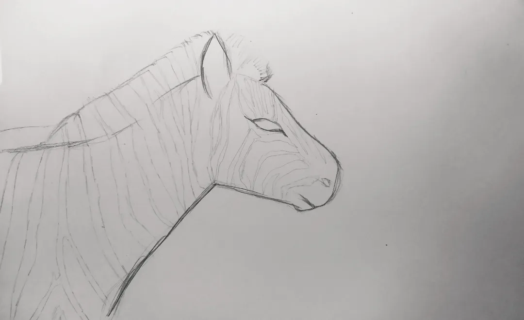
I started with a light sketch of the zebra. I normally make my sketches very faint but I decided to make it a bit obvious. It wasn't looking awesome after this and was looking bland.

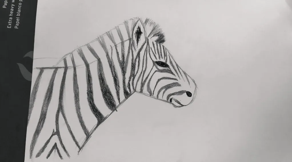
I then thickened the border lines and then shaded in-between the lined with my graphite pencil which is pretty dark. At this stage, some people would probably drop their pencils and say they've done their best.
After filling the dark stripes with graphite, I then used my blending stomp and tortillion to drag the graphite onto place where the sun isn't hitting. The quality reduced again because I had dragged the graphite away from where it was.
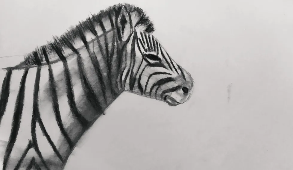
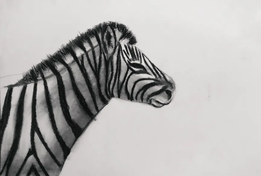
I had to go back with a charcoal pencil on the stripes and mane. I then went over with a blending stomp softly on the head and the sides. It was still looking bland without a background so I decided to add something blurry to the background.
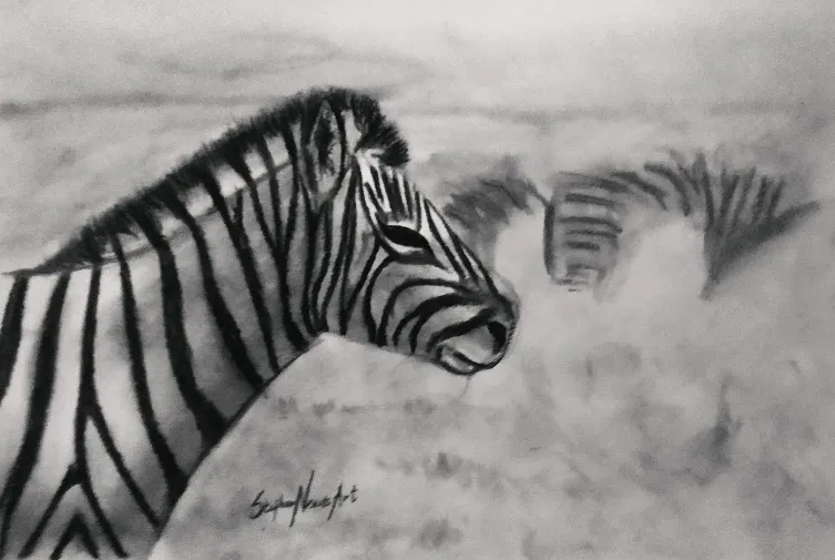
And this was the result I got.
What do you think about this?