English
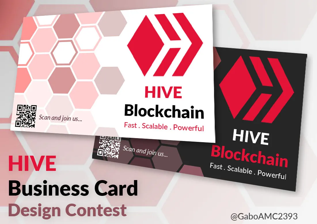
Greetings to all, fellow Hive members. For a few days now, I had been thinking about how to collaborate with the Hive Philippines community card design contest.
I was thinking about how to do it, what to do or what colors to use and from so much thinking I realized that I was not going to achieve anything if I just think, so I got down to work and started making many designs. There were some that I discarded because they were too ugly, others I liked but I put them aside. In the end, I liked one more than the others I made and it is the one I am here to present to you.
Here is the step by step of these hive business cards.
Español
Saludos a todos, compañeros de Hive. Desde hace unos cuantos días había estado pensando en cómo colaborar con el concurso de diseño de tarjeta para la comunidad de Hive Filipinas.
Estuve pensando en cómo hacerlo, qué hacer o qué colores usar y de tanto pensar me di cuenta que no iba a lograr nada si solo me dedicaba a pensar, así que puse manos a la obra y comencé a hacer muchos diseños. Hubo algunos que descarté porque eran muy feos, otros sí me gustaron pero los dejé guardados. Al final, uno me gustó más que otros que hice y es el que vengo a presentarles.
Les dejo a continuación el paso a paso de estas tarjetas de negocios de hive.

Step by step
The first thing I did was to prepare my workspace. The standard size for these cards is 85mm x 55mm. So that was the size I prepared. I had it clear, I wanted a white one, because they are the ones I have seen the most in my life.
I once designed some black and blue cards, but at the slightest damage the paint would tear and you could see the white part of the paper they were made with, so I decided to choose white as my main color. Although, as you can see in the image, I also made a black one.
Paso a paso
Lo primero que hice fue prepara mi espacio de trabajo. El tamaño standar de estas tarjetas es de 85mm x 55 mm. Así que ese fue el tamaño que preparé. Lo tenía claro, quería una de color blanco, porque son las que más he visto en mi vida.
Una vez diseñé unas tarjetas negras y azules, pero ante el más mínimo daño se rasgaba la pintura y se veía la parte blanca del papel con el que estaban hechas, así que decidí elegir el color blanco como mi color principal. Aunque, como ven en la imagen, también hice una de color negro.
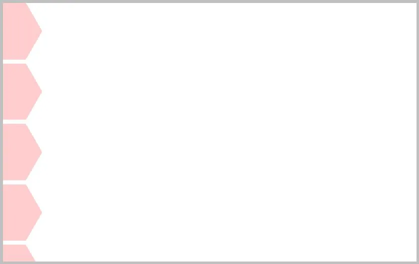
The main shape I decided to use for my design was hexagons, because it is something very characteristic of a hive. Besides, that's what we are, a hive of many users from all over the world.
Here you can see it, the first hexagon I placed:
La forma principal que decidí usar para mi diseño fueron los hexágonos, porque es algo muy característico de una colmena. Además, eso es lo que somos, una colmena de muchos usuarios de todo el mundo.
Aquí lo pueden ver, el primer hexágono que coloqué:
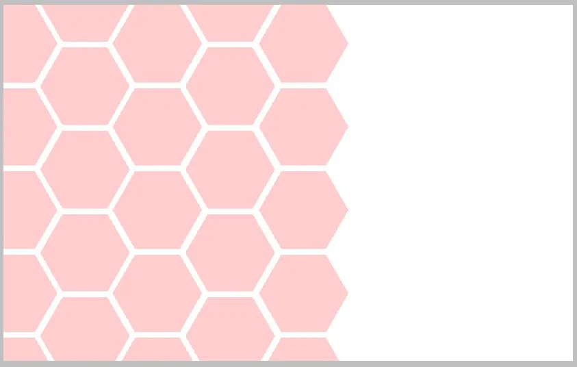
Once my base figure was ready, I simply multiplied it until I had vertical columns. In turn, I duplicated this column and placed them next to each other, taking care that all of them were adjusted to its shape. Let's go, as if it were a beehive.
Una vez lista mi figura base, simplemente lo multipliqué hasta lograr columnas verticales. A su vez, esta columna la dupliqué y la coloqué una al lado de la otra, cuidando que todas quedaran ajustadas a su forma. Vamos, como si fuese una colmena.
 |  |
|---|
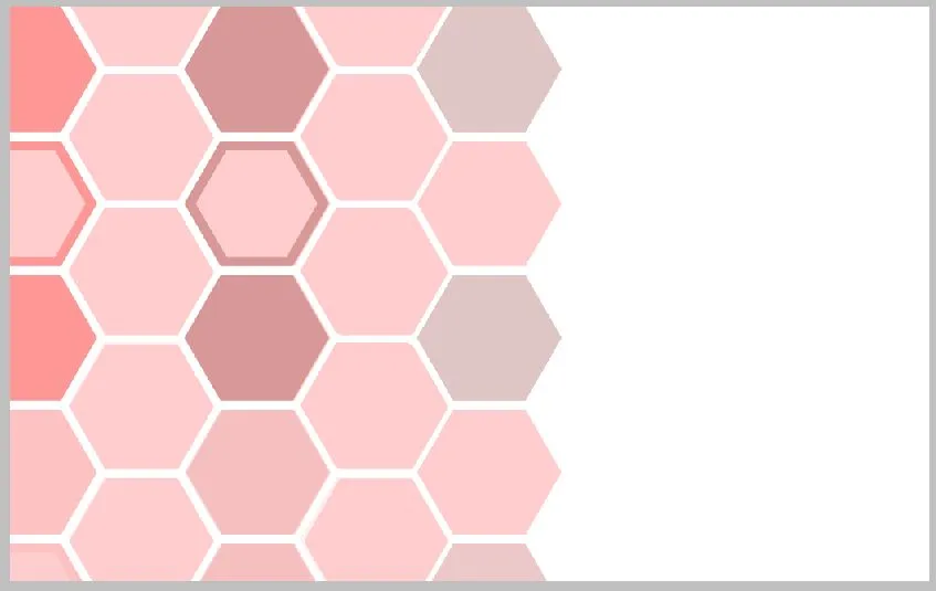
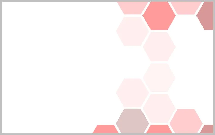
Why red? Well, red is a color that is always present in hive, but certainly for design red is a very intense color, so I chose a softer color palette, leaning more towards pastel shades of the same red.
Notice, for example, how I changed the colors of some vertical columns in the design, to give variety of colors. Similarly, I included other smaller, white hexagons within some of the main hexagons.
Similarly, I removed other hexagons to achieve a certain mix between the design of the hexagons and the white background on the right; also, I decreased the opacity of some hexagons at the bottom because I wanted to place the QR code there.
¿Por qué rojo? Pues el rojo es un color que siempre está presente en hive, pero ciertamente para diseño el rojo es un color muy intenso, así que elegí una paleta de colores más suaves, inclinándome más hacia hacia tonalidades pasteles del mismo rojo.
Fíjense, por ejemplo, como cambié los colores de algunas columnas verticales en el diseño, para dar variedad de colores. De igual manera, incluí otros hexágonos más pequeños, de color blanco, dentro de algunos hexágonos principales.
De igual manera, eliminé otros hexágonos para lograr cierta mezcla entre el diseño de los hexágonos y el fondo blanco de la derecha; además, disminuí la opacidad de algunos hexágonos de la parte inferior pues ahí deseaba colocar el código QR.
 |  |
|---|
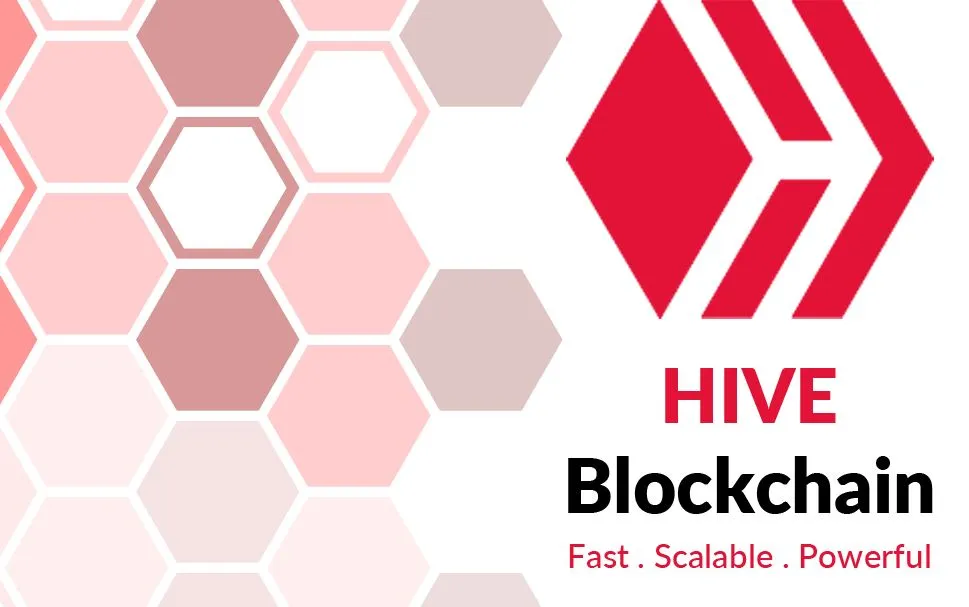
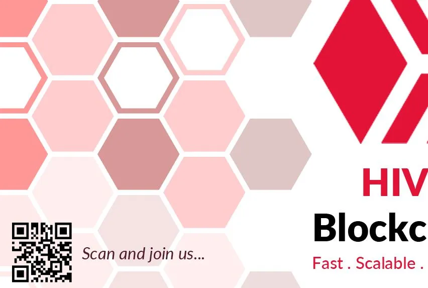
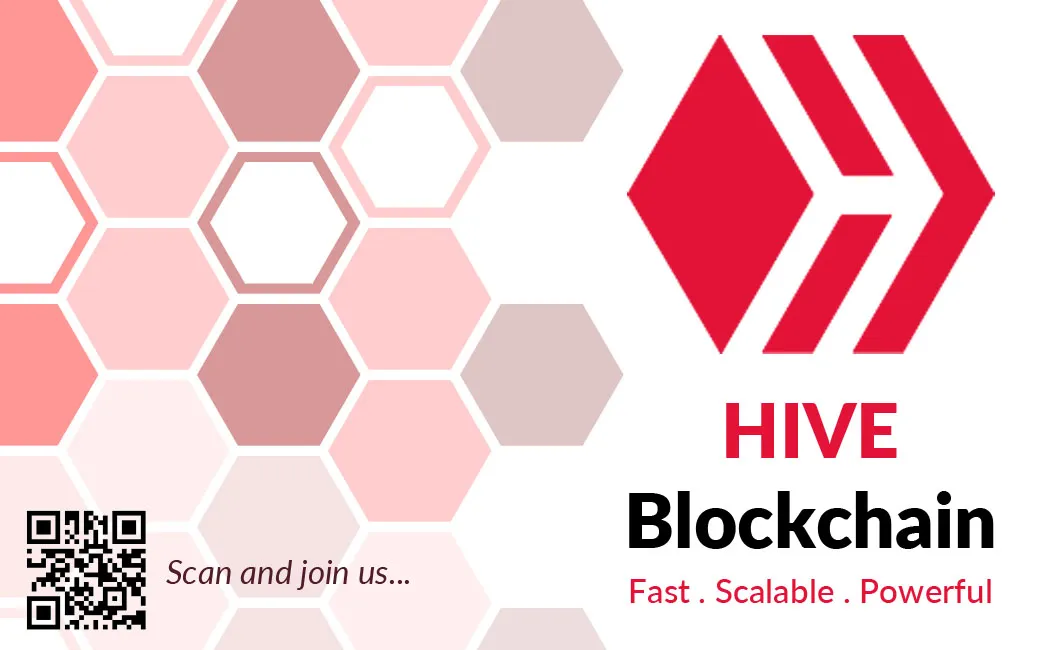
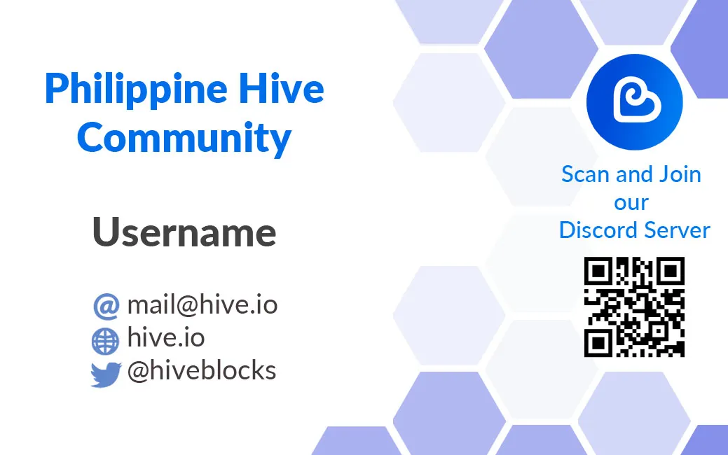
The hive logo will be the main actor on the card, so there is nothing in the background to distract the eye. Just the logo, the name and the words "Fast", "Scalable" and "Powerful".
El logo de hive será el actor pincipal de la tarjeta, por eso no hay nada en el fondo que distraiga la vista. Solo el logo, el nombre y las palabras "Fast", "Scalable" y "Powerful".
According to some requirements of the contest, they wanted one of the sides of the card to have a QR code that would direct them to hiveonboard, so that's what I did and there I placed the code, indicating what they should do with it, placing the phrase "Scan and join us...".
As you can see, both the QR code and the little phrase are on the opaque side of the hexagons.
Según algunos requerimientos del concurso, querían que uno de los lados de la tarjeta tuviera un código QR que los dirigiera a hiveonboard, pues eso hice y ahí coloqué el código, indicando qué debían hacer con este, colocando la frase "Scan and join us..."
Como pueden ver, tanto el código QR, como la pequeña frase, estan en el lado opaco de los hexágonos.
This way the front side of the card was finished. For the back side I did the same, I prepared my workspace with the same white background.
De esta manera quedó terminada la cara frontal de la tarjeta. Para la cara trasera hice lo mismo, preparé mi espacio de trabajo del mismo fondo blanco.
Although the design is the same, I wanted to vary it a bit and give more space so it wouldn't look saturated, since this side of the card is where more information has to be included.
I did the same, I created the hexagons, but I erased some and gave different shades of each color.
Aunque el diseño es el mismo, quise varias un poco y dar más espacio para que no se viera saturado, pues en esta cara de la tarjeta es donde hay que incluir más información.
Hice lo mismo, creé los hexágonos, pero borré algunos y di tonalidades distintas de cada color.
 |  |
|---|
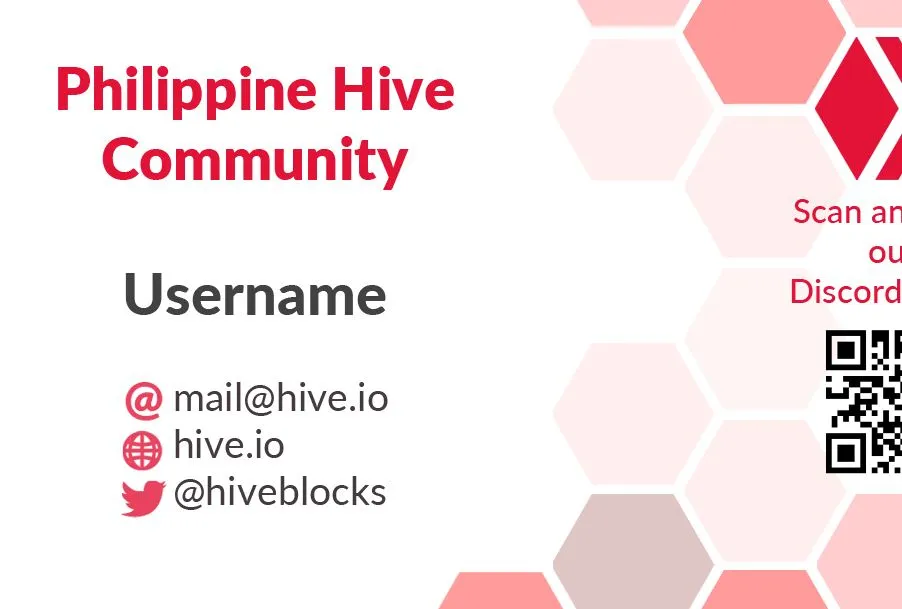
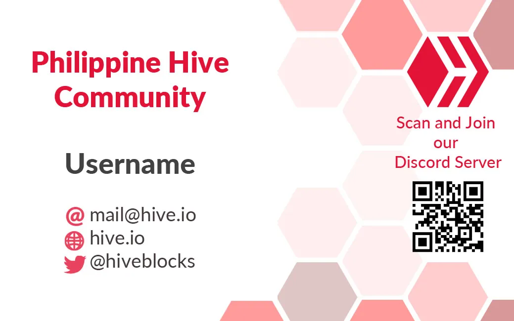
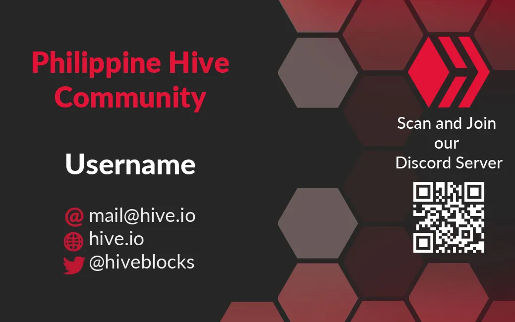
For this side of the card, I included the hive logo between some hexagons and it looks perfect. I also placed the phrase "scan and join our Discord Server" and below it the same QR of hiveonboard, because I don't have the discord of hiveph.
Para esta cara de la tarjeta, incluí el logo de hive entre algunos hexágonos y este queda a la perfección. También coloqué la frase "scan and join our Discord Server" y debajo de este el mismo QR de hiveonboard, porque no tengo el discord de hiveph.

Here I got a bit complicated because I didn't know what information to put. I thought about placing a flag or something similar, but certainly when you deliver a card in your own country, you don't see too many things allusive to the country, so I decided to simply leave the hive logo aside so as not to overload the card with too much design.
On the other hand, I did put a title related to the community: "Philippine Hive Community". In addition to this, I prominently placed a space for the username of the hive user who is submitting the card. It can also be replaced to place a blank space for the username to be written in pencil by its bearer.
In any case, there is also space for a contact email, the hive.io address and the hiveblocks twitter. These data are examples, they can be changed depending on the information you want to place on this side of the card.
Aquí si me compliqué un poco porque no sabía qué información colocar. Pensé en colocar una bandera o algo parecido, pero ciertamente cuando uno entrega una tarjeta en su propio país, no ve demasiadas cosas alusivas al país, así que decidí dejar simplemente el logo de hive a un lado para no sobrecargar la tarjeta con demasiado diseño.
Por otra parte, sí coloqué un título relacionado con la comunidad: "Philippine Hive Community". Además de esto, coloqué de manera resaltante un espacio para el username del usuario de hive que está entregando la tarjeta. También puede ser reemplazado para colocar un espacio en blanco y que el nombre de usuario sea escrito a lápiz por su portador.
En cualquier caso, también hay espacio para un correo electrónico de contacto, la dirección hive.io y el twitter de hiveblocks. Estos datos son ejemplos, se pueden cambiar en función de la información que se desee colocar en esta cara de la tarjeta.
This way the card was finished or at least the base design from which many other designs can be made.
Here is the final design:
De esta manera quedó terminada la tarjeta o al menos el diseño base a partir del cual se pueden hacer muchos otros diseños.
A continuación los dejo con el diseño final:
Front design - Diseño frontal
Back design - Diseño trasero
| |
| - | - |
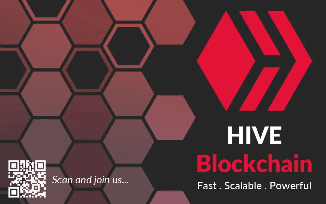
As I said, this is the base design I made, but it is a design easy to adapt to other colors and proposals, so I would like to show you other things that can be done with this design.
For example, a black card, which can also be liked by many:
Como dije, este es el diseño base que hice, pero es un diseño fácil de adaptar a otros colores y propuestas, por eso me gustaría mostrarles otras cosas que se pueden hacer con este diseño.
Por ejemplo, una tarjeta negra, que también puede gustar a muchos:
 |  |
|---|
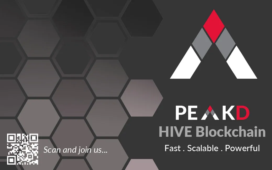
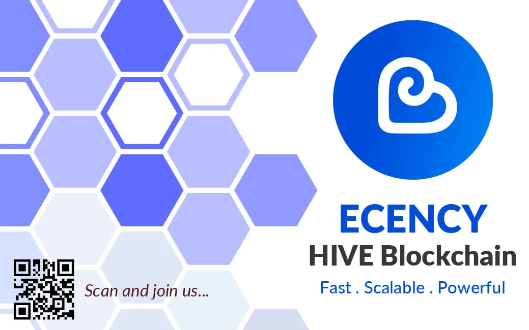
As with the black tajeta, I made other designs alluding to frontends of the same blockchain, two of the many frontends we use for bloggin in addition to hive.blog, such as peakd and ecency.
Below is the design of Peakd:
Al igual que con la tajeta negra, hice otros diseños alusivos a frontends de la misma blockchain, dos de los tantos frontend que usamos para bloggin además de hive.blog, como lo son peakd y ecency.
A continuación el diseño de Peakd:
 |  |
|---|
| And then Ecency's: | Y a continuación el de Ecency: |
|---|---|
 |  |
| - | - |
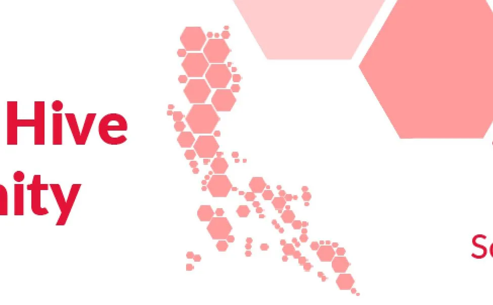
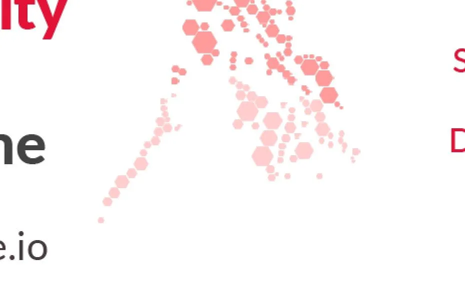
I also added some designs to give an individual touch to each card, giving a special touch to each one depending on the country it will be related to.
I did this on the recommendation of @acidyo who comments in his post that it is good to experiment for this purpose, so I see it necessary to show you these designs.
I simply added the map of the country, in this case the Philippines, but made only with small hexagons, as if the map of the country was a big honeycomb.
Below you can see the creative process of creating the map, hexagon by hexagon.
También agregué unos diseños para darle un toque individual a cada tarjeta, dándole un toque especial a cada una dependiendo del país con el que estará relacionado.
Esto lo hice en recomendación de @acidyo que nos comenta en su post que es bueno experimentar para este propósito, por eso veo necesario mostrarles estos diseños.
Simplemente agregué el mapa del país, en este caso filipinas, pero hecho únicamente con pequeños hexágonos, como si el mapa del país fuese un gran panal.
A continuación pueden ver el proceso creativo de la creación del mapa, hexágono por hexágono.
 |  |  |
| - | - | - |
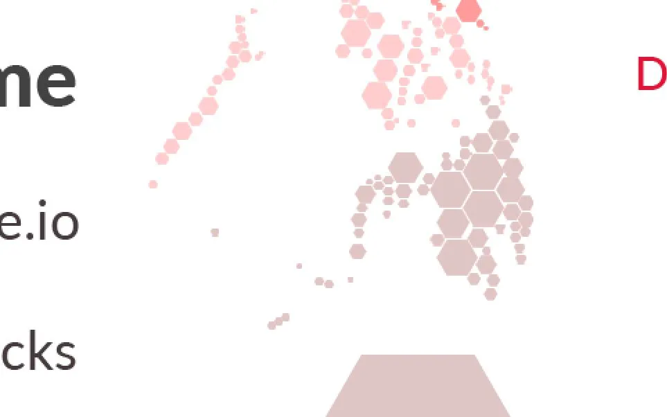
Finally, I did the same with each card design I have shown you. I attached the map of the Philippines (made with hexagons) to the back of each card.
This is the result on each design:
Finalmente, hice lo mismo con cada diseño de tarjeta que les he mostrado. Le coloqué el mapa de Filipinas (hecho con hexágonos) a la cara trasera de cada tarjeta.
Este es el resultado en cada diseño:
HIVE - White design
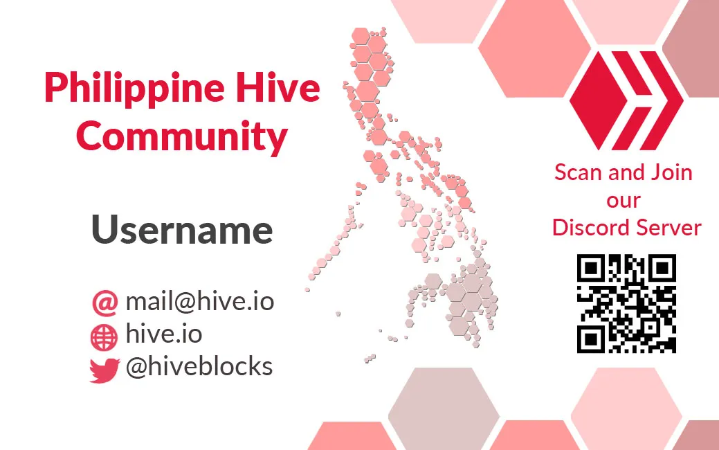
Both sides
| |
|---|
HIVE - Dark design
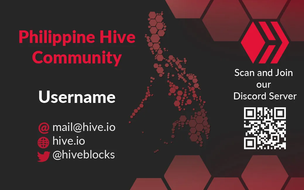
Both sides
| |
|---|
PeakD design
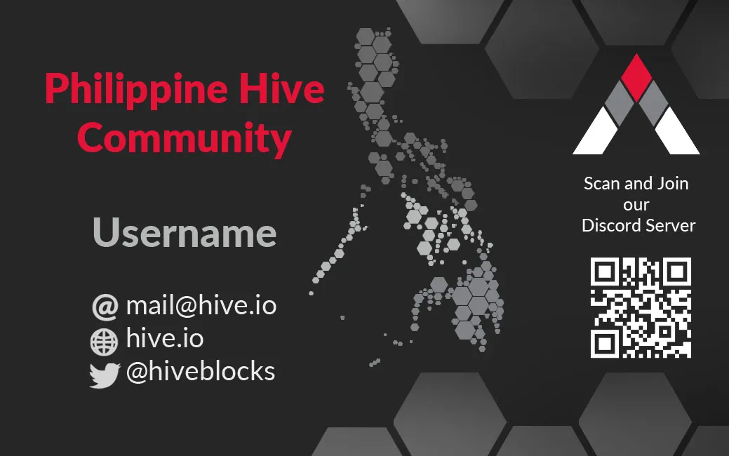
Both sides
| |
|---|
Ecency design
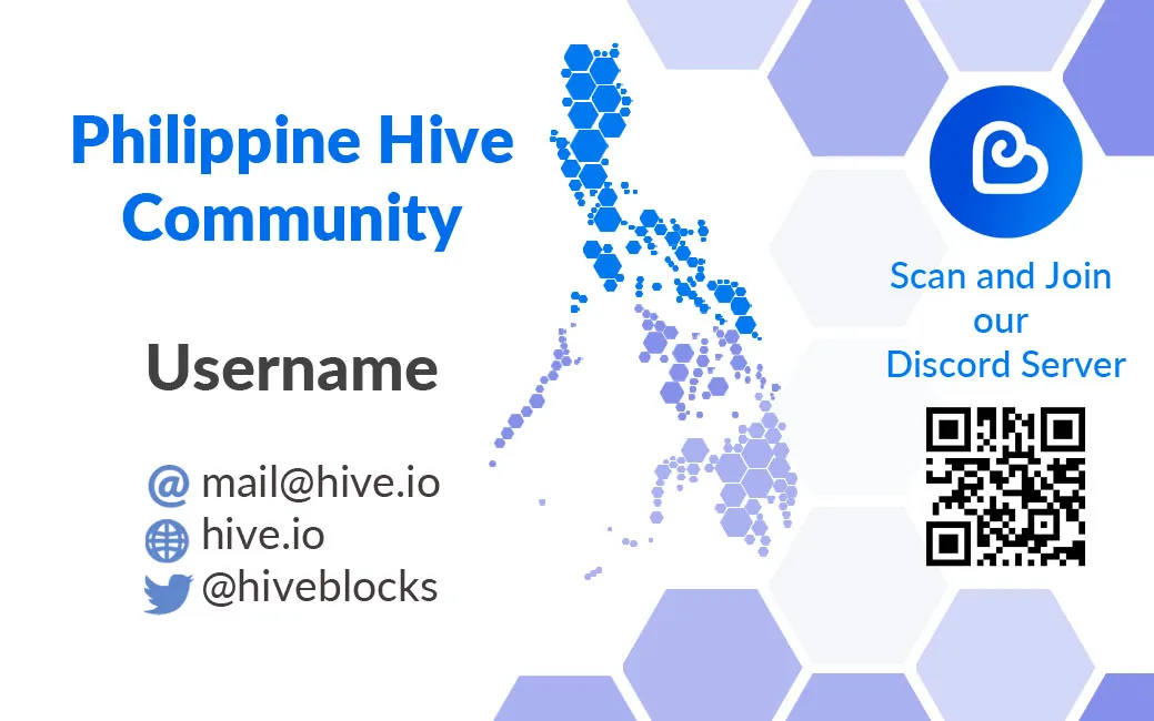
Both sides
| |
|---|
As you can see, this is a very nice and universal card design, as it can be adjusted to different types of requirements, as well as having space to add more information on the back side of the card.
It is a set of designs that can be used together or separately and there is something for everyone. I sincerely hope you liked my cards:
Como ven, este es un diseño de tarjeta muy bonito y universal, pues se puede ajustar a distintos tipos de requerimientos, además de tener espacio para agregar más información en la cara trasera de la tarjeta.
Es un conjunto de diseños que bien se pueden usar juntos o por separado y hay para todos los gustos. De corazón, espero que les hayan gustado mis tarjetas:
| |
|---|
| |
|---|
I would like to know what you think of my design. I invite you to leave it below in the comments, as always I will be happy to read it. With nothing more to add, I'll say goodbye then...
See you next time!
Me gustaría saber la opinión que tienen de mi diseño. Los invito a dejarla abajo en los comentarios, como siempre estaré encantado de leerlos. Sin más que agregar, me despido entonces...
¡Hasta la próxima!