Hello community. I'm here to share a post I made on typography.
There is quite a lot of misconceptions and questions about what typography does. I mean, it's just text, right?
Why do designers take so much care to choose the text that can best represent a design? Why are some boring and overly simple designs thought of as amazing? Isn't complex supposed to be better?
I decided to write about it because I think it would be helpful if people understood the roles that typography plays in designs, as well as the differences between fonts and Typefaces.
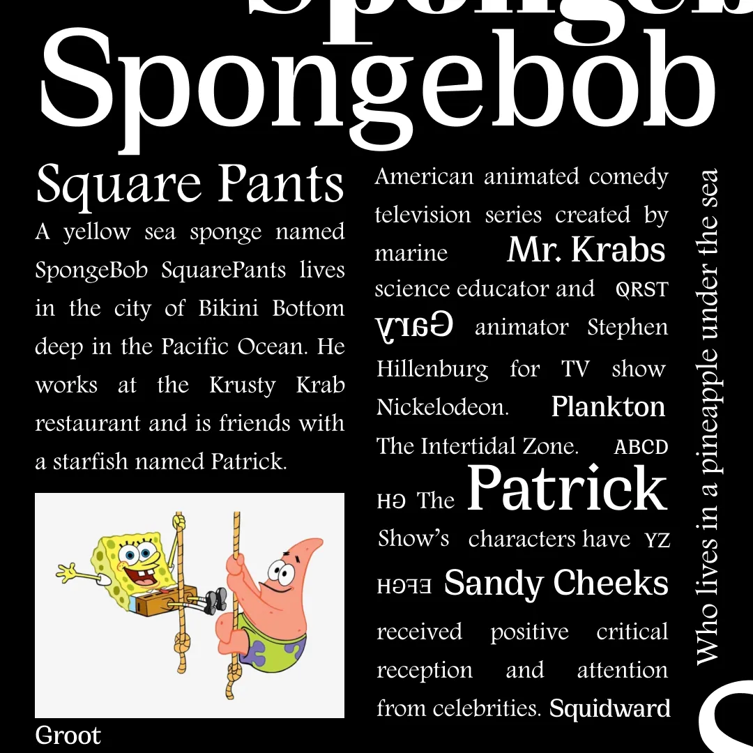
I also put in some extra work by designing a Spongebob photo using Typography only.
Here's a link to the article: @pangoli/understanding-typography-1-spongebob-squarepants
What do you think, guys?
Top or Flop?
Thank you for the opportunity, @twinner.