Yo' Guys, I stumbled upon this post four days ago about a business card design contest from @acidyo; here's the LINK and I thought I would save it and think of something so I could participate. At first, I just observed and checked other people's entries, and I couldn't help but be amazed at their work. They are too fast, and I thought, "Can I do this?"
I have zero creativity in my body, but I want to challenge myself, so I thought, why not do it? And I did! So I opened my Canva app that very day ago and started to work on it. I am thinking of the color that I will use, but I always end up with a dark red or maroon. Actually, it is in a gradient, which I think will look good on a card.
Also, it has white on it, like it will be a red and white color combination. I mean, red is hive, so I really focus on red and white. That will be their trademark color, and just seeing the card will make them think fast that it is HIVE. Although it is much darker, but dark is cool.
This should be the design that I will submit, but then I changed it and came up with another design. I am making this in Canva, so I can freely change the design as much as I want. It's really hard to come up with an idea, which is why I have to check other people's work first and think on what to do.
After checking and a little bit of thinking, I finally came up with a design. Actually, after I created this one, I was still not satisfied with it, so I changed it again. I felt like the design was very messy and not appealing at all. although it is only the color and its position.
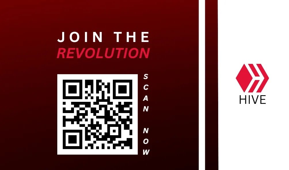
Front Design #1
BACK design #1
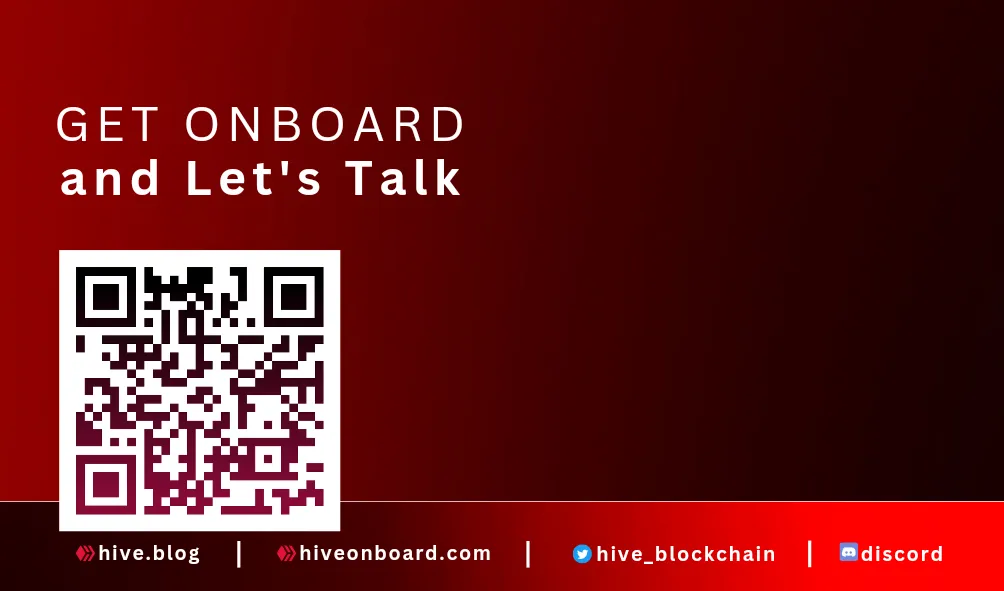
So this is the second design that I came up with. It is really simple, but I only did it that way because it has a purpose. I will share that later on the other design. I just find this a little boring, which is why I have to change it again. It should be simple and have an impact, not simple and boring.
Front Design #2
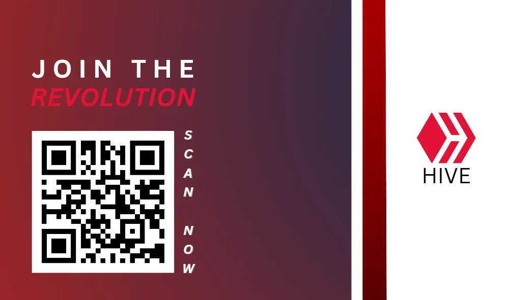
So aside from the color, I also changed the position of the QR Code. Instead of putting the QR code in the middle, I think it is much cleaner if it is placed on the left side. I know it will leave a lot of space in it, but I think it will look more appealing if I leave it like that without adding unnecessary designs that will only destroy its simplistic design.
And because I want it to look neat, I arrange the QR code on the same side as the back side of the business card. And aside from the neat-looking card, I only want them to focus on the QR code and what's written here. With that, they will be more curious to check the QR code, which will lead them to discover more about Hive.
BACK design #2

And once they are done on the front side, they can just flip the card, and once they see the word written on it, they will already know that the QR code will lead to a messaging app where they can inquire more about Hive. It will lead them to the Hive Philippines Discord app. They will be welcome in there, and we can guide them and give them insights about how Hive works.
And as for what's written in here, I got it at hiveonboard.com. I use that as part of being a neat business card. What you see on the website is the same on that card. Like that's more Hive, you will know Hive with those lines; it will be its trademark. Once you hear it, you will never forget it. And that's what I want to happen if I ever get myself this business card.
FRONT design #3
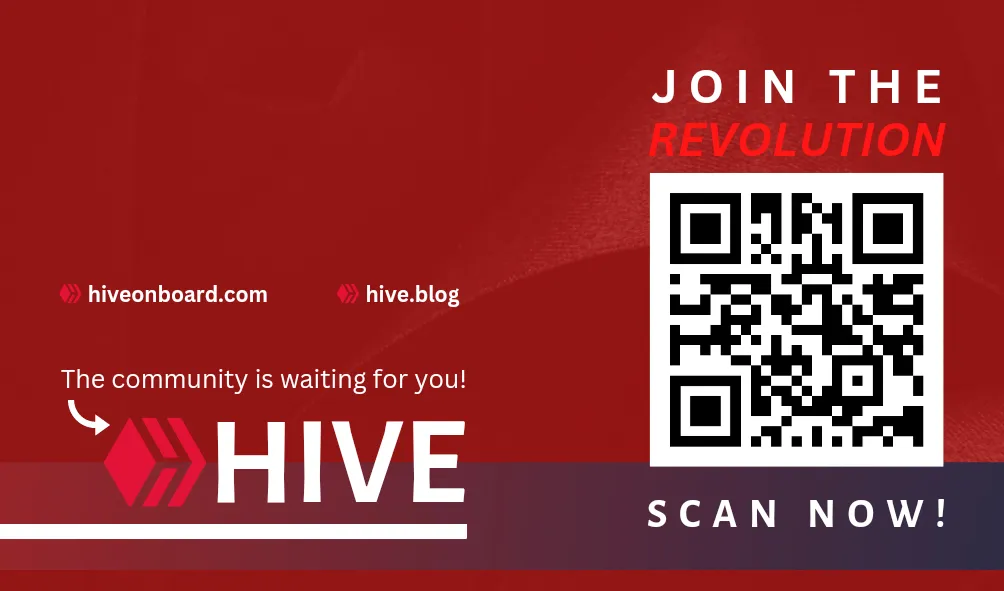
This one is just the same as design #2. The only difference is their color, their positioning, and the added caption on them. And the logo and the word Hive are much bigger compared to design #2. Also, it has more designs, like the added shapes and that arrow. But I think it still has a simple design, so that's it.
BACK design #3

and on the back side. This is actually my favorite design. I just like the position of every caption, link, and QR code on it. I feel like it has something that will pass as a business card; I mean, it has a change, lol. I don't know; I just like the design, which is why. This is the simple design that I am describing. only with a few captions that I think will still capture anyone's attention.
And that's all, what do you think?

Canva Link: Design #1 and #2 | Design #3
February 03, 2023 | FRIDAY