La estructura de un publicación es algo que puede o no agradar a la vista, puede tener un excelente y llamativo titulo, también una atractiva imagen de portada, pero si al abrir la publicación, la estructura del post no es limpia optima, agradable a los ojos del que la mira, por llamarlo de alguna manera, pues algunas personas podrían retirarse sin leer el contenido, hoy quiero hablarles del maquetado de la publicación.

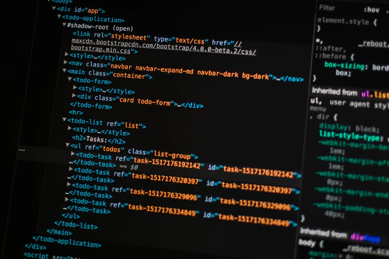
El Maquetado de una publicación, es la estructura del mismo y muchísimas veces o en buena parte está formado por códigos que permiten resaltar y ubicar en el espacio deseado algún elemento, por ejemplo centrar una imagen,en fin, es usar herramientas que te servirán para pulir tu publicación, para en este caso, darle una agradable impresión a su interior., que la misma sea agradable a quien la mira y termine de convencerse de leerla, recientemente revise una de mis primeras publicaciones y créanme, me di cuenta de cuánto ha aprendido,las imágenes y fotos que utilicé eran muy pequeñas, no estaban centradas, a mi particularmente me gusta que lo estén, la manera de citar sus fuentes no era la más atractiva, no tenía ni sabía cómo o de donde sacar un separador de párrafos, entre otros. Lo bueno, fue y esto es una mera especulación, que los curadores supieron que era nueva en la plataforma se centraron en el contenido y para darme ánimo me dieron su apoyo.
Por esa misma razón estoy yo aquí, deseo que todos tengan herramientas a la mano con las cuales puedan mejorar cada día sus publicaciones. Por ejemplo, no se como elaboran esas publicaciones con dos columnas una en español otra en ingles, así que ya tienen una perfecta excusa para dejarme un comentario, así aprendo y realizo una es ese estilo para variar, jajaja.

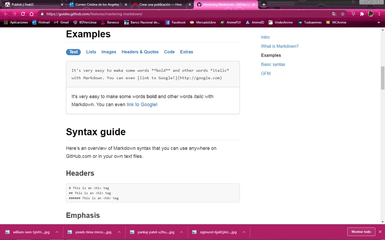
Ahora bien, les quiero compartir los códigos que mas uso y les compartiré una serie de enlaces de excelentes publicaciones que ha realizado otros compañeros y proyectos de curación acerca de este tema, asi te comparto mis códigos más usados ,a mí particularmente me gustan las publicaciones justificadas, así que uso este código
<div class="text-justify">

#
(texto)
</div>
También al citar un enlace de una publicación uso este Código
[aquí](enlace de la publicación)
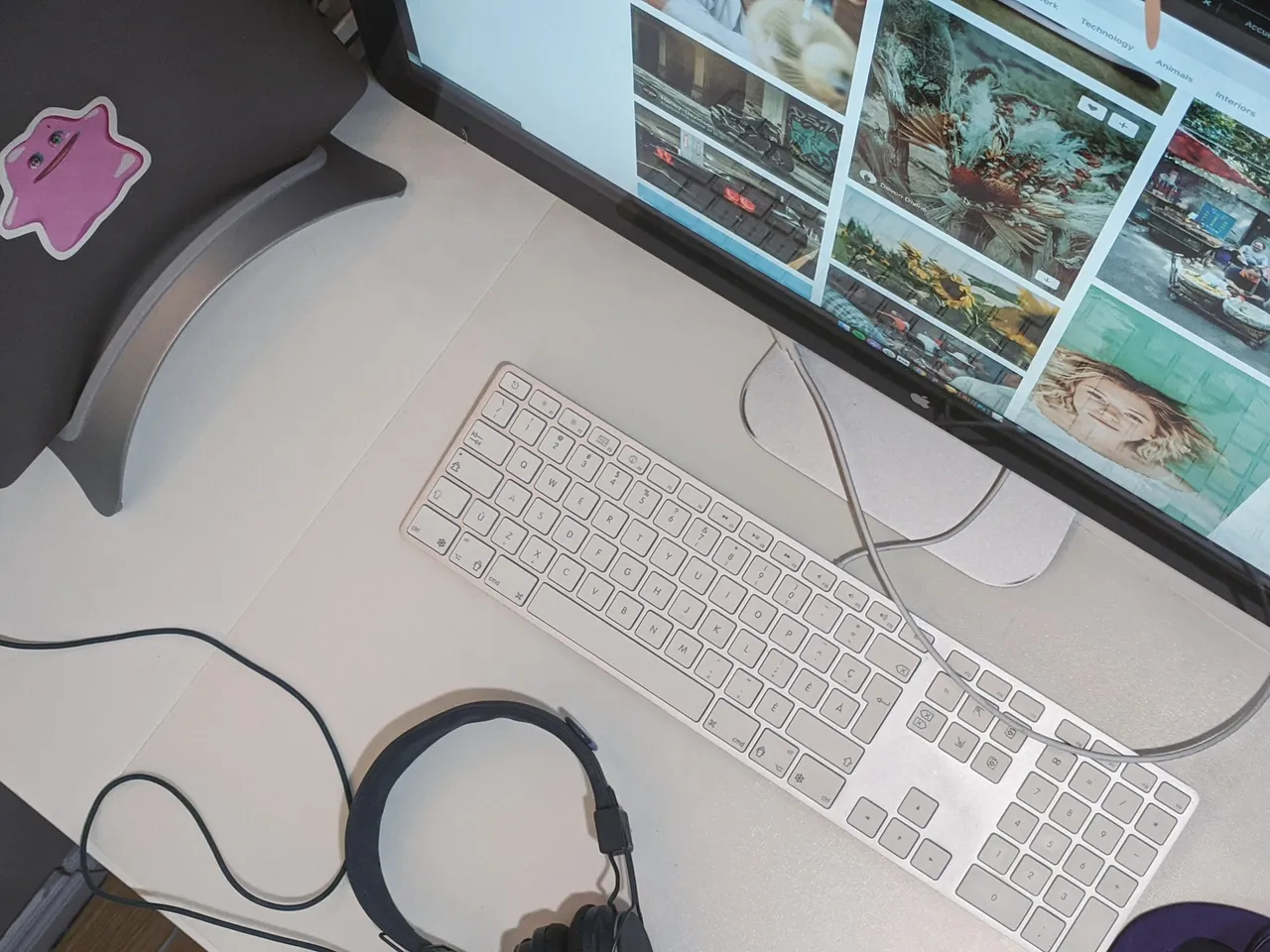
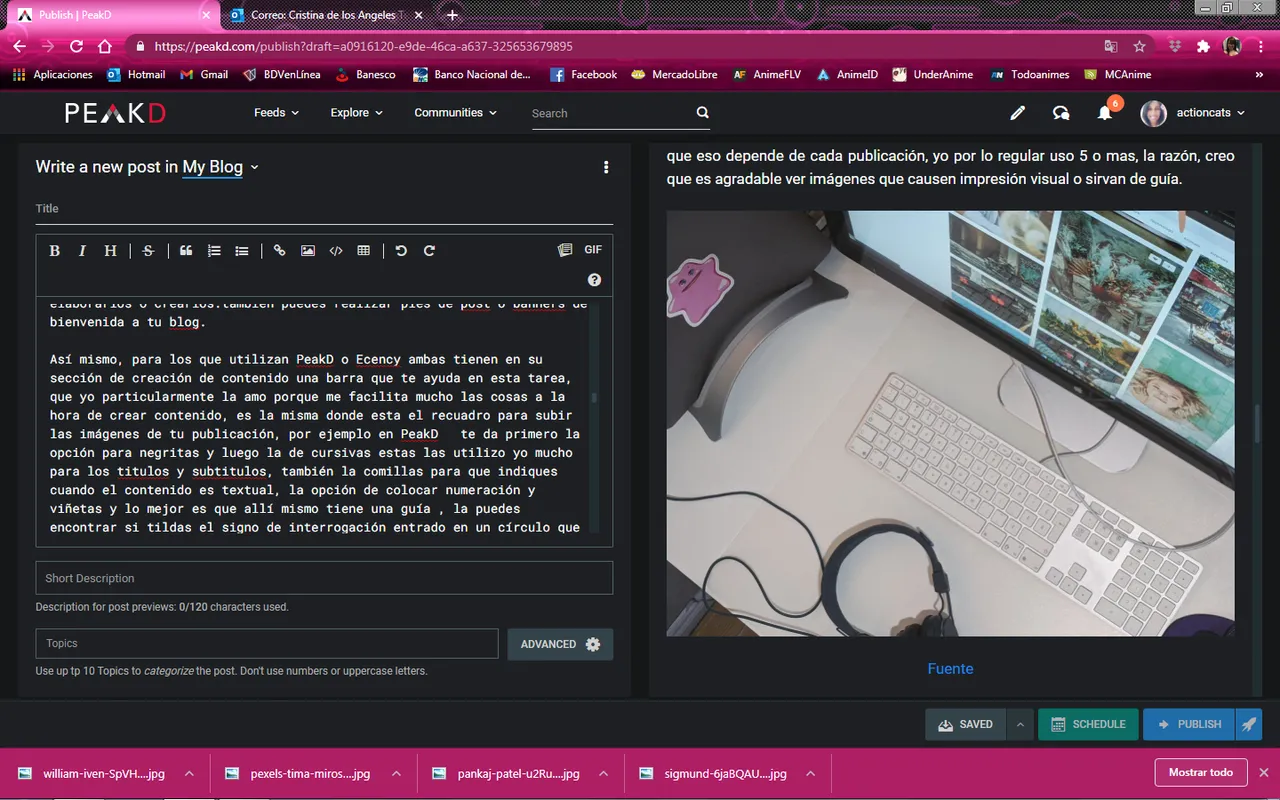
Una parte muy importante de la publicación son las imágenes que la acompañan, hay que elegirlas muy bien , deben tener relación con el mismo y además colocar sus fuentes, sobre la manera de citar las fuentes, existen diversas opiniones, yo coincido con la que presento hace poco el proyecto de curación @templo aquí les comparto su publicación, otro tema aquí, es la cantidad de imagnes a utilizar, yo creo que eso depende de cada publicación, yo por lo regular uso 5 o mas, la razón, creo que es agradable ver imágenes que causen impresión visual o sirvan de guía.
Por otro lado, te recomiendo el uso de divisores de texto o párrafos, en Hive puedes encontrar múltiples publicaciones que otros compañeros han creado para uso libre , todos bellísimos, o puedes crear los tuyos, por ejemplo en Canva también hay tutoriales donde te explican cómo elaborarlos o crearlos.también puedes realizar pies de post o banners de bienvenida a tu blog.
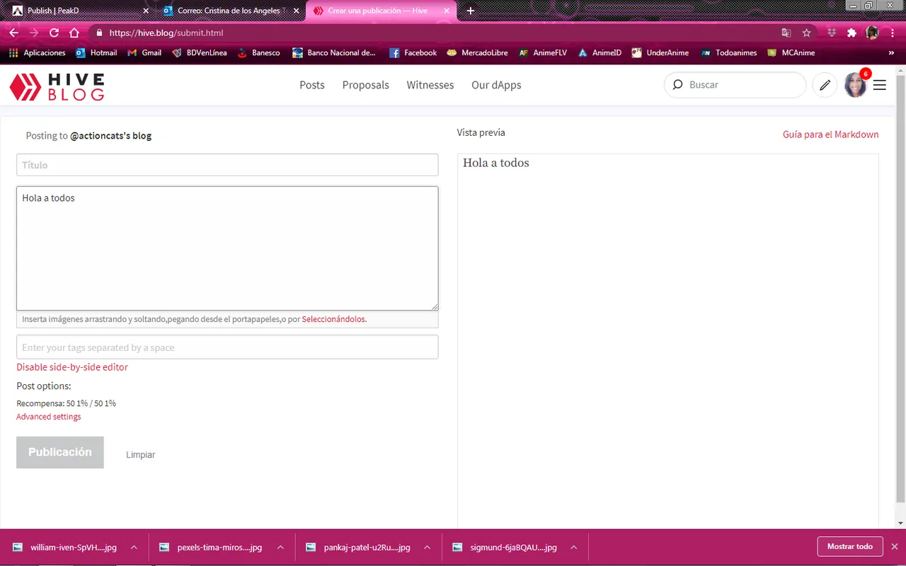
Así mismo, para los que utilizan PeakD o Ecency ambas tienen en su sección de creación de contenido una barra que te ayuda en esta tarea, que yo particularmente la amo porque me facilita mucho las cosas a la hora de crear contenido, es la misma donde esta el recuadro para subir las imágenes de tu publicación, por ejemplo en PeakD te da primero la opción para negritas y luego la de cursivas estas las utilizo yo mucho para los títulos y subtitulos, también la comillas para que indiques cuando el contenido es textual, la opción de colocar numeración y viñetas y lo mejor es que allí mismo tiene una guía , la puedes encontrar si tildas el signo de interrogación entrado en un círculo que está a mano derecha .Para los que prefieren usar Hive.blog aunque no trae esta útil barra también te facilita una guía o tutorial y está justo a mano derecha sobre la vista previa.
Quiero aprovechar este espacio para felicitar y aplaudir de pie a mis compañeros que manejan cualquier cantidad códigos de Markdown y Html de memoria y los plasman de manera sorprendentemente rápida en sus escritos, yo tengo una chuleta copio y pego, creo que mi mente ya tiene mucha información almacenada, debería limpiar el caché, (risas) ahora les comparto las publicaciones que hasta ahora conozco de Markdown y Html en la plataforma esperando les sean de utilidad:
Publicación original de @jossduarte
@jossduarte/markdown-y-html-guia-de-bolsillo
Publicación de @victoriabsb
@victoriabsb/tutorial-de-markdown-completo-or-traduccion-autorizada
Publicación @templo
@templo/codigos-para-enriquecer-sus-publicaciones
Antes de retirarme, quiero retomar o repetir las palabras que utilice en el post que dio origen a este serie de publicaciones donde desarrollo mas a fondo los elementos de un buen post.
Las cosas agradables a la vista a todos nos gustan y un post bien estructurado no es la excepción, disfrutamos observarlo, pude ser centrado, justificado, con títulos en distintos tamaños en negritas, cursivas, con separadores de texto, banners, en fin hay cualquier cantidad de herramientas y elementos que te pueden ser de utilidad, hay varios post sobre maquetado, vídeos en distintas plataformas, y aquí en nuestra amada red varios compañeros han realizado publicaciones donde han elaborado separadores de libre uso hermosos, muchos de ellos los he usado en mis publicaciones.
Fuente

Me retiro deseando que esta publicación logre su propósito que no es otro más que el que ya indique, brindar herramientas para aquellos que las necesiten o los que desean como yo hacer de sus publicaciones algo hermoso no solo de fondo también de forma, si esta publicación fue de tu agrado puedes dejarme un comentario.


The structure of a publication is something that may or may not please the eye, it can have an excellent and striking title, also an attractive image, but if when the publication is opened, the structure of the post is not clean and optimal, pleasant in the eyes of the person who looks at it, to call it something like that, because some people could leave without reading the content, today I want to talk to you about the layout of the publication.
The layout of a publication, is the structure of it and many times or mostly is formed by codes that allow to highlight and locate in the desired space some element, for example to center an image, in short, is to use tools that will serve you to polish your publication, in this case, give a nice impression inside.., I recently reviewed one of my first publications and believe me, I realized how much you have learned, the images and photos that I used were very small, were not centered, I particularly like that they are, the way to cite their sources was not the most attractive, did not have or did not know how or where to get a paragraph separator, among others. The good thing was, and this is mere speculation, that the curators knew I was new to the platform, they focused on the content and to encourage me they gave me their support.
For that same reason I'm here, I want everyone to have tools at hand with which they can improve their publications every day. For example, I don't know how they make those publications with two columns one in Spanish and the other in English, so they already have a perfect excuse to leave me a comment, so I learn and make one in that style for a change, hahaha.
Now then, I want to share with you the codes that I use the most and I will share with you a series of links of excellent publications that other colleagues and healing projects have done about this topic, so I share with you my most used codes ,I particularly like the justified publications, so I use this code
<div class="text-justify">

#
(text)
</div>
Also when citing a link to a publication I use this Code
[here](publication link)
A very important part of the publication are the images that accompany it, they must be chosen very well, they must have relation with the same one and in addition to place their sources, on the way to cite the sources, diverse opinions exist, I agree with which I present recently the project of cure @templo here I share its publication, another topic here, is the amount of images to use, I think that depends on each publication, I usually use 5 or more, the reason, I think it is nice to see images that cause visual impression or serve as a guide.
On the other hand, I recommend the use of text dividers or paragraphs, in Hive you can find multiple publications that other colleagues have created for free use, all beautiful, or you can create your own, for example in Canva there are also tutorials where they explain how to develop or create them.
Also, for those who use PeakD or Ecency both have in its content creation section a bar that helps you in this task, I particularly love it because it makes things much easier when creating content, is the same where the box is to upload the images of your publication, for example in PeakD gives you first the option for bold and then the italics these I use a lot for the titles and subtitles, also the quotes to indicate when the content is textual, the option to place numbers and bullets and the best thing is that there is a guide, you can find if you check the question mark entered in a circle that is on the right hand. For those who prefer to use Hive.blog, although it doesn't have this useful bar, it also provides a guide or tutorial and is just on the right hand side of the preview.
I want to take this space to congratulate and applaud standing up my colleagues who handle any amount of Markdown and Html codes in memory and shape them surprisingly quickly in their writing, I have a copy and paste chop, I think my mind already has much information stored, should clean the cache, (laughs) now I share the publications so far I know Markdown and Html on the platform hoping they are useful:
Original publication by @jossduarte
@jossduarte/markdown-y-html-guia-de-bolsillo
Publication of @victoriabsb
@victoriabsb/tutorial-de-markdown-completo-or-traduccion-autorizada
Publication @templo
@templo/codigos-para-enriquecer-sus-publicaciones
Before retiring, I want to take up again or repeat the words I used in the post that gave birth to this series of publications where I develop more thoroughly the elements of a good post.
We all like nice things to see and a well structured post is not the exception, we enjoy watching it, I could be centered, justified, with titles in different sizes in bold, italics, with text separators, banners, in short there are any number of tools and elements that can be useful, there are several posts about layout, videos on different platforms, and here in our beloved network several colleagues have made publications where they have developed beautiful free separators, many of them I have used in my publications.
Fuente

I leave wishing that this publication achieves its purpose that is not other than the one already indicated, to provide tools for those who need them or those who wish like me to make their publications beautiful not only in the background but also in form, if this publication was of your liking you can leave me a comment.