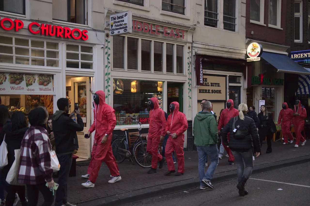
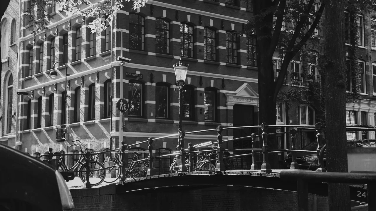
The headline is not only a reference to the liberal sex culture in Amsterdam but also to the collection of these pictures that ended up versatile in style. I hadn't taken much pictures for a while, but I'm glad I did during and after HiveFest in Amsterdam, because the editing process was a fun one and I ended up with many different styles of pictures from monochrome to scenery to details. Weirdly enough, I like the editing more than the photographing itself. Just need to get myself take the pictures first so I have something to edit, haha.
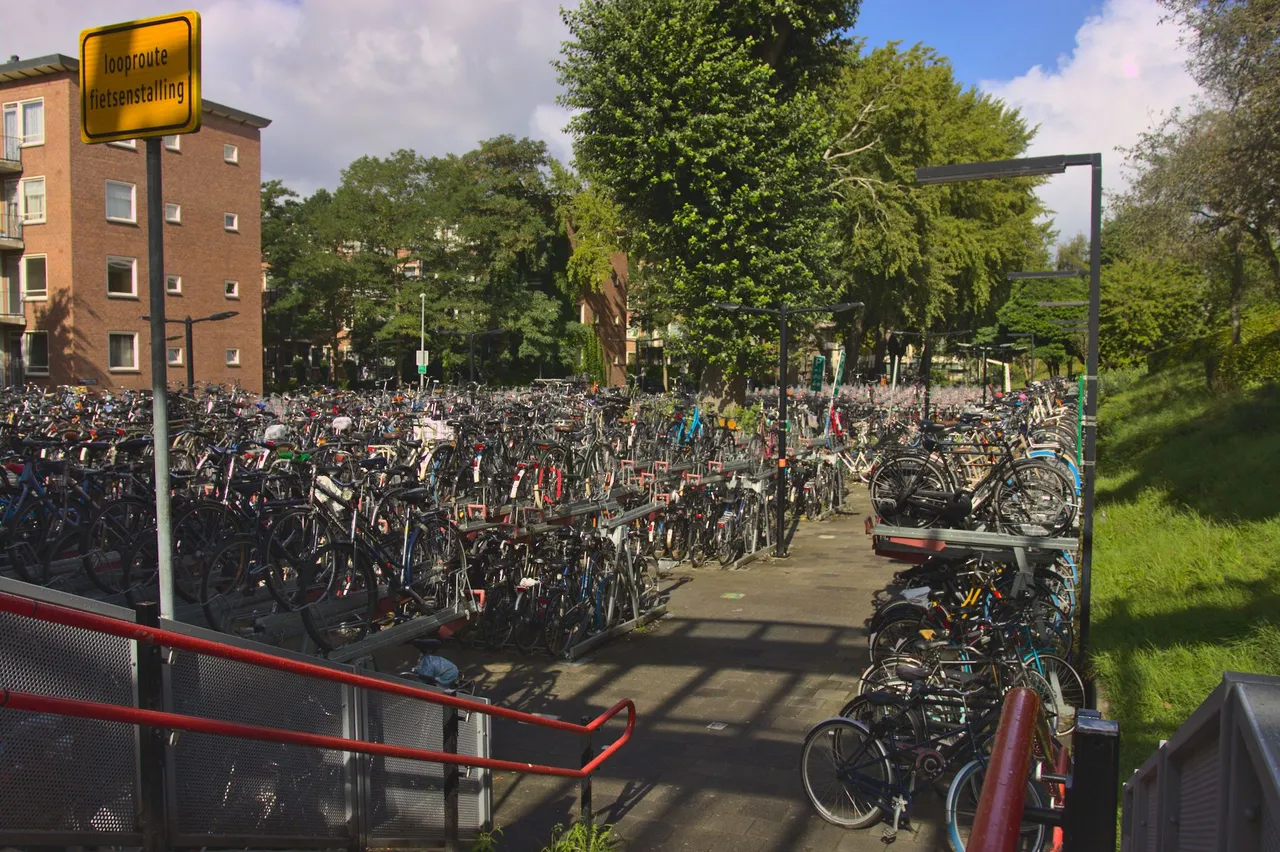
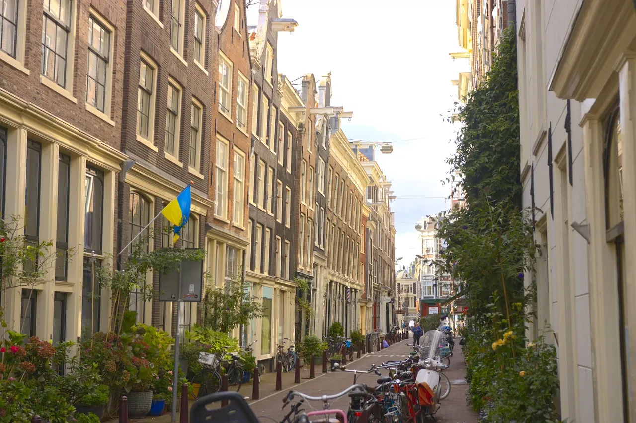
The very first thing you realize when coming to Amsterdam is that the city is dominated by bicycles. They're everywhere and the roads are prioritized for them.
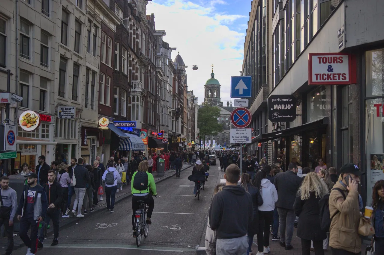
I've never witnessed a bicycle accident, yet being in Amsterdam, I witnessed twice a bicycler crashing onto a passenger. The other of those included a domino where the bicycler crashed onto another bicycle after hitting the passenger. It's crazy. Stay out of the bicycle lanes.
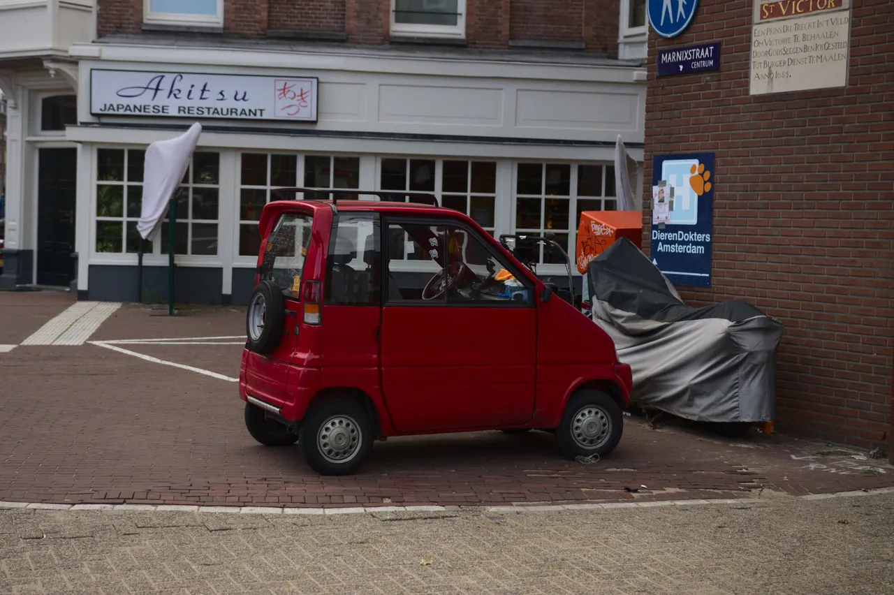
A peculiar thing with the bicycle lanes, is that you can ride them with a scooter, and with these one-seat mini-cars. @jeffjagoe had a hillarious commentary about them: "-- what kind of a car is that? You can basically kick them over --".
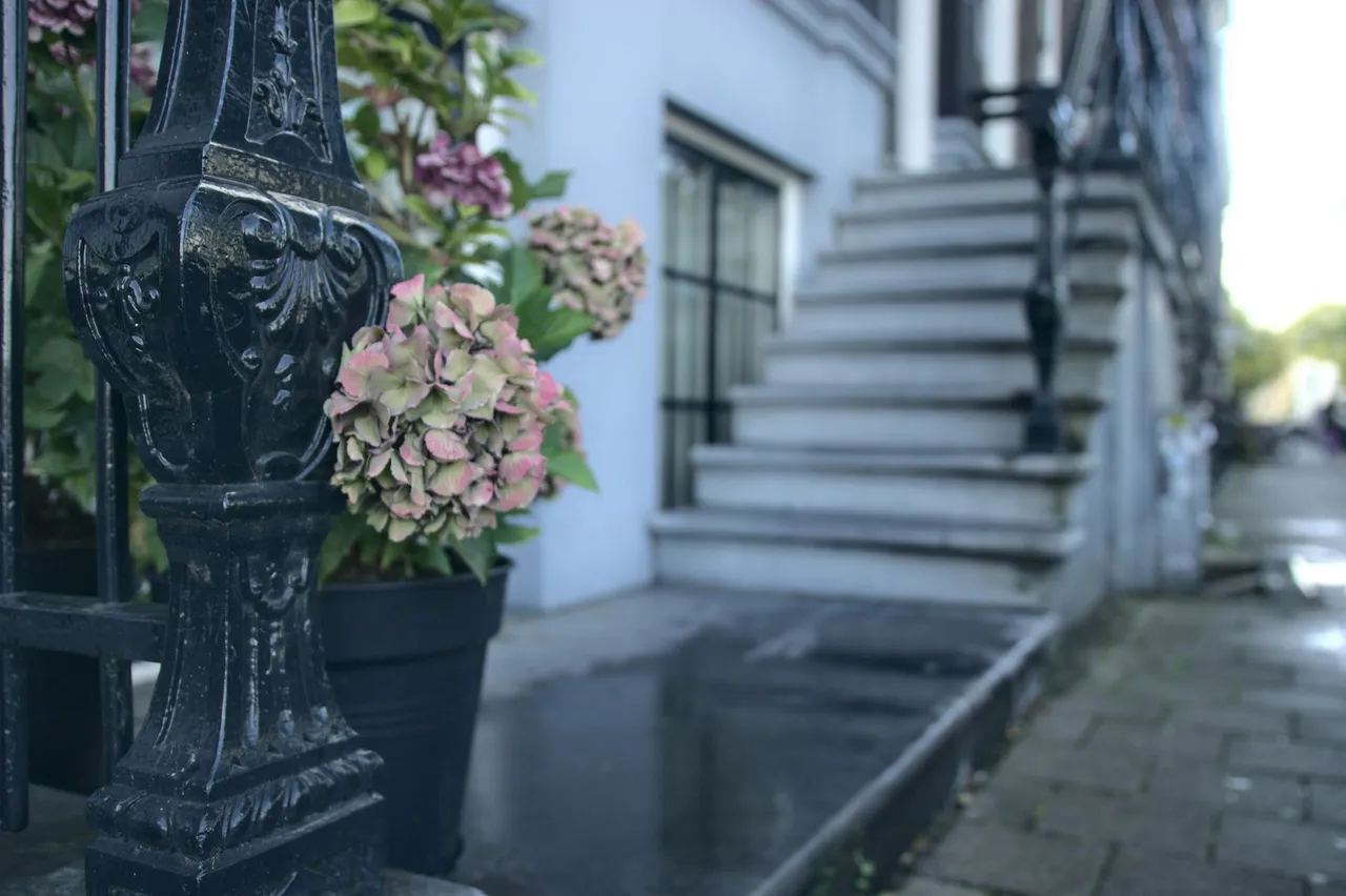

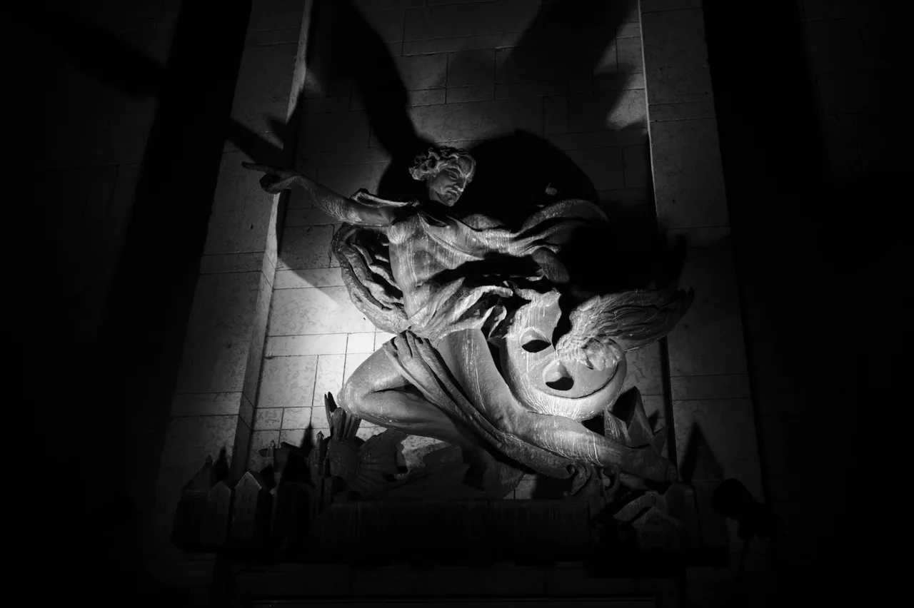
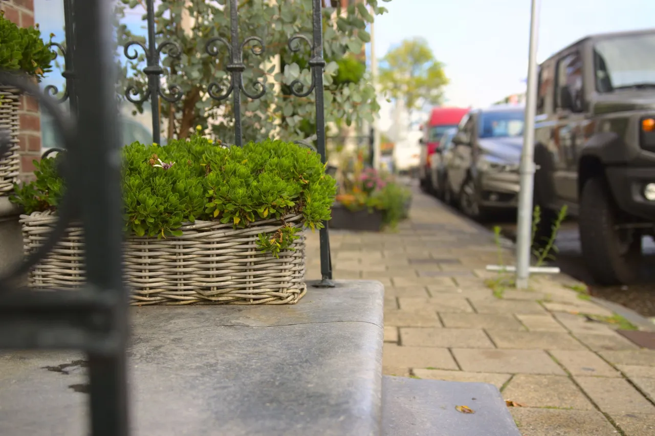
While editing these pictures, I discovered few nice tricks from Darktable editing software. The picture above has the object in forefront with the light source behind it. This setup leaves the object on the forefront underexposed and dark. You can just rise the exposure of shadows on "shadows and highlights" setting, but with such setup, it leaves the edges of the object with a dark halo. But somehow by tinkering I realized that changing the softening filter from gaussian to bilateral, I got rid of the halo. I have no idea what it technically does, but I got rid of the dark halo by doing this. My mind was blown a little when I realized this is possible to do.
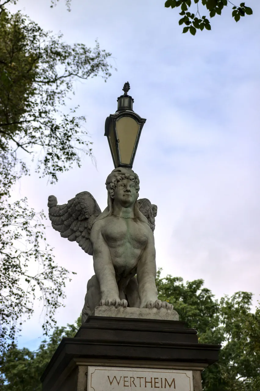
Another trick I discovered was with the "color contrast" setting. With the picture above and many others, my problem was that the red colors were too saturated compared to other colors. There are other settings to do this, but I noticed that with color contrast I got the smoothest result to reduce red saturation so that they don't sting out of the picture but blend in nicely.
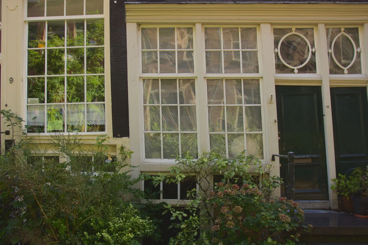
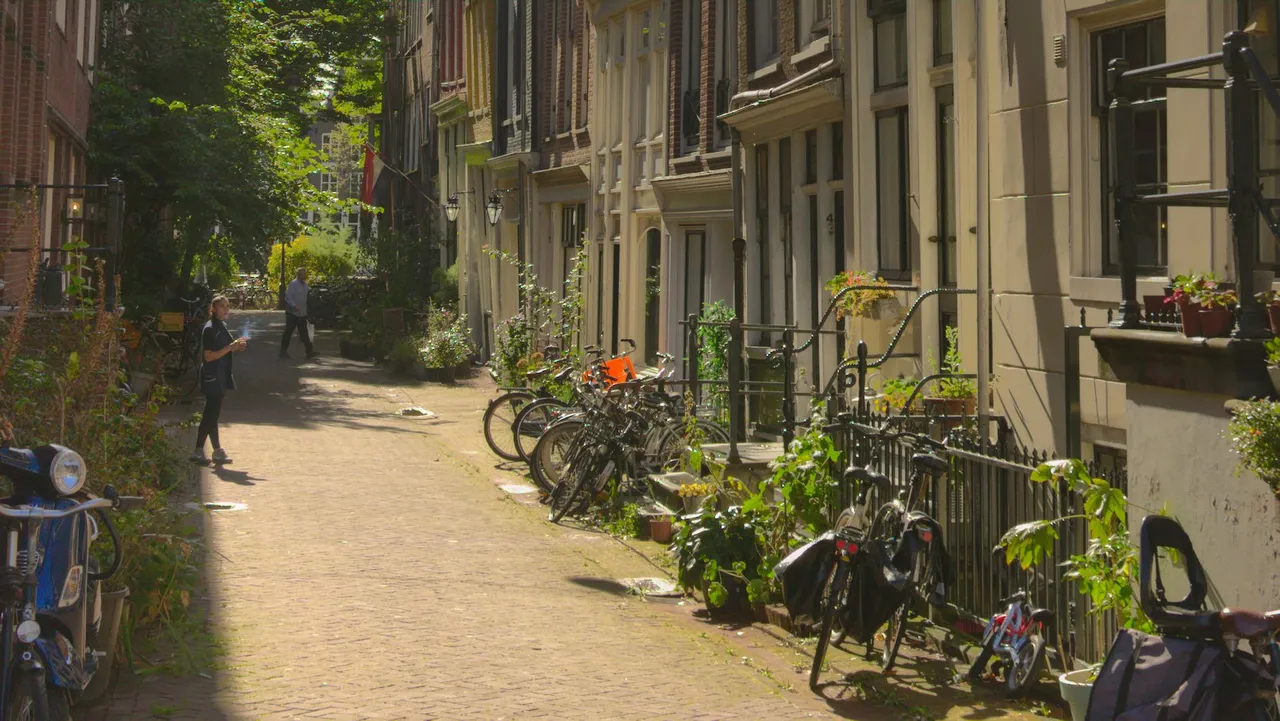
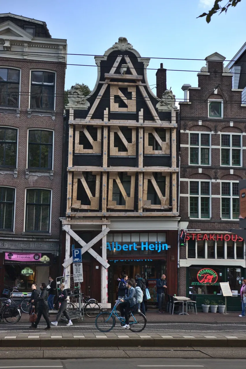
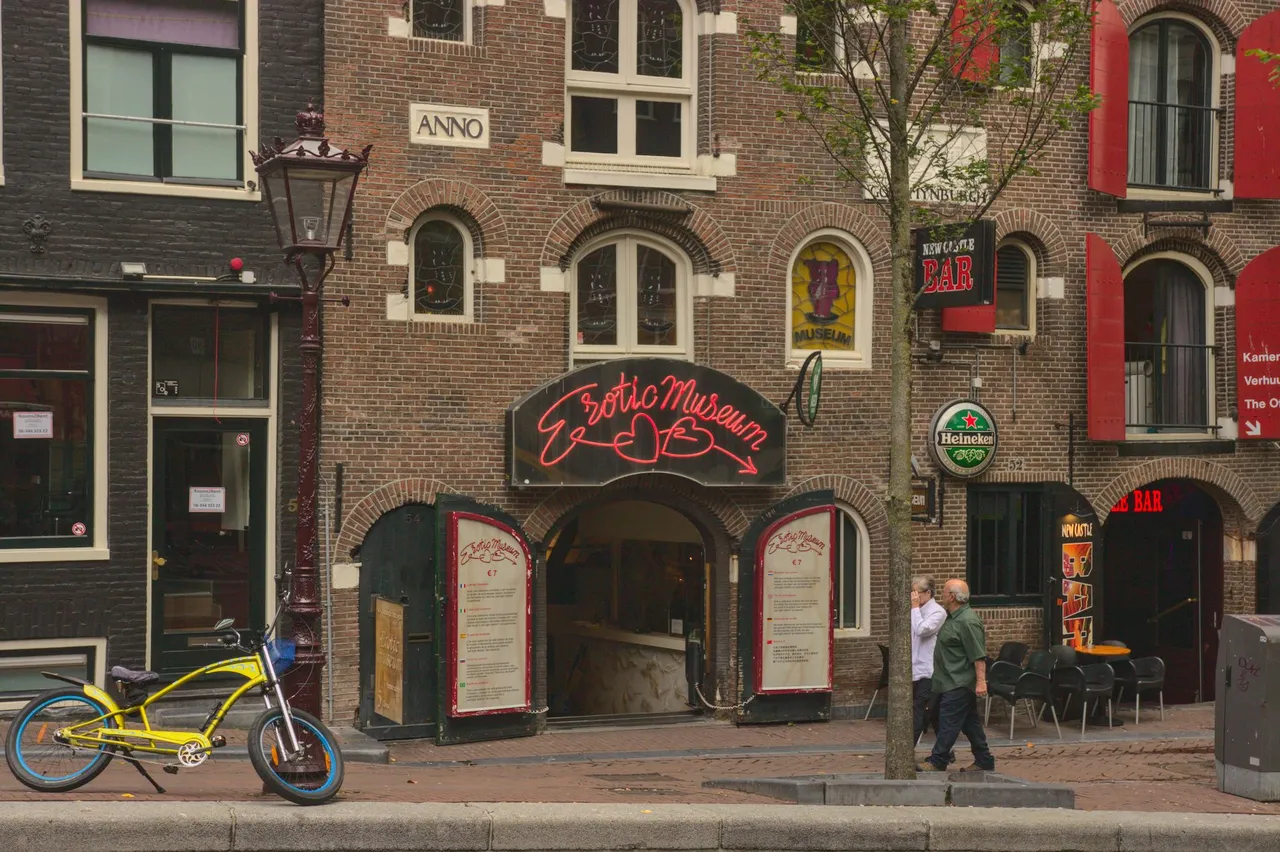
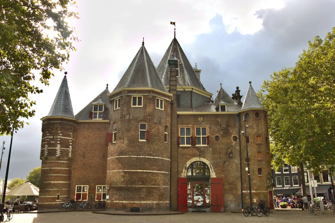
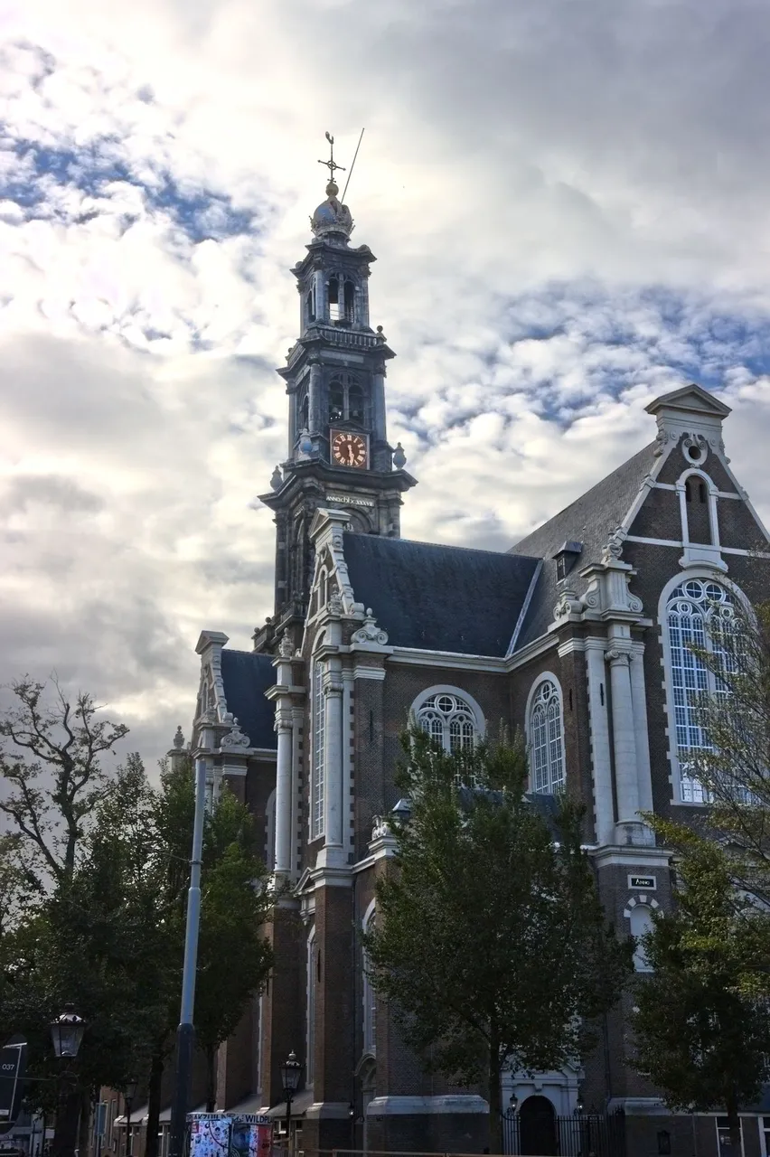
Amsterdam has a distinct look with its architecture, wonky buildings, canals, coffee shops and red light districts. Interestingly, parts of it reminds me of something like London, at least what I've seen on tv, never been there myself.
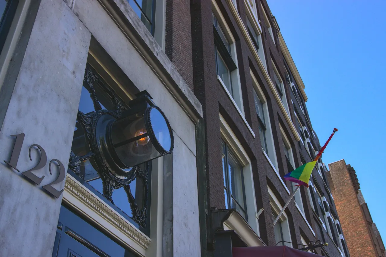
I really like how decorative the city looks. Details like old style streetlamps really add to the aesthetics. They really should build beautiful buildings like this today, too.
I mostly crop my pictures with the standard 4:3 ration, but sometimes I want that cinematic feel for a picture and I go with 16:9. The picture below might be my favorite and the setting was such that I knew right at the spot when photographing that this is good stuff; the woman with the cigarette was the cherry on top.