Hey everyone! I've been wanting to write up this kind of blog for a while now and I've finally found the motivation to actually get it done. The goal of this is to help anyone who might be struggling with their landscape photography, or anyone that might be looking for some fresh ideas. The primary focus will be on things that can be done in the field to strengthen your compositions. In my opinion, this is the hardest part about photography! However, I will occasionally touch on the editing side of things, because it still affects composition. A few images in here I may have already written about in previous blogs, however I'm using them again because they make exceptional examples for the techniques I am discussing.
1. Leading Lines and Curves
We will start this off with a classic one: leading lines and curves. I'm a firm believer that leading lines are one of the most powerful elements you can incorporate into a landscape photograph. If you go look at the portfolio of famous landscape photographers like Marc Adamus, Ryan Dyar or Galen Rowell, you'll notice that many of their works incorporate this technique. It's simple and effective, but it's not always simple to find nice lines!
I find that straight lines, parallel to the direction of the camera, often do not work well and are best avoided. What you really want to keep an eye out for are converging or diverging lines, or even S curves. These work so well because they gently lead the viewer around different parts of the image, ending up in the background.
Below is an image I've shared here before, but it's strong example of a leading S curve, so I'm sharing it again:
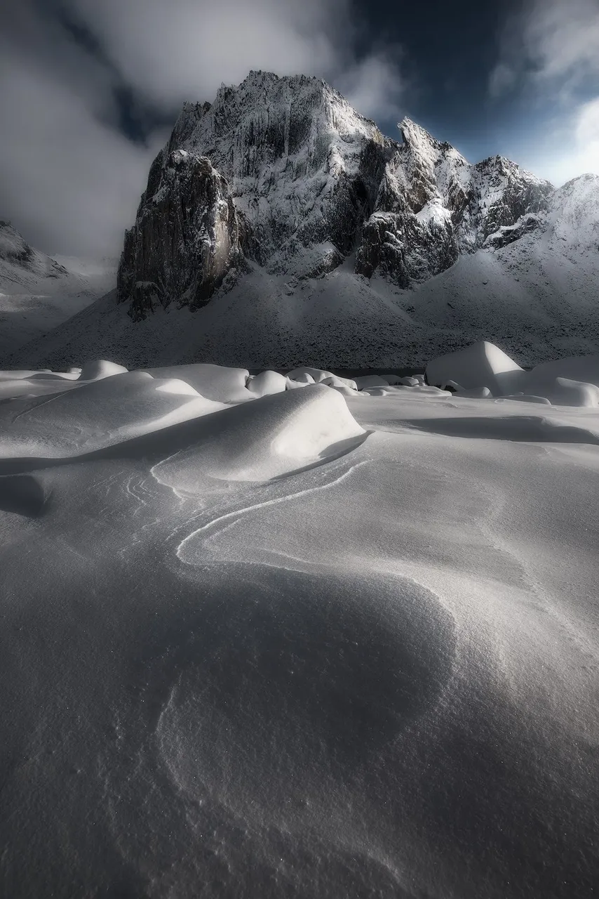
The lines in the snow guide the viewer's eye from the foreground, to midground and then finally to the mountain the background.
2. Avoid Distractions, Be Intentional
When I was a new photographer, I took photos of anything and everything, in a long learning process to figure out what works and what doesn't. It took me quite some time to realize that no part of the image should go to waste or distract the viewer: you want every part of your image to serve a purpose. Photographers like Marc Adamus and William Patino are masters of this. In many of their images they manage to cram many, many interesting elements in a cohesive way.
Think about your composition. Is there something that takes away from it? Does it feel unbalanced at all? If there's something in the image that yanks the viewer's eye away from the subject or ruins visual flow, I typically take that as a sign I need to zoom in or adjust my framing or perspective. But, sometimes these things are not noticed until you start editing your image, in which case you can use various post-processing techniques to remove or minimize any distractions.
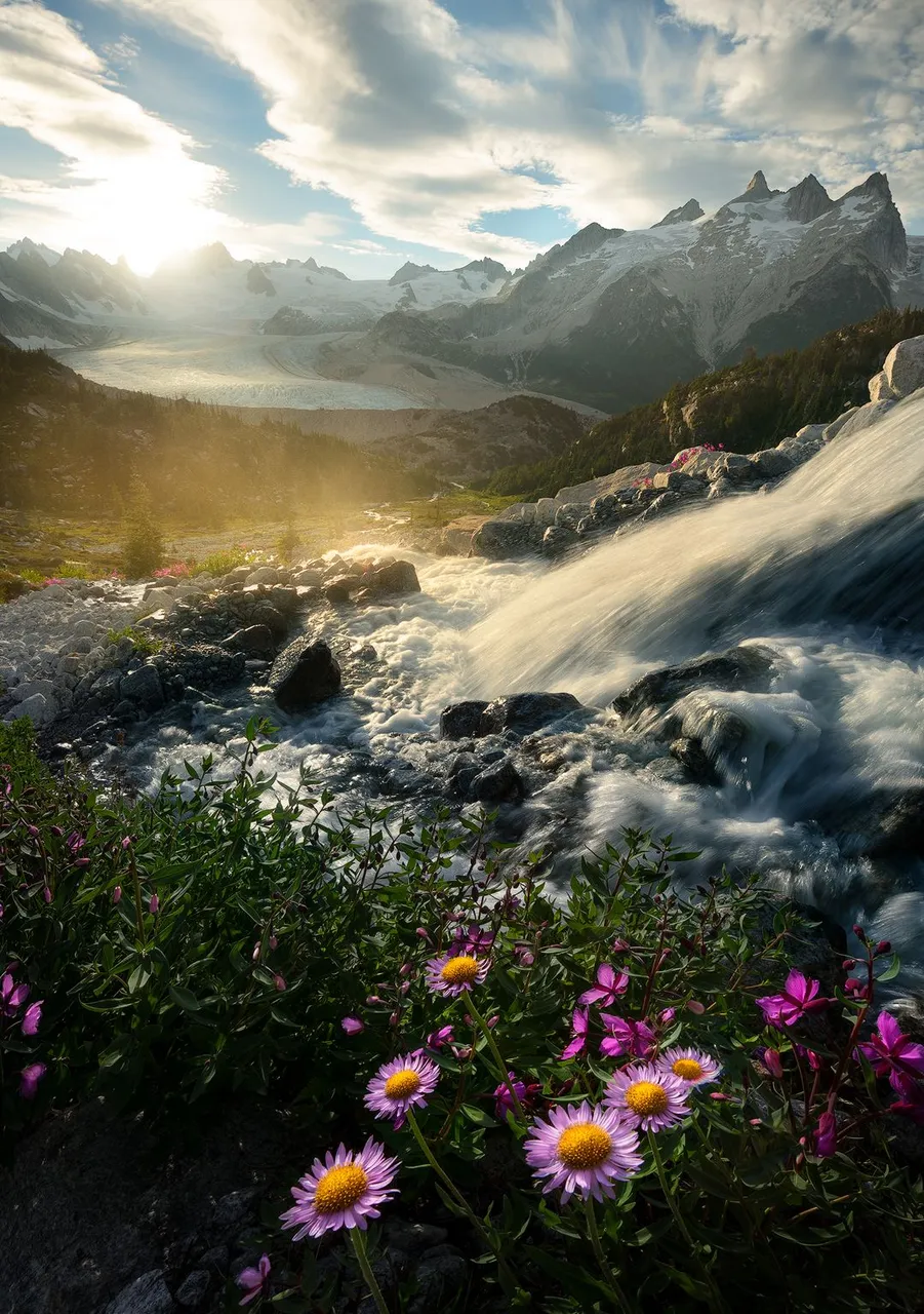
You can take this technique a step farther if you combine it with tip #1: use lines to 'link' different points of interest in your image! In the example image, I created my composition around 5 major areas of interest, zigzagging from foreground to background: the asters, flowing water, the water spray, the top left and the top right. You could further break the image down into minor areas of interest, such as the midground flowers, distant creek and glacier.
When I shot this image, there was one problem with it: the flowers were very heavy on the bottom right, with the bottom left a complete void. It felt very unbalanced. There was no way to fix this in camera, as there was a giant boulder just out of frame to the right. This was the best angle I could get. So, in post, I pulled the flowers more towards the center and this gave me the balance I was looking for. I also darkened the bottom left corner because I still felt it was a bit distracting.
3. Background Dictates Foreground
This piece of advice can be used in reverse, but typically it's easiest to use your background to determine the foreground due to a wider variety of options available for foregrounds. There are many ways in which this can be accomplished:
- foreground elements that mirror background elements
- warm versus cool
- soft versus harsh
- light versus dark
And so on! The first one can be particularly powerful, and the more of these that you can combine, the better!
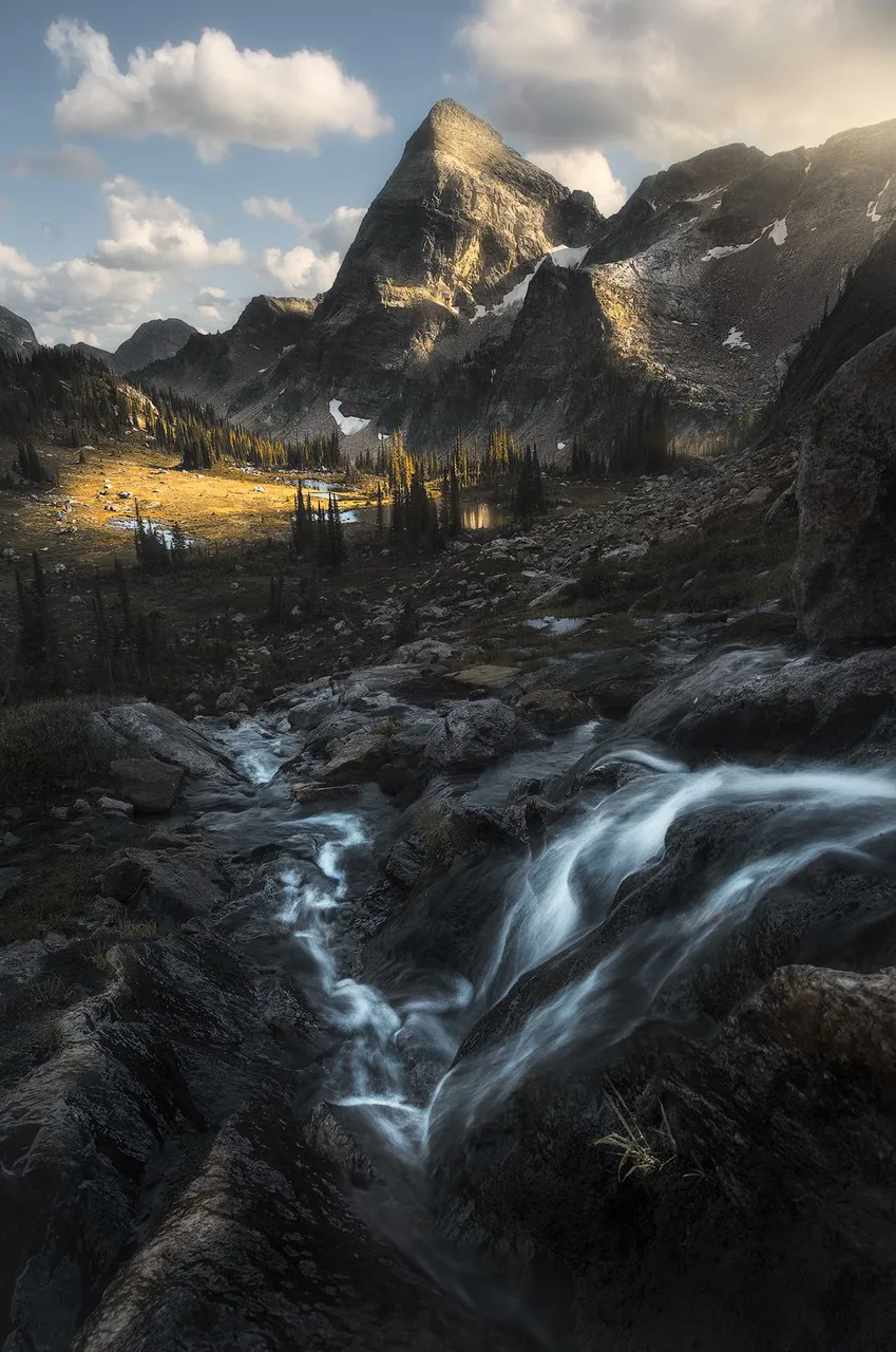
I knew I wanted an image of this mountain, so I searched for a foreground that would complement it. This stream happened to mirror the shape of the mountain, while simultaneously acting as a leading line. In post I was able to take things a step farther, creating a complementary color harmony. Patience also helped, as we waited here for hours to get the best light.
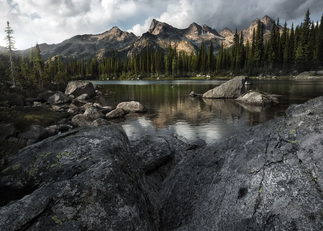
The story is similar for this image! The shape of the mountains is mirrored by the shape of the rocks. Additionally, the foreground is cooler, darker and texture heavy, while the background is warmer, brighter and softer.
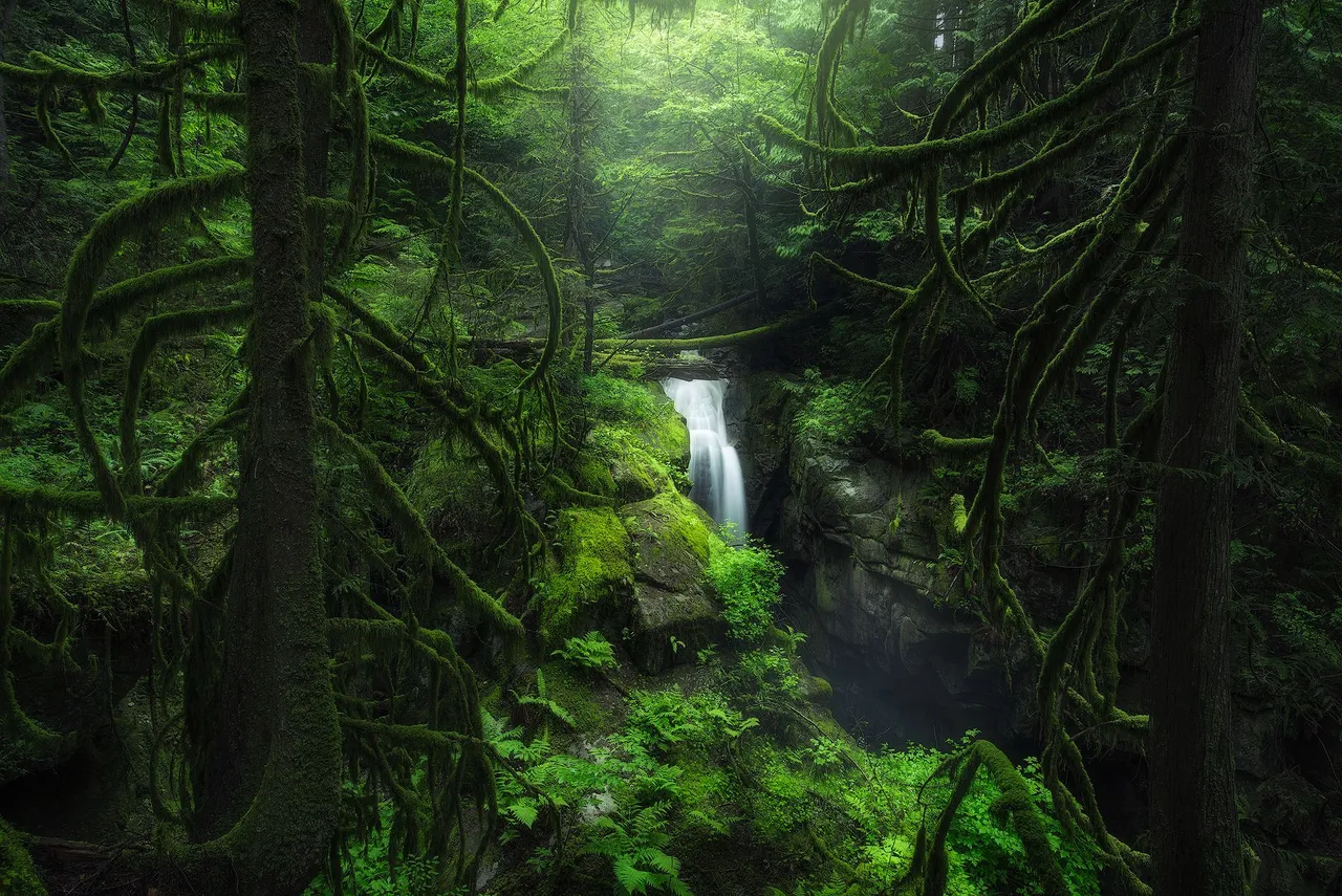
4. Natural Frames
You should always be on the lookout for natural frames, even though they're harder to find than leading lines. Often you may find yourself in a situation where you have an awesome frame... but nothing nice for it to frame! However, it's worth the effort because on the off chance that it all works out, it can create a really compelling image.
This first example is a good demonstration that it doesn't need to be anything crazy - here it's just a couple trees!
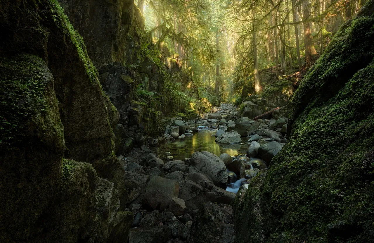
In the image below, I found a natural frame with really nice textures. Frames work really well if you can balance them using some of the things I talked about in the tips above. The background is warmer and softer, while the foreground is cooler and textured. To fully take advantage of this frame, I also did a focus stack to be sure the entire image was in focus.
5. Learn Your Location, Be Flexible
This piece of advice might feel a bit vague and less specific, but that's the point. I am not a person that plans out the majority of his images. I prefer to be flexible, keeping myself open to possibilities based on the light and my surroundings. In my opinion, there is no such thing as bad light! Some light may be bad for certain scenes, but there is always a scene that it is good for. It's simply a matter of being able to find it. For example, not every forest image needs to be foggy or filled with rays of light.
It was a partly sunny day, but that just meant I had to take a slightly different approach. I searched for compositions where the background was illuminated, with the foreground more in the shade. I worked with the light and took advantage of it, rather than being frustrated that there wasn't any mist. This was particularly important as this was my first time visiting this place - a location not very close to home.
I'm a big believer in getting to know your locations. I've visited my favorite places countless times, which allows me to search for things I may have missed. It also means if I see something that looks like it work well in different light, I can keep it in mind for a future visit!
Not everyone may have the luxury of getting to know a location. In that scenario, the latter half still applies: be flexible. Don't chase scenes that don't work with the light at hand and try to shoehorn them in. You'll almost certainly come away with a stronger image if you listen to the light.

This was taken on a day where the overall light was quite flat, and not conducive to wider scenes. So I zoomed in, focusing on the various textures and the reflected light from the water.
And that's it for today! If you've made it this far, thank you for reading. Please let me know if you have any questions, and if you'd like to see more blogs like this!
Find me elsewhere on the web:
Website: https://www.tristantodd.photography/
Twitter: https://twitter.com/tristan_todd_
IG: https://www.instagram.com/tristan.todd/