Hello Hive PH Community!
Before I discuss this logo rebranding, I would like to share that this is a personal project. I saw the @hiveph logo and the contest they were having over a week ago and had the time to actually make one.
I wouldn't be joining the contest due to the absence of the prize(s) to be won. I'd rather leave it to those who really made an effort to create a logo to join. However, I would highly suggest that for every contest like this, it would be a lot better to include the prizes in the information and not keep it a secret for the artists to weigh whether or not it's worth the time and effort. I have been in this industry enough to testify that logo design is indeed time consuming but I felt the challenge and also wanted to create a logo that might somehow reflect HivePH in just one look and at the same time be presentable on social media profiles.
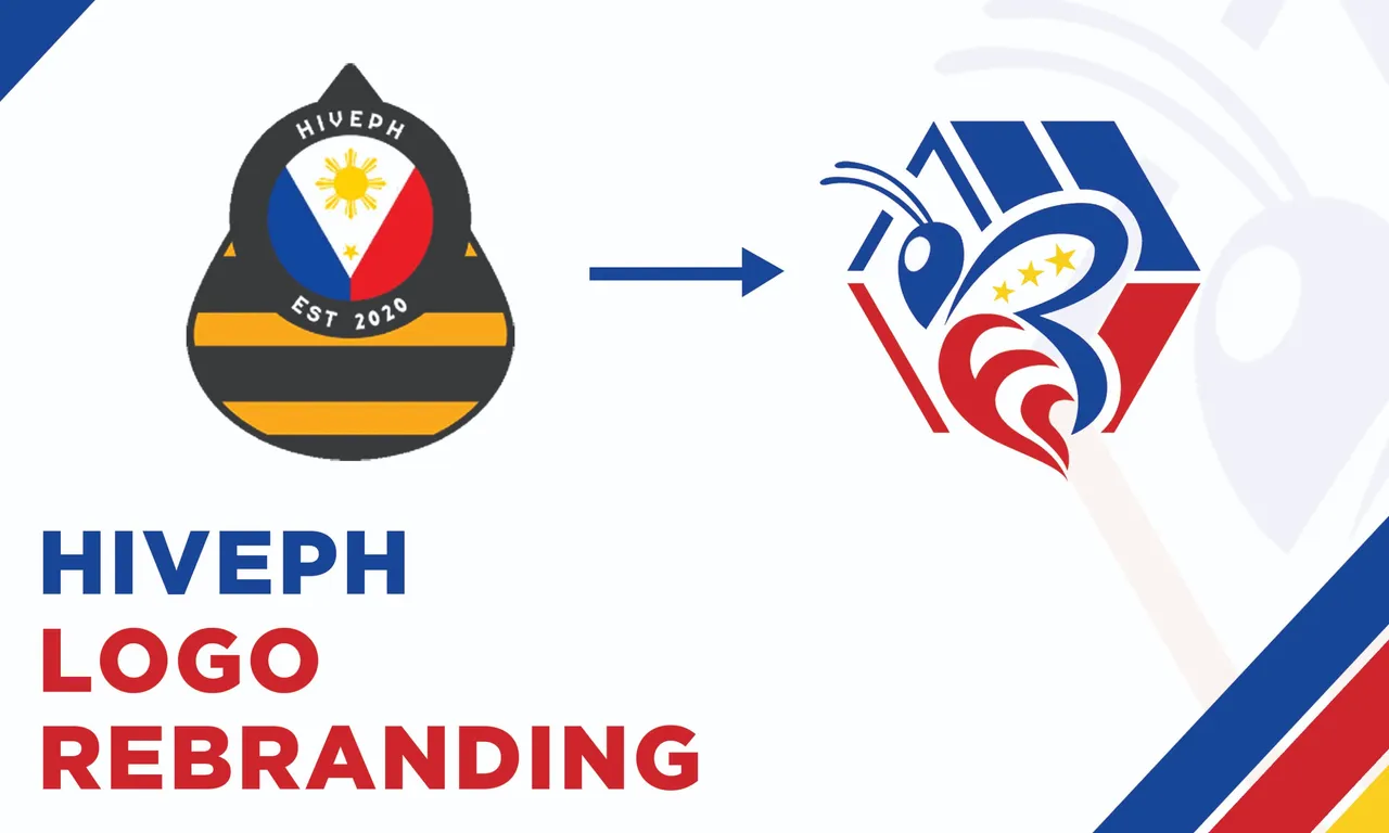
The Concept
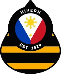
This is Hive PH's existing logo that they would like to have a makeover. Some elements and colors I took but went with the bolder path and mixed this with the existing Hive logo.
Them main elements would be the bee, the Hive logo and the Philippine flag.
I did not wanna mess with the flag so I just took its colors and the stars. As for the Hive logo, it was an inspiration as I wanted to use it as an enclosure for the bee. It took me a few tries and a bunch of different designs before finally deciding to stay with this path but I think I'm happy with what I came up with.
The Final Logo
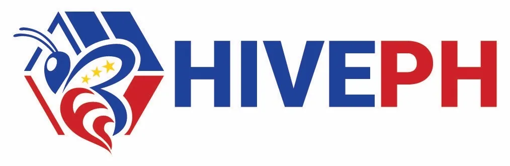
Here's the final product with the text. Thanks to @demotry for correcting me. I kept it simple so it's easier to read though I think the icon is strong enough to stand alone without the name.

Does it work? Please let me know in the comments!
That's all, thank you!