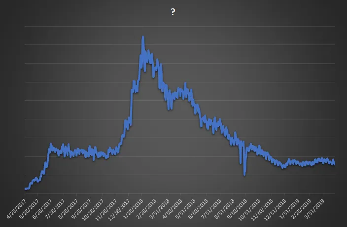
Does this chart look familiar to you?
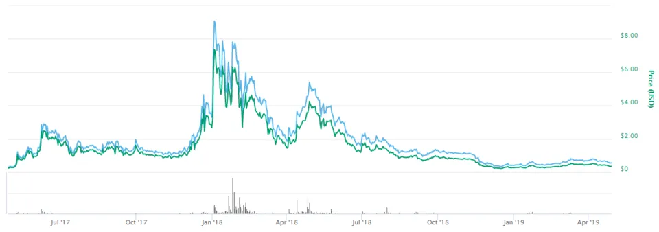
Looks a bit like this, doesn't it?
But it is actually...
So we are averaging around 8000/9000 daily unique posters/commentators at present.
Those are the daily counts though, what about the past week, fortnight, and month, etc?
7 days
select count(distinct author) from comments where created > getdate()-7
18446
14 days
select count(distinct author) from comments where created > getdate()-14
23720
28 days
select count(distinct author) from comments where created > getdate()-28
32402
On the 30th January 2018, 41288 accounts posted, the ATH. I posted on that day on one account.
In the past week, I have posted on abh12345, zapncrap (for actifit), steemcommunity (power-up league), and via automated comment on misterengagement, and on Thursday, all 4.
There were 8500 unique posters/commentators on Thursday. Remove promotion bots, community accounts, apps, other automated comments (bookkeeping, the spell-checker, etc), and how many individuals do you think posted?
8000?
4000?
2000?
This is in response to a message I received today - I'm pretty sure we don't have 500,000 active users, whatever you choose to base 'active' on.