In a world where we're constantly bombarded by a tidal wave of data, courtesy of tech giants, financial institutions, retail moguls, healthcare systems, and government agencies, it's abundantly clear that data reigns supreme. But, let's face it, not everyone is born with an innate ability to decode these data puzzles. And that's perfectly okay! This is where the captivating art of visualizing data comes into play, offering a lifeline for those seeking clarity amidst the data deluge.
Picture this: after immersing yourself in data-packed visuals for just three days, you'll find yourself retaining a remarkable 65% of the information, compared to a mere 10% from spoken words alone. In fact, MIT's research has illuminated that a staggering 90% of the information processed by our brains is delivered in visual form.
And here's where the hero of our story makes its grand entrance – IBM Cognos Analytics. Think of it as your trusty sidekick in the world of data. This innovative tool is designed to make data not just digestible, but downright delightful. With its arsenal of eye-catching visuals and brilliant insights, it transforms the daunting task of deciphering complex data into an exciting journey.
With IBM Cognos Analytics by your side, you'll unlock actionable insights that empower you to make savvy decisions and maintain a competitive edge in the ever-evolving business landscape. So, dive headfirst into the world of data with IBM Cognos Analytics and witness your data concerns vanish into thin air, paving the way for a brighter, data-driven future!
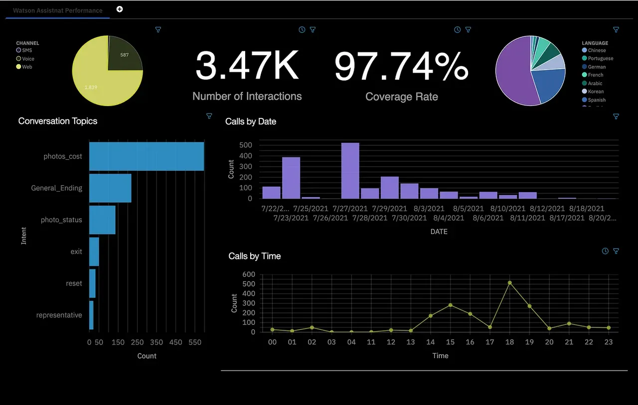
Let us take a look at IBM Cognos Dashboards User Guide: Revealing Percentages as our example for today!
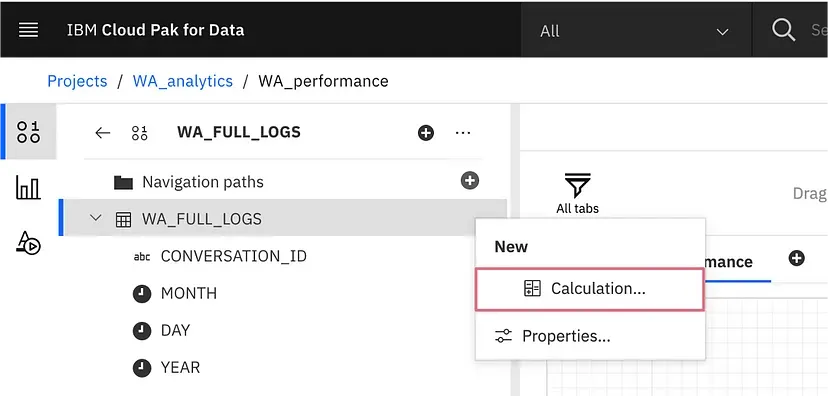
Step 1: Expand to Create New Calculation
To create a new calculation, open your data source and click the three dots next to the data source name.
Step 2: Putting in the Expression
Substitute your own table and column name for WA_FULL_LOGS.COVERAGE. We are using WA_FULL_LOGS.CONVERSATION_ID as the distinct identifier. In the provided expression, we are calculating the ratio of calls with "covered" in their COVERAGE field to the total sum of calls with "covered" and calls with "uncovered" in their COVERAGE field. To ensure the correctness of your expression, please click on the validation icon located in the top right corner. Once everything appears to be in order, click on OK to proceed.
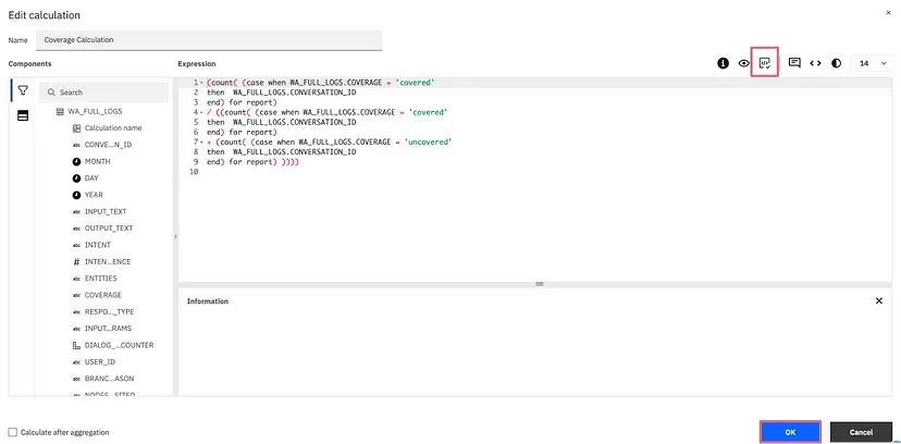
(count( (case when WA_FULL_LOGS.COVERAGE = ‘covered’
then WA_FULL_LOGS.CONVERSATION_ID
end) for report)
/ ((count( (case when WA_FULL_LOGS.COVERAGE = ‘covered’
then WA_FULL_LOGS.CONVERSATION_ID
end) for report)
+ (count( (case when WA_FULL_LOGS.COVERAGE = ‘uncovered’
then WA_FULL_LOGS.CONVERSATION_ID
end) for report) ))))
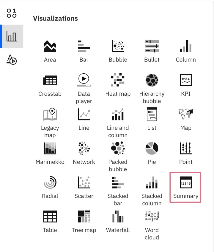
Step 3: Delving into Data Visualization
Navigate to the visualization tab and drag the "Summary" element onto your canvas to generate a visualization.
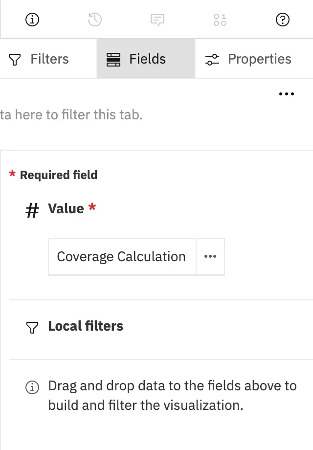
Step 4: Utilize Drag and Drop Method
Move the calculation you generated to the value field in the panel situated on the right-hand side.
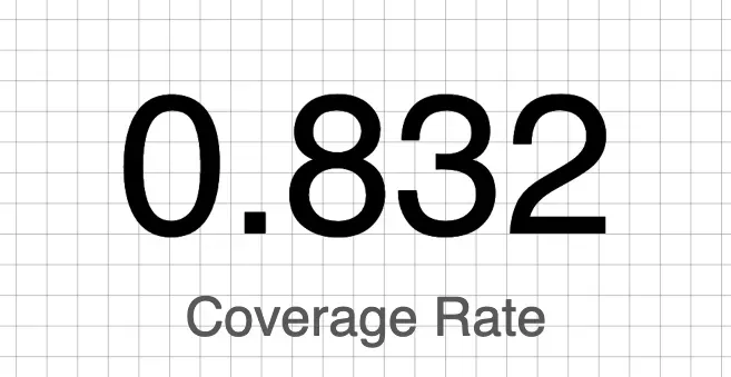
Step 5: Depicting Displayed Decimal Number
Currently, you'll notice that the number is displayed as a decimal. However, we want it to be shown as a percentage.
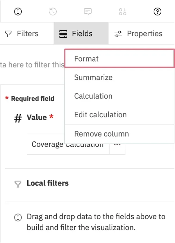
Step 6: Click "Format"
Select the ellipsis (three dots) located next to your field, and then choose "Format."
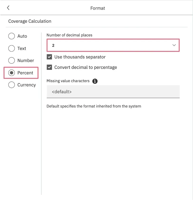
Step 7: Choosing the Right Format
Opt for the "percentage" format, and if desired, you can also specify the number of decimal places in this section.
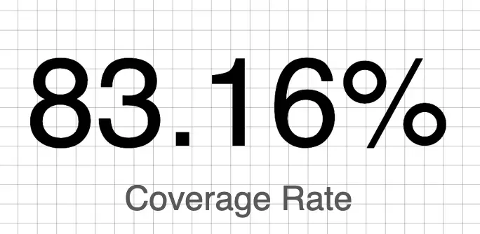
Step 8: Display Successful!
You have successfully displayed the calculated value as a percentage on your dashboard. Mission accomplished! Congratulations!
Conclusion
And that's it! We have gained critical understandings of the platform's capabilities after traversing this journey focused on IBM Cognos Analytics. First and foremost, we have a firm grasp on the relevance of custom calculations, knowing how to work with and extract useful data from this feature. Additionally, we've looked into the Cognos Analytics visualization development process and explored how to efficiently create data visualizations using the "Summary" element. We have learned how to format data as percentages, which is a critical skill for improving the readability and comprehension of data presentations. By mastering these stages, we were able to fully utilize IBM Cognos Analytics' capability to transform unstructured data into aesthetically appealing and educational displays, promoting more informed decision-making and efficient data communication. The skills we've acquired now enable us to effectively utilize IBM Cognos Analytics in a wide range of data analysis and reporting tasks!
Posted using Honouree