Data visualization is an essential part of data analytics as it allows for the presentation of data in a less technical manner through the use of graphs and plots. It shows performance results and statistical summaries of critical insights at a glance to help decision-makers make better decisions quickly and accurately. Data visualization tools vary from free downloadable software to premium web-based platforms. IBM Cognos is one of the popular web-based data dashboarding platforms employed by prominent organizations such as the United Kingdom's Ministry of Defence, Georgetown University in Washington, DC, and Hilton Grand Vacations in Orlando.
Navigating through IBM Cognos is easy and great for beginners. Recent activities and options for creating a new task are being shown in the platform dashboard. The user can upload their own datasets in Cognos. Comma-separated documents, Excel, and other delimited flat files are supported in the platform. There are also sample datasets that are available to be used in practicing making dashboards. It is a prerequisite to explore uploaded datasets to check if their properties match the requirements of the task. Users can modify column data types, add calculations, and even refine data by filtering.
The platform offers various templates that the user can choose depending on their desired dashboard layout. A drag-and-drop functionality is employed when adding graphs and charts, making it less intimidating to users, especially those without prior programming knowledge. Some of the common diagrams used in making dashboards are column charts, bar charts, line charts, tree maps, and scatter plots. Column and bar charts are often used interchangeably. Though both charts are used for the same purpose, bar charts are best suited for categories with long labels, while column charts are best suited for comparing data with short labels as this provides smaller label space, especially on the x-axis. Line charts are excellent for visualizing time series data to plot trends across several years. Moreover, a tree map chart shows the relationship between categorical variables by applying color coding and nested boxes. Boxes highlighted by the same color are within the same group, and the box size signifies the value. This type of visualization is excellent when dealing with a hierarchical kind of data or data with various categories.
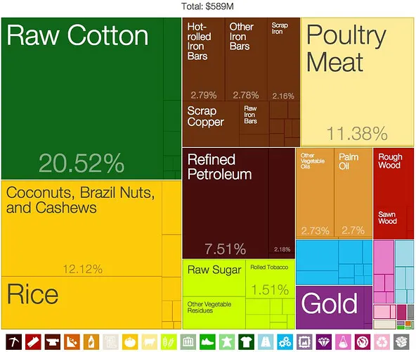
Figure 1. Tree Map Visualization
Image source: https://discourse.metabase.com/t/treemap-visualization/7598
Widgets, including text, images, and shapes, can also be added to the dashboard. In addition, users can customize the widgets to be consistent with the overall theme of the project. After creating the dashboard, it can be exported to a PDF file or a PowerPoint presentation. A data dashboard is an interactive presentation tool that allows you to filter data by categories or focus on a particular performance indicator during the presentation. They can also show real-time changes in the dataset, which are offered in a premium subscription.
IBM Cognos also provides data reporting, which presents detailed information about a topic. Reports differ from dashboards that provide a high-level overview or general insight into the organization's performances and data trends. Cognos reports can be separated into various tabs within one report file, which allows for a more focused description and disclosure of analysis per tab. Reports can also be linked to Jupyter Notebook, a powerful and popular integrated development environment (IDE) that supports Python. Analysis outputs from the Jupyter Notebook can be outputted in the report, and recent updates are included from the last time the notebook was run.
A free trial is given for 30 days for those who want to experience doing data visualization tasks before availing of the premium services. Dashboards and reports can also be shared with colleagues by placing them in the Team content folder.
Posted using Honouree