Hello Fellow Steemians!
So recently I got to know about this amazing project called The Steemit Newbie Resteem Initiative started by @mudcat36 supported by @davemccoy and @deliberator and various other founding members. Their aim is to help out newbies to get a hang of this site and get noticed.
Being a newbie myself, I found out soon enough that it's DIFFICULT to get noticed here. I'm an Artist, Animator and Designer and even though I'm not an Instagram sensation, I have a decent number of followers and the fact that I was struggling to get upvotes and struggling to understand the system that's been put in place got me feeling a bit down. but I decided to continue posting anyway.
But thanks to the initiative my recent posts are getting recognised a bit more and it is nice to see that we have lovely people ready to lend a helping hand, so I decided to do my bit and contribute by entering the logo contest.
Now as mentioned before, I'm not only an artist, but an animator and a designer, well I will be once I'm done with my ongoing last year of college and get my degree.I was taught to create multiple options and show them to the client so that the client can pick one or more elements he or she likes and work together with them to create the end product, but since we are short of time I decided to just come up with one end product.
so I applied the education I received from college and created a logo. And as usual, I have included the process, except this time its a breakdown of my thought process.
Process:
So first I scribbled up Steemit's logo and drew arms around it, they are holding on to each other symbolizing us, the community being united.
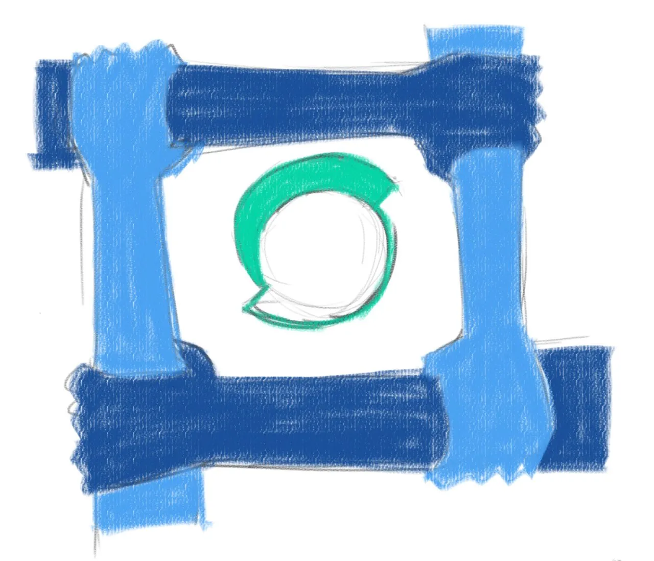
But I decided it wouldn't work as the key factor about logos is simplicity. Logos must be simple and easy to remember. eg:

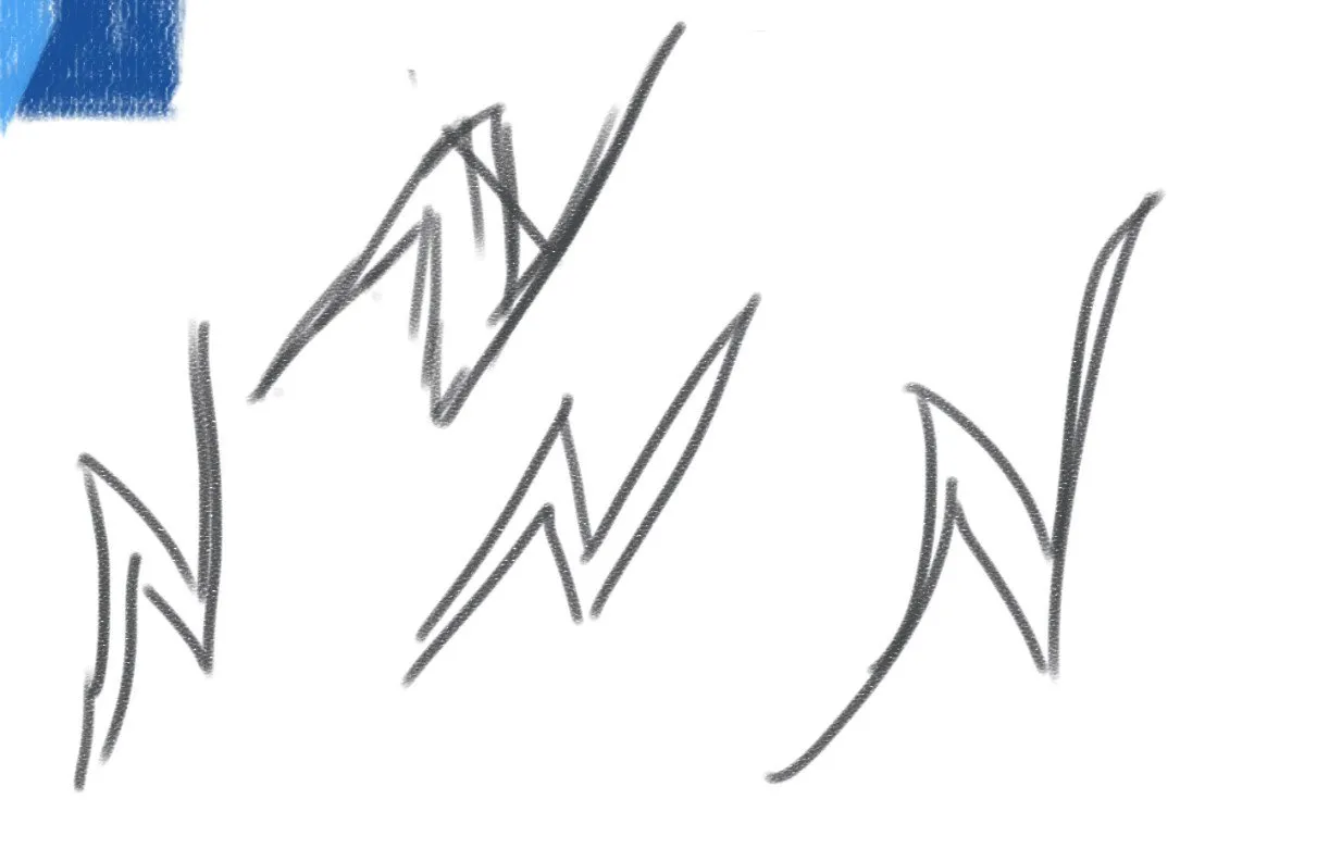
So I had to simplify it.
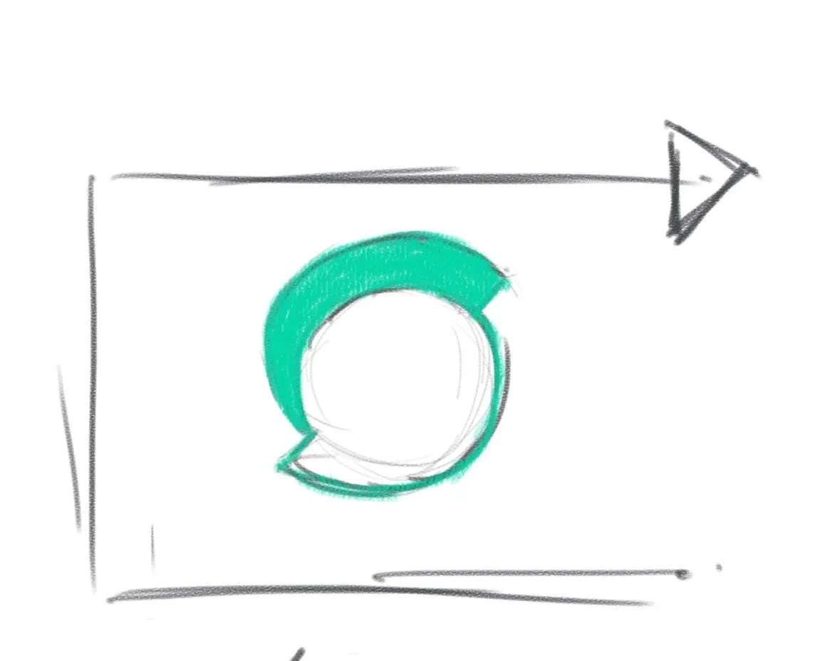
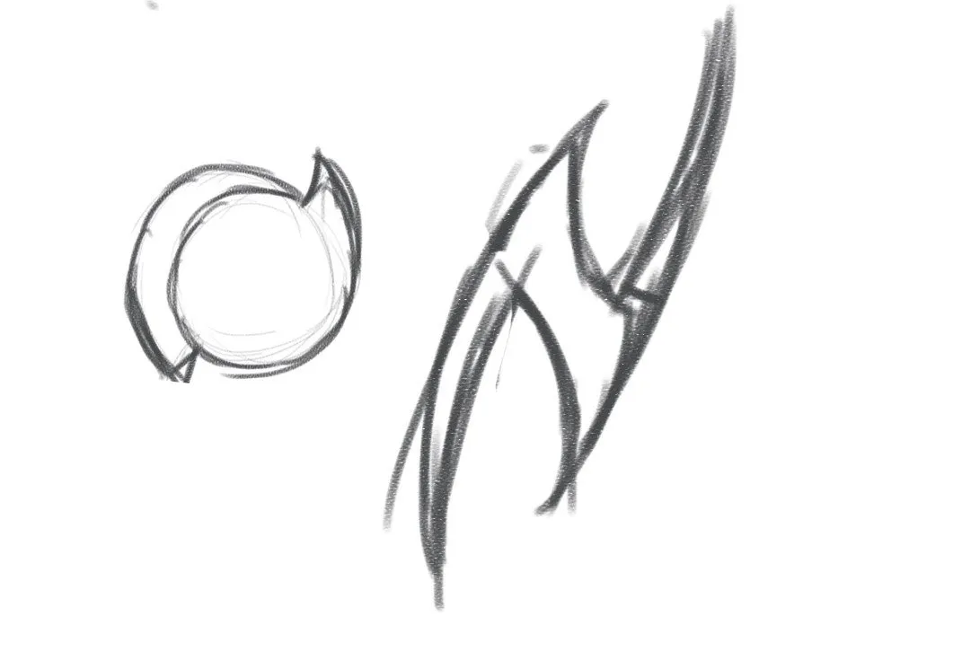
Then I used the Steemit logo and the resteem icon,still didn't seem original enough.
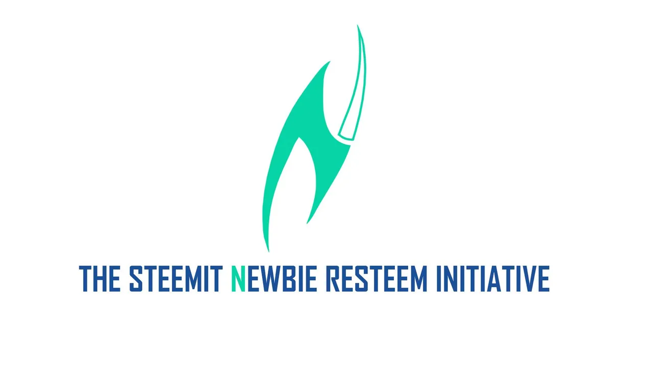
But then I noticed that if you flip and turn the Steemit logo it looks like an N. N for newbie. This initiative is for newbies, so I decided to create an N logo.
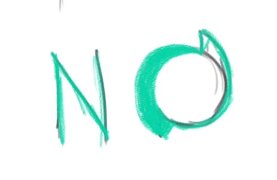
So the initiative resteems newbie posts to give them more power on the platform. Power, electricity. Electric bolts. So I decided to try and create an N in the form of an electric bolt.
I compared the electric bolt with the Steemit logo. I wanted the new logo to retain its essence of Steemit. Hence I added curves to it.
this is the final N logo.
hhttps://i.imgsafe.org/e4/e4432cc57a.jpeg
The N logo is basically a stylized electric bolt N. N for newbie. Electric bolt for the increase in power on the platform. Curves and the same colour scheme of the Steemit logo because it needs to show the essence of the platform.
It can be used by itself OR with a resteem icon around it as its a huge part of the initiative but I personally like it without it because simplicity.
So it can be like this:
Or like this:
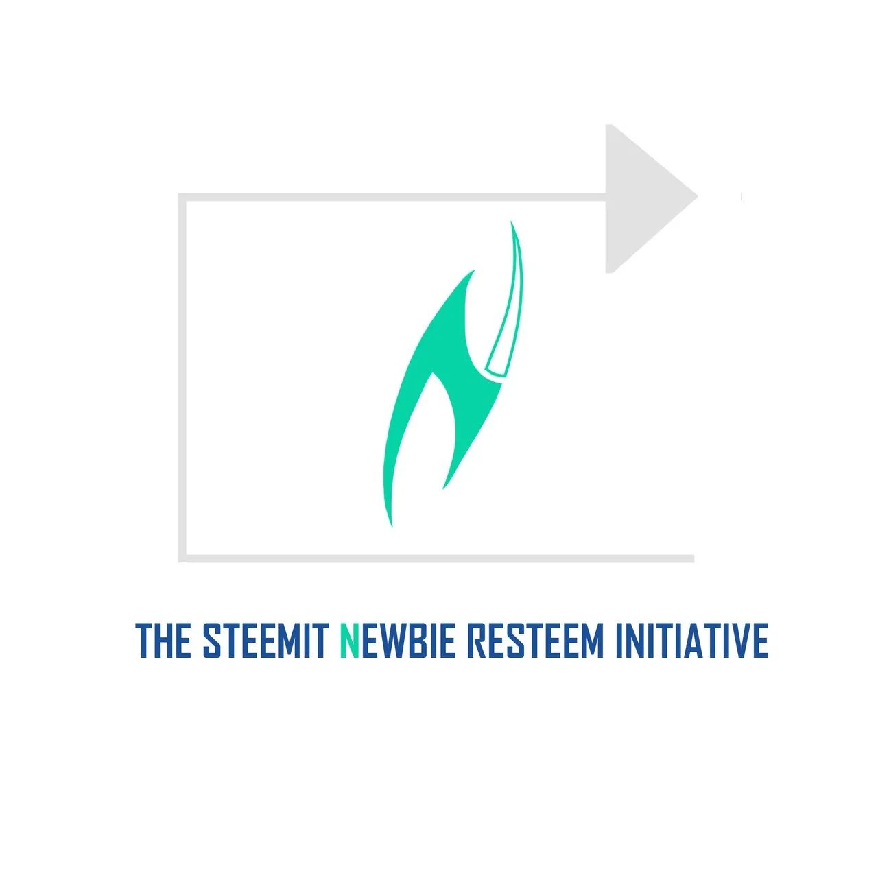
The text is blue , the same blue from the Steem logo.

And the "N" is the same colour as the logo because it makes a connection. N for newbie. The initiative was created to help newbies.
Of course the text , the colour , the font can be changed to however the client prefers it, but for now, this is my final product.
I hope you like my take on the logo. But as it is always said, may the best win.
If you liked what you just saw please upvote this post, leave a comment and please click follow!
Help a young artist on Steemit.
If you'd like to follow me on Instagram : https://www.instagram.com/krishnendu_kj/
Have a great day!