Hello to all art lovers on the internet !! I'm already a few days away from going on vacation, which I look forward to giving my guides a break and taking up some projects, which I have on hold ^ _ ^.
Seriously that I do not learn, it was supposed in theory that this was going to be one of the easiest guides to finish, but since it was an important topic I wanted to make it special, and I ended up complicating myself more, I even arrived late to work to be finishing it, as sometimes I say: "the world wants to give me roses, but I only want the thorns XD".
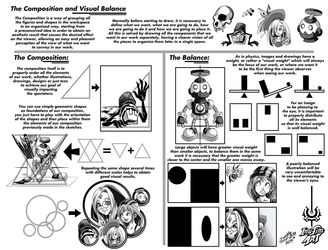
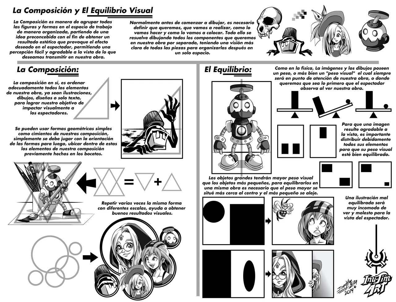
The theme of this guide is the most important when you want to make an illustration, poster, cover of a comic or book and you are going through a kind of blockade and ideas are not coming to your head, composition and Visual balance is everything when wanting to convey an idea visually, and using simple geometric shapes such as structures or molds to fill with our characters, we can create stunning images. At the time of making this guide I was only going to use drawings of characters in simple and basic structure, only made in lineart, but I think that for my students to better understand the concept of composition, it had to be with finished drawings, so look at my folder of old sketches and I decided to rescue and update these 5 characters that from now on will accompany me this guides, and anything else that I will explain on the network, especially the 3 girls. ^ _ ^
Pencil sketch of my guide
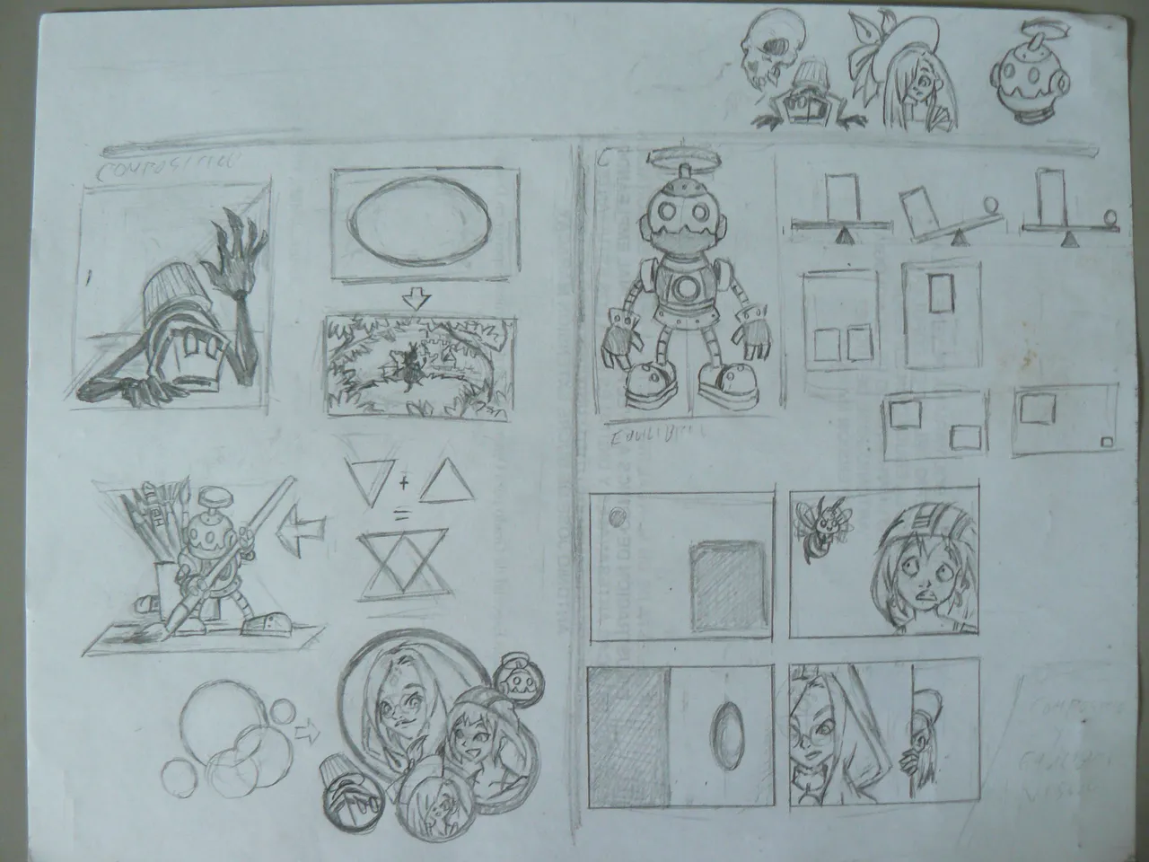

Any geometric shape is useful.
As you can see using basic geometric form, in this case the triangle, as a foundation or starting point for our drawing is very helpful to guide us to where our character in the format. (Fun fact, this character believes it in 2010)
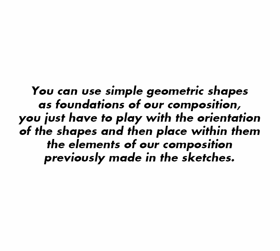
The idea is to use several geometric shapes in different positions, orientations or interlaced, and then fill each of them with characters and other elements of our ideas, or what we want to achieve or see in our final image, in case of having a blockage of ideas you can draw circles, triangles or squares at random, and then with the imagination see what elements could be accommodated within them.
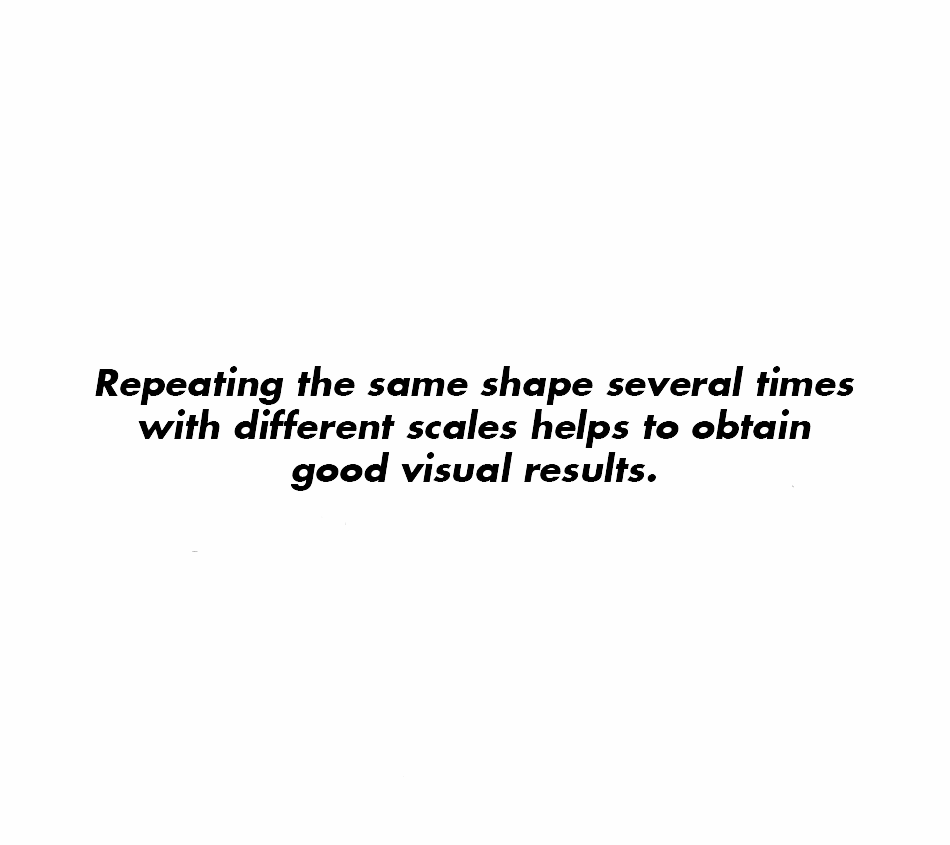
You can also use the same form and repeat it with different scales, with the intention of determining with its size that figure has greater relevance and importance in the image we wanted to capture, establishing a visual hierarchy to highlight a character with greater emphasis.
The Visual Balance
In each drawing or illustrated work that we are doing, regardless of whether it is symmetric or asymmetric, it must show a perfect balance in its elements distributed in the format.
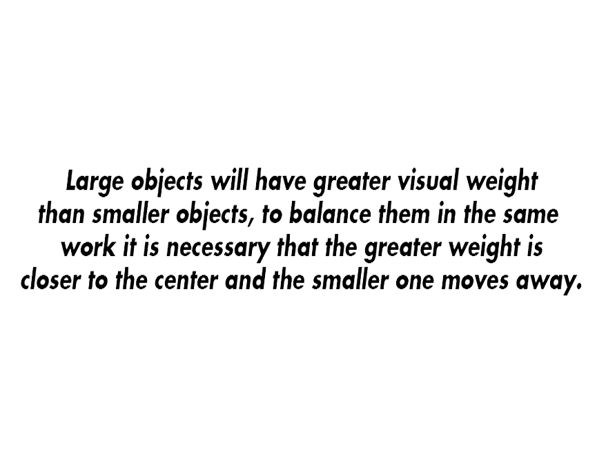
If you can balance a picture well, in the same work a tiny figure will have the same weight and attention as a huge figure, to achieve this you have to be careful with the distribution of both elements and in their tones, the small one must be darker and the large figure by obligation must wear light tones, and be closer to the center.
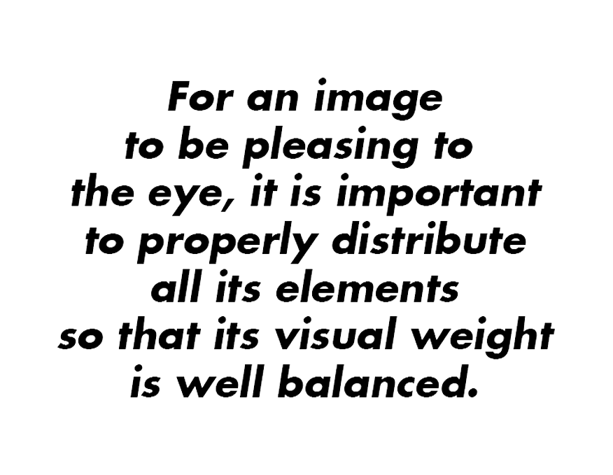
We as illustrators must make very harmonious visual works, which have a visual weight that is pleasing to the eye, so that the viewer clearly appreciates each of its elements and does not go unnoticed.
Technical information:
Digital vector drawing
Program used Adobe Illustrator CC 2015
Full resolution 4724 x 3602px at 300dpi
Spanish version
Thank you very much for reading my post
I hope you liked my Guide and find it very useful
See you in a next post
Inu-Jim
Copyright @inu-jim –Allrightsreserved
I hope you liked my Guide and find it very useful
See you in a next post
Inu-Jim
Copyright @inu-jim –Allrightsreserved