I came across this old chart on Twitter a while back, and I saved it because I believe it's a valuable resource for investors. In this post, I want to share this gem with you because it would be a shame to keep it to myself. Now, what is it all about?
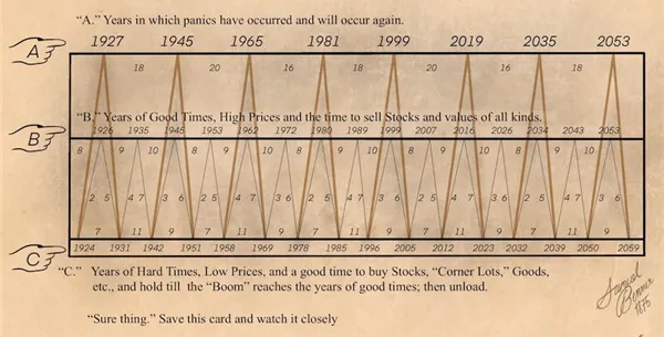
Back in the 19th century, an American pig farmer from Ohio called Samuel Benner may have discovered the secret patterns behind asset prices.
After seeing his own assets wiped out in the panic of 1873, he created a chart forecasting the rise and fall in the average price of hogs, corn and pig-iron, identifying an 11-year cycle in the former, as well as a 27-year cycle in the latter.
In 1875, he unveiled his 'magic formula' in Benner's Prophecies of Future Ups and Downs in Prices and since then, it's been spookily accurate at predicting the ups and downs of global stock markets, including the Wall Street Crash, the Second World War, and the dot-com bubble.
source
If the chart were five or six years old, I probably wouldn't pay it much attention. However, considering it was created in 1926 and many of its cycle peaks and bottoms have had real-life impacts on the stock market, I believe it's worth considering for medium to long-term investments.
I almost forgot about this gem, but while scrolling through my YouTube feed yesterday, I stumbled upon this video of Alessio Rastani, where the renowned market analyst provided an in-depth analysis of the chart's accuracy and shared his views on how the markets will unfold based on its predictions.
I don't have a strong background in market analysis, nor am I a seasoned investor, but according to Alessio, the graph, dating back to the late 1800s, accurately predicted the 2026 financial collapse, the dot-com bubble of the late '90s, and the 2008 financial crisis with a small margin of error.
It wasn't precise about the "local top" in 2016 when, according to the chart, one should have exited the markets. However, overall, it's a valuable tool when navigating the waves of the crypto and traditional markets for profit.
I mentioned crypto because, although it didn't exist when the chart was created, it's highly correlated with the stock market. Therefore, it makes sense for crypto enthusiasts like us to occasionally refer to the graph.
According to Benner, the year 2023 presents a promising financial opportunity to buy stocks and crypto, and in my opinion, that's not far from the truth. Bitcoin has already hit bottom, and many altcoins are down 80%-90% from their all-time highs, making current levels a smart entry point.
However, based on the long-defunct brilliant pig farmer's insights, 2026 should be a good year to sell. I don't consider the years on the graph to be 100% precise for identifying these potential tops and bottoms. Nevertheless, having been in crypto for a while and understanding how these cycles usually unfold, I believe that 2023 has indeed provided a favorable entry opportunity for numerous cryptocurrencies across the board.
When to exit? Personally, I don't expect 2026 to be the year for that. I believe the crypto market will peak around 2025, approximately 1.5 years after the halving, and I'll adjust my actions accordingly. If my price targets are reached earlier, I'll sell my coins sooner. No more emotionally driven strategies for me during this cycle.
I find Benner's work of art to be deserving of attention, and I thought I should share it with you here on @leofinance. What are your thoughts?
Thanks for your attention,
Adrian