 Aoi Ogata is best known for creating the character HateChan as a mascot for his signature art style. As a freelance digital artist that hosts a gallery of anime inspired monochrome gray digital artworks, he has built a name for himself in DeviantArt and other social media sites.
The thing that caught my attention most about this artist is the seeming simplicity of how they render forms with simple textures. If you examine his gallery, the portraits featured does appear identical to one another. However, I do note that some subtle differences in composition, facial expression, color scheme and pose let the each character live as a separate personality.
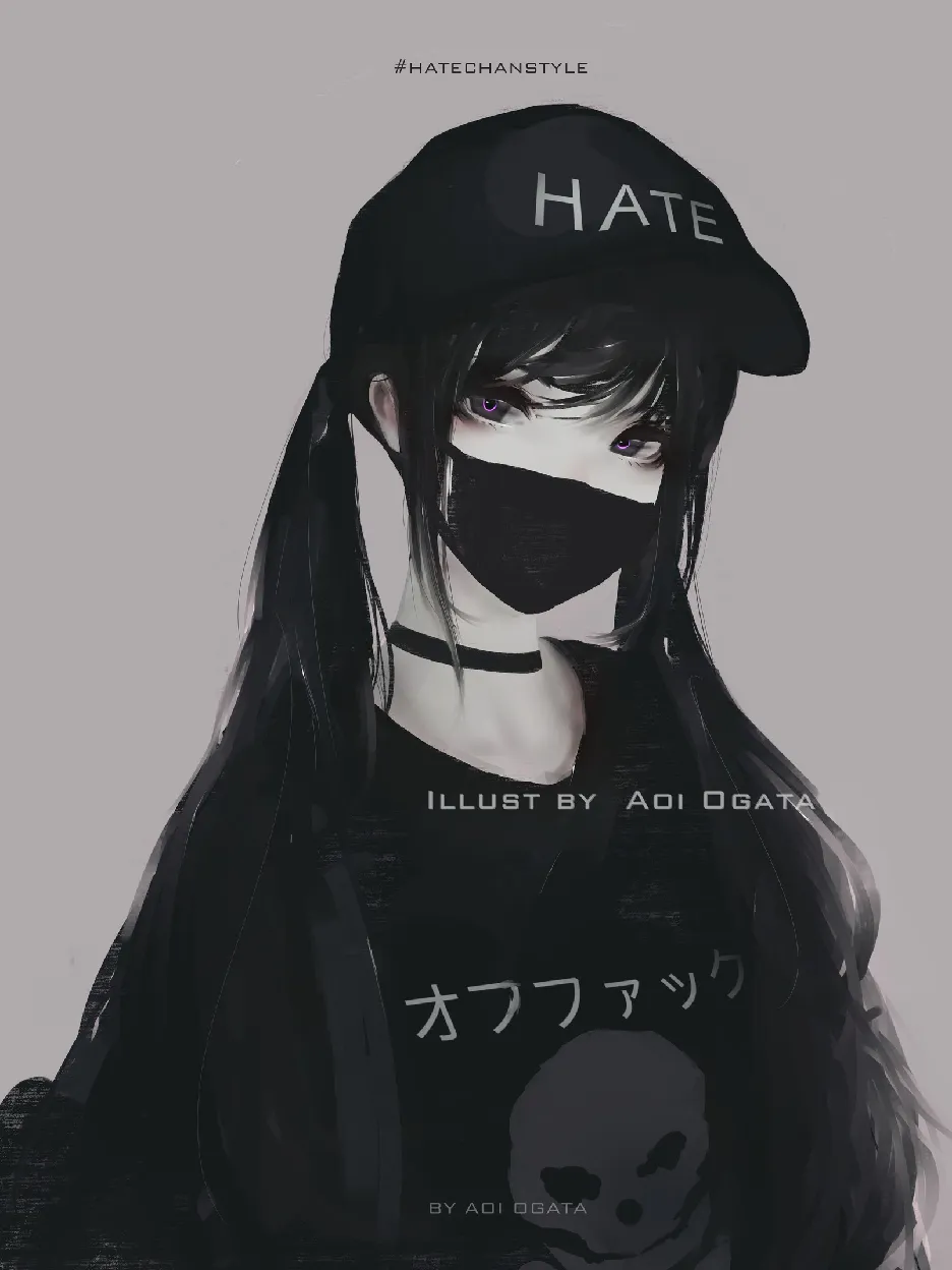
For instance, HateChan as his main recurring character, is known best for her portrayal as playful and mischievous persona. You’ll see this character give the middle finger or in masks that suggest defiance over something.
I can tell that Aoi Ogata draws in inspiration from various sources judging from his set of portraits. These include the large eyes made popular by korean fashion, mainstream anime, and video games. You can see some works containing strong semblance to popular characters only twisted to his own style. I do recommend taking your time examining those links as this helps you get closer to the artist’s thinking process.
It was serendipity that I got to encounter Aoi Ogata’s works when I had mistaken HateChan as a work of WLOP. WLOP is another artist I admire that is also known for their monochrome grayscale based digital artworks. Compared to WLOP, Aoi Ogata’s art involves establishing simple draft of his characters and followed up with focusing more detail on a focal point such as the eyes.
Another contrast worth noting is the use of highlights sparingly on his works. Aoi Ogata relies on giving the least amount of detail for parts of the piece where eyes are not expected to wander on. He makes good use of detail through putting in most effort on areas that the human eyes are naturally drawn to. Every portrait or character he makes always possesses eyes that could keep the audience examining in detail over the rest of the body parts.
The focus on putting a lot of effort on the parts of the head fit the type of art he promotes. I’ve only seen portraits of his characters. Unlike drawing action oriented visual art where visual effects that suggest motion is given focus, a portraits require the character to be static and this requires more emphasis on the details people would likely focus on.
The least amount of detail on unnecessary parts, korean fashion, non intrusive colors to the eyes, and in depth focus on creating those pretty eyes are what strongly defines his works over other artists out there.
I would liken this method to how a photographer makes use of their lens to focus on the eye candy details over and blur out the rest without sacrificing form. One only needs to block or use simple texture brushes to convey some depth to the clothing.
I wouldn’t recommend following his art style without getting the basics of painting with values. His style obviously deviates from the natural anatomical proportions. Before any artist pursues a unique art style of their own, they should at least be familiar with the rules they are breaking. I have no doubt that Aoi Ogata has spent a lot of time building a good foundation in proportion and mastering values.
Aoi Ogata is one of the many artists I draw inspiration from when coming up with my digital works. His color choices also resonates with my personal preferences and it gives me a direction on what route to go on as an artist. You can find out more about the artist from the following links below.
Visit our website · Follow us Steemit
Join Community Discord · Bounty Program: Topaz Token