So this is my very first post on the dapplr app since its launch a couple of weeks ago. I haven't been with my phone for about two weeks so I didn't get a chance to explore the app at its launch. However, I just got my phone back and I am playing around with the app.
For some time now I and many other hivians have been clamouring for a very intuitive and easy to use mobile dapp on the hive blockchain. There are some existing options but I never really got myself to using then. My favourite social dapp was patiko. I loved it for its simplicity and ease of use. As a mobile user then, it did make my experience a lot better. Unfortunately, the project was abandoned and I began having issues using the dapp. so you will understand my excitement when I heard about the development of a new mobile dapp. It is one of the projects I voted for.
At first glance, it looks really nice. I love the theme options--currently using the blue theme. Also, I like the fact that there is a night-mode(what app doesn't offer that these days?). This is one of the features I wanted on my favourite dapp patiko.
As an upcoming frontend developer, I do appreciate the work that has been done to create this app. However, I think they should have kept a few things very basic. Take for example the voting option.
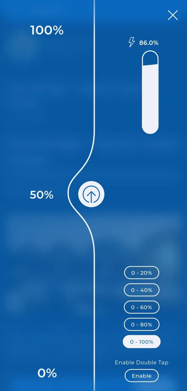
I dunno I find this a little off for some reason--moving to a new page to perform a simple task of voting on a post. Yes, it does look fancy and might appeal to certain people but I think a more simplistic and basic design like you would find on most webpages would have been great.
(Just noticed there is a double tap voting option)
The second thing I don't like would be the dapplr title sitting at the top the page. It is annoying. They could possibly do something different in the future. Maybe work on a log that can be strategically positioned somewhere on the page and its position isn't fixed permanently in the sense it remains always-on display even when strolling.
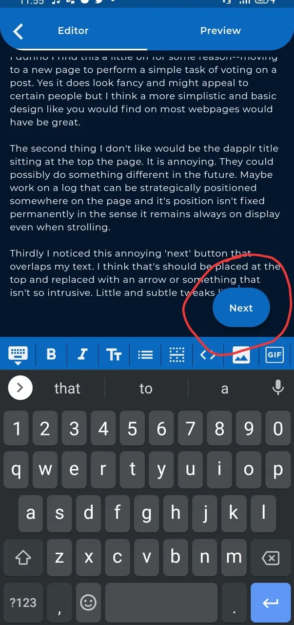
Thirdly I noticed this annoying 'next' button that overlaps my text. I think that's should be placed at the top and replaced with an arrow or something that isn't so intrusive. Little and subtle tweaks like this will help improve the overall experience using the dapp.
Notwithstanding, I think dapplr is a nice app. I have been using it for about 2hours plus and I haven't had any lagging issue(s). The interface looks nice which is a major appeal to me. It is refreshing having a better mobile experience while exploring the hive blockchain. I hope to see more mobile dpapps like this in the future. I also love the fact that they were able to integrate the hivesigner which reduces the risk of having to input your hive private/posting key repeatedly, that's a plus for me.
So I am going to spend more time exploring the dapplr dapp. Hopefully, if I find out anything worth sharing about the dapp I make another post. Cheers!