Christmas is upon us and I reckon we should all give away SBD instead of the usual cold hard cash or standard store voucher. (Many thanks to @dreamiely for the inspiration!)
Here are my reasons why I think giving SBD instead of fiat is a great idea this Christmas.
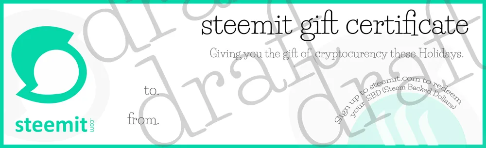
The Gift of Cryptocurrency.
I'm pretty sure most of the planet has heard about Bitcoin by now and through that the word "cryptocurrency." I'm also pretty sure most of them are all WTF about it, some would probably be keen if it didn't seem too intimidating. This is where Steemit shines like a beautiful beacon of crypto hope. And if they haven't heard of cryptocurrency, today is their lucky day! Right?Money
Let's be real now. It's very rare that people will say 'No' to money. It's just how it is. If you tell them that x amount SBD on that certificate can one day be worth 5 times the amount - Do you think they'll be interested to learn more?As Steemians
As Steemians, PROUD Steemians, not only should we be able to preach the word of Steemit to all, but it is actually in our best interest to do so as shareholders of the platform. You want that x5 to happen we need more contributing members on the platform and to achieve that we all have to pitch in and spread the word.Back to 2)
Here is a scenario. You give someone SBD for Christmas in 2017. Just say you have a newborn nephew, first Christmas Aunty Arly goes ahead and gives baby 100SBD, puts it in an account and that amount just sits there forgotten until a few years later it's remembered.
I imagine a world where, in my scenario, that amount would be huge. Like if you forgot you had a bitcoin and found it right now. Wouldn't you be cheering? I would be!
Obviously this was a great idea and needed to be done so....
Step 01. Begin!
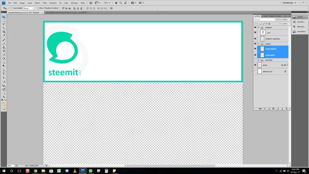
I wanted to be able to fit 4 vouchers on a single A4 page. You know, save trees and all that, and began with a quarter of the page first and filled it with white to act as the BASE.

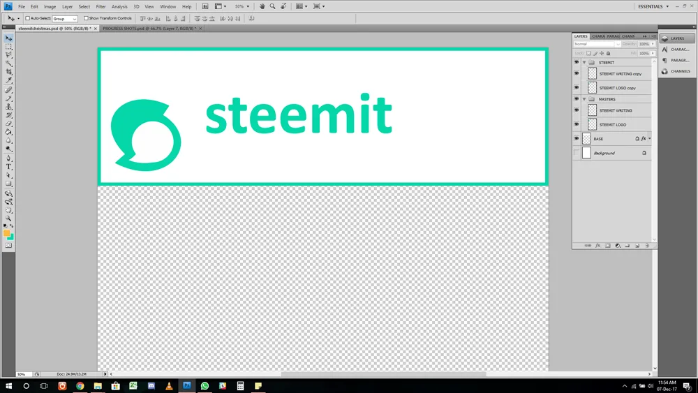
Step 02. Find the new Steemit logo
I did a search, found it via this post, saved it and inserted it into my work.
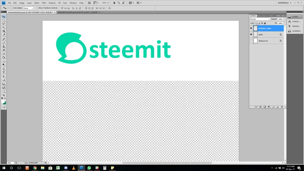
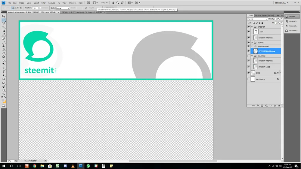
Step 03. Separate the saved image
The saved image is of the logo with Steemit written beside it. I cut the text and pasted it into it's own layer so I can work on each component on their own. This change is reflected in the layers section.

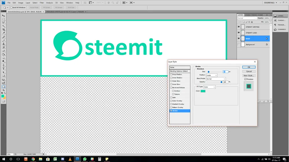
Step 04. Add a border
I went back to the BASE layer, added a border using the Stroke--Inside--100% Opaque and used the eyedropper to select that delicious Steemit teal as the border colour.
Step 05. Copy layers & organise them
I then proceeded to copy the Steemit text and logo and dragged them into MASTER folder. This is so just in case I make a wrong move I still have my original sources 😊. Now I have my originals and I also have another folder labelled STEEMIT which will contain the Steemit logo & text that I will be working on from here on in.
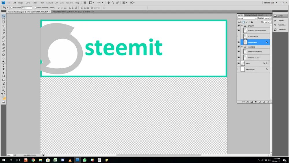
Step 06. Add dimension
So you guys know we can't be messing around with the new Steemit logo right? By that I mean, no touching any of it. Like, we leave that mohawk looking thing AS IS 😆
I'm sorry, I couldn't resist a dig at it. But now that we are all stuck with it, lets grow to love it. How about that spanking green right?!! 😍
With that in mind I created a copy of the LOGO layer, coloured it grey to complement the green and enlarged it just to add another dimension to the design without getting slapped for messing around with the logo.
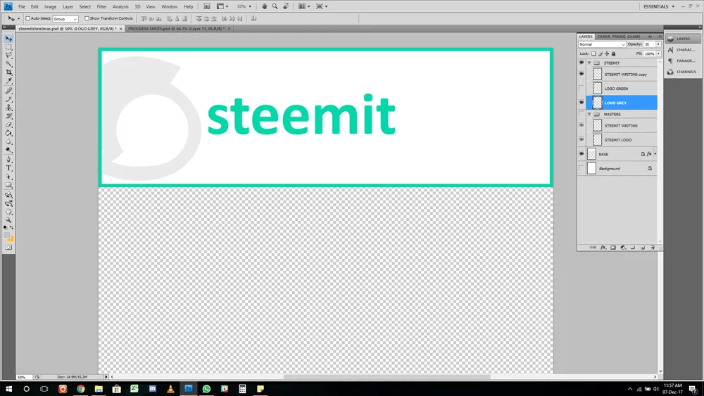
Step 07. Fix it up a bit
I reduced the LOGO GREY layer to 30% opaque making it much lighter. I also moved it to the side and cut the bit of the logo that crossed the border. If I had left it there, there would have been a dark patch over that side and I wanted a clean border so it had to go. I also had to drag the grey logo to the side where I can further crop bits of the logo that will be unseen on the design - just because my ocd kicked in.
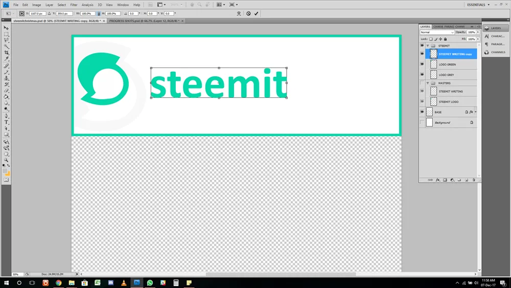
Step 08. Organise logo and text
Now that he grey logo is positioned I brought the other logo back up to view so I can begin scaling down the text to fit in line with it.
Step 09. More organising and adding .com
With the Steemit text reduced down to size I felt any smaller and it would be visually out of whack, so adding .com along side it was not going to work but .com absolutely has to be there so people know what to type on their phones when they look it up on the spot. I did a little design fix and chucked it on it's side.
Step 10. Brand recognition
We all about brand recognition right now. If we're not we should be. We want everyone to see that mohawk (& that luscious green) and think STEEMIT!
So repeat Step 07.
Step 11. This could be toeing the line a bit.
Note: I missed a few screen shots, sometimes the process happens so fast, it's actually quite painful to keep taking screen shots, but today I will be a true blue Steemian and make an effort.
If you see below not only did I throw some writing in there, I also added a few things to the Steemit logo like a lighter teal where the white is (just to add another teal pop in there to remind our viewers what our colour is). I saw that space where people can write their own amounts in and felt it was appropriate to throw the STEEM logo in there.
Is this going to be a problem? Big boo boo?
It eventually turned into this...
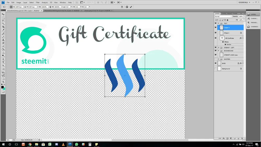
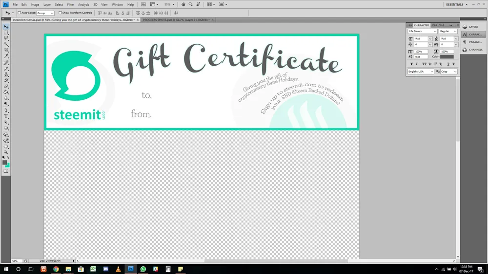
Step 12. Add writing
At this stage the font I was using for 'Gift Certificate' was driving me batty, not even extending the width or the spacing between letters or a curve could fix how this font was making this design feel but I had to move past that and think of what to write.
To & From seemed like a good start.
'Giving you the gift of cryptocurrency these Holidays.' sounded good.
And of course they need to know they need to sign up to redeem their certificate.
How it's all hanging on there feels wrong though.
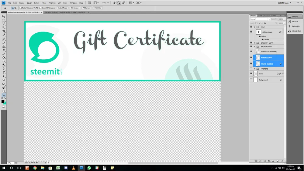
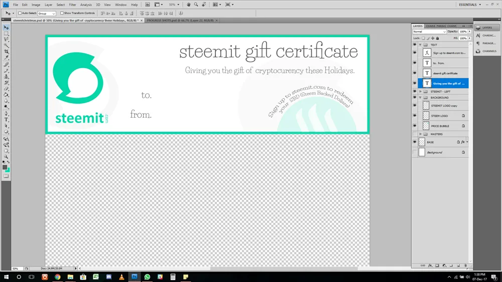
Step 13. K.I.S.S
When in doubt I K.I.S.S (Keep It Simple Stupid).
The big font had to go. Streamline the fonts and just use two and a smaller size one that allows the Steemit text and logo jump out at the screen.
I also turned the opaque right down on the modified mohawk (Step 11) so you can barely see it but still manages to hint at the Steemit logo shape.
Close up!
As I look at it now, I see the Steemit logo and the text needs aligning. Possibly change the font, although it's kinda growing on me. The 'Sign Up to steemit.com' text could possibly look better as fine print around that semi circle. I can also remove the second grey logo so I'm not stepping on toes. AND I think it needs to look more festive.
YUP. Definitely on draft stage.
This is where ya'll come in.
What else do we want to write on this?
How will it work? Do we pre-sign them up and write down their passsword at the back of the certificate? Or they can sign up on their own, if so how do they claim their sbd?
Ideas? Please pop them in the comments and lets work this thing out.
💗Arly