Let us reproduce the next chart in the @arcange's report - the distribution of post counts by category.
Before we start, we prepare the workspace as usual (see the previous posts in the series for additional context: 1, 2, 3):
%matplotlib inline
import sqlalchemy as sa, pandas as pd, seaborn as sns, matplotlib.pyplot as plt

sns.set_style()
e = sa.create_engine('mssql+pymssql://steemit:steemit@sql.steemsql.com/DBSteem')

def sql(query, index_col=None):
    return pd.read_sql(query, e, index_col=index_col)
As we know from the previous episode, all posts and comments are recorded in the TxComments SteemSQL table. If we are only interested in posts (and not comments), we should only leave the records with an empty parent_author. We should also drop rows, where the body starts with @@, because those correspond to edits.
Finally, the main category of the post is given in its parent_permlink field. This knowledge is enough for us to summarize post counts per category (leaving just the top 20 categories) as follows:
top_categories = sql("""
    select top 20
        parent_permlink as Category,
        count(*) as Count
    from TxComments
    where
        parent_author = ''
        and left(body, 2) <> '@@'
    group by parent_permlink
    order by Count desc
""", "Category")
To plot the results:
ax = top_categories.plot.bar(figsize=(7,3), ylim=(0,200000));
for i,(k,v) in enumerate(top_categories.itertuples()):
    ax.annotate(v, xy=(i, v+25000), ha='center', rotation=45, fontsize=8)
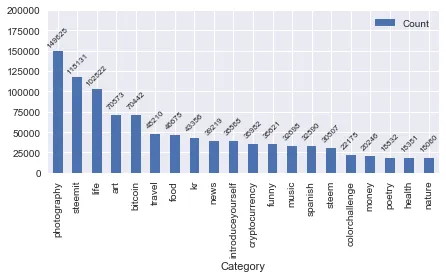
Note that the values are (again) slightly different from what we see in the most recent report by @arcange. Hopefully @arcange will one day find the time to explain the discrepancy here.
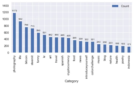
If we wanted to limit the statistics to just one day, we could simply add an appropriate where clause to the SQL query:
top_day_categories = sql("""
    select top 20
        parent_permlink as Category,
        count(*) as Count
    from TxComments
    where
        parent_author = ''
        and left(body, 2) <> '@@'
        and cast(timestamp as date) = '2017-08-10'    -- This line is new
    group by parent_permlink
    order by Count desc
""", "Category")

ax = top_day_categories.plot.bar(figsize=(7,3), ylim=(0,1500));
for i,(k,v) in enumerate(top_day_categories.itertuples()):
    ax.annotate(v, xy=(i, v+50), ha='center', fontsize=8)
This concludes the set of various "post count" charts you may find in the @arcange reports. In the next episode we will be reproducing the reputation distribution charts.
The source code of this post is also available as a Jupyter notebook.