Today we will examine the distribution of voting power among active Steemit users.
Preparation
Before we start, we prepare the workspace as usual (see the previous posts in the series for additional context: 1, 2, 3, 4, 5):
%matplotlib inline
import sqlalchemy as sa, pandas as pd, seaborn as sns, matplotlib.pyplot as plt

sns.set_style()
e = sa.create_engine('mssql+pymssql://steemit:steemit@sql.steemsql.com/DBSteem')

def sql(query, index_col=None):
    return pd.read_sql(query, e, index_col=index_col)
Vesting Shares and Steem Power
As we know from the previous episode, SteemSQL maintains the current state of all Steem accounts in the Accounts table. The current voting power (aka STEEM POWER) of each account is maintained in the vesting_shares field of this table:
sql("select name, vesting_shares from Accounts where name = 'konstantint'")
| name | vesting_shares | |
|---|---|---|
| 0 | konstantint | 914600.995558 VESTS |
A couple of things to notice here. Firstly, rather than storing the value as a decimal, the database maintains a string of the form "xxxx VESTS". Just to be sure, let us check that indeed all records are in this form:
sql("select count(*) from Accounts where right(vesting_shares, 6) != ' VESTS'")
| 0 | 0 |
|---|
Good. We may safely convert vesting_shares to a float by simply dropping the last 6 characters:
sql("""select top 3
    name,
    cast(left(vesting_shares, len(vesting_shares)-6) as float)
from Accounts""")
| name | ||
|---|---|---|
| 0 | a00 | 51459.530130 |
| 1 | a-00 | 12422.163690 |
| 2 | a000346 | 1035.984522 |
The second thing worth noticing is that the number of vesting_shares is not exactly equal to the STEEM POWER one may see in their profile page. Indeed, the number of VESTS per each unit of STEEM POWER is configured by the steem_per_mvests setting in the blockchain configuration. We can find on SteemD that its current value is 484.529. Consequently, if I wanted to obtain the exact amount of STEEM POWER in my own account, I could do it using the following query:
sql("""
select
    name,
    cast(left(vesting_shares, len(vesting_shares)-6) as float)*484.529/1000000 as SP
from Accounts
where name = 'konstantint'""")
| name | SP | |
|---|---|---|
| 0 | konstantint | 443.150706 |
This does match the number I see today on the Wallet page. However, this was a diversion from our main goal: reproducing the distribution of accounts by their "Level" of voting power.
User Levels
The "Level" of a user is defined by the creators of SteemitBoard as follows:
- 0 <=
vesting_shares< 1M: "Red fish" - 1M <=
vesting_shares< 10M: "Minnow" - 10M <=
vesting_shares< 100M: "Dolphin" - 100M <=
vesting_shares< 1G: "Orca" - 1G <=
vesting_shares: "Whale"
In addition, the SteemitBoard site defines an account to be a "dead fish" if it had no activity for at least 7 days, no matter how much VESTS it has.
First, let us practice counting the "dead fishes". For this we need to note that the Account table keeps two helpful fields: last_vote_time and last_post. Consequently, here is the total number of dead fishes as of today:
sql("""
select count(*) as DeadFishes
from Accounts
where
  last_post < dateadd(day, -7, cast(getdate() as date))
  and last_vote_time < dateadd(day, -7, cast(getdate() as date))
""")
| DeadFishes | |
|---|---|
| 0 | 258229 |
Now, sorting users by their vesting_shares into levels, taking liveness into account, could, for example, be done with a couple of CTEs as follows:
levels = sql("""
declare @weekAgo date = dateadd(day, -7, cast(getdate() as date));

with Data as (
    select
        iif(last_post < @weekAgo and last_vote_time < @weekAgo, 1, 0) as Dead,
        cast(left(vesting_shares, len(vesting_shares)-6) as float) as Vests
    from Accounts),

Levels as (
    select
        case when Dead = 1 then 0
             when Vests < 1000000 then 1
             when Vests < 10000000 then 2
             when Vests < 100000000 then 3
             when Vests < 1000000000 then 4
             else 5
             end as Level,
         Vests
     from Data)

select Level, count(*) as Count from Levels
group by Level order by Level
""", "Level")
levels
| Count | |
|---|---|
| Level | |
| 0 | 258229 |
| 1 | 44845 |
| 2 | 2594 |
| 3 | 736 |
| 4 | 142 |
| 5 | 20 |
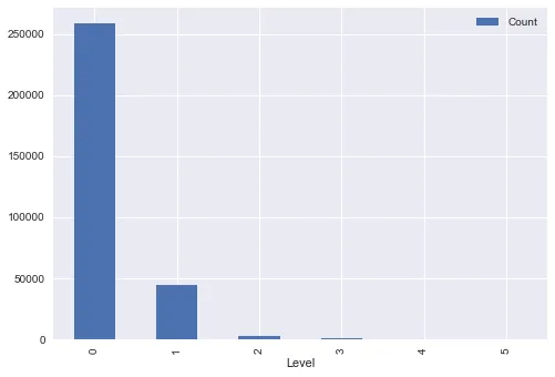
Plotting
We can plot the data as usual:
levels.plot.bar();
In his reports, @arcange also adds "level badges" (as used in SteemitBoard) to the chart for added cuteness. Let us do it as well.
First we need to get the images. Some browsing around SteemitBoard tells me I could probably take the necessary images from the profiles of the users at the corresponding levels. Hence, for now the following URLs seem to correspond to the six different "fish" badges.
f0 = "
f1 = "
f2 = "
f3 = "
f4 = "
f5 = "
urls = [f0, f1, f2, f3, f4, f5]
Let us use scikit-image (already available in the Anaconda Python distribution) to load these images and AnnotationBbox to insert them into the plot instead of the X-axis labels:
from matplotlib.offsetbox import OffsetImage, AnnotationBbox
from skimage import io

imgs = [io.imread(url) for url in urls]
ax = levels.plot.bar(figsize=(8, 4), ylim=(0, 280000))
plt.xlabel("Level", labelpad=40)
plt.xticks()

for i,v in enumerate(levels.Count):
    ax.annotate(v, xy=(i, v+5000), ha='center')
    oi = OffsetImage(imgs[i], zoom = 0.15)
    box = AnnotationBbox(oi, (i, 0), frameon=False, box_alignment=(0.5, 1))
    ax.add_artist(box)
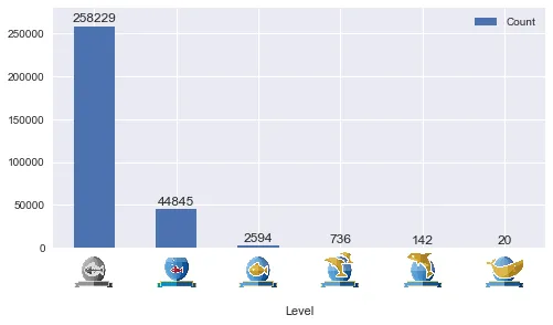
Once again, the numbers differ slightly from what @arcange shows in his reports. Let us hope this mystery will be resolved one day.
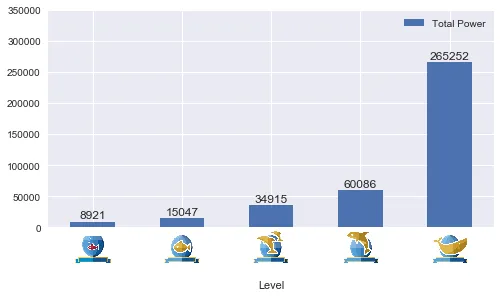
Total Voting Power per Level
Finally, let us compute the total sum of vesting_shares within each level (@arcange calls this chart "Cumulative Voting Power", but I feel that the word "Cumulative" is misleading).
We will reuse the CTE-based query we made above:
total_power = sql("""
declare @weekAgo date = dateadd(day, -7, cast(getdate() as date));

with Data as (
    select
        iif(last_post < @weekAgo and last_vote_time < @weekAgo, 1, 0) as Dead,
        cast(left(vesting_shares, len(vesting_shares)-6) as float) as Vests
    from Accounts),

Levels as (
    select
        case when Dead = 1 then 0
             when Vests < 1000000 then 1
             when Vests < 10000000 then 2
             when Vests < 100000000 then 3
             when Vests < 1000000000 then 4
             else 5
             end as Level,
         Vests
     from Data)

-- The line below was modified
select Level, sum(Vests)/1000000 as [Total Power] from Levels
group by Level order by Level
""", "Level")
Some final copy-paste programming to plot the results:
ax = total_power.plot.bar(figsize=(8, 4), ylim=(0, 300000))
plt.xlabel("Level", labelpad=40)
plt.xticks()

for i,v in enumerate(total_power['Total Power']):
    ax.annotate(int(round(v)), xy=(i, v+5000), ha='center')
    oi = OffsetImage(imgs[i], zoom = 0.15)
    box = AnnotationBbox(oi, (i, 0), frameon=False, box_alignment=(0.5, 1))
    ax.add_artist(box)

Now this is very different from the picture in @arcange's report. I suspect the reason is that @arcange is sorting the bars incorrectly (so that the tallest, "Dead fish" bar is accidentally shown as the "Whale" category).
Update: According to @arcange's comment he only includes "red fishes" in the "dead fish pool" in the latter chart. In principle, it makes sense. In fact, it might make most sense to disregard the "liveness" aspect in this chart at all:
total_power2 = sql("""
declare @weekAgo date = dateadd(day, -7, cast(getdate() as date));

with Data as (
    select
        iif(last_post < @weekAgo and last_vote_time < @weekAgo, 1, 0) as Dead,
        cast(left(vesting_shares, len(vesting_shares)-6) as float) as Vests
    from Accounts),

Levels as (
    select
        case when Vests < 1000000 then 1   -- The previous line removed
             when Vests < 10000000 then 2
             when Vests < 100000000 then 3
             when Vests < 1000000000 then 4
             else 5
             end as Level,
         Vests
     from Data)

select Level, sum(Vests)/1000000 as [Total Power] from Levels
group by Level order by Level
""", "Level")

ax = total_power2.plot.bar(figsize=(8, 4), ylim=(0, 350000))
plt.xlabel("Level", labelpad=40)
plt.xticks()

for i,v in enumerate(total_power2['Total Power']):
    ax.annotate(int(round(v)), xy=(i, v+5000), ha='center')
    oi = OffsetImage(imgs[i+1], zoom = 0.15)
    box = AnnotationBbox(oi, (i, 0), frameon=False, box_alignment=(0.5, 1))
    ax.add_artist(box)
Now we see how the few whales do rule the ocean here (although we also know that disproportionately many of them are "dead").
The source of this post is also available as a Jupyter notebook.
In the next episode we will chart the payout statistics, stay tuned.