Hello, I will show you the process I followed to create my entries for Ragnarok Logo Contest.
First I selected some fonts that I counsidered could represent the Ragnarok identity:
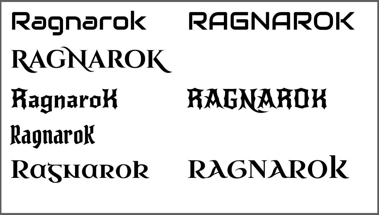
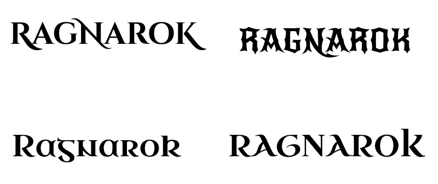
Then I filtered and kept only those I considered more epic:
After that I made color testing to check what could work:
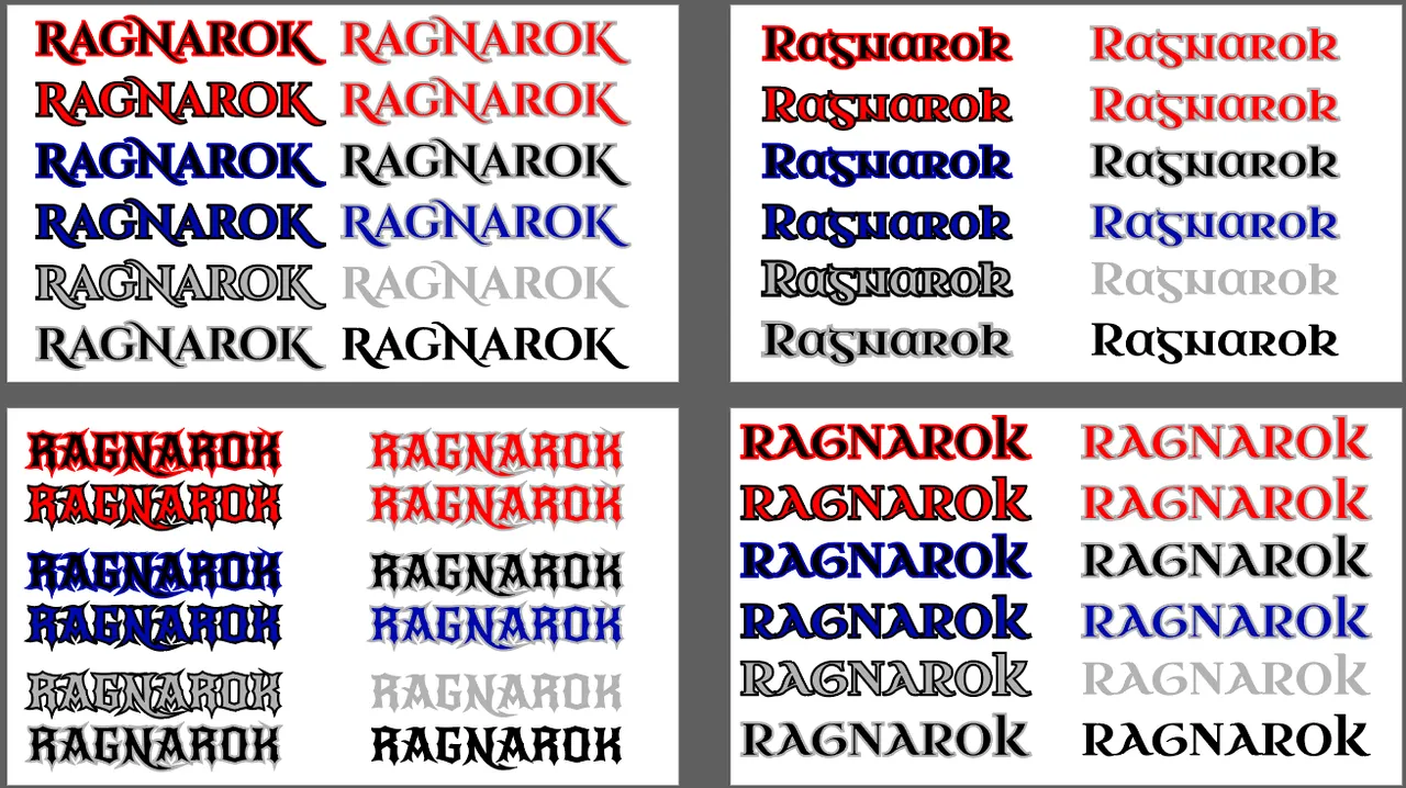
I focused on primary colors, specially red and blue, since those are easy to remember and usually have more impact in the viewer.
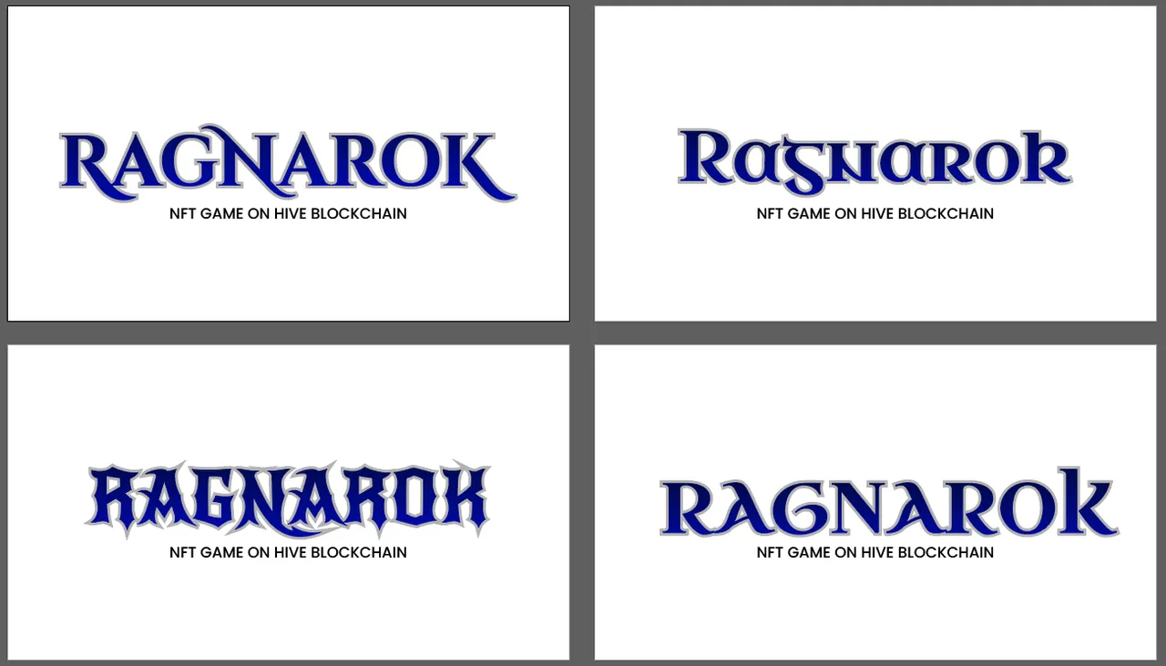
Then I isolated my favorite color combinations:
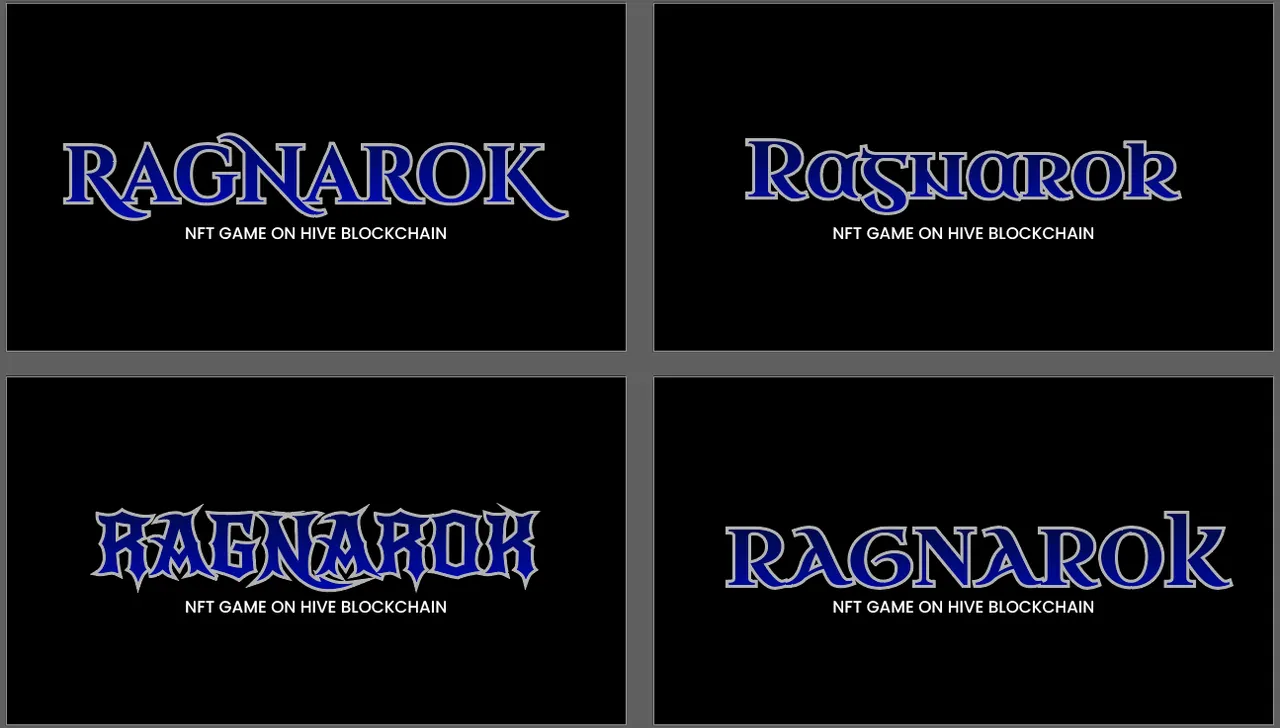
Blue and gray over white background:
Blue and gray over dark background:
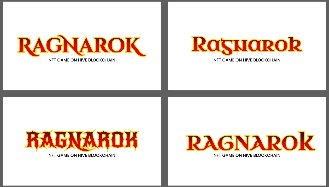
For the red version I opted for a gold outline:
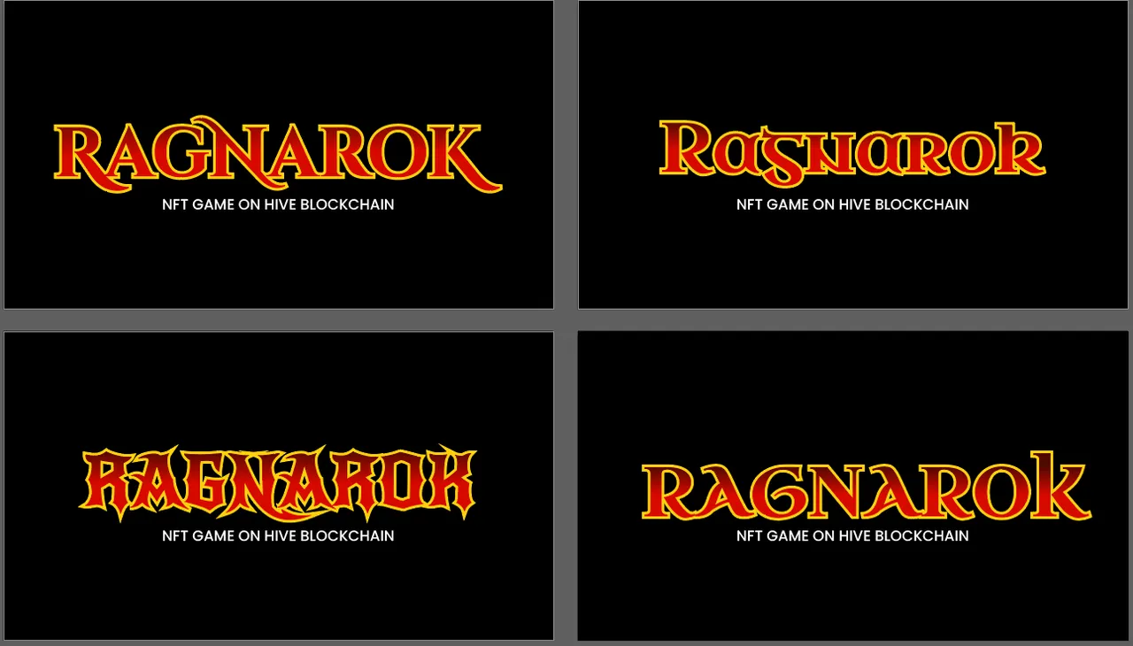
Red and gold over dark background:
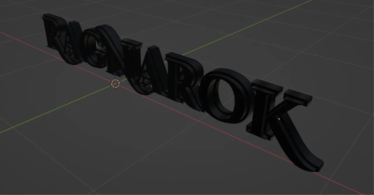
I also decided to make some 3D versions of the logos, so I imported the SVG files to Blender 3D:
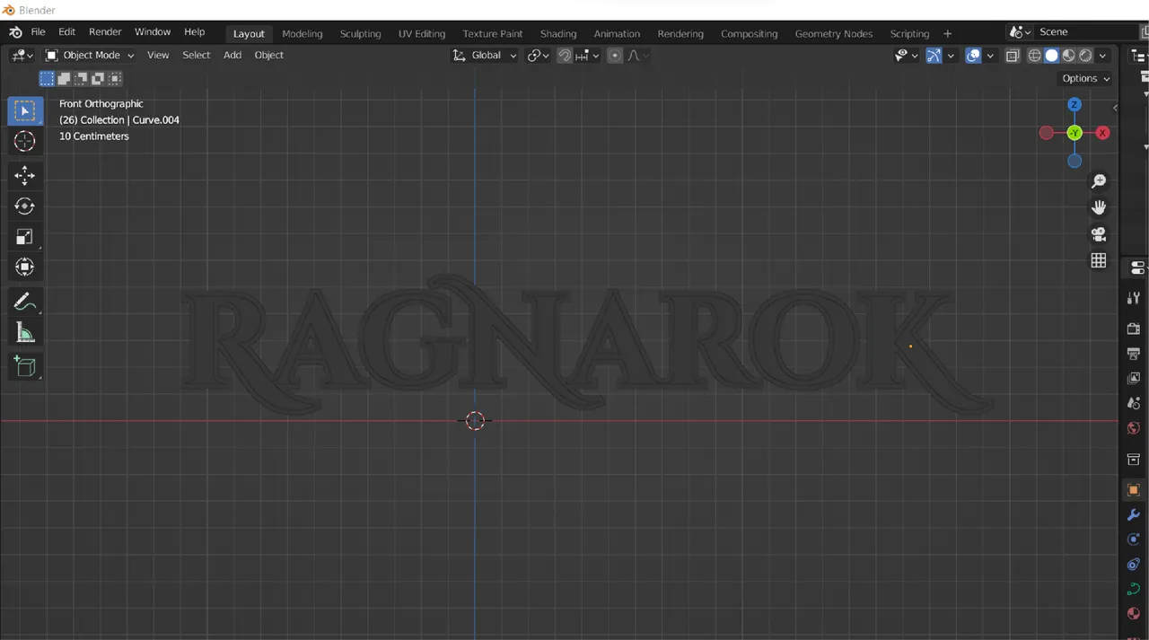
Then I made some testing to add volume to the word:
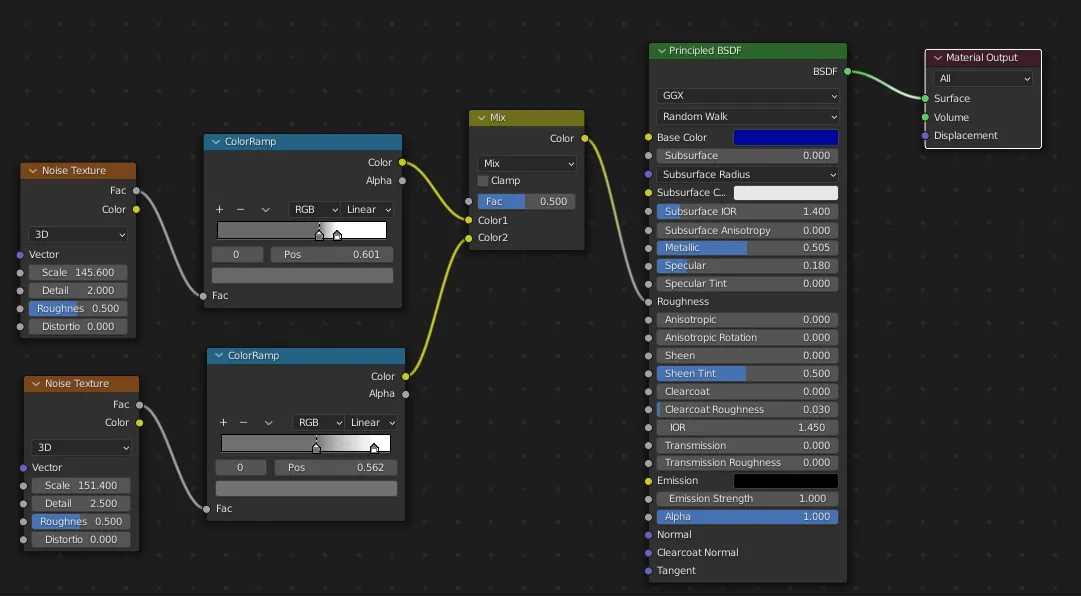
Material for font:
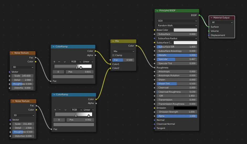
Material for border, a bit different:
Scene layout:
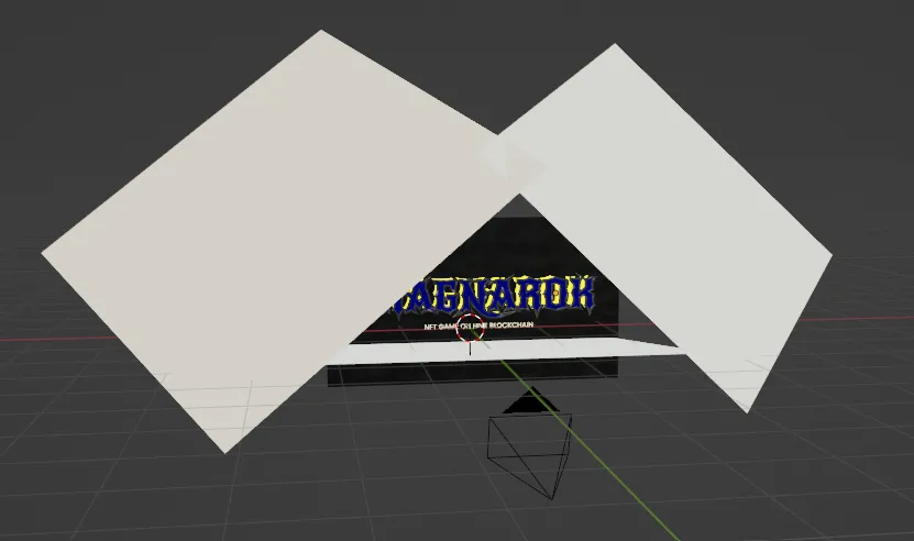
Big white squares are light sources.
Final 3D renders
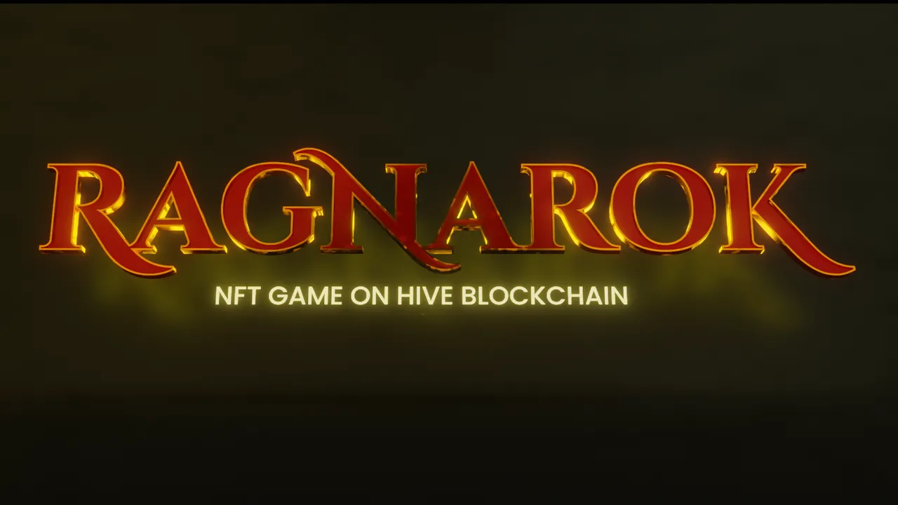
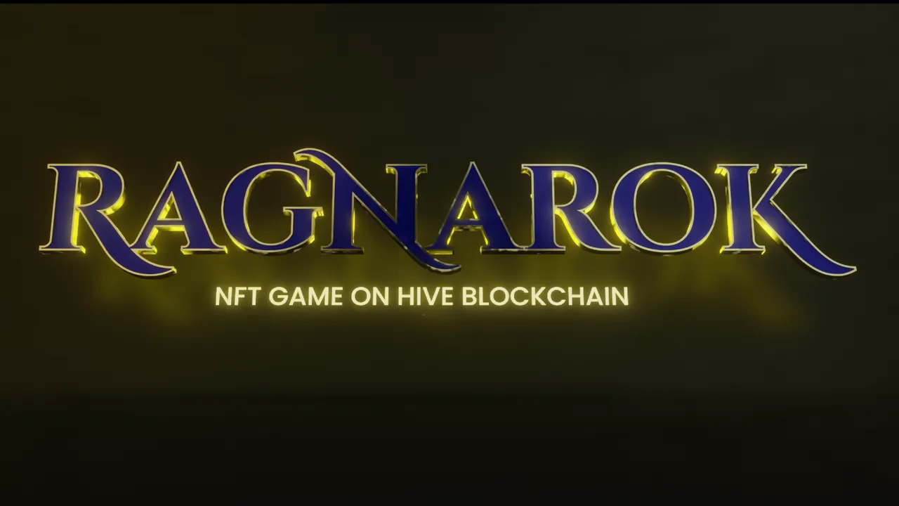
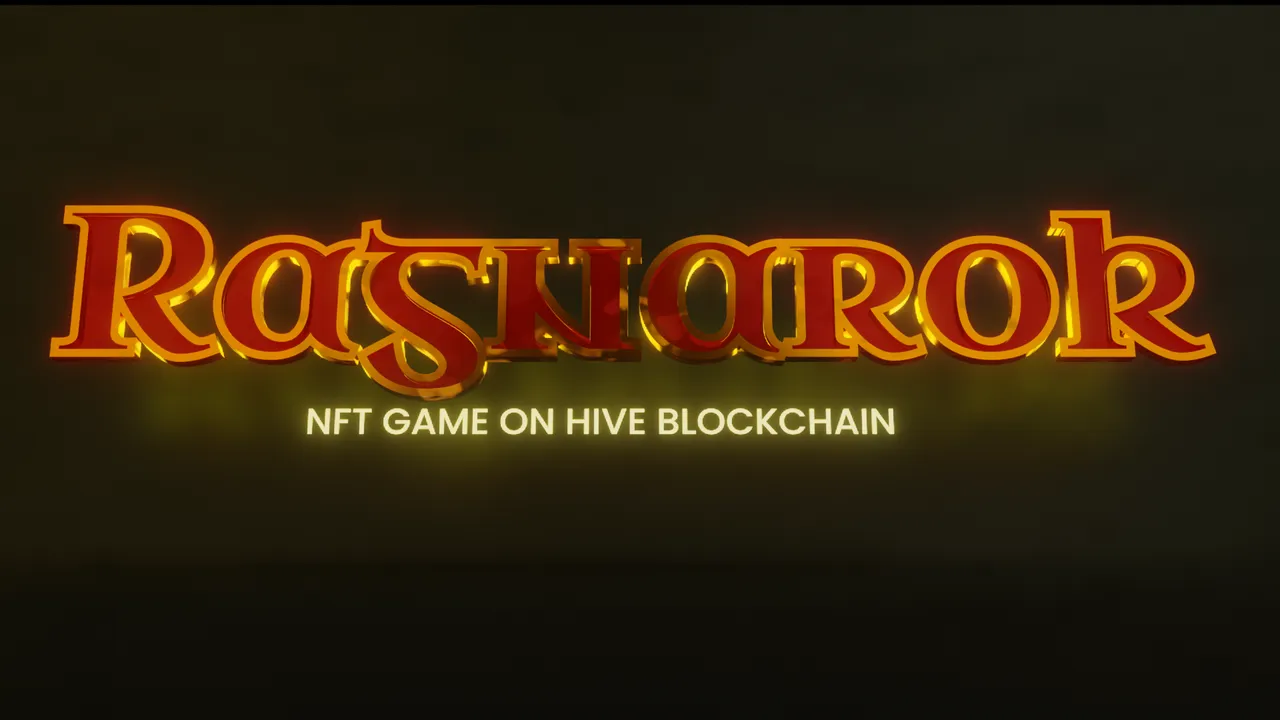
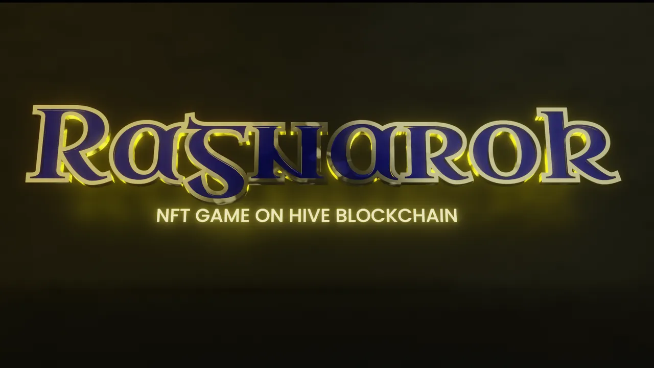
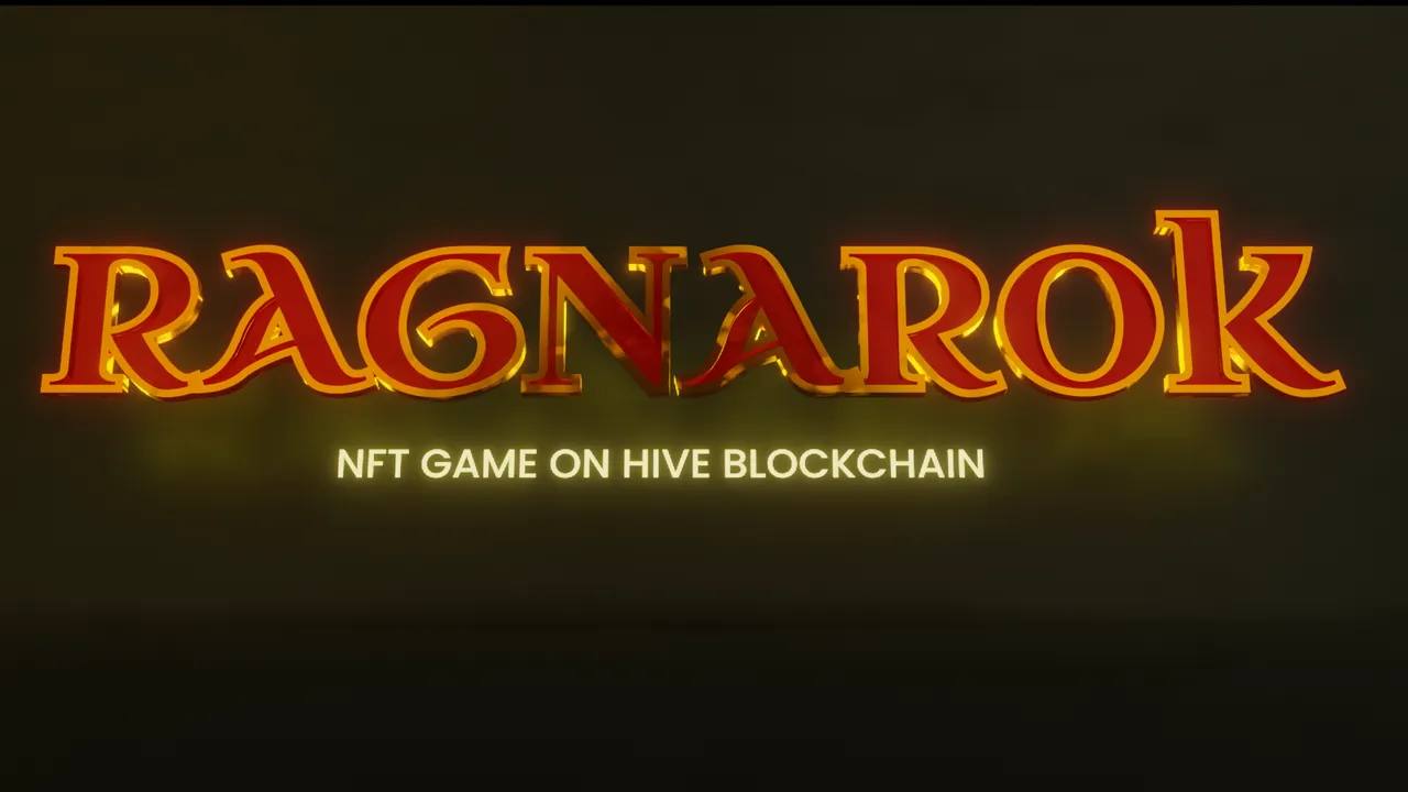
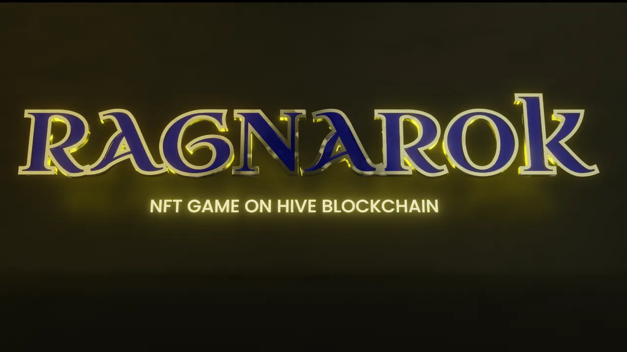
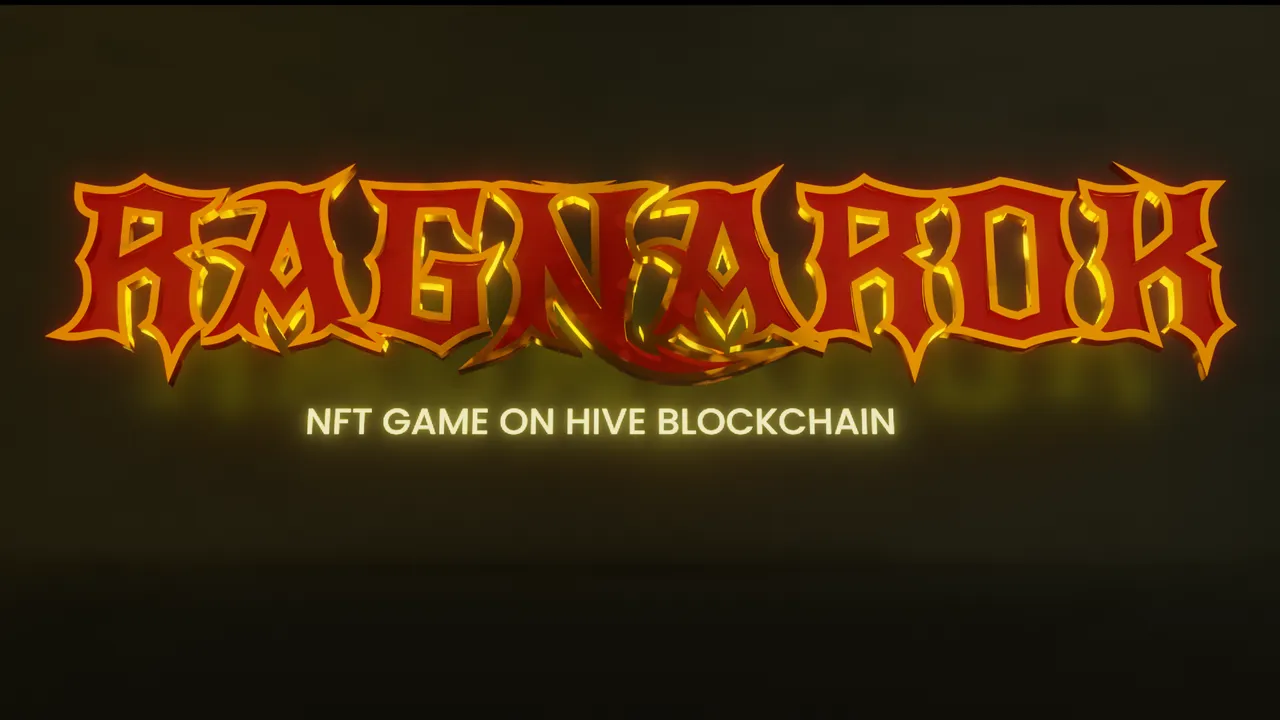
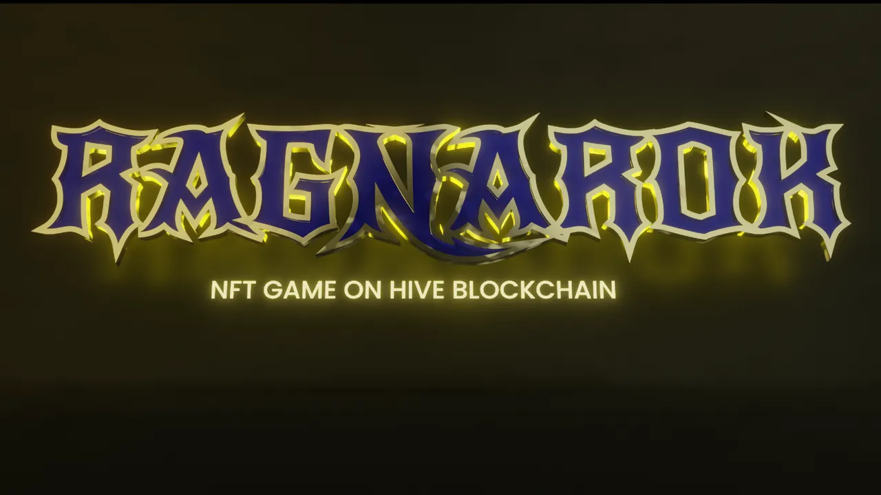
As you can see, I created 4 logo proposals, all in 2D and 3D versions. Let me know which one is your favorite!
If you want a more detailed guide on how to make a 2D logo into 3D using blender, please let me know in the comments.