Hiya all, So like most of you I mostly use PeakMonsters for all that is Splinterlands
BUT I enjoy looking at my collection and card prices on the Splinterlands website ad have noticed something very small that frustrates me enormously.
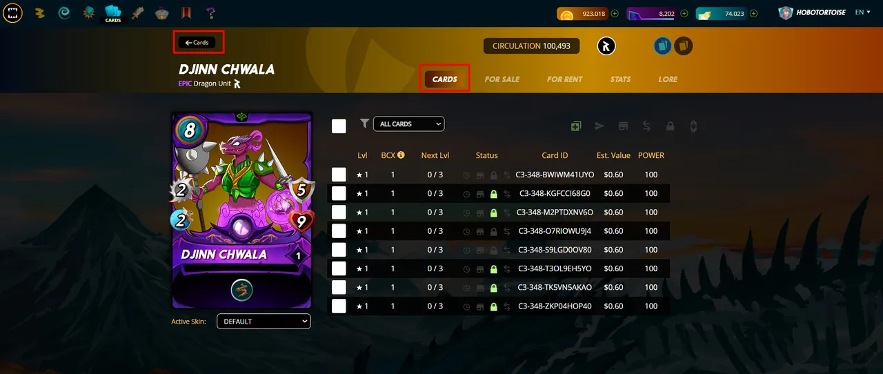
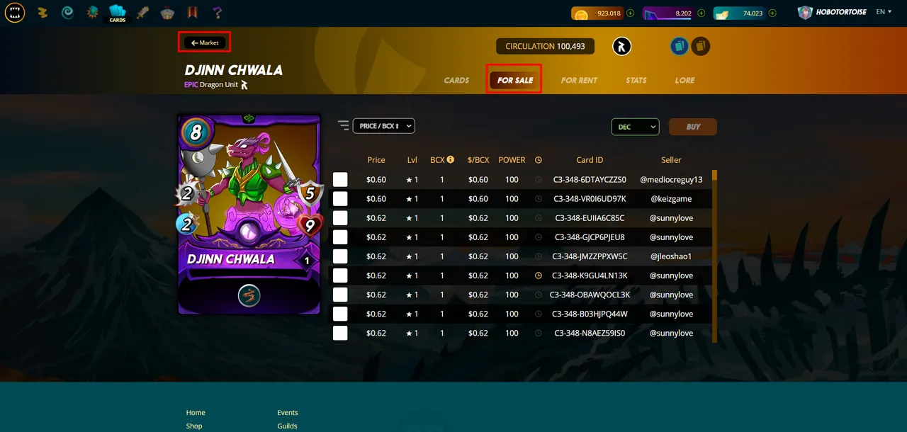
Above is the way the tab system works in game, when you're looking at your "cards" you can go back to your own cards, but the moment you look at the "for sale" it shows you the "market" tab which means if you're not paying attention you go back to market, and then lose another 5-10 seconds getting your cards to load again and load the "owned cards" etc.
What I propose is that you have both the "cards" & "market" tab always on display.
I know this is nit-picky but in terms of UI it makes things streamline and much more comprehensible in my personal opinion, below is a representation of what I'm thinking.
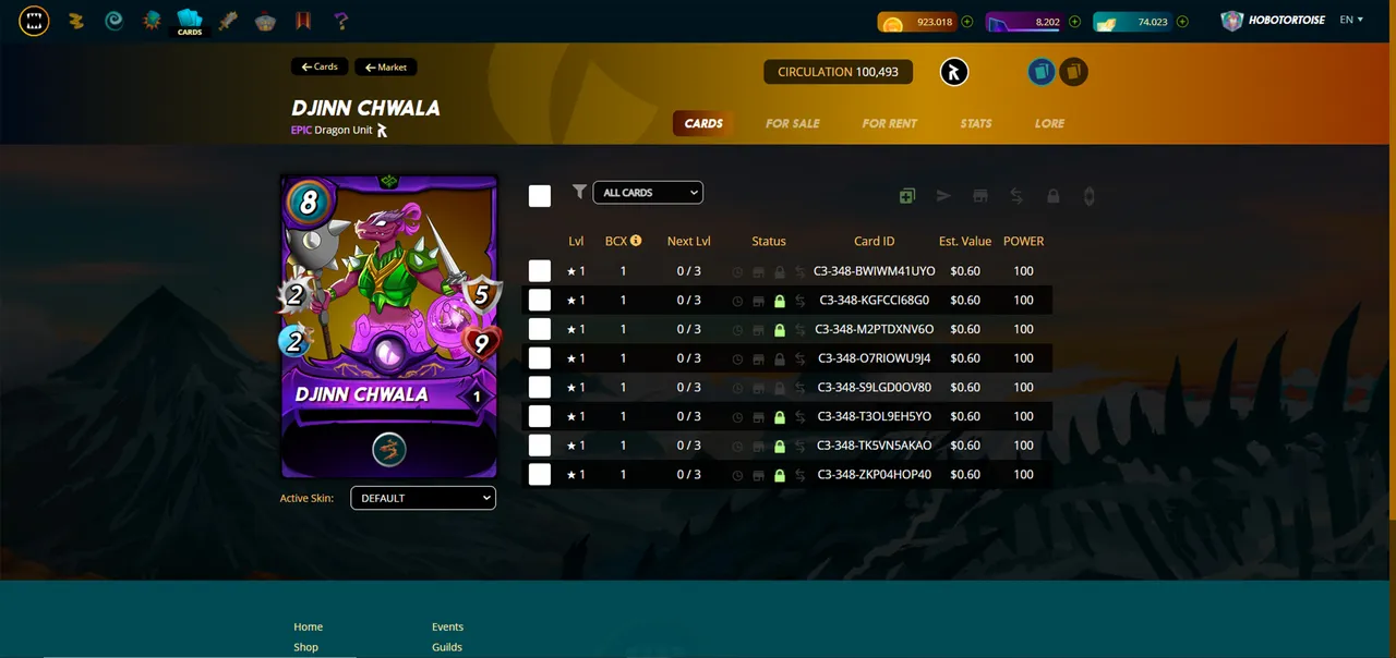
I know my idea isn't exactly groundbreaking shit, and what I've illustrated is the same. But I think it'd be a small but needed change.
Thanks for reading this!
HoboTortoise