Hi! I want to show you one of mine creation – compiled logo & also to promote two interesting aspects related Splinterlands (collectible card game):
- splinterfilter.com – service to explore cards abilities and other stats, Which was presented by @gringo211985 in this post;
The other thing is
- "Splinterlands Art Contest! // Week 75" – this is: "an open-ended Art contest for Splinterlands inspired creations. You can create art based on the cards or you can create something entirely new! Contest consist 15 Booster Packs prize pool.
So here it is as final version of logo:
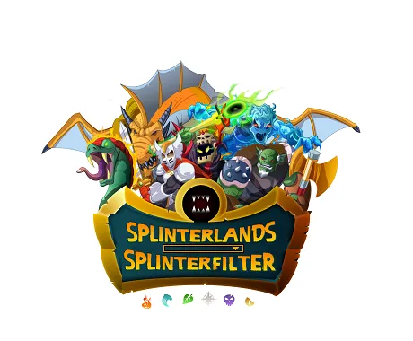
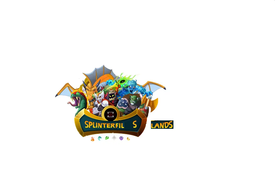
(first of all I demonstrate the final version, so that it goes to the image preview of this post)
And, since the competition requires the conditions to describe and to show some steps of the process, here we go:
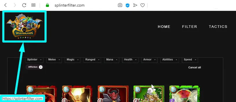
- First of all at I found that in the upper left corner of the site there is the Splinterlands brand logo, but the link below it leads to main splinterfilter.com page:
I thought it isn’t correct to leave it in such way, and I began to think how to improve it: if the link must be still to the main page, so еhe logo should be this project individually.
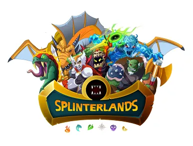
- So, lets take the original one:
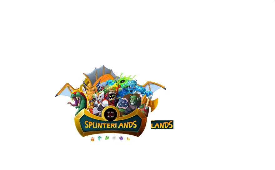
- What if to do the Splinterfilter sign directly like the Splinterlands sign style?
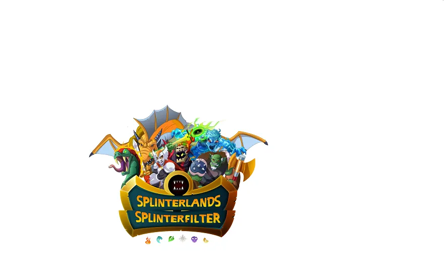
So I copied the part of the word behind and went to morph the "-lands" part:
- The next etap:
- And when I was thouht "finally!":

I remembered one thing about the copyright ( you may find, for example at this post):"You brand your game "Splinterlands+"" unless you actually lisence it with us for 10% of revenue."
- OK, so what about to combine in logo "Splinterlands" and "Splinterfilter"?
- One more step to slightly correct the boarders & add the divider – so that visually in such a small space the two words would seem more separated:
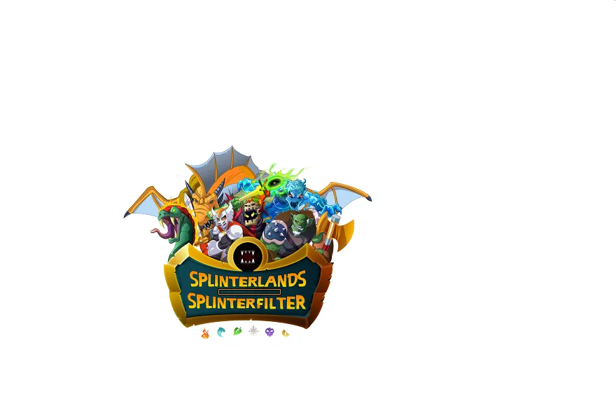
- Oh, what about the divider will be a "filter with a drop down menu list"? So this is the final version of this splinterfilter.com logo:

Thanks for attention!
Join the game, try the service, and participate into the contest!