Here is my entry for the weekly Splinterlands Art contest found HERE
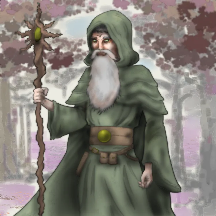
Magi of the Forest
Although, technically "magi" is the plural of "mage" or "magus" so this should probably be called Forest Mage.

Here is his write-up from the Splinterlands Wiki. Which, obviously I did not read before I drew this...
Despite his youthful appearance, the Magi of the Forest is one of the oldest beings in the land. He is the Spirit of the Forest’s messenger to all her people. The Magi travels, writes, teaches, and does whatever he can to promote unification of the Splinterlands. When summoned to battle he brings a robust magic attack.
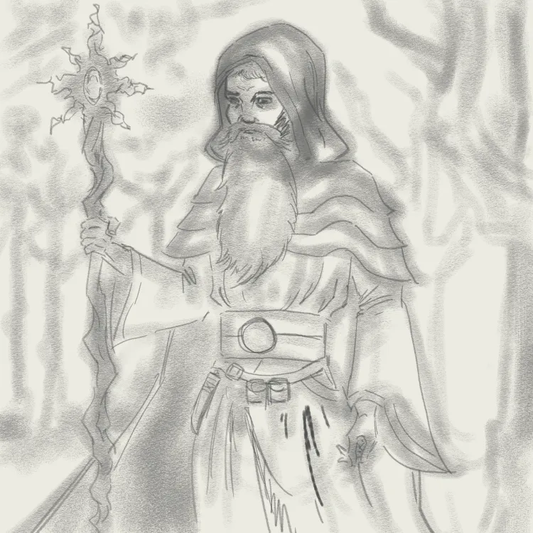
Right. No youthful appearance in my guy. He looks more like Gandalf the Green.
Compare to the original card art:
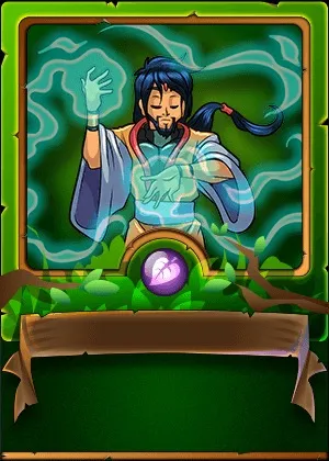
Now that guy looks youthful... er.
Drawn using Clip Studio Paint Pro on a Microsoft Surface Pro 7+. Here is the time lapse video: https://rumble.com/v6xc4rg-forest-mage.html?mref=18dagn&mc=d3obe
Tried again to make this illo look less comic-bookish, more painting-like.
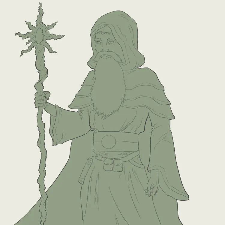
Step 1: Rough draft. I use a wide pastel brush to lay out the silhouette, then add some details using a mechanical pencil brush.
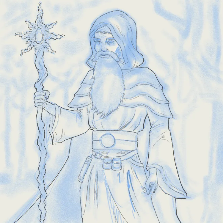
Step 2: Lineart. I change the rough art layer to blue and create a new layer for the line art. I used a narrow Real G Pen brush.
Step 3: Flat. Hide the rough layer, then fill the entire silhouette of the main figure with a nice hippy green color.
Step 4: Other flat color layers. Add a new layer on top of the greens for all the rest of the colors on our Mage. Real artists would make separate layers for each color but I can't be bothered.
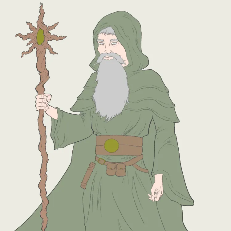
Step 5: Shading. This is the step that I probably need the most practice on. I made a new Multiply layer clipped to the flat green layer then just started shading in with the airbrush tool. Looks a little bit sloppy.
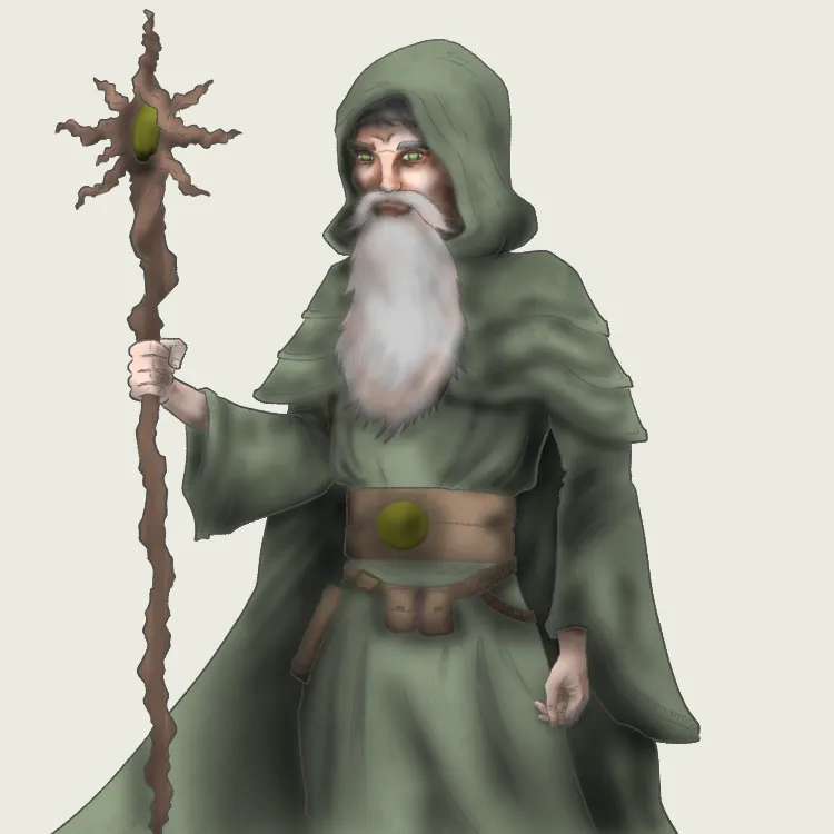
Step 6: Highlights and details. Add and clip a new Overlay layer to add some reflected light. Also went back into this layer and the shading layer playing around with some different texture brushes trying to make cloth look like cloth, hair look like hair, etc. You have to zoom in pretty close to even see anything resembling texture, so we'll call this experiment a fail.
Step 7: Diffuse the line art. I duplicate the line art layer and hit it with a strong gaussian blur. Then I reduce the opacity of the original line art to 50%. Last, use the Magic Wand tool to select everything that is NOT the green flat layer and delete the blurred line art layer. This makes the lines look deeper, adds an additional lair of shading between lines. Deleting everything outside the flat layer is necessary so that the figure doesn't end up with a gray halo. Tell me if you think there's a noticeable difference:
Before
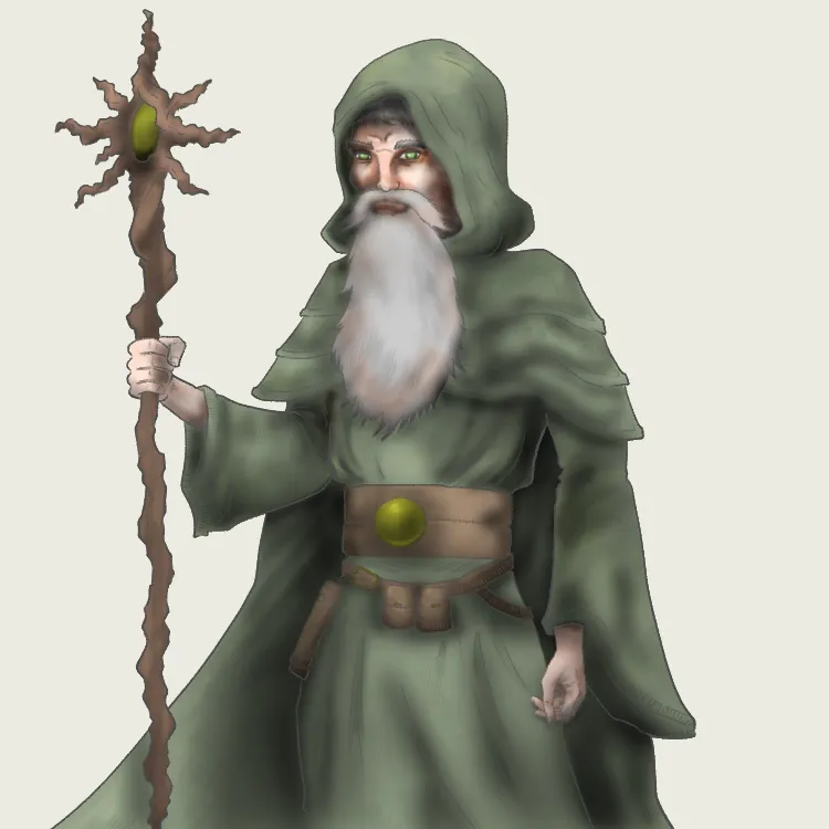
After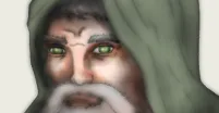
Yeah, it's not really that noticeable. This might be another one of those waste of time steps, except it doesn't take much time to do. It might be because I started with such a light line weight that it's not very noticeable. I'll try this again with fat, black, comic-book lines next time.
Step 8: Background. I just started scrubbing in some trees using a square brush. Kept changing the size of it, going for an impressionistic look. Then I tried messing around with some different effects: Blur and Crystallize. Then used Tonal Correction to make the whole thing a better contrasting color for Green Gandalf.
Step 9: Sign it!
Step 10:
Profit!
This has been your latest episode of Matt "Snarky Bob Ross" Law drawing a wizard that is definitely not Green Gandalf.