As many of you know, we have 2 top prize awards of $1000 in upvotes for the Lesson 1 logo competition and a steembath for the rest of the contestants ($6000 budget).
You have until June 30 to submit your entry.
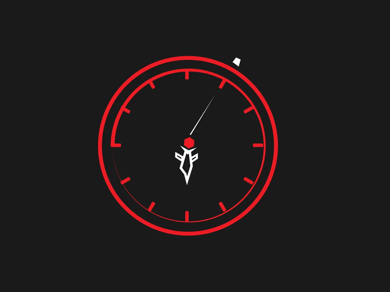
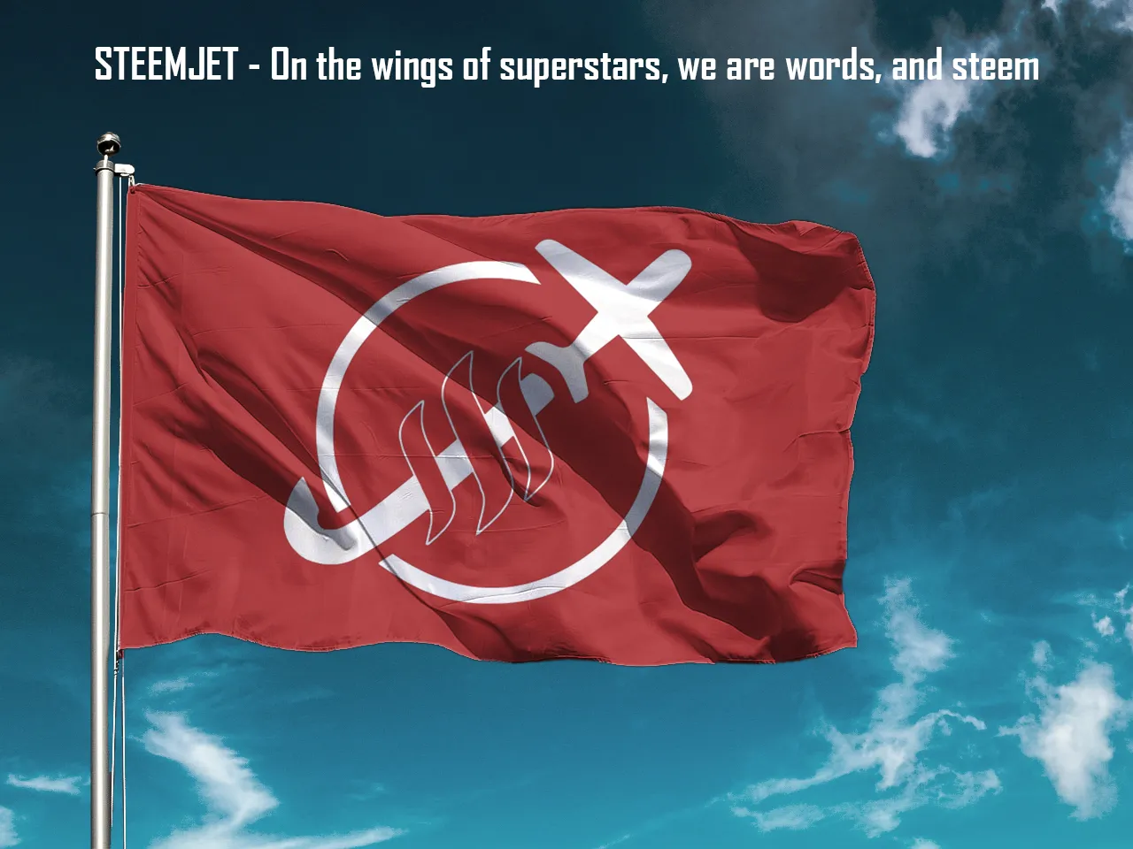
Currently @jogreh has the best variation on the Steemjet logo designed by @shartsy which was the focus of this competition:
Create an image that can remind a child that tme is money.
Kids already know that time is money, and it is ok to remind them about this (remind them how wealthy they are).
How can we logically prove that kids have already grasped the knowledge that we are all born with (that time is money)?
Because kids don't want to grow up. Therefore, they KNOW that they are rich with time and do not want to part with their wealth because they are not stupid. Any kid who wishes that they were already a grown up is a perfect candidate to teach them this lesson, however, most kids already know that they are going to live longer than you, and that no amount of money can bring someone back from the dead.
This is Lesson 1, and it is a basis/reference point for communicative learning that we are all born with.
And @jogreh has intuitively siezed the moment with this brilliant interpretation of the essence of how we all know that we have no money as childeren but that we never want to grow up and get old

12 two-tone dots = clock
Then the eyes follow the 3 cirles getting smaller until you hit the focal point in the center which is STEEM (money) (3 circles = 3 steem curves for balance)
Then the Steemjet blasting through just like @shartzy did so you know that you heard it first here at Steemjet
Kids love color and to perform such elegant and minimal design to the color palette (given the direction of full palette range and max fading light to dark allowed) to a degree that @shartzy exhibited in his initial masterwork at the other end of the color spectrum (no color aka black and white with max contrast meaning no fading light to dark) is like lightening striking the same place at the same time. Seriously what are the odds that these 2 brilliant minds would have been able to construct a crypto communication tool so bold effective and powerful as these 2 designs we now have today. We have come a long way in a very short time, and I am so proud to be part of this community of superstars!
The color scheme with bold use of primary colors was not lost on me either. @jogreh has made the jet and the center steem line 2 different shades of light blue, and the purple dots and purple steem lines don't match either which is perfect because in both instances they are separated by an opposing color which tricks the eye into thinking that they actually are. This is color genius at work, and is a thrill to behold. This piece is the most perfect example of combining colors with slightly different hue and shading in a way that is pleasing to the eye. It is a design skill that I have attempted countless times and not only never mastered, but frankly, I have NEVER SUCCEEDED EVER at this design concept that is relatively simple to others.
It's simply incrredible that you have taught me in a mathmatical formula kind of way how to integrate multiple versions of the same color. And this particular skill of combining similar (but different) colors is REQUIRED to be able to subliminally let the viewer know (without explicitly having to rudely say that we do not discriminate outright) that we accept ALL different kinds of colors. That we do not discriminate or hate due to differences in color. A truly profound statement you have just made on behalf of the entire Steemjet community, because at Steemjet, we not only tolerate diversity, WE SEEK MAXIMUM DIVERSITY, because it is our mission to seek to include ALL. Which leads us perfectly into Lesson 2 - The network effect where we work to put STEEM into the hands of ALL!
What we all have just witnesses @jogreh brilliantly pull off here is the most dificult and advanced form of color coordination known to man. Or at least known to me.
The icing on the cake is the color intensity fading around the circle just as the chemtrail fades. Absolute perfection. If you mind me asking, how did you come up with this. Your determination was obviously unaffected through each successive iteration until something happened to make all the elements come together. Or maybe it came to you in a remote viewing. However your process works, I sure am glad that you did not give up after successive failures. Your determination is legendary @jogreh. I would not have given up either, but I would not have come to such a devine conclusion for many years. Muchos gracias for saving me mucho tiempo mi amigo!
Kids don't want to grow up because they know that living long pain-free stretches of time is the best meditation toward enlightenment you can get here on this planet in this body.
This image used to derive this was originally created by @shartzy

Steemjet Logo
@jogreh was at first struggling with the hands of the clock before realizing that they were unecessary if the clock tick marks were on the outside of the circle

And here is where @jogreh began building his famous color palette, behold the process


It was this image produced by @dendaniels that prompted us to take the direction of writing a childeren's book. After deandaniels posted this, I think it inspired @jogreh to do what he did (am I right?)(I like to learn your process)


Other beautiful submissions include these gold themes that sparked many new bounties to paint one of the pages for our kids book:
https://steemit.com/steemjet/@dimimp/five-usd50-bounties
by @aaniejack


@shuta made a couple clean and effective tools here. Much thanks!


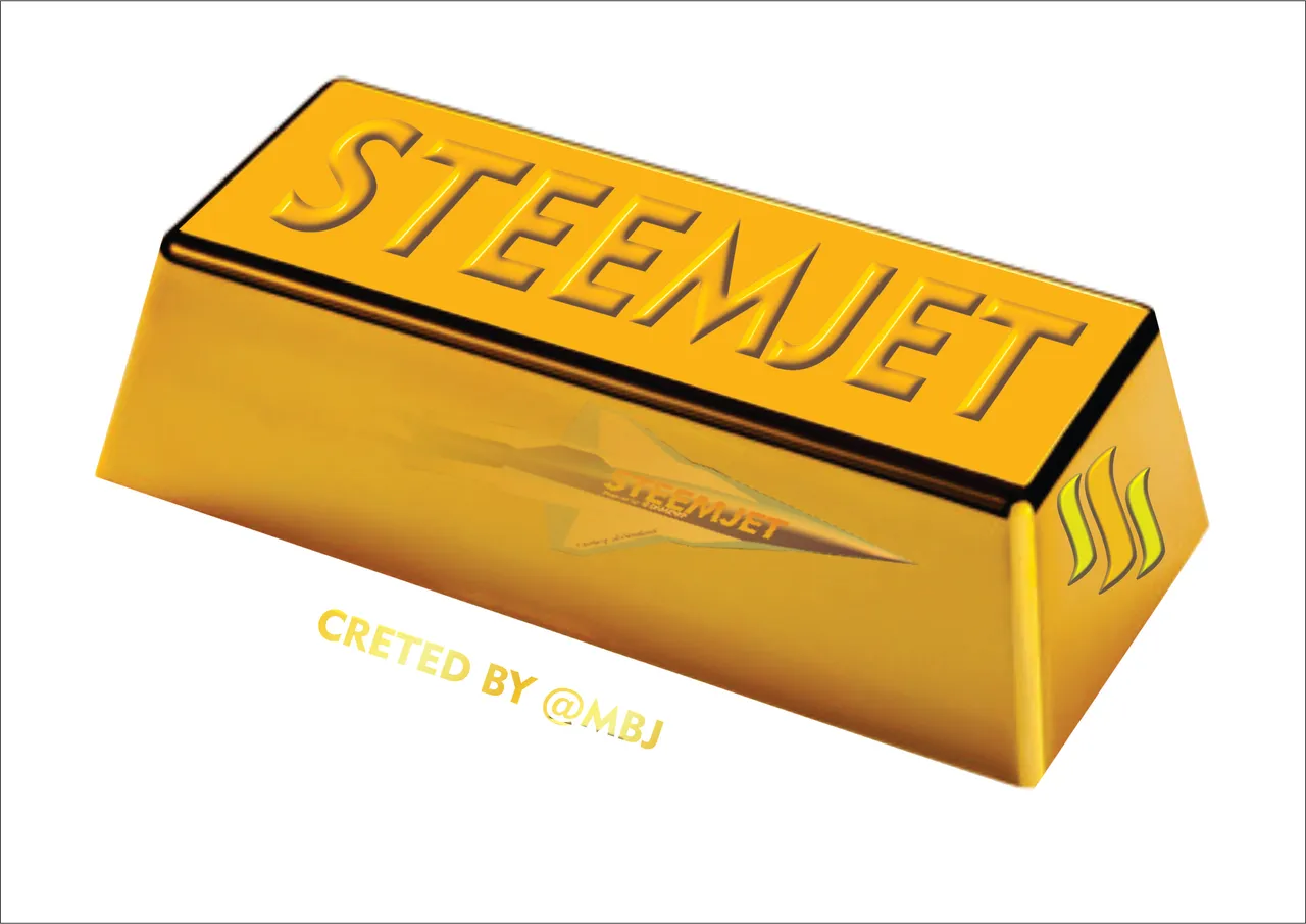
and of course @mbj acting like an MVP
@bibkchhetri with an emotionally powerful money (steem) powered:


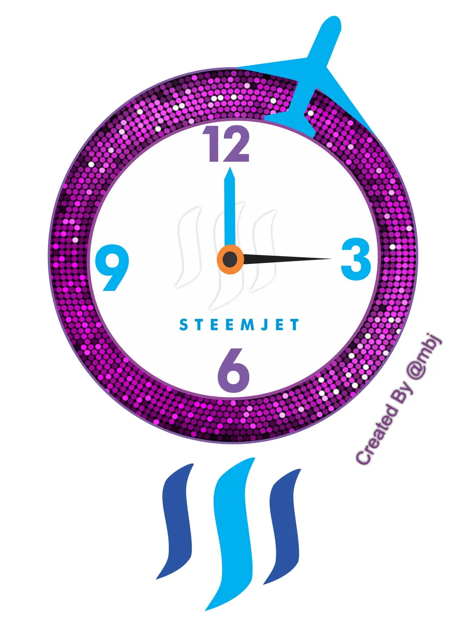
@yatri with this beautifully minimal clock
And we can't forget @meher04 with this emotionally personified:
This recent breakthrough by @jogreh has allowed us to look ahead to the Lesson 2 competition
Lesson 2 - Gold (gold)(silver too? not sure) - Who else owns your crypto (the network effect)
I am going to kick off this Lesson 2 contest very soon because I do not know where we are going.
It seems that now the steemjet community is in tune with their own needs for survival and success to a degree that I am reluctant to apply as much direction as I have in the past for fear of restricting/limiting our potential. This community has already taken Steemjet farther than I could ever have predicted, and to the point where I am now looking to the individual steemjet superstars for advise and direction.
The Lesson 2 contest post will pop up here soon, and I will be looking for suggestions.
Thank you @jogreh for moving us forward to help bring our destination more into focus.
I'm not telling anyone to quit working on their Lesson 1 contest submission, because if you think that you can do this better, then go for it.
compliments of @bibkchhetri
and @techmyth

some of the designs that keep rolling are fantastic!