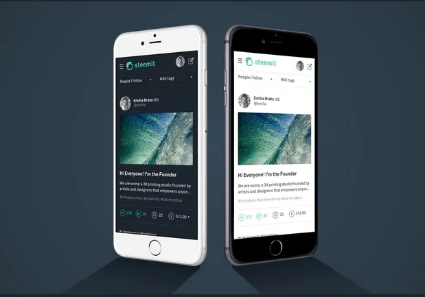
I think it looks pretty good, especially night mode but a few things caught my eye.
The welcome page still uses old logo and color.
Some button still uses the blue color


The effect when hovering vote button is still blue
All of these things are not in harmony with the new design.
Now regarding the landing page

First I am really bothered with the word 'money talks' and I would really like to know what the meaning of this word is in this context and what message steemit inc want to get accross with this slogan, because to me there is a very negative connotations with this expression( money is everything).Nowhere has steemit inc explained the choice to use this nor have they asked the community if they like it, so if you read this steemit please let us know.
I think it would be much better and more professional to just use
YOUR VOICE IS WORTH SOMETHING
Join the community that pays you to post and curate high quality content
Secondly I think it would be nice to have some background pic, maybe something like this ( especially if steemit is not going to have a proper landing page)
And finally It would be nice if steemit could show users's avatar in the wallet transactions/follower list,etc..it makes it more user friendly. Also showing avatar of the person before transfering money would go along way to make the user experience better.