Smooth, simple, inviting.

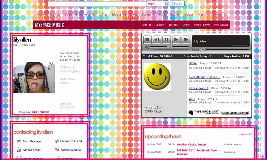
Part of the exodus from myspace to facebook was facebook's simplistic design and lack of clutter. Remember - each myspace page was custom; with the background, navigation buttons, and music all randomly decided by the author. It was a jungle of self-expression, with edgy neon palettes assaulting you from all sides while you madly grasped for your best friend - the mute button. In 2017, Clutter is out. Slick is in.
Bad
![]()

While adding more features, I hope the steemit team keeps the elegant flow that we have now. Even older users have no trouble finding the important buttons and aren't slammed with too much info too fast.
Good job Steemit web team!
P.S: All i want for Christmas is a dark mode :)