Your definition of accumulation and distribution are different from mine.
I would also suggest that you zoom out to the full chart instead of looking at such small time frame as you miss the bigger picture.
I consider accumulation when a token has been in a price range for a long period of time. This range is completely determined by what time frame and how big of a timeline you use when you zoom out on the chart.
Even on that chart you posted, you'll see that on every mini-rise (circa early november, mid december and mid january), there was volume associated to it.
These are small volume indicators that show higher amounts of BUYING than normal (since they really are all associated to price moves up. Don't let the December red volume marker fool you in the image you posted, it's just the time in which that candle was painted.)
These larger than normal volume days are an indication of activity and help to confirm the accumulation mode the token is in.
Here's a chart that clearly shows the pattern that I mean.
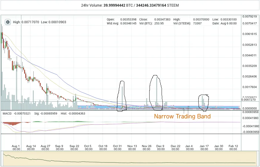
The narrow band is highlighted with some blue and purpleish lines to indicate the range. This where the price has been for the last several months.
Notice the volume indicators that mark as confirmations of this chart pattern.
Also, observe that the majority of the price has been closer to the support level of that narrow band.
Indeed, you can see the same type of phenomena in many other charts, i.e. narrow trading band for a period of several months (or even longer) with various candles strewn about that have larger than normal volume which are almost always paired with a rise in the price.
To me, this is a chart that has all the hallmarks of a cryptotoken that is in 'accumulation' mode.
RE: A Chat With A Top Steem Trader…….. Steemians Speak - Has Steemit Met Your Expectation?....... This Week On Steemit…….. SteemMag – Steemit’s Weekend Digest #25 p.2