hello guys, this is my first post in which I want to talk about some improvements that have occurred to me while playing steemnova, and which I would like the team of game developers to read to see if they can be applied within the game.
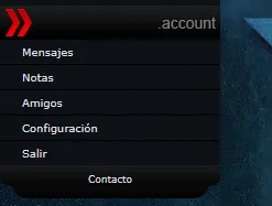
Today I will talk specifically about the area account, that within the short time that I have been playing I have felt that from the beginning this is badly located, since one of the problems that I always present is that I can not visualize the messages that I have in my inbox , but I must go down every time to see if I have a message or not, the same with the other options that the area has.
so my proposal is to locate this area at the top of the page, thus facilitating the display of the input tray.
one of the options that for my easiest to apply is to place this area first above wirtschaft.
another option that has occurred to me has been to take advantage of this space that I am pointing out with the red box and place the following information:
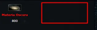
-name of the user (which would be a link that leads directly to the overview)
-name of the alliance (which would take you to the area of the alliance)
-place an icon of an envelope (which would indicate with a number the number of unread messages in your inbox)
-an icon of a person (which would be the link that would take you to friends)
-a post-it icon (which will take you to the notes)
-an icon with the paid button (that makes you leave the page)
-an icon of a gear (to go to the settings area)
Until now this has been what I have come up with as improvements and new designs.
Later I will propose new recommendations that help improve the game, and that is more friendly to new and old members of this community.