A few days ago I finished my design of a new logo for @raybrockman. It turned out to look OK and I was pleasantly happy with the outcome.
After it was finished and sat on the dining table(annoying Mrs welshstacker) I took a second look at it and wasn't 100% happy, so decided to have a little tinker.
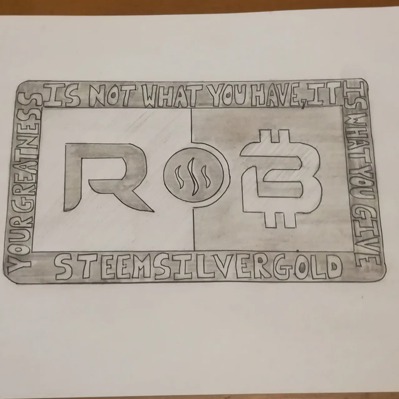
I really like the inner initials (RB), I think they will look amazing. So rather than clutter the face, I thought it might look better with the writing located on the outer rim. So that's what I've changed.
I've had a play and also come up with a round design that might work along with a bar.
What do you think?
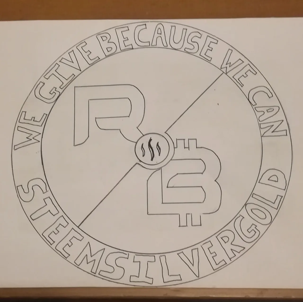
The same design and finish applies from the bar to the round, raised and pressed surfaces to create a 3D effect.
The phrases/verse are completely changeable and if Ray has any that are personal to him then they can easily be added.