
As writers, our focus is on the art of words and narratives, so it’s not surprising many don’t have the skills to create their own artwork for their books. I myself am an indie author and, like many emerging or aspiring writers, I’m situated in the lower working-class status (based on the socio-economics of South Africa, that is), which doesn’t allow me to spend money on projects that might not make a return on investment, either in the immediate future or ever. I have the privilege of being able to create art (though not quite as well as some of my peers) and I’m able to make my own covers. Many are not as fortunate. Hopefully, this quick tutorial can help a few out.
Before we get into it, make sure you have the software. I recommend using Krita (available for Linux, Windows, and Mac OS) but GIMP is also free. For some quality text creation, try InkScape (N.B: not really user-friendly), though Krita has a good text tool as well. You can create great art using the touchpad on a laptop or a mouse, you don’t have to have a graphics tablet.
Got what you need? Then let us begin:
Create Your Text
First, create a new canvas in your software of choice and set the dimensions to the size you need (ebook cover dimensions are recommended at 1600x2400 pixels at 300ppi at set to RGB colour-mode). For book cover jackets, work out the physical size, the bleed, and spine before starting.
Create your text in whichever font and text-effect you wish. Check out @multi4g’s post on fonts. Keep in mind the colours you want to use in your artwork and the mood you desire to show. @multi4g has another great post on this right here. You may want to make this file large; it’s easier to shrink than to blow up graphics. Save your finished text to a .png file, making sure there is no background and the transparency is on.
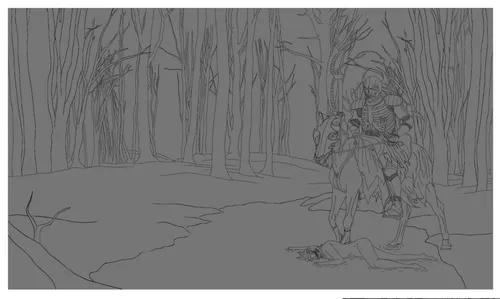
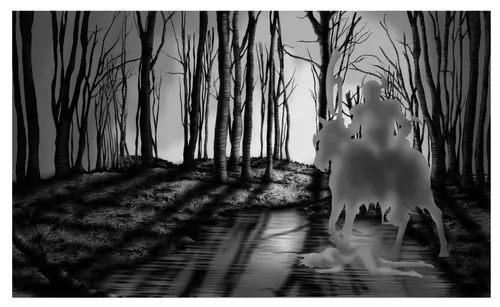
1. Start With A Sketch
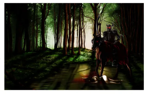
Now create a new canvas and add a layer to sketch out your art piece. It doesn’t have to be perfect line-art, as long as you know what’s going on. Mine was cleaned up for this tutorial. Establish your composition (use the Golden Mean, or divide your canvas into three equal parts with lines on a new layer) and keep in mind the text you want to put in; you don’t want your subject (focal point) covered over, at least not too much—a little bit can look really good, especially if part of your subject overlaps some of your text (without making the text unreadable). Keep this in a transparent layer and build your layers underneath for easy referencing. Remember to save your file regularly!
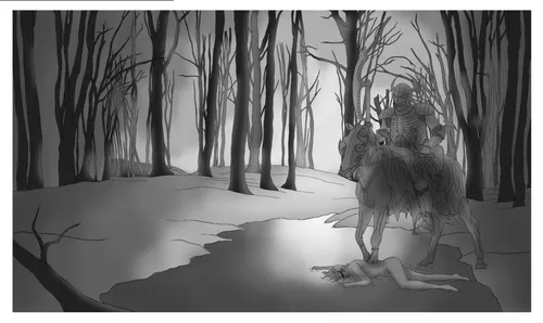
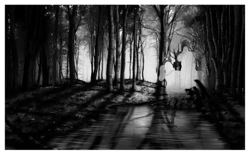
2. Lighting
Determine where your light-source should be. This will affect mood, atmosphere, and shadows later on. You can work in grey-scale as I have or start off with colour, either way is right if you want it to be. Pick the darkest shade and fill a new layer. Set up a swatch (a collection of shades for each colour) and pick 2-3 more shades for the lighting, each being a lighter shade until you reach the lightest shade you want or the true colour of your light-source. With your swatch at hand, start filling in areas in a circular motion around your light-source/s, from lightest to darkest.
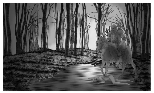
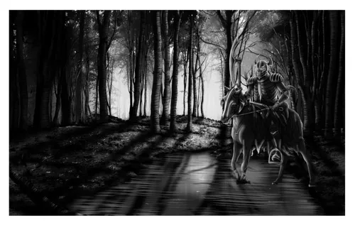
3. Textures
Now that we’ve established atmosphere, partly, let’s get started with texturing. The internet is filled with texture brushes for Photoshop, Gimp, and Krita (the software I use) as well as stock texture photos. The textures used below are Krita’s standard texture brushes. The trick with texturing is that it doesn’t have to be the actual texture of the object unless you want it to be. A great example of texturing can be seen in Rodney Matthews’ art.
Now, create a new layer above your lighting layer and start adding texture. I recommend keeping each object’s texture in a different layer, making a group layer to keep them together and keep your Layers toolbar neat—this makes it easier to clean up and adjust layer styles later on.
4. More Shadows and Highlights
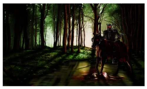
This is the part where you grab a snack and a fresh cup of coffee/tea/hot chocolate, and take a break. You will need to determine how to set the mood of your artwork. Dark, mysterious, horror, etc work well with deep, strong shadows (as I have done below), while the opposite works for light moods. Make another group layer for shadows and add in layers for each object’s shadows. Then make another group layer and add new layers for each object’s highlights. Keep in mind your light source and composition; objects closer to the light-source will cast shadows on objects behind them and/or further away from the light-source. You might notice a lag in your computer’s processing as the file size grows. Save!
5. Background Texture
We’ve established atmosphere and mood, so now we need to accentuate them. This we do by adding detail to the background. Yes, it’s important. The background can make or break the intended atmosphere or mood of the painting. You can do this by creating it from scratch if you want, or by using stock images on lowered opacity. Keep detailing to a minimum – you don’t want your background to be too prominent, just enough to add that extra oomph in your desired effect.
6. Repeat As Needed
If you’re like me, you may have only concentrated on the environment and left out the subjects. If so, now is the time to do it before continuing. Just follow the steps above.
Done? Okay, now save!
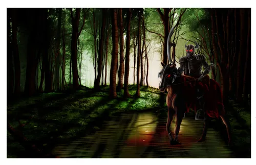
7. Add Some Colour
This is where it gets easy. If you’ve started using colour and not grey-scale, feel free to skip this step. For those who worked in greyscale, add new layers for each object and paint in your desired colours. Again, keep in mind mood and your light-source, as well as contrasting colours (see: the colour wheel). Play around with the layer styles until you’re happy with each colour’s effect. I used Overlay on all my colour layers, for the sharp contrast, to compliment the dark mood.
8. Rinse and Repeat
Again, if you’ve missed a subject or want to add in new elements to the piece, do so now and repeat the steps above as needed.
Great, now save your work!
9. After-Effects
And so we start to simmer down into the finer details as we approach completion. This is where you add new layers for mist, light rays, dust, magical elements, blood, etc. Play with each layer’s style and opacity to make them blend in with the painting.
SAVE!
10. Add Your Text
Need more coffee/tea/hot chocolate? Get it now! Your artwork is complete but your book cover is not… yet. Now, open your art and import your text file over all the layers. At this point, you may choose to keep your line-art or do away with it, it depends on you.
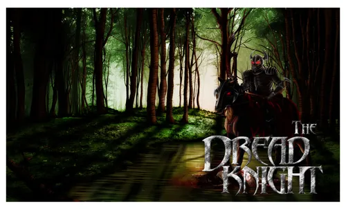
Congratulations! You have an original art book-cover! Okay, now save and breathe. Maybe indulge in something sweet, too. I hope this helped you. If so, comment with a link to your artwork made with this tutorial, but only if you decide to publish it on Steemit (this requires some consideration). I’d love to see how your art ends up!
