Thank you for your contribution.
One color version you have done is quite different from full color version. Full color version clearly shows a circle, while one color version doesnt.
It also contains messy geometry which will be impposible to reproduce in any format:
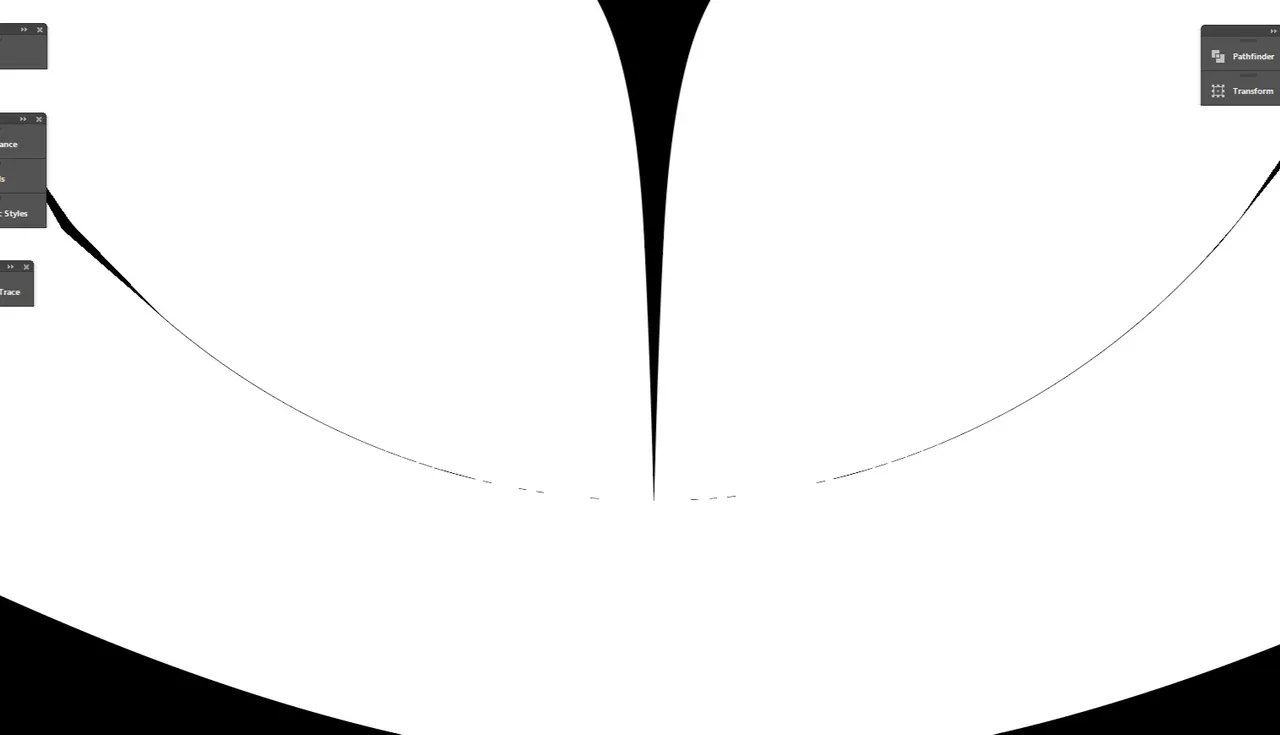
I advise you to fix these issues and make one color version more circluar, like this:
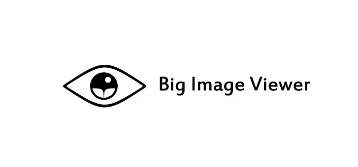
I like the idea of landscape in the eye. It is minimalistic, yet understandable.
Consider making your presentation more like this https://steemit.com/utopian-io/@ggabogarcia/new-logo-for-drawtogether. Sketches, construction, colors, safe zone and more versions.
Your contribution has been evaluated according to Utopian policies and guidelines, as well as a predefined set of questions pertaining to the category.
To view those questions and the relevant answers related to your post, click here.
Need help? Write a ticket on https://support.utopian.io/.
Chat with us on Discord.
[utopian-moderator]
RE: New Logo for Big Image Viewer