Hey @mansyaprime ,
Thank you for the contribution. In my opinion; the logo design looks unbalanced and not working on small sizes.
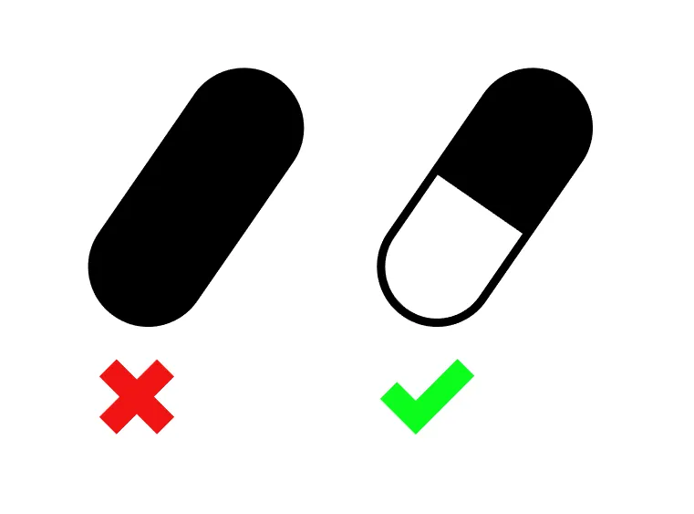
- Elements with different forms does not seem to be combined.
- On your logo design, elements has different style from each other. Two of them has stroke lines (bottle and open source logo) , other one has not.
- Thicknesses of stroke lines are should be same
- There are some flaws on editable files and single color version need to be corrected
Your contribution has been evaluated according to Utopian policies and guidelines, as well as a predefined set of questions pertaining to the category.
To view those questions and the relevant answers related to your post, click here.
Need help? Write a ticket on https://support.utopian.io/.
Chat with us on Discord.
[utopian-moderator]
RE: New Logo for Grosir Obat