Hey @mansyaprime ,
I think something wrong in here:
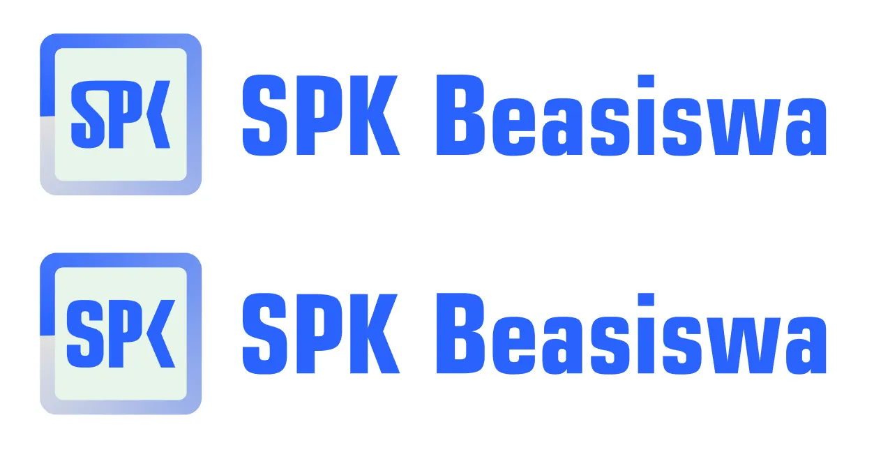
I did not like connection between 'S' and 'P'. Typeface which you choose has sharp corners but you made connection part rounded. It might be the reason why it comes defective to the eye. Also, the letter 'K' may be more inclined to be understandable.

Here, I used basic 'S' letter and more inclined half part of 'K'. In my opinion it is more clear now.
Your contribution has been evaluated according to Utopian policies and guidelines, as well as a predefined set of questions pertaining to the category.
To view those questions and the relevant answers related to your post, click here.
Need help? Write a ticket on https://support.utopian.io/.
Chat with us on Discord.
[utopian-moderator]
RE: New Logo for SPK Beasiswa