Hello steemians and welcome to my blog.
Today i will be writing on what i noticed about comments and replies under posts in busy.org on mobile.
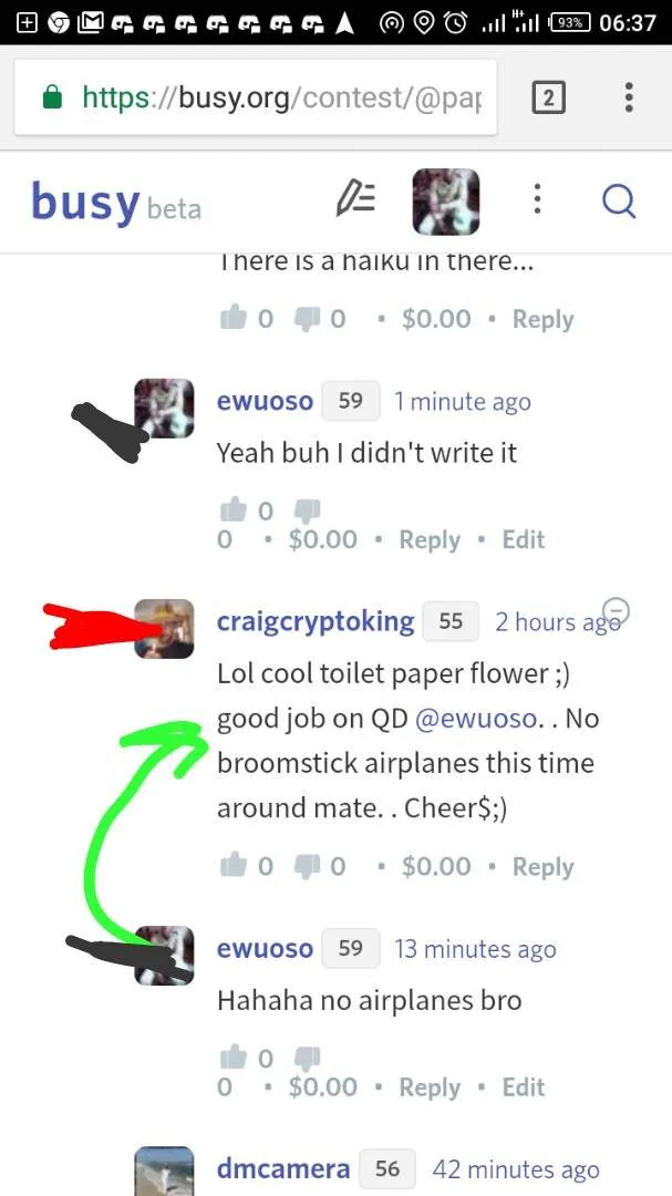
I have been using busy.org for a while but i am not happy with the way comments are just jam packed with no indication to which comment a user is replying to. This is making it untidy
Lets Take A Look
Busy.org

Taking a look at the screenshot below, we will noticed that all the replies were on a straight line without a clear indication which each replies is meant for. The red demarcations are for replies under a direct comment to the post while the black demarcation shows responses to the replies under the direct comment to the post.
Compared to the screenshot below, we will notice that the whole thing was just jam packed. The image below shows spaces in the replies and better arrangement which will enable a user to know which comment a reply is for.
Steemit.com

Busy.org
Steemit.com

My suggestion is that the programmers should leave spaces in between the replies like that of steemit.com or they can have a phrase like "replying to" on each replies.
That is my suggestion. Thanks for reading.
All screenshots were taking with my infinix hot 4.
I accessed the site using my dell laptop which runs on windows
Posted on Utopian.io - Rewarding Open Source Contributors