The last update was at the end of last year. I didn't make a new post because not much was changing (and I didn't have too much time left). I continued gathering the data and now we can again observe some patterns in the data.
Purpose of the experiment
I continue this experiment because it provides interesting facts. The ones who are very involved in gridcoin know that RAC can change and is not predictable for various reasons. This experiment shows this with real life data and can help newcomers by example to see how complex gridcoin mining is and give experience users some data to look at and confirm their understanding and insights.
This data is gathered on a virtualized Microsoft Windows Server 2012 R2 Standard x64 Edition running on a Intel(R) Xeon(R) CPU E5-2630 0 @ 2.30GHz [Family 6 Model 45 Stepping 7] core with 4GB of RAM. The computing preferences are set to use at most 50% of the cores at 100% of the time. The project being crunched is VGTU.
Top 10 users
I'm now keeping track of the RAC of the top 10 users. For this project @dutch is making the biggest contribution. And something interesting is happening here. All of a sudden his RAC is dropping steep. I contacted him to ask for the reason and it seems he had to reduce the spare computing resources for his PhD. What's interesting to note here is that the team RAC is not dropping immediately. I have mentioned before that those figures are related but there can be a time shift. This is what we see here.
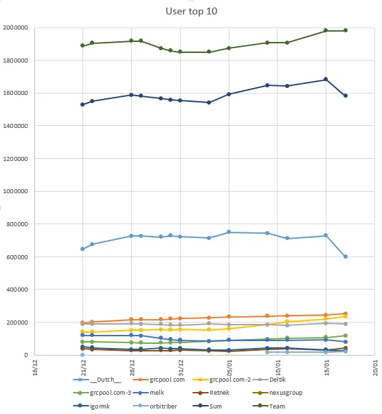
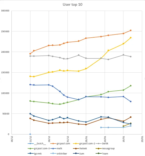
When we zoom in a little we see that a couple of the top 10 users slowly faded away. All pools are slowly growing which is obviously a good sign. I wonder if we will see a drop here because of the crash.
Evolution
In my previous post I mentioned the sudden drop in awarded points. This really seemed to be something step like. Around December 23th the average points rewarded dropped from around 1100 to around 1000. As explained before the RAC smoothens the difference. After about 1 week RAC dropped to 1050, a week later to 1025, ... And now it seems we start to see a change in the other direction.
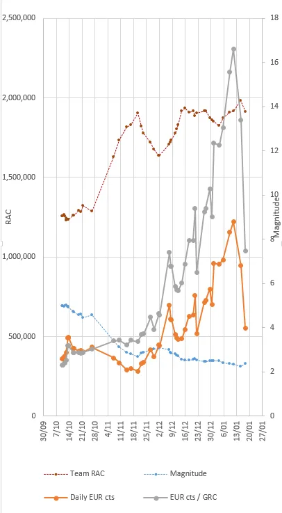
As for the monetary side... well let's just say things returned to normal levels.
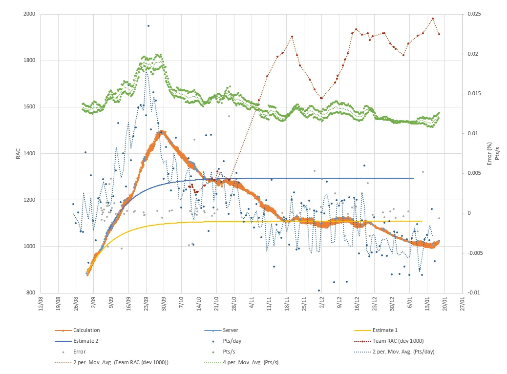
This post has most info about the first chart: The RAC experiment progress and request for help
This post has the motivation for the second chart: The RAC experiment continues
Posted on Utopian.io - Rewarding Open Source Contributors