After the positive reception that my step-by-step Fusion 360 walk-through for redesigning the side-panel of the SteemPi, @Techtek was kind enough to notice that I had an extant Pi case lying around in my design folder and he asked if I would be interested in designing a whole case for the SteemPi project.
The case that was lurking in my project list was a redesign of the 01110-M-P VESA case from Thingiverse with a highly modified bottom venting cut and a redesigned top logo, but I liked the original lines of the case so much that I ended up keeping most of them (save for the actual VESA mounting tabs which I removed). In retrospect, I cut most of the things which made this design particularly notable except for the large external corner screws to hold the parts together and the general lines and cut outs. I really like the way that this case handles the cut out sections so I didn't want to touch those at all.
I've been kicking around the idea in the last week and today I ended up staring at my project folder and thinking to myself, "you know, maybe I can do a complete logo redesign and make it work for this base."
So that's what I did.
I'm not quite cruel enough to make you sit through an entirely new step-by-step walk-through of how I made this thing, but I just couldn't resist doing a number of renders which show off some of the details.
After all, if you have a serious rendering engine, who wouldn't want to show off some design elements?
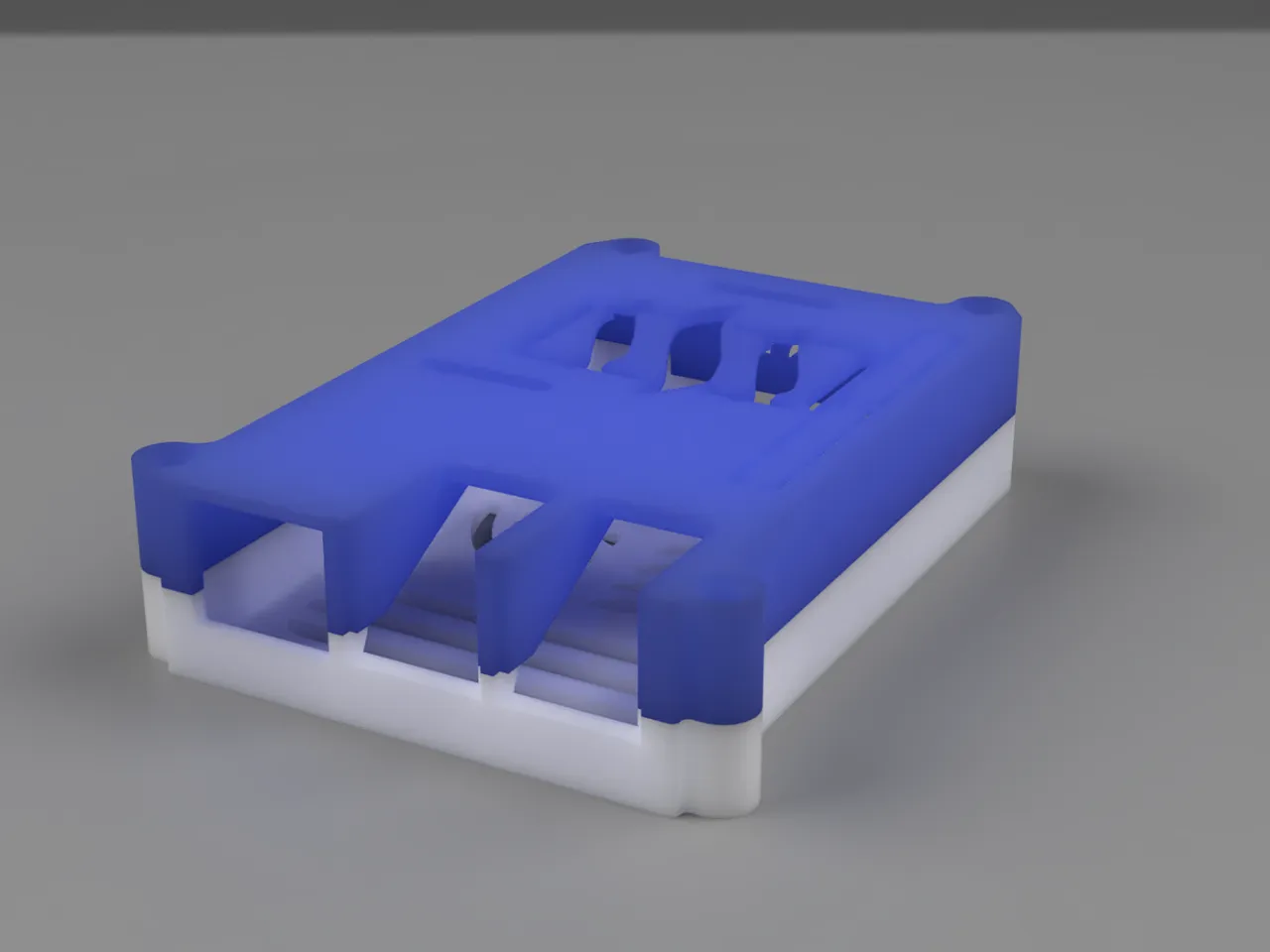
So let's start with the biggest and most important one, the logo on the top case.
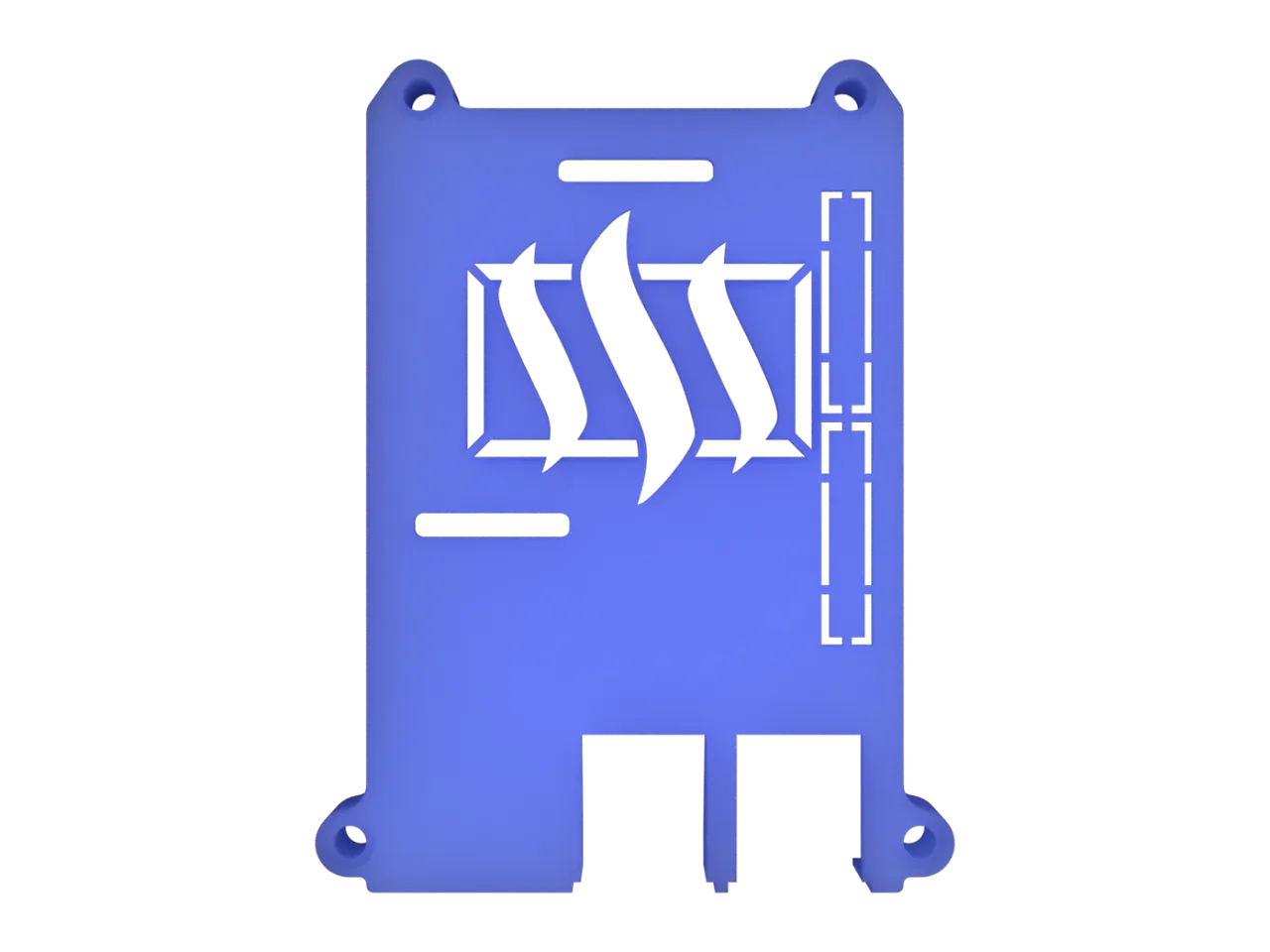
The SteemPi logo is a little bit complicated for putting on 3D prints because the identifying portion of the icon is just a 16 x 9 rectangle. That makes sense in the context of the device, being representation of looking at things in the perspective ratio of most devices these days – but it's hard to make interesting.
I knew I needed to layer it with some other element, and the obvious one was the STEEM logo itself.
You have a problem when you start stacking icons, though. A lot of the time you end up with islands which don't connect to one another. This isn't a problem when dealing with actual graphics but when thinking about something that will become a three-dimensional object there's the question of "how will this be connected?"
I had that problem in a number of places with this logo.
In the end, I cheated a little bit. With the obvious solution for any kind of rectangular structure is to mimic a bevel and bring a line in from the outer corners. That covers the outer two islands, but what about the inner two, which are right next to the central figure in the STEEM logo?
What I ended up doing was extending the outer edge of that central figure a millimeter and using that as a fill for the structure to support the island on either side.
The hard-core industrial designers in the audience are already disgusted with me because this top structure is in no way, shape, or form loadbearing. There is roughly 2 mm of plastic holding any of these islands in place, and all of them are only supported on one side.
I can only suggest not putting anything on top of your SteemPi. (You wouldn't want to anyway, because that's your top ventilation.)
It seemed a little lightweight to only do a top logo, so I had a look around on the body of the case itself for something else to do. And I found it!
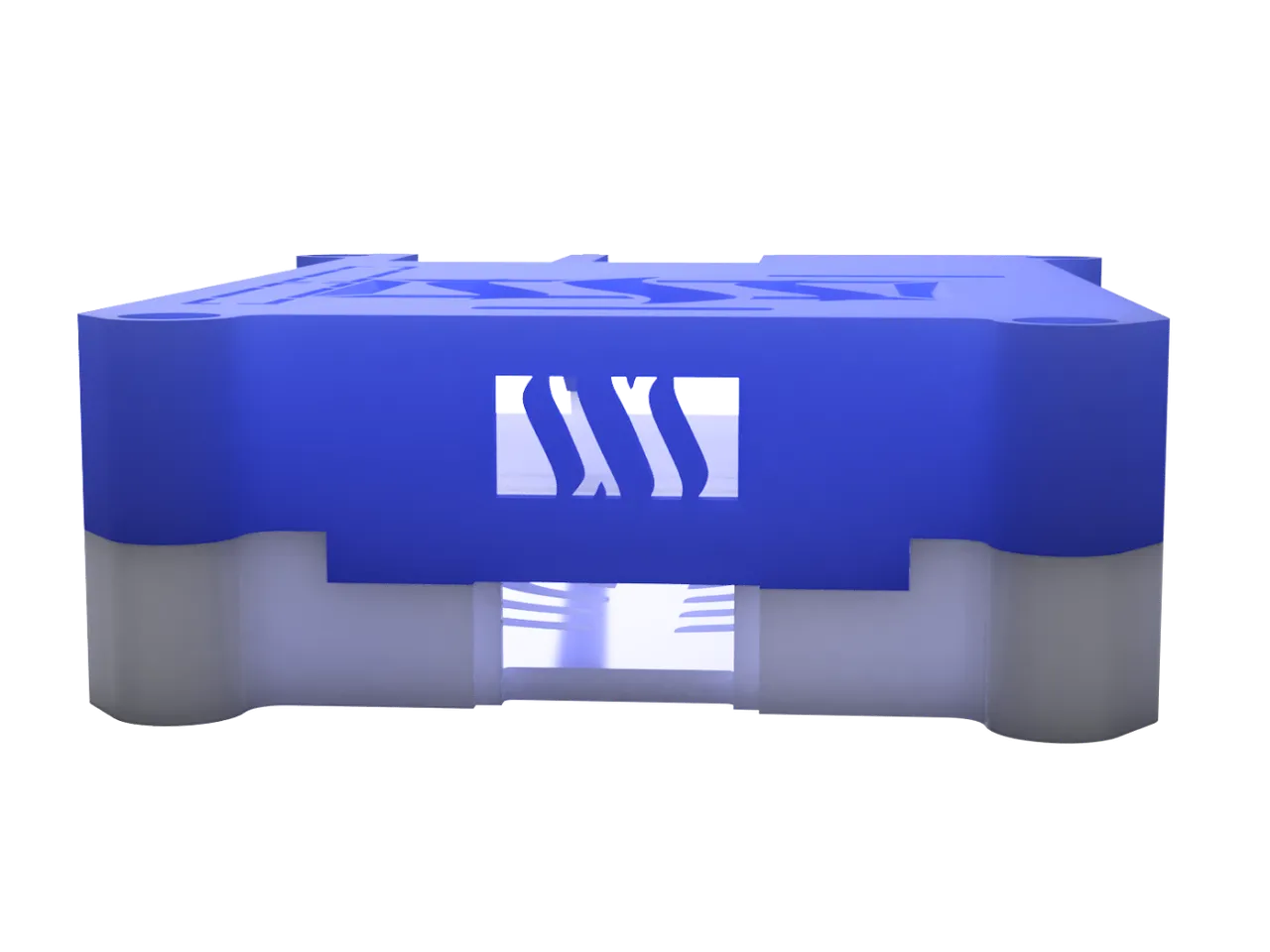
We needed a place to have the LED be visible, anyway – so the back panel seemed an obvious place to put a variant of the logo. Again, I went with a 16 x 9 box centered above the port with enough material at the top and bottom to support the curves. It was an unintentional bonus that the shape of that cut out matches the one in the bottom case.
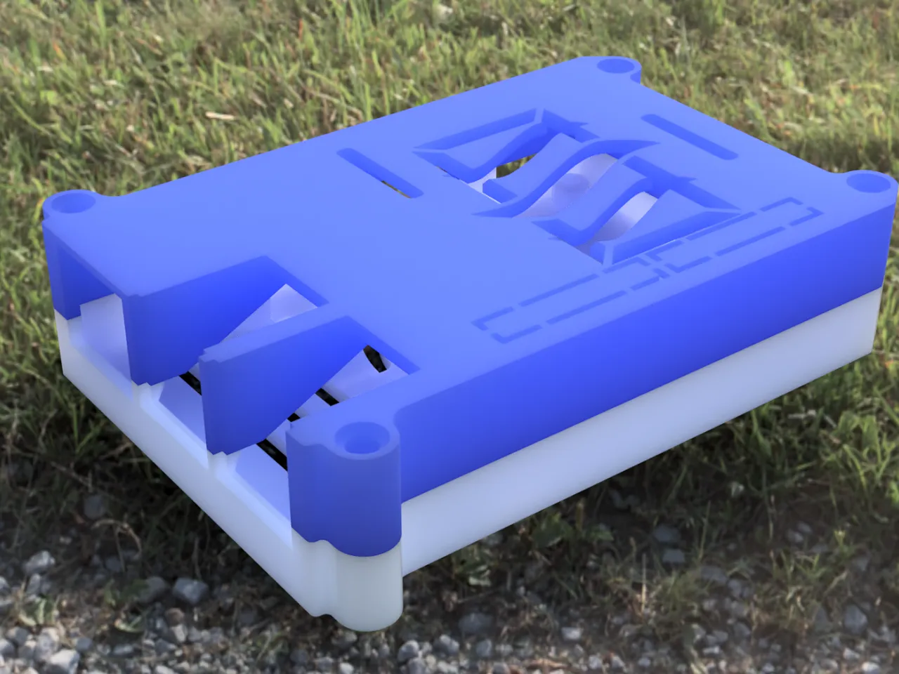
One of the great things about the Fusion 360 renderer is that you can use an HDRI environment which provides realistic lighting and the hint of a realistic background when you bring it into play. There are a number of HDRI environments which are included with the free download and you can find more online in tons of places, but one of my favorite for rendering as an actual visible background is the grassy park land.
You could almost believe that someone left their SteemPi out in the parking you stumbled over it.
Had you noticed that I was rendering the case in the default logo colors for the SteemPi project? That light blue and white works really well as an identifiable style. It helps define the brand.
But I can't let anything go that simply.
You know what I like? I like flash metallic. I like flake paint. I like things that look like they go faster simply because they're brightly colored.
It just wouldn't be me if I hadn't done at least one render with some ridiculously garish orange metal flake paint and a black bottom case.
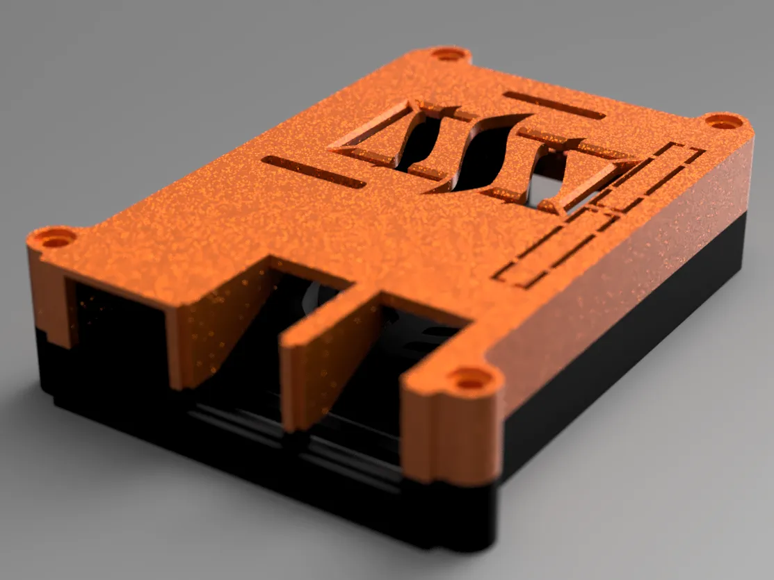
That is some flash looking tech, right there.
Giving it a critical eye, however – it feels a little last season. And by that I mean literally last season: Halloween. While everyone loves black and orange in any context, ultimately I felt like I needed to have at least one reason for the season render.
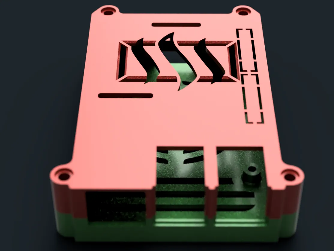
That's right, bright red metal flake top case, emerald green metal flake bottom case, an HDRI environment chosen to give some directional lighting so we have a little bit of reflection inside the case to really bring out that green, and presto.
Christmas has come early this year.
If you want to pick up the files for this particular case, you can grab them from the GitHub project which I created to be a central repository for this design – including the STEP files for those folks who want dimensionally accurate geometry to make modified versions from and the STL files in case you want to take things straight to the printer.
If you want to pick these files up on Thingiverse, that's certainly an option.
If you have any suggestions or ideas about what to work on next, or you make your own variants of this case, let me know down below. I admit, I'm strangely tempted to give a stab at designing a very nonlinear, organic-looking case at some point, just to see if I could.
Until next, you know how to rock out.
Posted on Utopian.io - Rewarding Open Source Contributors