Preface
Data visualization is important, in fact some say it is more important than the data itself. For this reason, I'd like to create a few tutorials on what I consider the best bang for your buck open-source charting javascript library: Chart.js
While it is lightweight, the ease of use and configurability make it a worthwhile learn if you want to add a creative flair to your data. Hopefully these will be useful and you will find something interesting to do with Chart.js
What Will You Learn?
In this particular tutorial, I'll show the surprisingly robust coordinate handling system that opens this library to creative ideas. In general, I plan to go into things that may not be at the forefront of the advertised functionality, but nonetheless easily possible and useful.
- How to setup and initialize a basic chart with Chart.js using its various parameters.
- How to add user interaction with touch, click, hover, etc. that maps correctly to x,y coordinates on point graphs.
Requirements
- The Chart.js library, with install instructions here: Chart.js docs
- A folder or directory with index.html and main.js files.
- A browser, this tutorial tested on Firefox, Edge, Android Firefox, and Chrome.
- A text editor of your choice (I use Brackets).
Difficulty
- Basic
Tutorial Contents
The very first thing to do is to get and load the Chart.js library into your index.html or webpage. I will use the cdn links linked on the docs where you will have two choices. You can either get the bundle which I believe has Moment.js and some other things, or just the pure Chart.js library. Here is what my index.html looks like after doing so:
index.html
<!DOCTYPE html>
<html>

    <head>

        <meta charset="utf-8">
        <meta name="viewport" content="width=device-width,initial-scale=1">
        <script src="https://cdnjs.cloudflare.com/ajax/libs/Chart.js/2.7.2/Chart.bundle.min.js"></script>
        <script src="main.js"></script>

    </head>

    <body>


    </body>

</html>
The currently available cdn for the pure library is:
<script src="https://cdnjs.cloudflare.com/ajax/libs/Chart.js/2.7.2/Chart.min.js"></script>
With that done, next we need to create the canvas html5 element upon which our actual graph will be drawn. Because of the way Chart.js handles chart dimensions and such, to retain control over the size, aspect ratio, and position I will add my elements in the body like so:
index.html in the body
<div style="width:75%; height:auto; margin:auto; border-style: solid;">
<canvas id="ChartCnvs" width="2" height="1"></canvas>
</div>
With the above setup, I have control over the relative size and position of the graph. The div container has a percentage width along with an auto margin to always keep the graph centered, an auto height to adjust the height based on the canvas but that's the default value anyway, and a border just to easily see the boundaries of the entire chart.
What really controls the height of the graph is the width and height declared in the canvas element. These values are treated as a ratio, so for example: If your browser window had a theoretical size of 100px, then the width of the graph would be 75px, and the height would be 75px/2 = about 37.5px.
This concludes everything you need to do in the index.html file. Now we can begin on the javascript in our main.js that creates, controls, and updates the graph however we want. Before I start on the actual graph though, I will first do three things to prepare and make things easier down the road:
main.js
let globalChartRef;

window.addEventListener('DOMContentLoaded', function () {

    createGraph();

}, false);

function randomColor(alpha) {
    return String('rgba(' + Math.round(Math.random() * 255) + ',' + Math.round(Math.random() * 255) + ',' + Math.round(Math.random() * 255) + ',' + alpha + ')');
}
The first thing I do is declare a global variable that will store a reference later on of our graph. Then I add an event listener for after the page loads because Chart.js relies on a canvas element which we need to make sure is loaded before trying to reference it. The function called inside it will be our own that creates the graph. Finally, the randomColor(alpha) will create a random color in the string format that the chart takes, with 3 random integer values 0-255, and a passed-in alpha value being the opacity.
Next we'll build the createGraph() function that makes the chart.
main.js
function createGraph() {
    var config = {
        type: 'scatter',
        data: {
            datasets: [{
                label: "Dataset Made of Clicked Points",
                data: [],
                fill: false,
                showLine: true
            }]
        },
        options: {
            onClick: function (element, dataAtClick) {
                console.log(element, dataAtClick);
                let scaleRef,
                    valueX,
                    valueY;
                for (var scaleKey in this.scales) {
                    scaleRef = this.scales[scaleKey];
                    if (scaleRef.isHorizontal() && scaleKey == 'x-axis-1') {
                        valueX = scaleRef.getValueForPixel(element.offsetX);
                    } else if (scaleKey == 'y-axis-1') {
                        valueY = scaleRef.getValueForPixel(element.offsetY);
                    }
                }
                this.data.datasets.forEach((dataset) => {
                    dataset.data.push({
                        x: valueX,
                        y: valueY
                    });
                });
                this.update();
            },
            title: {
                display: true,
                text: "Chart.js Interactive Points"
            },
            scales: {
                xAxes: [{
                    type: "linear",
                    display: true,
                    scaleLabel: {
                        display: true,
                        labelString: 'X-Axis'
                    }
                }, ],
                yAxes: [{
                    display: true,
                    scaleLabel: {
                        display: true,
                        labelString: 'Y-Axis'
                    }
                }]
            },
            responsive: true,
            maintainAspectRatio: true
        }
    };

    config.data.datasets.forEach(function (dataset) {
        dataset.borderColor = randomColor(0.8);
        dataset.backgroundColor = randomColor(0.7);
        dataset.pointBorderColor = randomColor(1);
        dataset.pointBackgroundColor = randomColor(1);
        dataset.pointRadius = 7;
        dataset.pointBorderWidth = 2;
        dataset.pointHoverRadius = 8;
    });

    var ctx = document.getElementById('ChartCnvs').getContext('2d');
    globalChartRef = new Chart(ctx, config);
}
So, to break down this function, the first thing I do is create an object variable called config where I define all the parameters that are a native part of what Chart.js looks for. The first is the type of graph, and since I want an easy x,y grid I can choose from "line", "scatter", or "bubble". Because I want to plot points based on random clicks on the graph, I will opt for scatter which needs an x and y component to its points. Next is the overarching data object which will contain our datasets.
The datasets key is an array of objects each representing the information used for only one set of data. All of the other attributes you can give are explained in the docs, so the most notable thing I've done is created an empty array for my actual data. This is to show off the scale adjustments and since we will be adding points by clicking, we don't need any pre-obtained data. Otherwise, it would be populated with objects with x and y key:value pairs.
Now on to the actual part that handles clicking, finding coordinates, and plotting points: The onClick key within the options. It is a native feature and if you add a function with two arguments, the first will be the element housing the chart, and the second will be a point that you have clicked if there was one. You can also interchange this key name with onHover to get whatever functionality you've created within called while hovering over the graph. Anyway, I log both arguments but we will not be doing anything with the clicked-on points. After declaring the variables we use in this function, then I find out the x and y values of where I clicked with:
for (var scaleKey in this.scales) {
    scaleRef = this.scales[scaleKey];
    if (scaleRef.isHorizontal() && scaleKey == 'x-axis-1') {
        valueX = scaleRef.getValueForPixel(element.offsetX);
    } else if (scaleKey == 'y-axis-1') {
        valueY = scaleRef.getValueForPixel(element.offsetY);
    }
}
Because we can have several scales on the same chart, I'm iterating over all of them and then checking what the names are based on the standard naming convention used by Chart.js. I also check if the x-axis is horizontal redundantly to show that such an option exists. There are many ways to do this but I will try to show different routes that could work with multiple scales or datasets if wanted. Similarly, the next part uses an arrow function to plot the same point where you clicked for each dataset you have. Since we only created one, this does not matter but could be modified quite creatively. After pushing a new data object with the x and y coordinates, all that is left is to do this.update(); to call the native update function on our chart.
After that, the most notable keys left are "linear" type under the xAxes so the x-axis uses normal numbers. The responsive key which dictates whether or not the chart rescales when window size changes. And the maintainAspectRatio key that enables us to use the ratio/div auto height trick to control canvas size. These last two are default, but important to know.
The last part sets some options on the datasets used such as colors and sizes. This is where our randomColor function makes things easy and adds a bit of color. After that, the ctx creates a reference to the canvas, and we create the chart by assigning it to our global variable and passing the canvas reference and our config object.
With that all finished, if we launch our index.html in a browser, here is what it should look like:
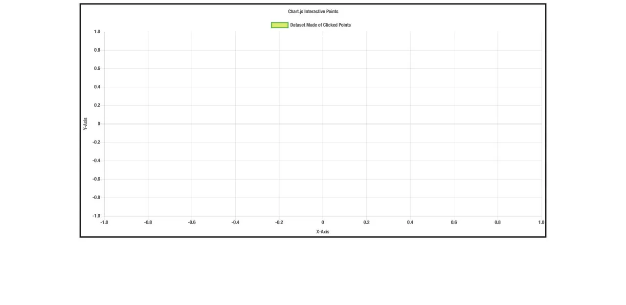
As a default without any data, the coordinates are -1 to 1 for both axes. Now, if you click on the chart, a point should get plotted but it likely will not be where you clicked. This is because the graph resets the scale's min and max values based on the data within. That means that while the first two points will not be exactly where you clicked visually, the coordinates will be the same. After the first two, the boundaries are established and as long as your clicks are within the graph space, the points will plot exactly.
If you want the graph to be initialized with a specific size or remain a specific size no matter what, here are some options to do that:
scales: {
    xAxes: [{
        type: "linear",
        display: true,
        scaleLabel: {
            display: true,
            labelString: 'X-Axis'
        },
        ticks: {
            min: -10,
            suggestedMax: 5
        }
    }, ],
    yAxes: [{
        display: true,
        scaleLabel: {
            display: true,
            labelString: 'Y-Axis'
        },
        ticks: {
            beginAtZero: true,
            suggestedMax: 15
        }
    }]
}
Each axis object can contain a ticks object with option such as:
minandmaxwhich render the chart with those value boundaries regardless of if points exit outside them.suggestedMinandsuggestedMaxwhich render the chart with those boundaries but will expand the chart if datapoints go outside.beginAtZerowhich is the same assuggestedMin: 0
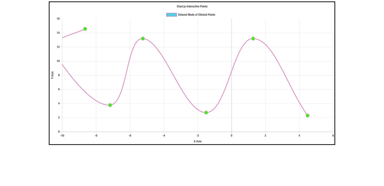
While clicking around, here is the result. Only the negative x-axis will create a point outside of the graph, any other axis will simply expand the dimensions to show the point:
Now, if you go and start clicking everywhere within the border box of the div, you will likely notice a few problems. One is that points are made no matter where you click, even outside the grid space. Those points outside the grid space do plot correctly though, according to where they would be on the grid, but still you would likely not want this functionality too much. The second problem is that you can no longer click on the legend to disable datasets. I have a fix for both problems which relies on transferring the entire click functionality outside of the chart object and handling it ourselves. For now, this will lose the data from points we click on, but since we are not using that now it does not matter. For this method, lets update our page loaded event handler and we can choose any of the interaction events. I will use onmousedown for demonstration:
main.js
window.addEventListener('DOMContentLoaded', function () {

    createGraph();

    document.getElementById('ChartCnvs').onmousedown = function(result) {
        ourClickHandler(result);
    };

}, false);
Then we are essentially going to recreate the same function that we made in the chart object, with only two major differences:
main.js
function ourClickHandler(element) {
    let scaleRef,
        valueX,
        valueY;

    for (var scaleKey in globalChartRef.scales) {
        scaleRef = globalChartRef.scales[scaleKey];
        if (scaleRef.isHorizontal() && scaleKey == 'x-axis-1') {
            valueX = scaleRef.getValueForPixel(element.offsetX);
        } else if (scaleKey == 'y-axis-1') {
            valueY = scaleRef.getValueForPixel(element.offsetY);
        }
    }

    if (valueX > globalChartRef.scales['x-axis-1'].min && valueX < globalChartRef.scales['x-axis-1'].max && valueY > globalChartRef.scales['y-axis-1'].min && valueY < globalChartRef.scales['y-axis-1'].max) {
        globalChartRef.data.datasets.forEach((dataset) => {
            dataset.data.push({
                x: valueX,
                y: valueY,
                extraInfo: 'info'
            });
        });
        globalChartRef.update();
    }
}
The only differences are that anywhere I used this I now use our global reference globalChartRef and that I have added a gatekeeper if statement which prevents making points outside of the grid area by getting the current min and max values of the scales and checking them against the calculated click coordinates. With this method, we do not interfere with the onclick function already assigned to the legend to disable datasets. Also, the extra info key:value pair I added into the points is just to show that you can add whatever information you need to the points as long as the key names do not interfere with ones checked for by Chart.js.
Here is my completed main.js since I took out the onClick object for my own function:
main.js
let globalChartRef;

window.addEventListener('DOMContentLoaded', function () {

    createGraph();

    document.getElementById('ChartCnvs').onmousedown = function(result) {
        ourClickHandler(result);
    };

}, false);

function randomColor(alpha) {
    return String('rgba(' + Math.round(Math.random() * 255) + ',' + Math.round(Math.random() * 255) + ',' + Math.round(Math.random() * 255) + ',' + alpha + ')');
}

function ourClickHandler(element) {
    let scaleRef,
        valueX,
        valueY;

    for (var scaleKey in globalChartRef.scales) {
        scaleRef = globalChartRef.scales[scaleKey];
        if (scaleRef.isHorizontal() && scaleKey == 'x-axis-1') {
            valueX = scaleRef.getValueForPixel(element.offsetX);
        } else if (scaleKey == 'y-axis-1') {
            valueY = scaleRef.getValueForPixel(element.offsetY);
        }
    }

    if (valueX > globalChartRef.scales['x-axis-1'].min && valueX < globalChartRef.scales['x-axis-1'].max && valueY > globalChartRef.scales['y-axis-1'].min && valueY < globalChartRef.scales['y-axis-1'].max) {
        globalChartRef.data.datasets.forEach((dataset) => {
            dataset.data.push({
                x: valueX,
                y: valueY,
                extraInfo: 'info'
            });
        });
        globalChartRef.update();
    }
}

function createGraph() {
    var config = {
        type: 'scatter',
        data: {
            datasets: [{
                label: "Dataset Made of Clicked Points",
                data: [],
                fill: false,
                showLine: true
            }]
        },
        options: {
            title: {
                display: true,
                text: "Chart.js Interactive Points"
            },
            scales: {
                xAxes: [{
                    type: "linear",
                    display: true,
                    scaleLabel: {
                        display: true,
                        labelString: 'X-Axis'
                    },
                    ticks: {
                        min: -10,
                        suggestedMax: 5
                    }
                }, ],
                yAxes: [{
                    display: true,
                    scaleLabel: {
                        display: true,
                        labelString: 'Y-Axis'
                    },
                    ticks: {
                        beginAtZero: true,
                        suggestedMax: 15
                    }
                }]
            },
            responsive: true,
            maintainAspectRatio: true
        }
    };

    config.data.datasets.forEach(function (dataset) {
        dataset.borderColor = randomColor(0.8);
        dataset.backgroundColor = randomColor(0.7);
        dataset.pointBorderColor = randomColor(1);
        dataset.pointBackgroundColor = randomColor(1);
        dataset.pointRadius = 7;
        dataset.pointBorderWidth = 2;
        dataset.pointHoverRadius = 8;
    });

    var ctx = document.getElementById('ChartCnvs').getContext('2d');
    globalChartRef = new Chart(ctx, config);
}
That will be everything for this tutorial, I hope you find it useful and interesting. I would like to continue on with some more Chart.js tutorials on some fun stuff I've been looking into. The above code seems to work well on desktops with touchscreen as well as androids, although there used to be some problems in the past with Chrome and Safari but I could not reproduce them. If you encounter any inconsistencies or missclicks, pls let me know because the coordinate system in Chart.js seems quite robust. Anyway, as always, I hope you enjoyed and have a good one.
Posted on Utopian.io - Rewarding Open Source Contributors