Utopian is beginning to switch to our new design, and as the self-proclaimed "Lead Frontend Developer" 😜 it's my job to help facilitate the code/development changes.
Though this is bound to be one of my more controversial changes, I believe after getting to use this new contribution format for a while, you'll really love it!
New Contribution Appearance Format
Below is a before vs after look at the new changes. Notice the:
- new appearance of primary tags
- new look for reputation
- new look for the header of the contribution
- border/background color scheme changes
Before

After
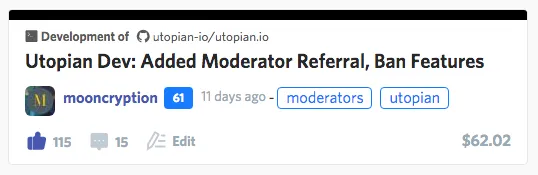
The biggest problem with before is that is way too large. It's not space-efficient at all, and takes up way too much space. Notice how the after image is much more compact/cozy and fits more information in even less space.
However, there are people that prefer minimal designs with a very low amount of clutter and lots of whitespace. The problem with this is that it sacrifices utility— a few contributions would take up the whole page, and space is not saved efficiently.
Though this might seem like a stark change or big difference, give it a while, and I'm sure you'll get used to it! Also, there may be even more changes that are done on this before it goes out to the public.
Proof of Work
Here, I'll attach the first commit and the last commit for all my work on this:
More
Here's an image of how this new layout would look in a *user profile feed:
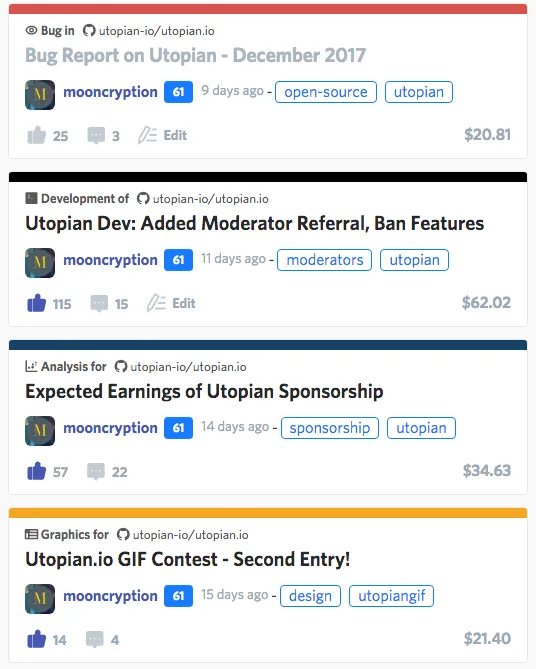
Keep in mind that:
- this will only affect the short look (preview appearance) of a contribution, e.g. when it's in a feed
- these changes will be released to the public very soon
Thanks for reading,
— @mooncryption
Posted on Utopian.io - Rewarding Open Source Contributors