Thanks for the contribution,
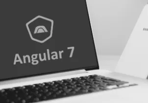
- It's better to display real life applications as mockups, there is no such use case like these for this application.
 |  |
|---|
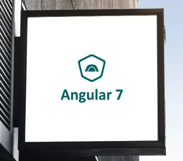
Color information on presentation is not readable.
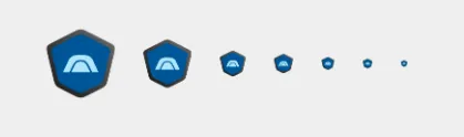
It's hard to see the logo after 3rd size, better contrast could avoid such situations. And favicons can has less elements resizing the whole logo to 16 pixel, doesn't work every time.
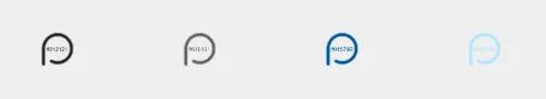
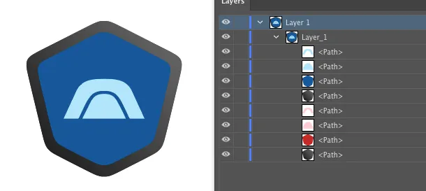
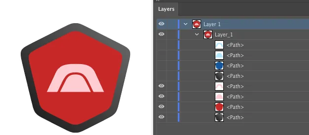
And the provided files were sloppy. Two different color schemes overlaying each other. I suggest you to pay attention to these details.
 |  |
|---|
Your contribution has been evaluated according to Utopian policies and guidelines, as well as a predefined set of questions pertaining to the category.
To view those questions and the relevant answers related to your post, click here.
Need help? Write a ticket on https://support.utopian.io/.
Chat with us on Discord.
[utopian-moderator]
RE: New Logo for Angular 7 Example App