This is an opensource project that runs on an Android system. An Android app that allows you to request TWRP for your (officially unsupported) device. All it needs is some basic info about your device, and through the app, it sends the info to be used for the creation of TWRP Recovery for your device.
So what is TWRP?
Wouldn't it be better if there was an explanation what is TWRP so we would have a better opinion about what we are looking at. Since I don't know what it is, I don't relate what that cog and arrows means.
I just check their website and it says "TWRP Builder is a project that aims at creating Team Win Recovery Project (TWRP) for the devices which don't have their own TWRP support yet." Still not enough information tho.
So let's move on to design,
I can see you just combined an already existing logo with a cog icon. Without any further adjustments. Cog has rounded corners and arrow has straight ones. And for the colors I like the one color version most, it's better to try more harmonic colors.
And unfortunately I can see you keep repeating the same things over and over again. There are no logotype primary and secondary, those are just vertically and horizontally positioned versions.
And again you're displaying an android app icon on an iPhone. Even we mentioned this several times.
https://steemit.com/utopian-io/@mansyaprime/new-logo-for-record-view
https://steemit.com/utopian-io/@mansyaprime/new-logo-for-oksocket
Easier ways to draw a cog. 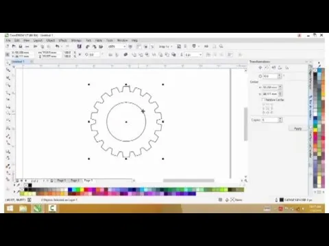
Your contribution has been evaluated according to Utopian policies and guidelines, as well as a predefined set of questions pertaining to the category.
To view those questions and the relevant answers related to your post, click here.
Need help? Write a ticket on https://support.utopian.io/.
Chat with us on Discord.
[utopian-moderator]
RE: New Logo for Twrp Builder