How-to Do Data Visualization using RAWGraphs
I've decided to write a tutorial series on Open Source Data Visualization tools, from beginner stuff to pretty complex and advanced. In the past few years, there's been a tremendous development going on regarding Data Visualization tools (it's not just the built-in tools within OpenOffice or Excel anymore people!), and today I'm starting this series with a tutorial about RAWGraphs.
What is RAWGraphs?
As RAW's GitHUB Repository states: "RAW is an open web tool to create custom vector-based visualizations, on top of the amazing d3.js library by Mike Bostock.". And also: "Primarily conceived as a tool for designers and vis geeks, RAW aims at providing a missing link between spreadsheet applications (e.g. Microsoft Excel, Apple Numbers, Google Docs, OpenRefine, …) and vector graphics editors (e.g. Adobe Illustrator, Inkscape, …)."
Hence:
- RAW can be used inside your web browser,
- it lets you create cool data visualizations,
- that are SVGs: Scalable Vector Graphics,
- RAW is built on top of d3.js, a famous JavaScript library for manipulating documents based on data (BTW: d3 is short for Data-Driven Documents, hence the name d3.js). I'll be covering how to build custom Data Visualizations using d3.js in my follow-up tutorials,
- RAW is extremely easy to use, doesn't provide in-depth programming skills (or any programming at all for that matter, if you have the data already),
- you can just insert and edit data in your favorite spreadsheet program (like OpenOffice),
- visualize that data using some easy RAW configurations,
- export and save the data visualizations, either as a PNG image or SVG vector file,
- and further stylize those SVG visualizations in a vector-enabled graphical editor (like InkScape).
How to use RAW?
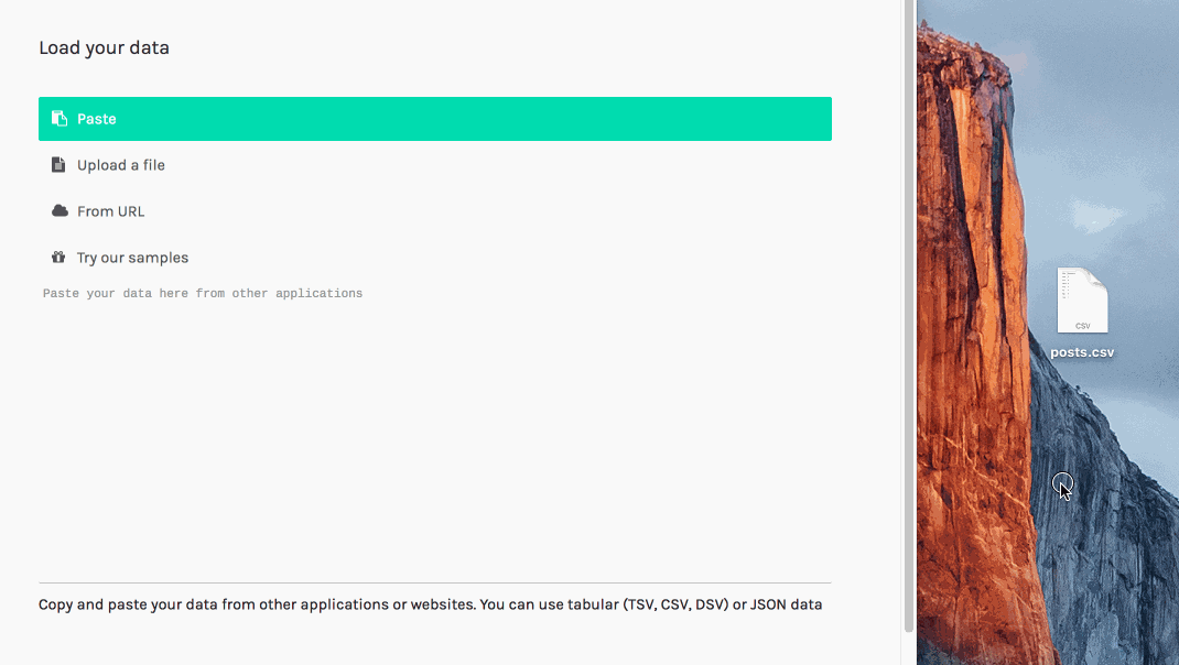
- first create and save a data file, in JSON or CSV (comma-separated values) format. You could prepare that data by hand, or query and format it from any source (for example the Steem blockchain). I've prepared, for this tutorial, an example CSV file saved as
posts.csvwith the following data:
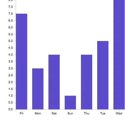
Day,Postcount
Mon,3
Tue,5
Wed,8
Thu,4
Fri,7
Sat,4
Sun,1
- Next, either go to http://app.rawgraphs.io/ or build / install it locally from the RAW GitHub repo. In this tutorial, for simplicity matters, I'm just using http://app.rawgraphs.io/ ,
- Drag-and-drop your own
posts.csvfile, at the 'Load your data' area, or manually type in your own data (structure) in there. If your data structure is valid, a message will show your data was successfully parsed.
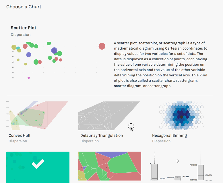
- Then, choose a prefab chart type. There are loads of cool chart types to choose from (yet apparently a simple Line Chart seems absent!), and in my example - due to the extremely simple data structure - I will pick and click "Bar chart",
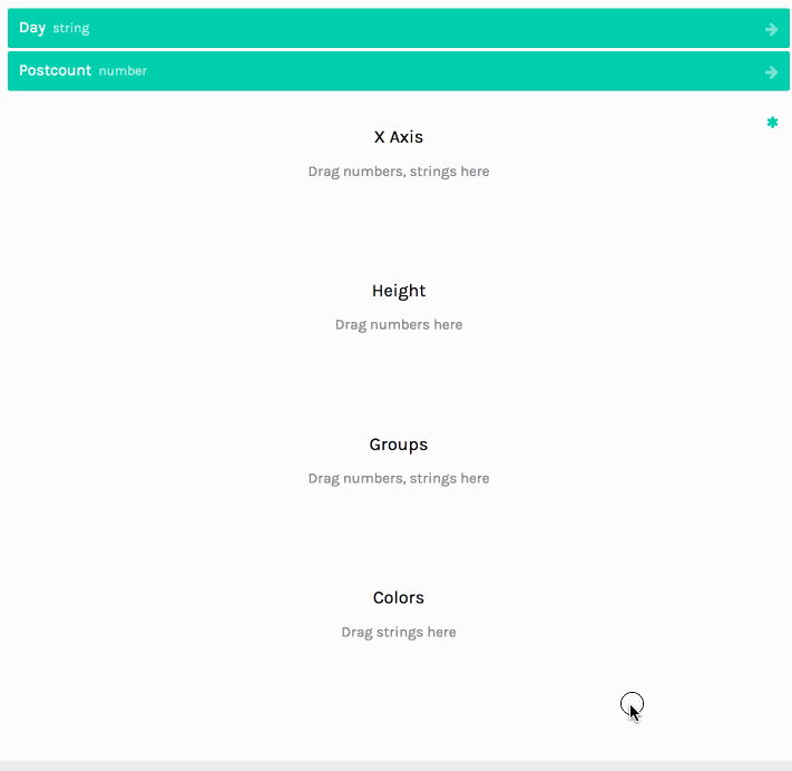
- Next, you need to map your data file to the chart parameters. These depend on the type of chart you have chosen in the previous step. In my "Bar Chart" example, I simply map the "Day"-column to "X Axis" and the "Postcount" to "Height",
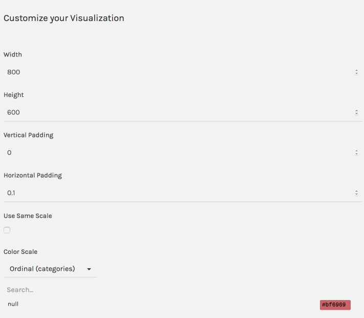
- after that, you may want to customize your data visualization, and in this example I change the image dimensions to 400 pixels (width & height), increase the Horizontal Padding (how much space exists between the bars), and pick another (purple / blue) color for the bars in my chart,
- Finally, you can either download the data visualization as a PNG image (primarily intended "As-Is", but of course you could change it with a Photo Editor like Gimp or Photoshop), or SVG (which will be fully customizable via Inkscape or for example Illustrator). My own example end-result is this:
Some conclusions about RAWGraph
Although RAWGraph is extremely beginner-friendly, and therefore a good tool to start your data visualizations endeavors with, it is also somewhat limiting. RAWGraph is built upon D3.js (and other JS libs) for that exact reason: to be beginner-friendly.
However D3.js itself allows for building data visualization tools from scratch, which can be somewhat daunting at first, for it requires (some) knowledge on programming in JavaScript. Apart from building data visualizations, D3.js at the core can also be used as a DOM selector and manipulation engine, like jQuery but faster, and therefore I will continue my "data visualization series" on D3.js, from beginner to advanced!
Stay tuned #BlockchainBI and #Utopian-IO fans! ;-)
Posted on Utopian.io - Rewarding Open Source Contributors