Details
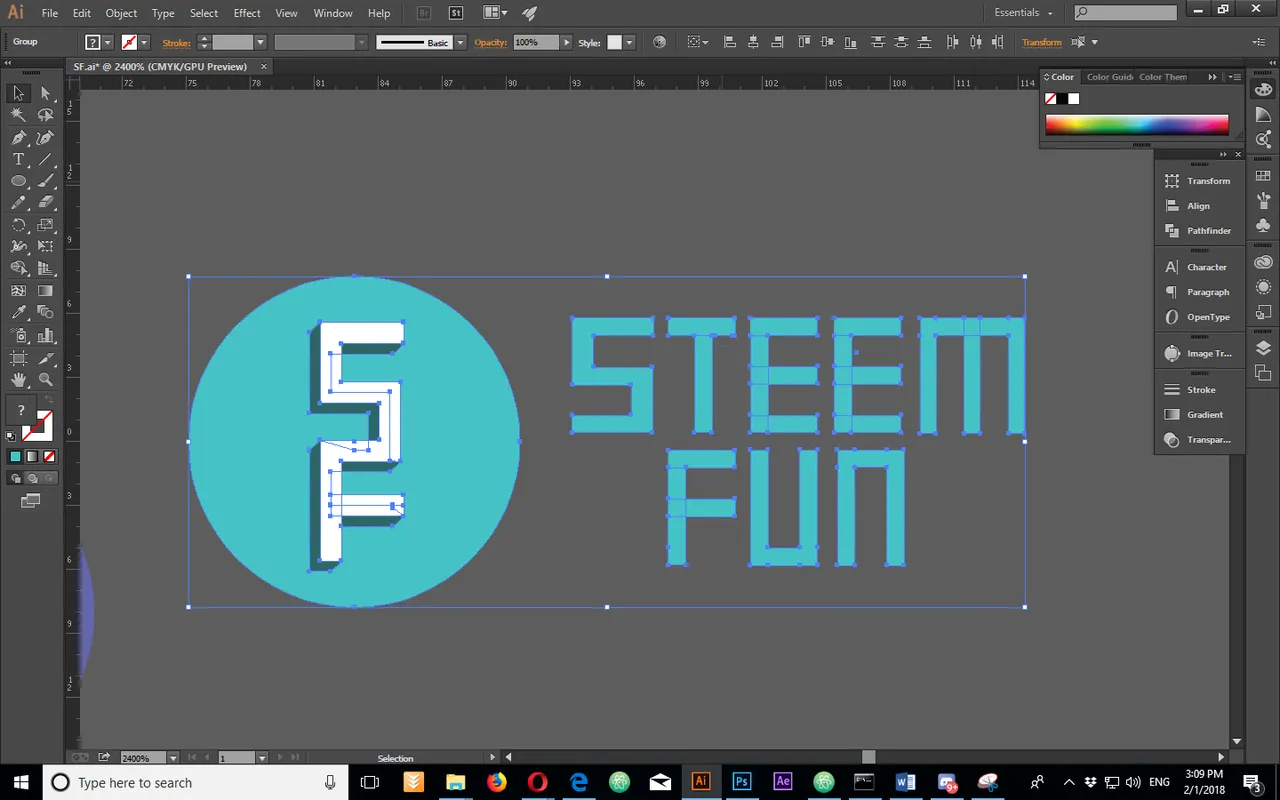
I went for a simple typographic logo. I used simple shapes and i created a shadow. I put it in a circle, but the logo can be used without it if needed. Here is my creation process.
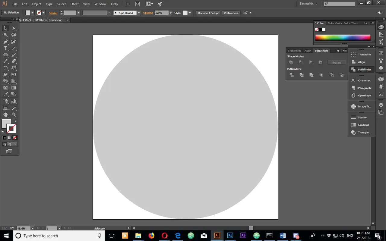
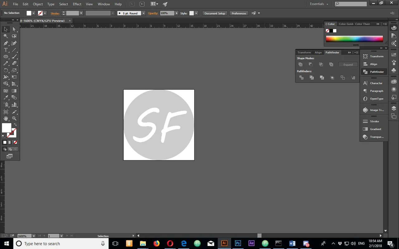
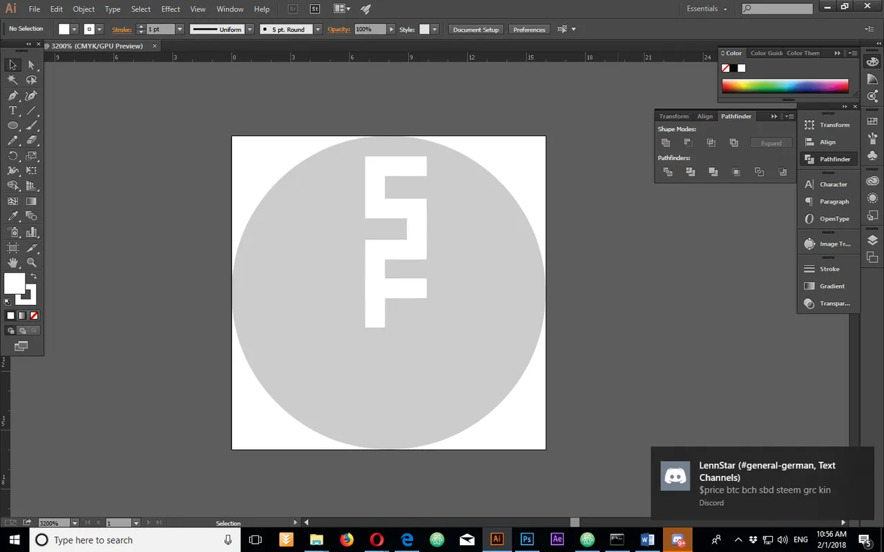
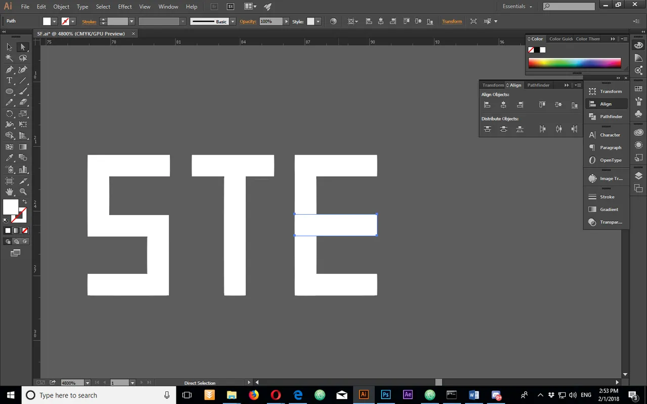
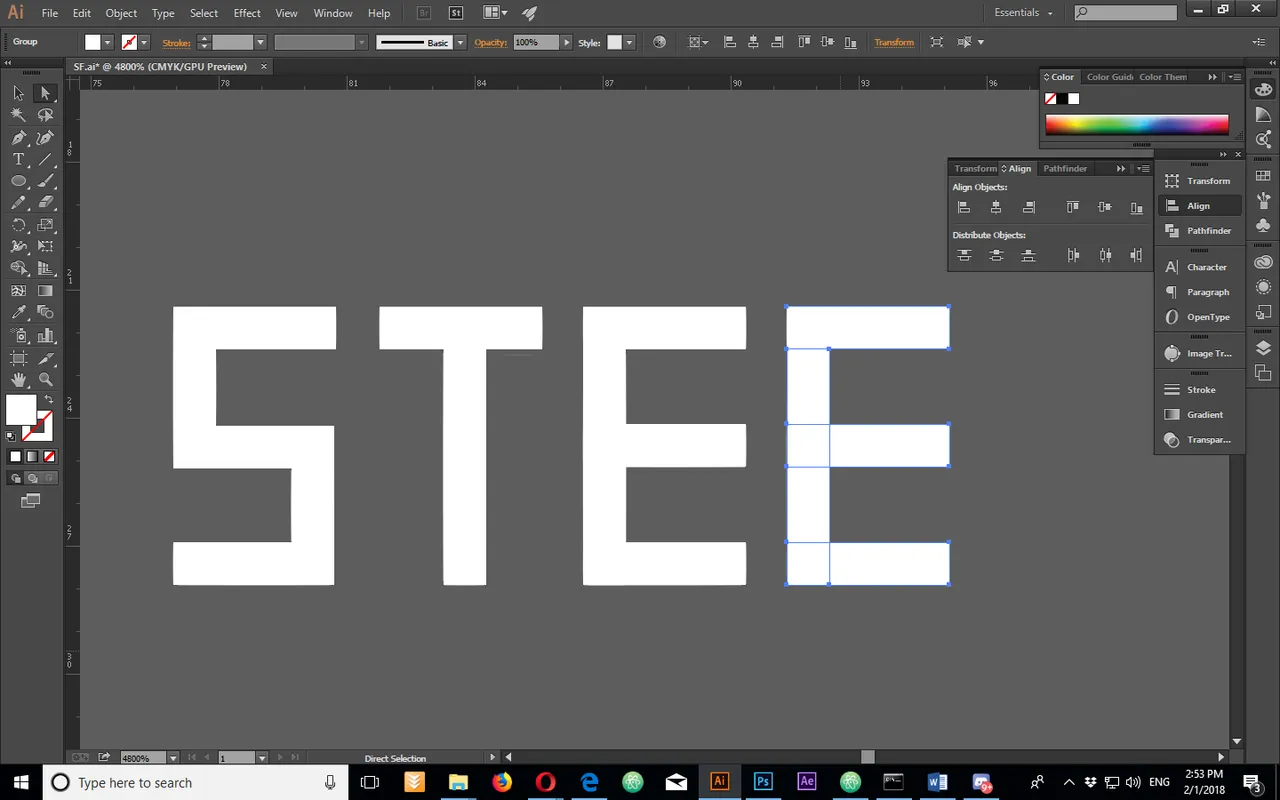
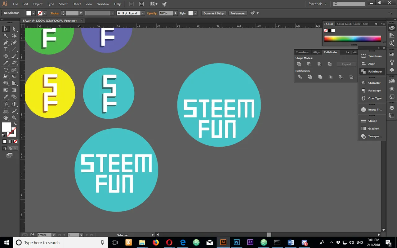
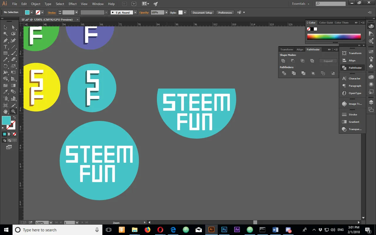
I created the circle and i tried combining the S and F.
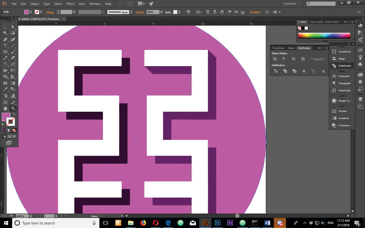
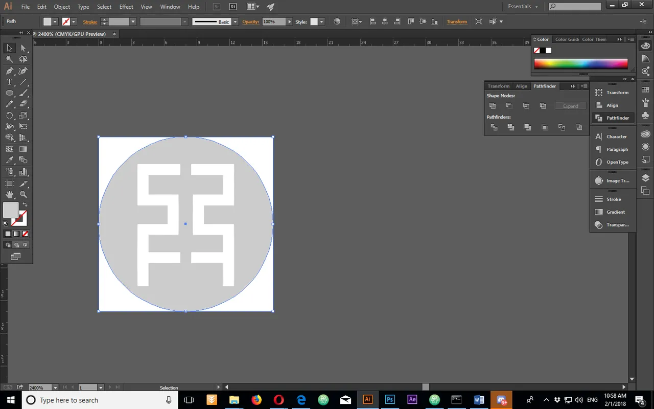
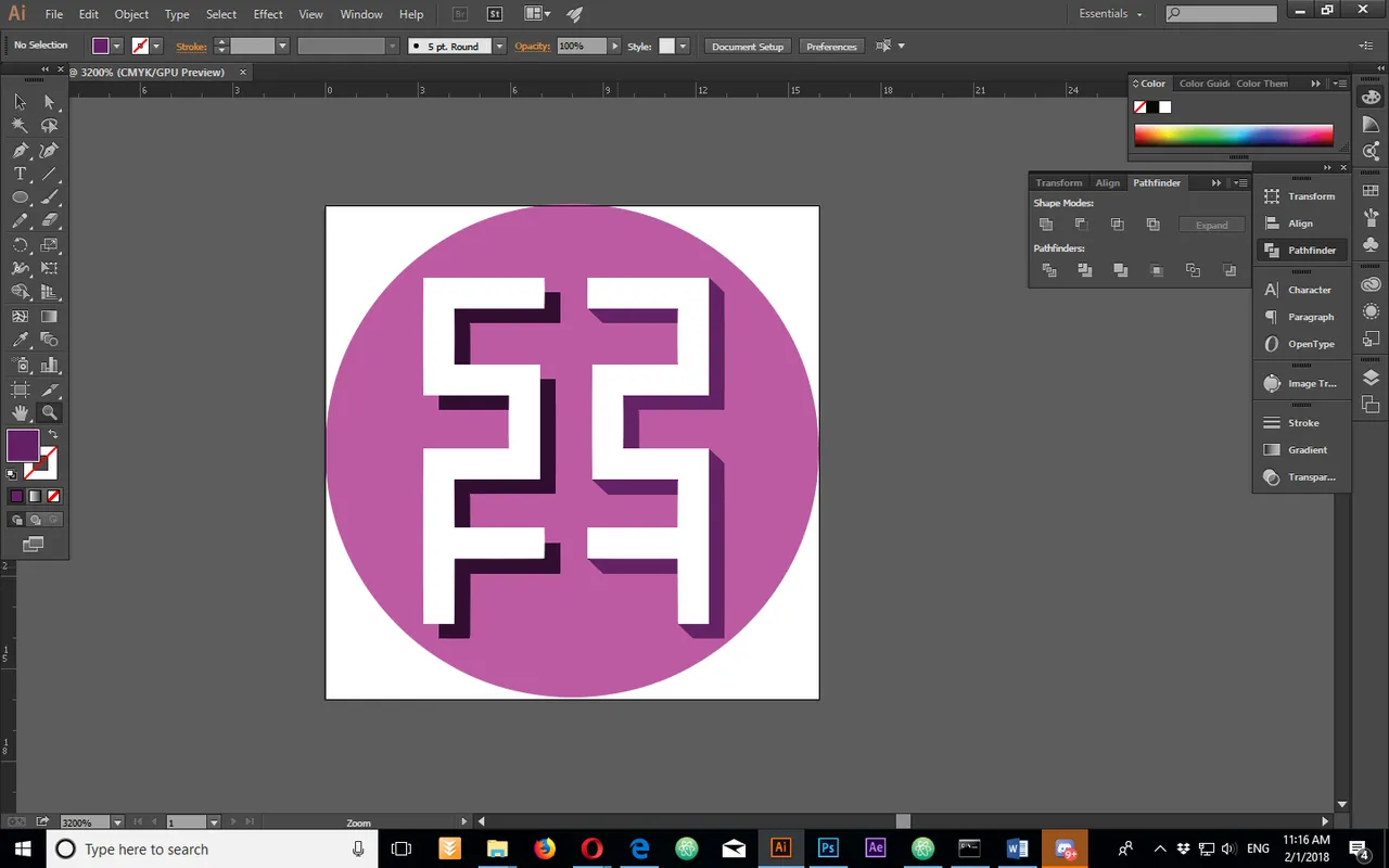
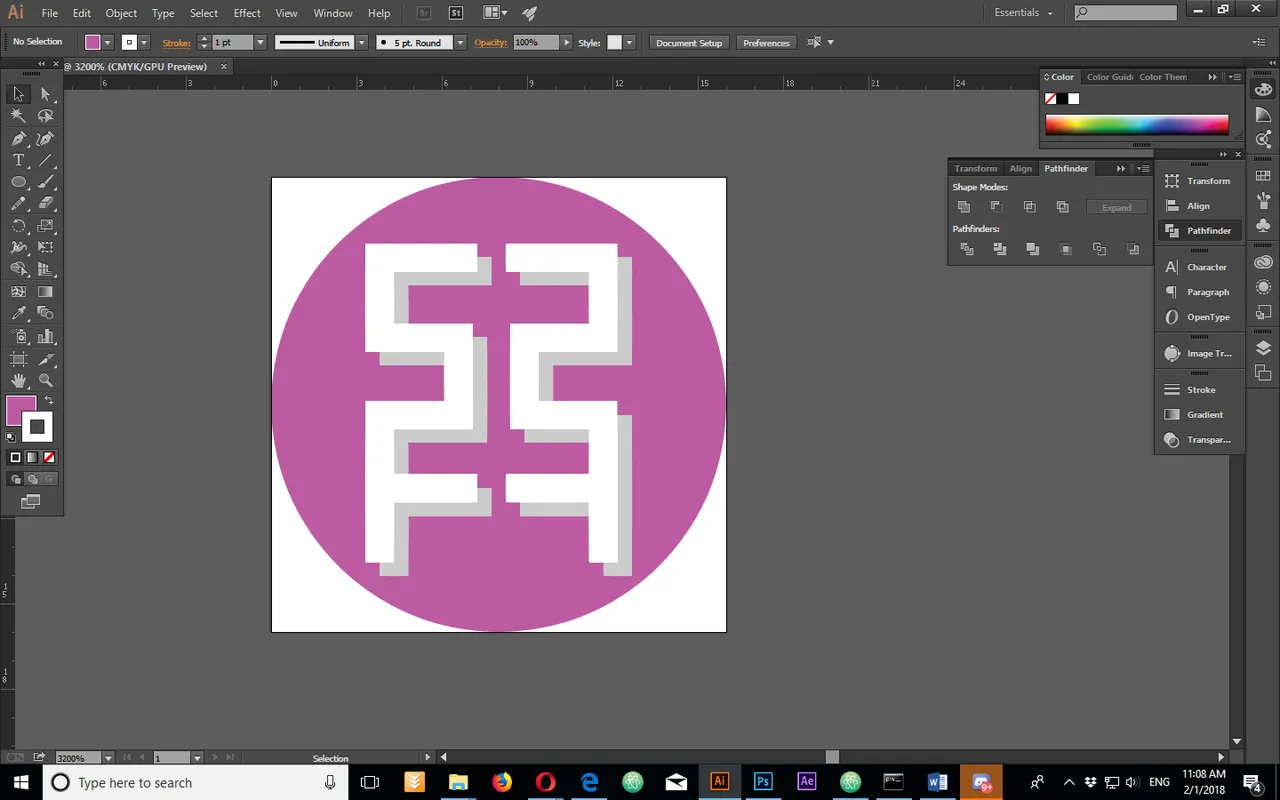
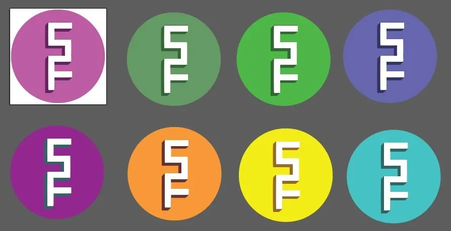
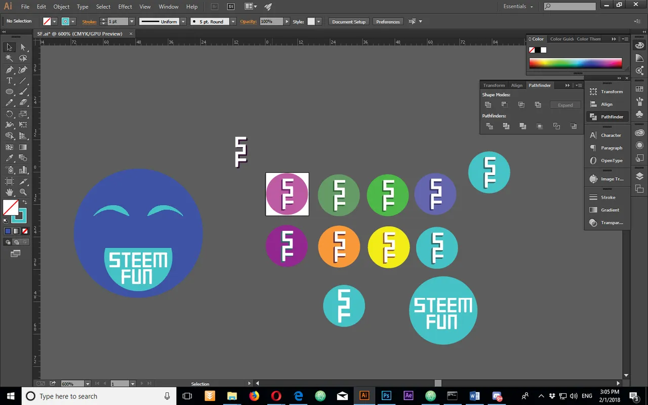
I created a shadow and i tried duplicating the shape, but even though i liked something about that design, when i scaled it down to 16 px it lost all the detail and was practically unusable, so i went back to my original idea and i tred out some different colors.
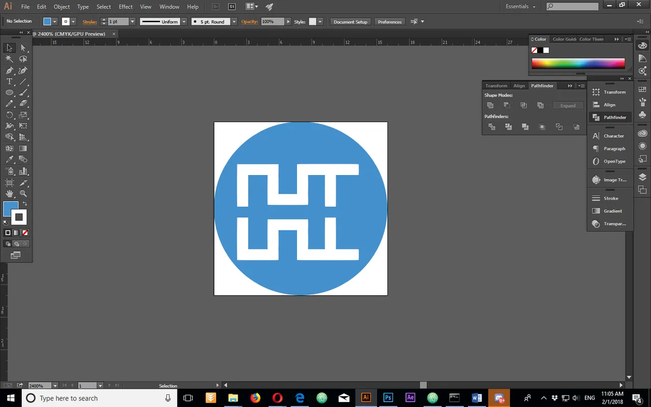
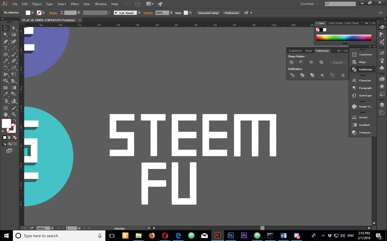
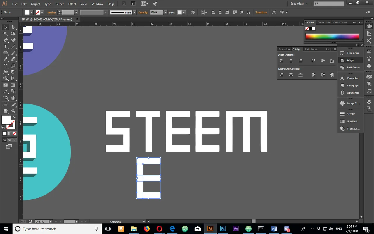
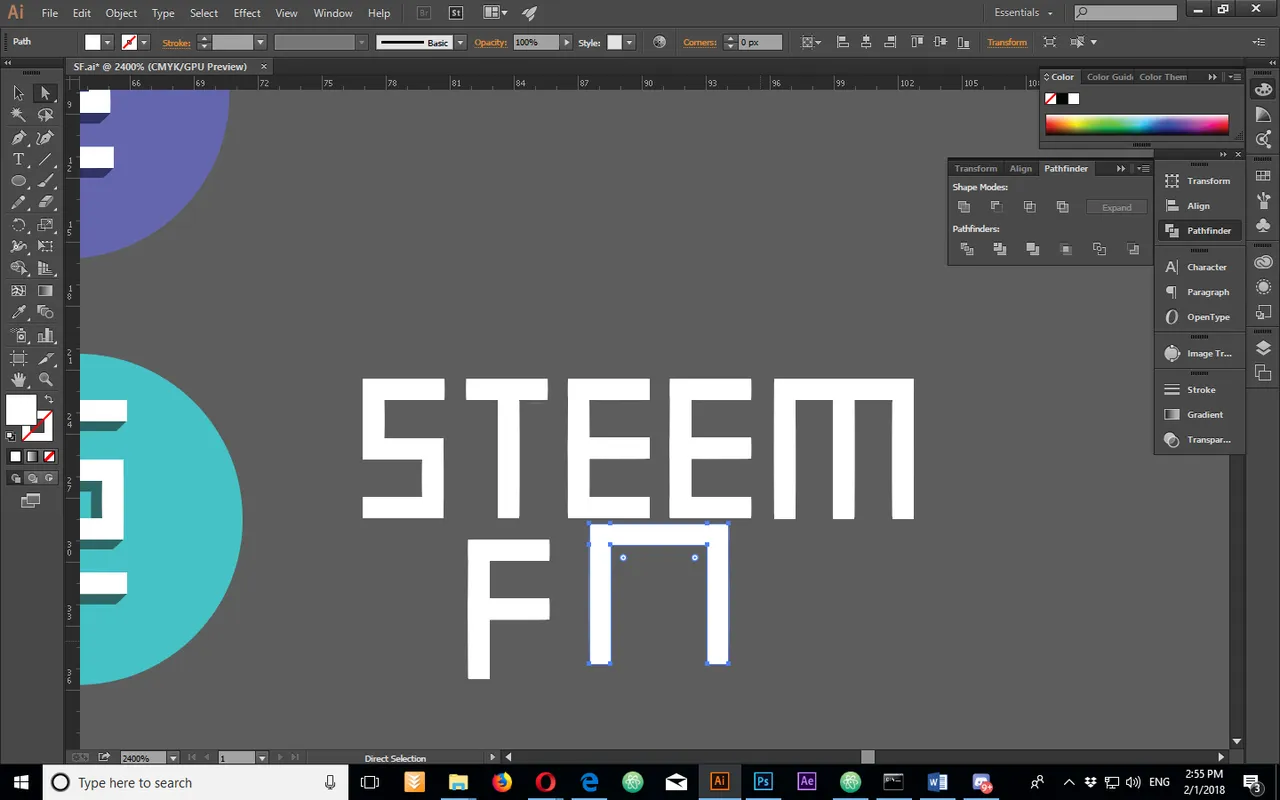
Afterwards i created a font and tried out an idea with the full name.
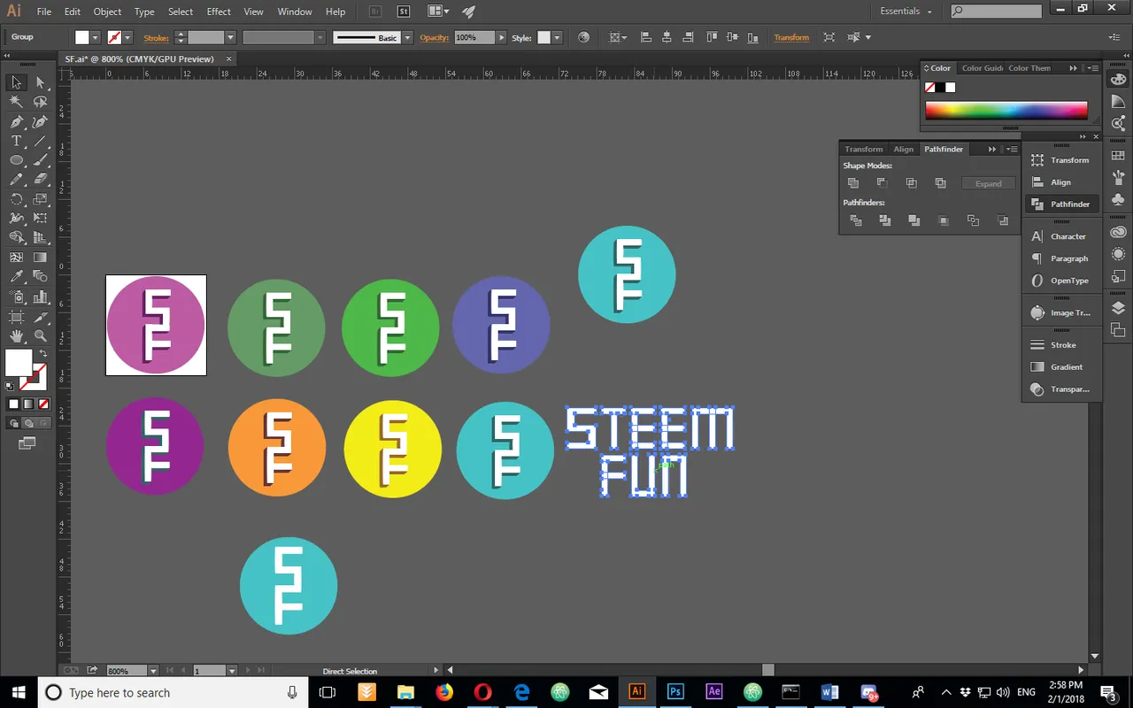
Logo size Variations:

128x128

64x64

32x32

16x16
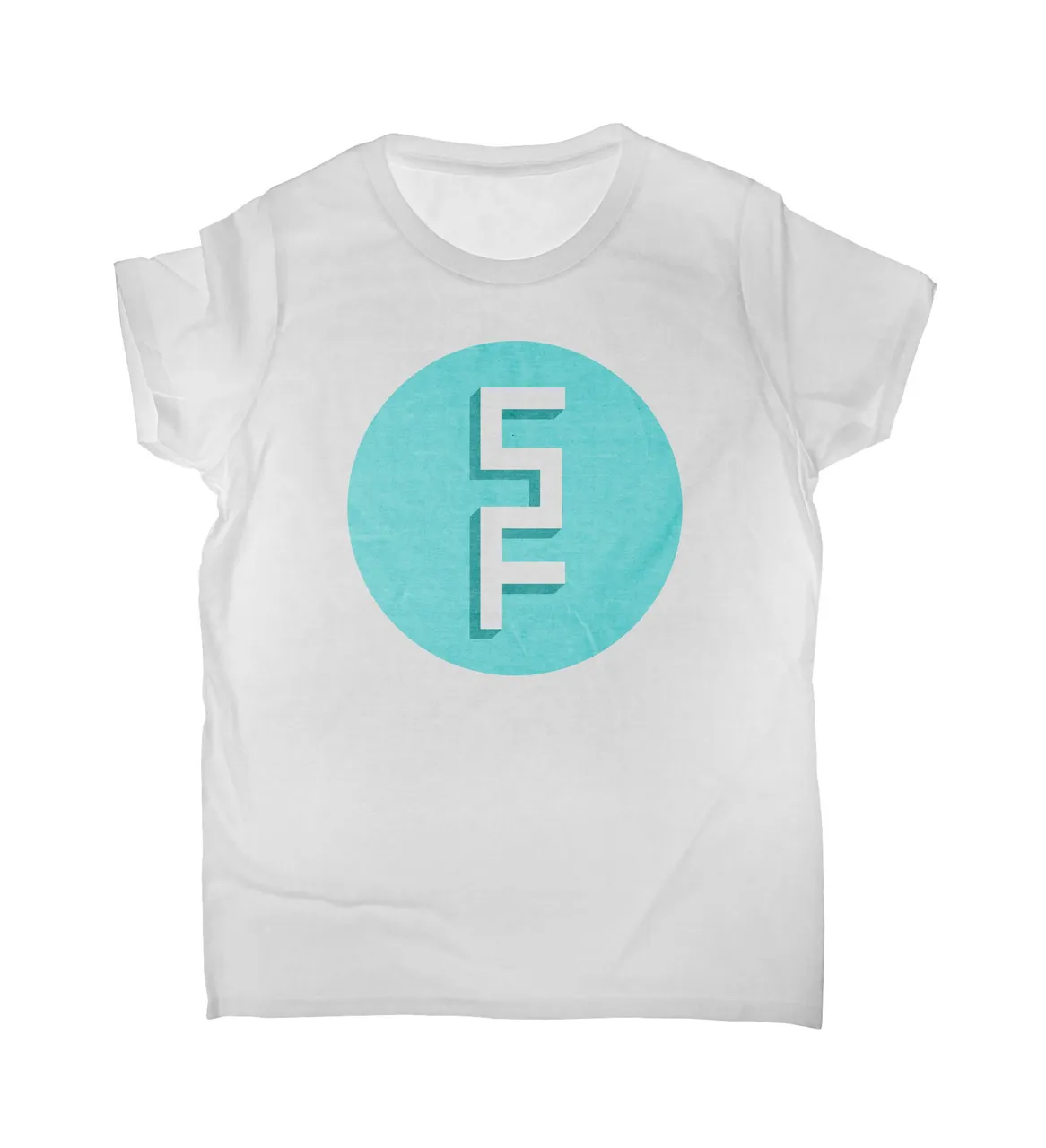
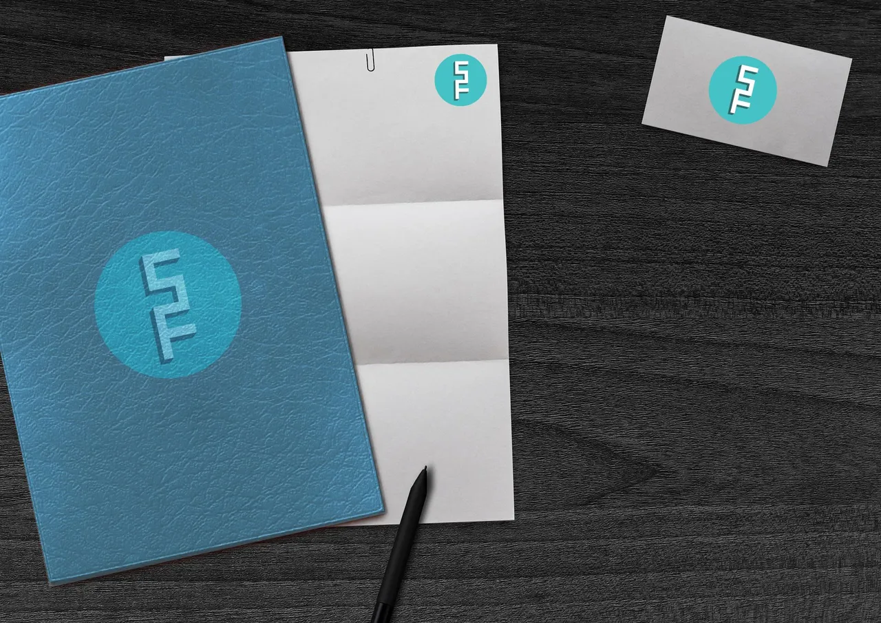
Last but not least, some usage occasions:
Benefits / Improvements
The logo has a scalable version for smaller sizes. I removed the shadow to make that possible, but on 64x64 and above there is no loss in the detail, because the logo uses simple shapes.
Tools
AI CC
AP CC
Original files
https://drive.google.com/drive/folders/1uJoU8oVjdlJdGQ3-KdxyI1j3zyMEiO76?usp=sharing
Picture Source:
Pixabay
Your support means a lot to me so please share with me your thoughts and opinions and help me grow. Thank you for reading. :)
Think Big!
xTrex
Posted on Utopian.io - Rewarding Open Source Contributors