This guide shows how to confront the attributes of different objects in order to understand how those objects are similar (based on their attributes) or on the other hand differ one from the other. By plotting these attributes in a matrix it is possible to built a heatmap looking plot.
In this particular case it is possible to confront the cars from their speed or gears or miles per gallon. As you can see the ones that are more luxury cars as Cadillac, Linkoln or Mercedes tend to group by number of gears and consumption of fuel expressed in mpg (miles per gallon) while the modest cars such as Fiat or Toyota for a low consumption and hp(horse power)
The code for creating this kind of plot is given bellow and is straight forward as you don't need to import particular libraries:
heatmap(as.matrix(mtcars),

Rowv=NA,

Colv=NA,

col = heat.colors(256),

scale="column",

margins=c(2,8),

main = "Car characteristics by Model")
The result is displayed in the following picture :
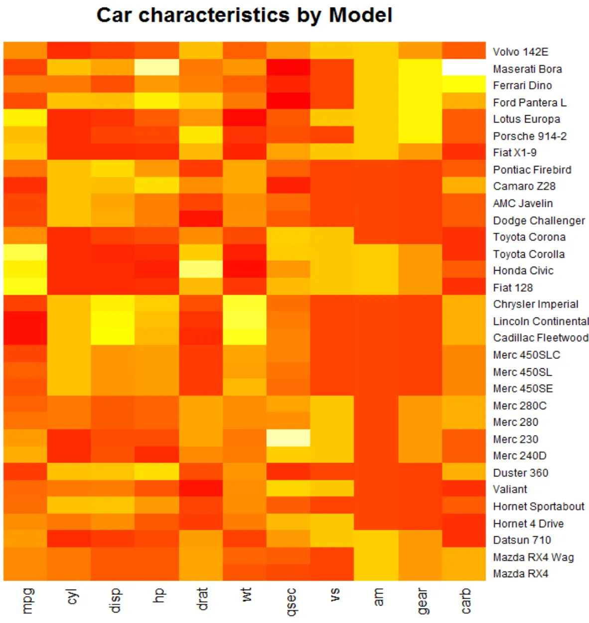
So you will see that the car models that share similar features tend to stay in the same group, thus creating the more densely populate areas, thus a heatmap.
If you enjoyed this article guide on plotting an heatmap in R please show your support to datatreemap.
We will come up with more articles on data visualization so stay tuned.