For a Java user sometimes there is a data task to visualize how a certain variable changes in time. For that you can use JFreeChart. And if there are many variables, no problem there is JFreeChart. JFreeChart is an open source library and it is free to use. In this example we visualize a series of lines that represent how variables change on time.
A very self explanatory code for the above task is also the following one :
The code we will :
1 - generate an interval of values to use it for each line
2 - make the methods for representing the multiple lines graph itself
The Java code for the multiple lines graphic is ready to use and you can copy paste it in your Eclipse IDE after importing the jfreechart.jar file in your project
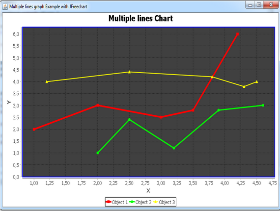
public class MultipleLinesChart extends JFrame { // the class extends the JFrame class } And this is the result we have after running the code . With JFreeChart it is pretty easy to make even more data visualizations. There are many other guides in DataTreeMap and if you liked this guide please follow .
public MultipleLinesChart() { // the constructor will contain the panel of a certain size and the close operations
super("XY Line Chart Example with JFreechart"); // calls the super class constructor
JPanel chartPanel = createChartPanel();
add(chartPanel, BorderLayout.CENTER);
setSize(640, 480);
setDefaultCloseOperation(JFrame.EXIT_ON_CLOSE);
setLocationRelativeTo(null);
}
private JPanel createChartPanel() { // this method will create the chart panel containin the graph
String chartTitle = "Objects Movement Chart";
String xAxisLabel = "X";
String yAxisLabel = "Y";
XYDataset dataset = createDataset();
JFreeChart chart = ChartFactory.createXYLineChart(chartTitle,
xAxisLabel, yAxisLabel, dataset);
customizeChart(chart);
// saves the chart as an image files
File imageFile = new File("XYLineChart.png");
int width = 640;
int height = 480;
try {
ChartUtilities.saveChartAsPNG(imageFile, chart, width, height);
} catch (IOException ex) {
System.err.println(ex);
}
return new ChartPanel(chart);
}
private XYDataset createDataset() { // this method creates the data as time seris
XYSeriesCollection dataset = new XYSeriesCollection();
XYSeries series1 = new XYSeries("Object 1");
XYSeries series2 = new XYSeries("Object 2");
XYSeries series3 = new XYSeries("Object 3");
series1.add(1.0, 2.0);
series1.add(2.0, 3.0);
series1.add(3.0, 2.5);
series1.add(3.5, 2.8);
series1.add(4.2, 6.0);
series2.add(2.0, 1.0);
series2.add(2.5, 2.4);
series2.add(3.2, 1.2);
series2.add(3.9, 2.8);
series2.add(4.6, 3.0);
series3.add(1.2, 4.0);
series3.add(2.5, 4.4);
series3.add(3.8, 4.2);
series3.add(4.3, 3.8);
series3.add(4.5, 4.0);
dataset.addSeries(series1);
dataset.addSeries(series2);
dataset.addSeries(series3);
return dataset;
}
private void customizeChart(JFreeChart chart) { // here we make some customization
XYPlot plot = chart.getXYPlot();
XYLineAndShapeRenderer renderer = new XYLineAndShapeRenderer();
// sets paint color for each series
renderer.setSeriesPaint(0, Color.RED);
renderer.setSeriesPaint(1, Color.GREEN);
renderer.setSeriesPaint(2, Color.YELLOW);
// sets thickness for series (using strokes)
renderer.setSeriesStroke(0, new BasicStroke(4.0f));
renderer.setSeriesStroke(1, new BasicStroke(3.0f));
renderer.setSeriesStroke(2, new BasicStroke(2.0f));
// sets paint color for plot outlines
plot.setOutlinePaint(Color.BLUE);
plot.setOutlineStroke(new BasicStroke(2.0f));
// sets renderer for lines
plot.setRenderer(renderer);
// sets plot background
plot.setBackgroundPaint(Color.DARK_GRAY);
// sets paint color for the grid lines
plot.setRangeGridlinesVisible(true);
plot.setRangeGridlinePaint(Color.BLACK);
plot.setDomainGridlinesVisible(true);
plot.setDomainGridlinePaint(Color.BLACK);
}
public static void main(String[] args) {
SwingUtilities.invokeLater(new Runnable() {
@Override
public void run() {
new MultipleLinesChart().setVisible(true);
}
});
}
See you next time with more interesting guides on data visualization.