Today I want to present you the chart of the day. It is the alltime WTI production chart in the USA in million barrels. When I saw this, I was startled at first, because it doesn't make much sense.
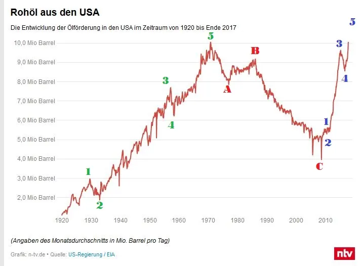
This chart belongs to N-TV.de, a german news site like CNBC.
https://www.n-tv.de/wirtschaft/Zweites-US-Olwunder-bringt-Opec-in-Noete-article20282848.html
As you can see, there are clearly visible elliott wave structures. But wait a minute... This is not a tradeable market like BTC or the DOW. It is just the overall WTI production output of the USA. So why is the output running in wave structures?
The only explantion I have is, that because WTI market moves in elliott wave structures. So when the WTI price is high, it is profitable to produce as much oil as possible. When the price is low, it is not as profitable. So my hypothesis is, that because of this correlation of production output and price, the production output chart also shows elliott wave structures like 3 steps forward, two steps back. This chart shows nearly 100 years of output data, so it can't be a coincidence.
I think this is astonishing... I guess the fractal nature can be found in anything this universe has to offer.