"Marketing" may immediately make you cringe, but it doesn't have to be evil. One of my jobs at the library is creating promotional materials for programs and events. My goal is just to ensure people are aware of them. In this post, I intend to share the principles I have learned.
Of course, the easiest option is to edit a preconstructed template. They often have passable layouts, typefaces, color schemes, and so forth, but finding something which suits your needs can be a challenge. If you need to create an advertisement or handout from scratch, here's how to do it yourself!
Created in Canva
Images
Good graphics catch the eye. A lost dog flyer needs a photo of the missing mutt. A concert poster needs a picture of the band. An ad for a new product needs to show the product! If you don't have a photo of your own, you might find yourself risking legal trouble thanks to copyright laws. I suggest using sites like Pixabay, Unsplash, or Pexels to find royalty-free photos or illustrations under permissive licenses to serve any stock photo needs.
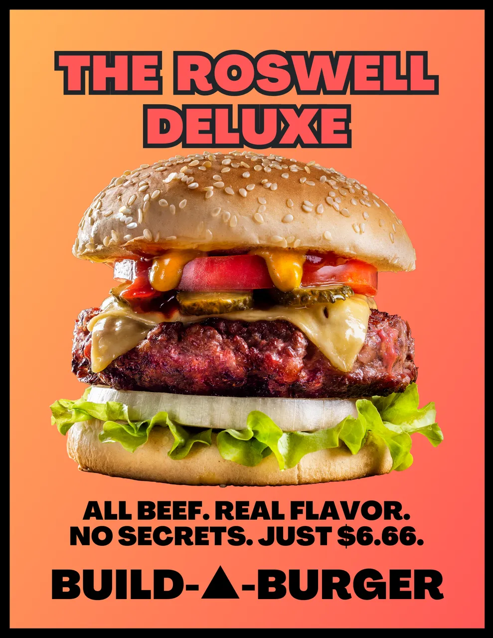
I designed this advertisement poster for my unexpectedly-useful fictional fast-food franchise with a cheeseburger image from the Canva clipart library because the emphasis is on the food. The yellow/orange background is mainly because my real-world national brand competitors also have yellow and red as their corporate colors.
Text
When your goal is getting attention and communicating information quickly, you need to carefully consider your text. Clear, concise posters should be both legible and aesthetically pleasing.
Ideally, use two fonts, and no more than three. A different size or color counts as a separate font. It can be effective to combine a bold font with a narrow font, or a serif font with sans-serif, to create added contrast.
In the burger poster above, text is minimal. I used only one typeface in two versions, plus the wordmark branding at the bottom, as if that one font was key to brand identity. In the band poster below, I used a fancy typeface for the band name and then simple sans serif text everywhere else.
Canva offers a useful guide, and Fontjoy has a fun tool to mix and match typefaces for title and body text. Just don't use Comic Sans, Papyrus, or handwriting/brush scripts unless you are absolutely certain you are using them properly. And then don't use them anyway because you're still wrong.
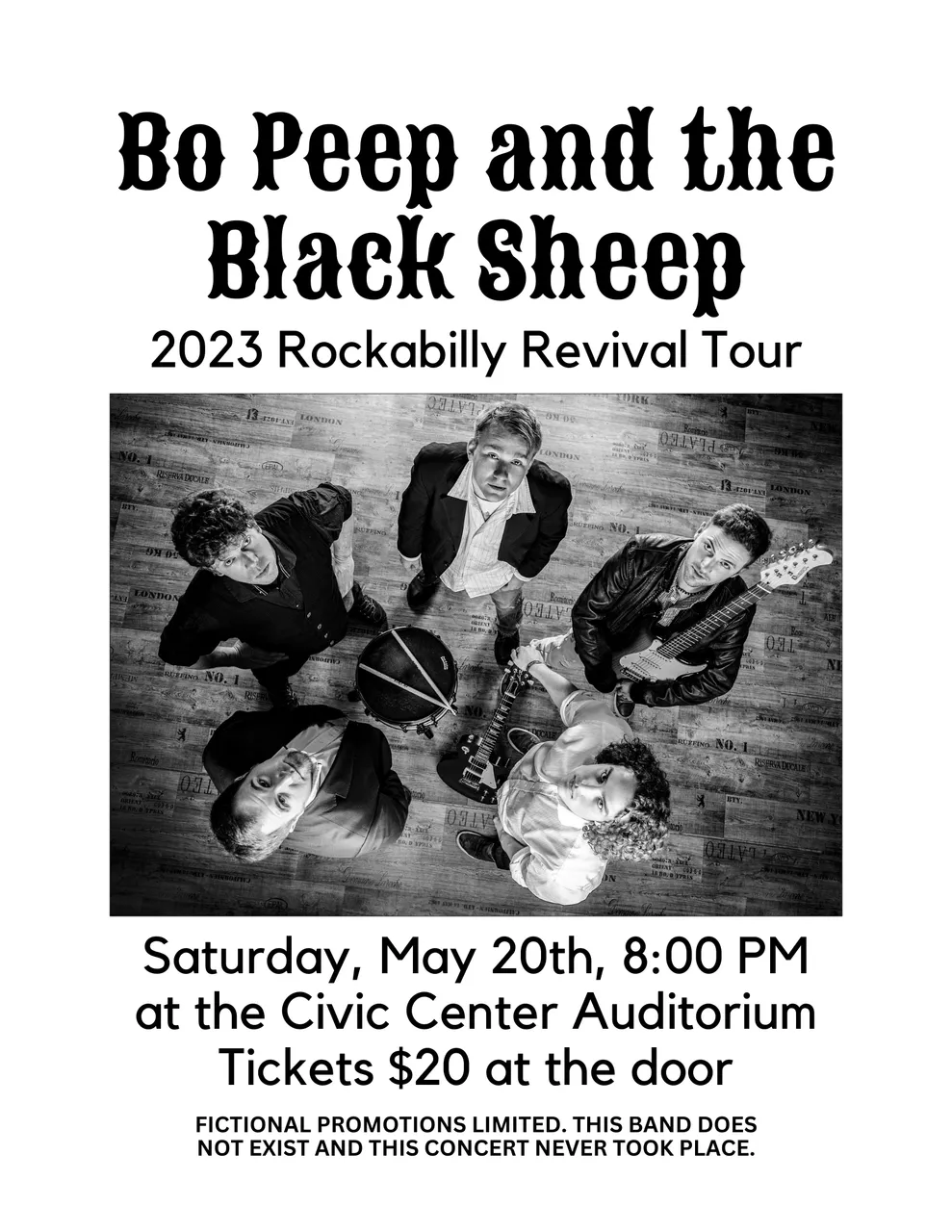
Created in Canva with an image from Pixabay
Content
Who, what, when, where, why, and how are the core facts you need to communicate, whether you are writing an in-depth investigative journalism exposé or designing a simple flyer.
In this music poster, you can see who is performing, what style of music to expect, where and when it will occur, and how to get a ticket. Why you might attend is up to you.
Layout
Once you have your core image and text, layout is the next consideration. Would a straightforward layout or dynamic angular design fit your theme? Do you want a full-color poster or a simple black-and-white document? You can print the latter on colorful paper to still be more eye-catching while saving money per page.
Software
Online tools like Canva include a lot of stock photos even for a free account, and the text editor and layering tools are good. Most office suites include a program designed for flyers and handouts, including Microsoft Publisher or LibreOffice Draw. For those who like full control, Adobe Photoshop or GIMP have you covered.
Final Thoughts
Please forgive the hastily-created example posters. Did I miss anything important in these brief points? All of these are guidelines and starting points for you to consider, but they exist for good reason. If rules were made to be broken, understanding why they exist will allow you to break them constructively. Otherwise, you risk a mess that makes Web 1.0 personal sites look restrained in comparison.